Chapter 5 Visualizing Multivariate Data
## Linking to ImageMagick 6.9.12.3
## Enabled features: cairo, fontconfig, freetype, heic, lcms, pango, raw, rsvg, webp
## Disabled features: fftw, ghostscript, x11
We’ve spent a lot of time so far looking at analysis of the relationship of two variables. When we compared groups, we had 1 continuous variable and 1 categorical variable. In our curve fitting section, we looked at the relationship between two continuous variables.
The rest of the class is going to be focused on looking at many variables. This chapter will focus on visualization of the relationship between many variables and using these tools to explore your data. This is often called exploratory data analysis (EDA)
5.1 Relationships between Continous Variables
In the previous chapter we looked at college data, and just pulled out two variables. What about expanding to the rest of the variables?
A useful plot is called a pairs plot. This is a plot that shows the scatter plot of all pairs of variables in a matrix of plots.
dataDir <- "../finalDataSets"
scorecard <- read.csv(file.path(dataDir, "college.csv"),
    stringsAsFactors = FALSE, na.strings = c("NA",
        "PrivacySuppressed"))
scorecard <- scorecard[-which(scorecard$CONTROL ==
    3), ]
smallScores <- scorecard[, -c(1:3, 4, 5, 6, 9, 11,
    14:17, 18:22, 24:27, 31)]
Let’s first start with a small number of variables, just the first four variables
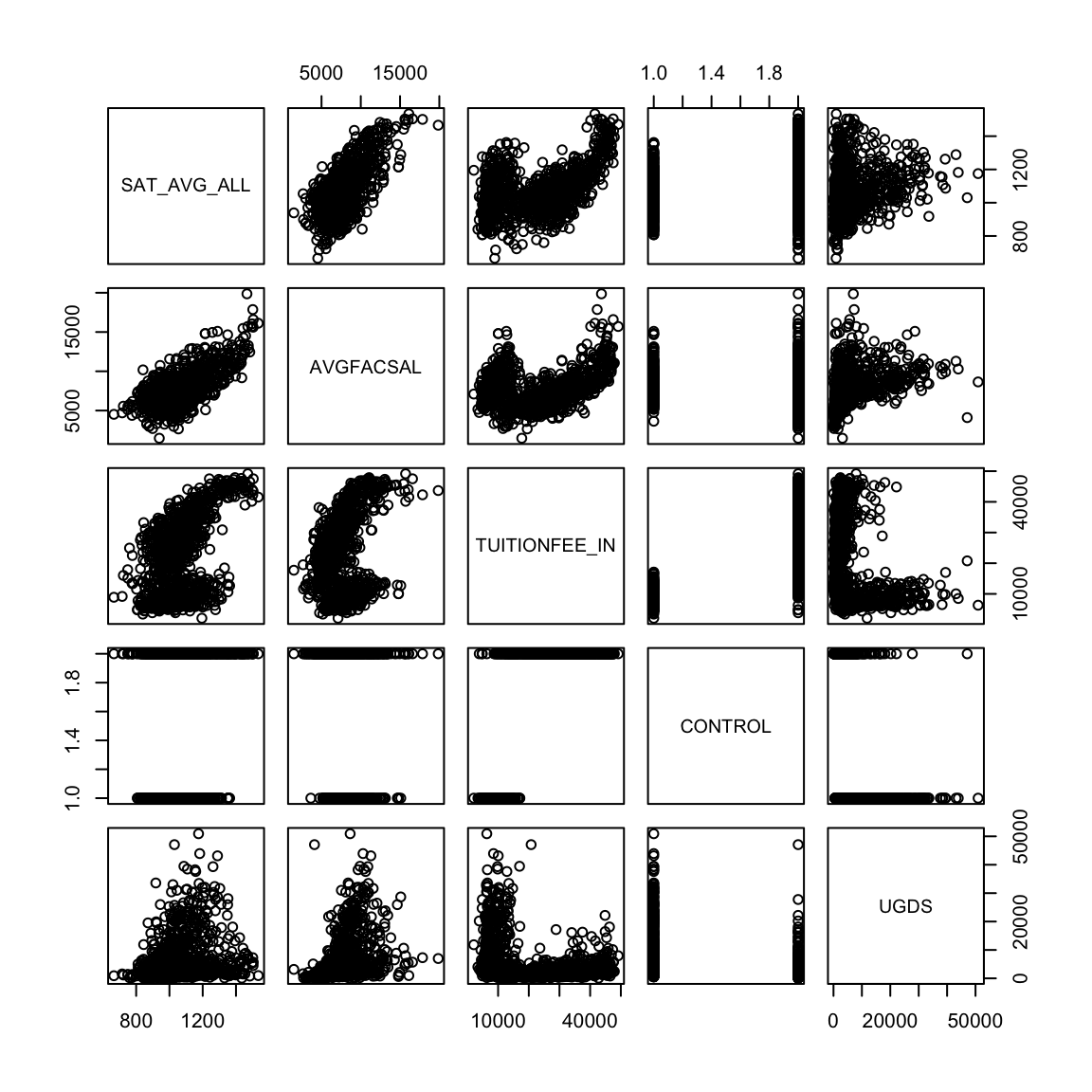
What kind of patterns can you see? What is difficult about this plot? How could we improve this plot?
We’ll skip the issue of the categorical Control variable, for now. But we can add in some of these features.
panel.hist <- function(x, ...) {
    usr <- par("usr")
    on.exit(par(usr))
    par(usr = c(usr[1:2], 0, 1.5))
    h <- hist(x, plot = FALSE)
    breaks <- h$breaks
    nB <- length(breaks)
    y <- h$counts
    y <- y/max(y)
    rect(breaks[-nB], 0, breaks[-1], y)
}
pairs(smallScores[, 1:5], lower.panel = panel.smooth,
    col = c("red", "black")[smallScores$CONTROL], diag.panel = panel.hist)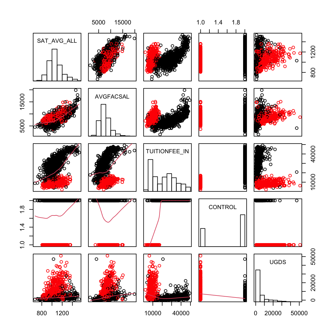
In fact double plotting on the upper and lower diagonal is often a waste of space. Here is code to plot the sample correlation value instead, \[\frac{\sum_{i=1}^n(x_i-\bar{x})(y_i-\bar{y})}{\sqrt{\sum_{i=1}^n(x_i-\bar{x})^2\sum_{i=1}^n(y_i-\bar{y})^2}}\]
panel.cor <- function(x, y, digits = 2, prefix = "",
    cex.cor, ...) {
    usr <- par("usr")
    on.exit(par(usr))
    par(usr = c(0, 1, 0, 1))
    r <- abs(cor(x, y, use = "pairwise.complete.obs"))
    txt <- format(c(r, 0.123456789), digits = digits)[1]
    txt <- paste0(prefix, txt)
    if (missing(cex.cor))
        cex.cor <- 0.8/strwidth(txt)
    text(0.5, 0.5, txt, cex = cex.cor * r)
}
pairs(smallScores[, 1:5], lower.panel = panel.smooth,
    upper.panel = panel.cor, col = c("red", "black")[smallScores$CONTROL],
    diag.panel = panel.hist)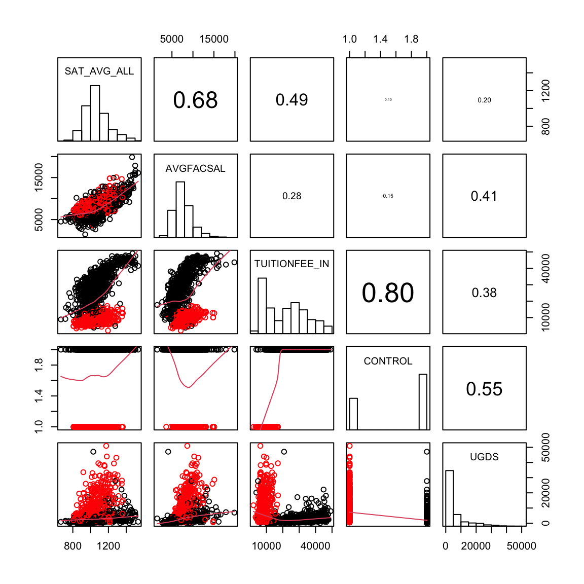
This is a pretty reasonable plot, but what if I want to look at more variables?
pairs(smallScores, lower.panel = panel.smooth, upper.panel = panel.cor,
    col = c("red", "black")[smallScores$CONTROL], diag.panel = panel.hist)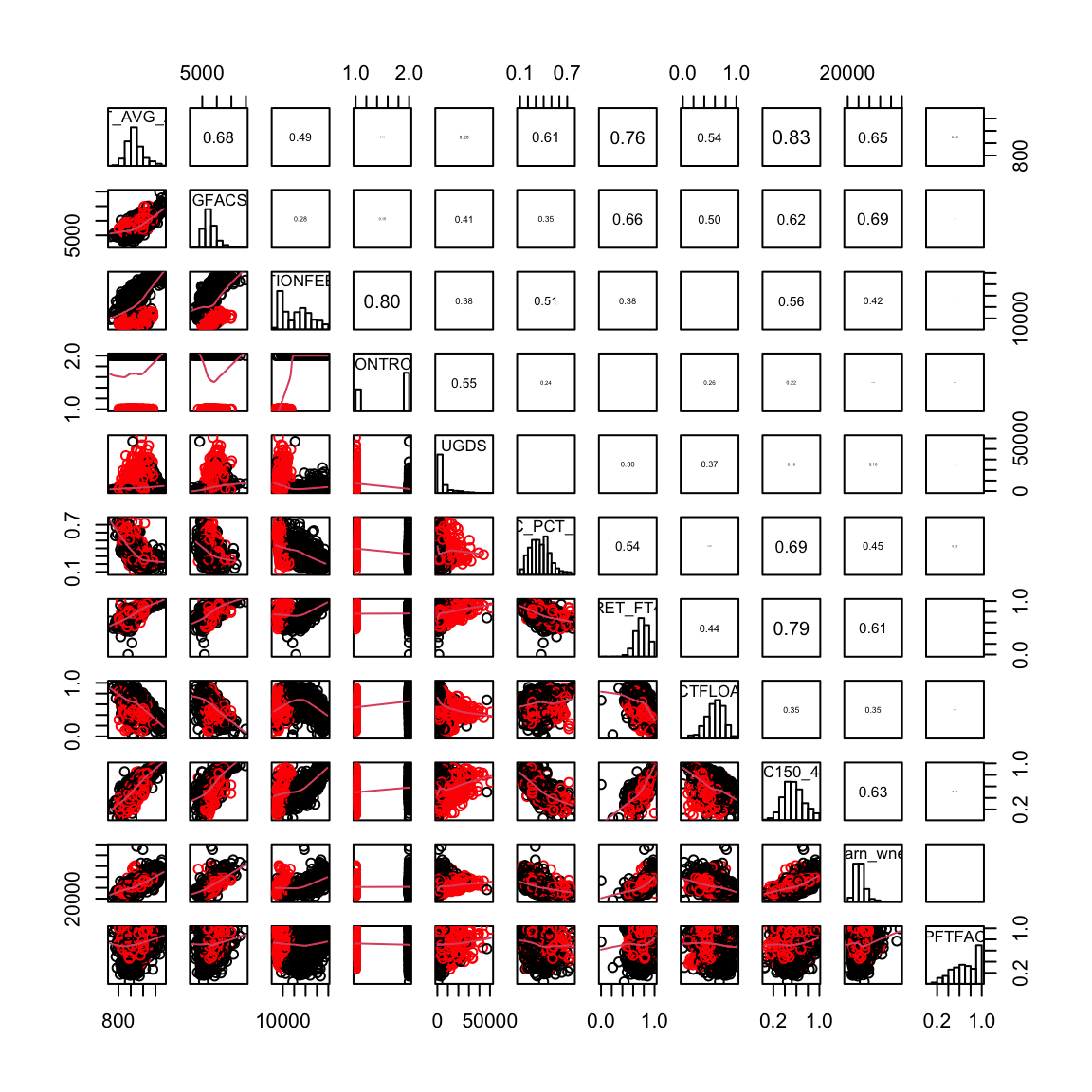
Even with 11 variables, this is fairly overwhelming, though still potentially useful. If I want to look at all of the 30 variables this will be daunting. For many variables, we can make a simpler representation, that simply plots the correlations using colors on the upper diagonal and a summary of the data via loess smoothing curves on the lower diagonal. This is implemented in the gpairs function (it also has default options that handle the categorical data better, which we will get to below).
The lower panels gives only the loess smoothing curve and the upper panels indicate the correlation of the variables, with dark colors representing higher correlation.
What do you see in this plot?
5.2 Categorical Variable
Let’s consider now how we would visualize categorical variables, starting with the simplest, a single categorical variable.
5.2.1 Single Categorical Variable
For a single categorical variable, how have you learn how you might visualize the data?
Barplots
Let’s demonstrate barplots with the following data that is pulled from the General Social Survey (GSS) ((http://gss.norc.org/)). The GSS gathers data on contemporary American society via personal in-person interviews in order to monitor and explain trends and constants in attitudes, behaviors, and attributes over time. Hundreds of trends have been tracked since 1972. Each survey from 1972 to 2004 was an independently drawn sample of English-speaking persons 18 years of age or over, within the United States. Starting in 2006 Spanish-speakers were added to the target population. The GSS is the single best source for sociological and attitudinal trend data covering the United States.
Here we look at a dataset where we have pulled out variables related to reported measures of well-being (based on a report about trends in psychological well-being (https://gssdataexplorer.norc.org/documents/903/display)). Like many surveys, the variables of interest are categorical.
Then we can compute a table and visualize it with a barplot.
##
##     Very happy   Pretty happy  Not too happy     Don't know Not applicable
##           4270           7979           1991             25           4383
##      No answer
##             18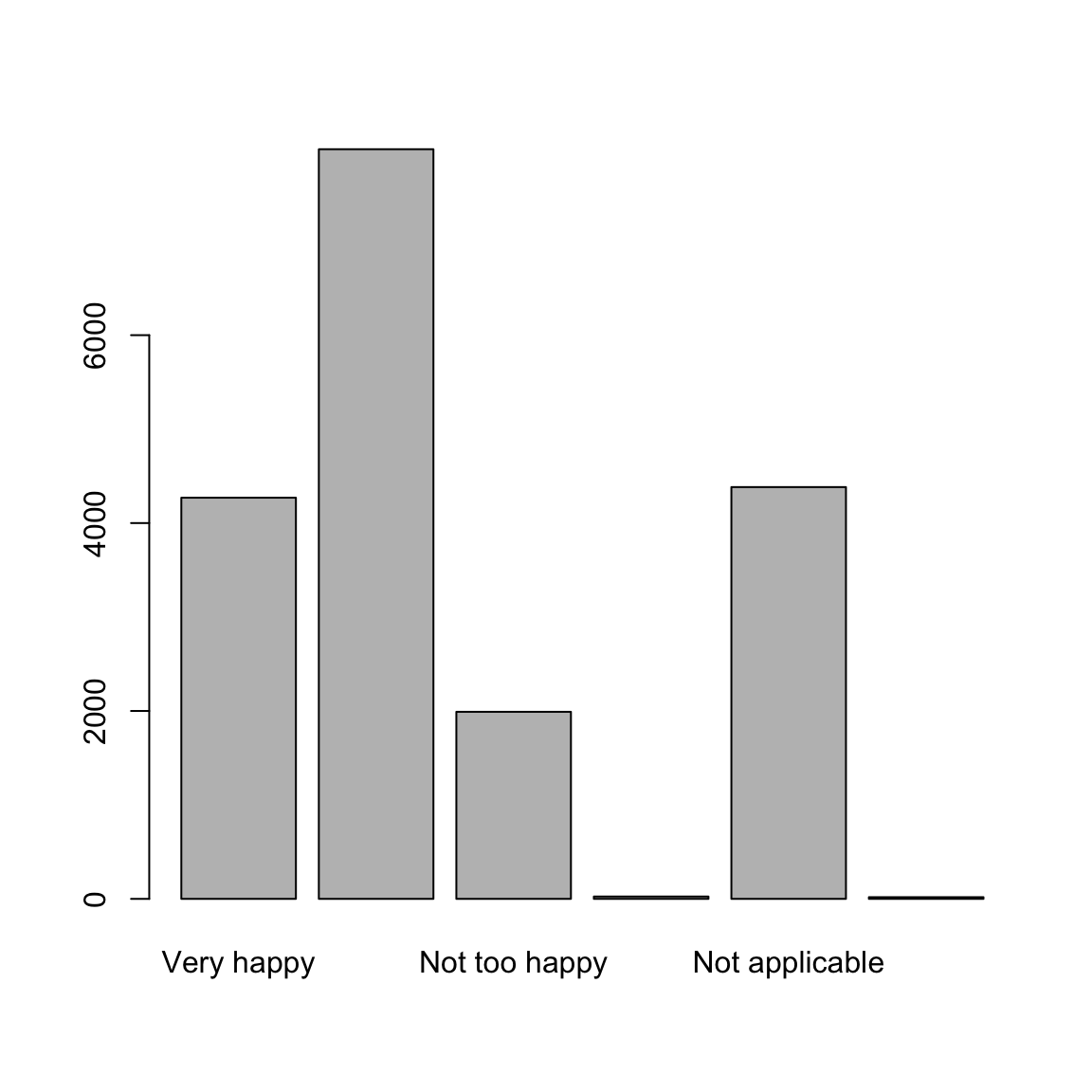
Relationship between a categorical and continuous variable?
Recall from previous chapters, we discussed using how to visualize continuous data from different groups:
- Density plots
- Boxplots
- Violin plots
Numerical data that can be split into groups is just data with two variables, one continuous and one categorical.
Going back to our pairs plot of college, we can incorporate pairwise plotting of one continuous and one categorical variable using the function gpairs (in the package gpairs). This allows for more appropriate plots for our variable that separated public and private colleges.
library(gpairs)
smallScores$CONTROL <- factor(smallScores$CONTROL,
    levels = c(1, 2), labels = c("public", "private"))
gpairs(smallScores, lower.pars = list(scatter = "loess"),
    upper.pars = list(scatter = "loess", conditional = "boxplot"),
    scatter.pars = list(col = c("red", "black")[smallScores$CONTROL]))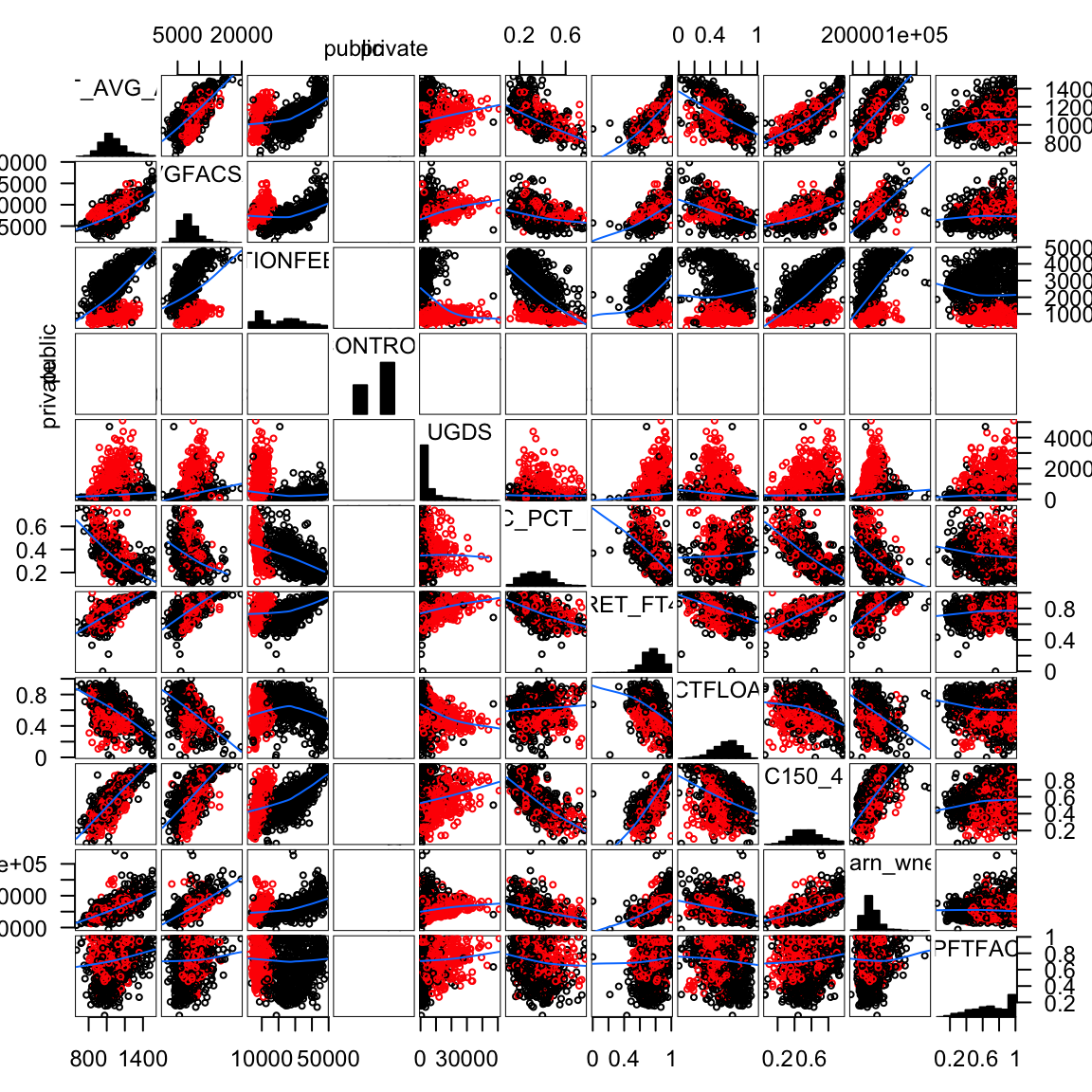
5.2.2 Relationships between two (or more) categorical variables
When we get to two categorical variables, then the natural way to summarize their relationship is to cross-tabulate the values of the levels.
5.2.2.1 Cross-tabulations
You have seen that contingency tables are a table that give the cross-tabulation of two categorical variables.
## Job.or.housework
## General.happiness Very satisfied Mod. satisfied A little dissat
## Very happy 2137 843 154
## Pretty happy 2725 2569 562
## Not too happy 436 527 247
## Don't know 11 1 4
## Not applicable 204 134 36
## No answer 8 2 1
## Job.or.housework
## General.happiness Very dissatisfied Don't know Not applicable No answer
## Very happy 61 25 1011 39
## Pretty happy 213 61 1776 73
## Not too happy 161 39 549 32
## Don't know 0 1 8 0
## Not applicable 12 1 3990 6
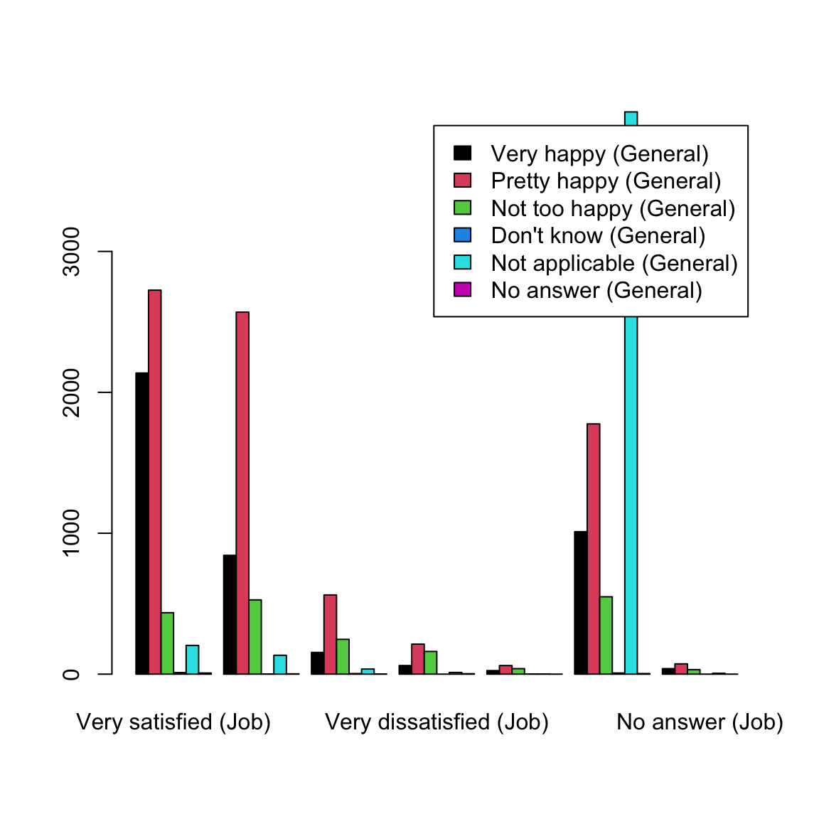
## No answer 3 0 4 0We can similarly make barplots to demonstrate these relationships.
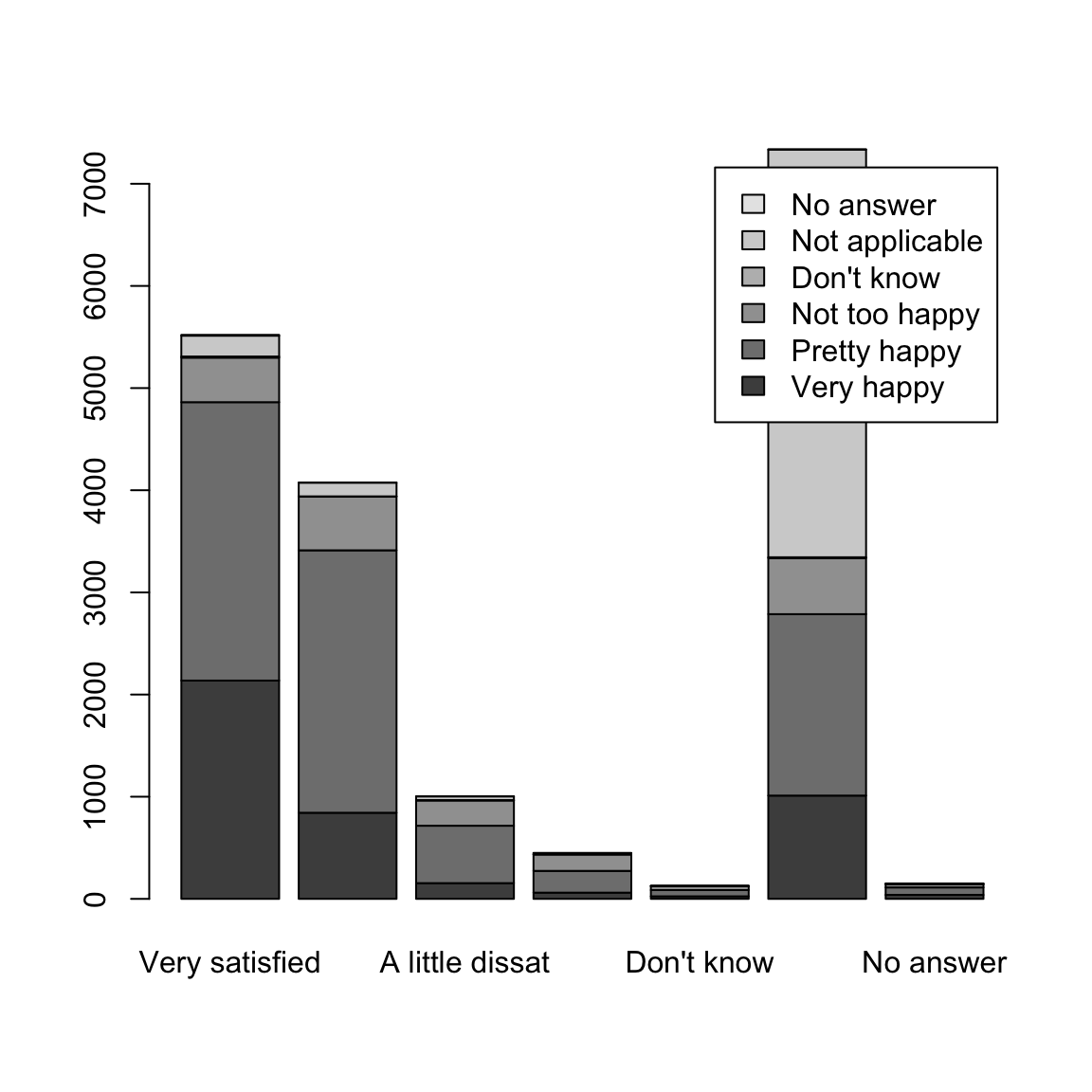
This barplot is not very satisfying. In particular, since the two variables have the same names for their levels, we don’t know which is which!
colnames(tabGeneralJob) <- paste(colnames(tabGeneralJob),
    "(Job)")
rownames(tabGeneralJob) <- paste(rownames(tabGeneralJob),
    "(General)")
barplot(tabGeneralJob, legend = TRUE)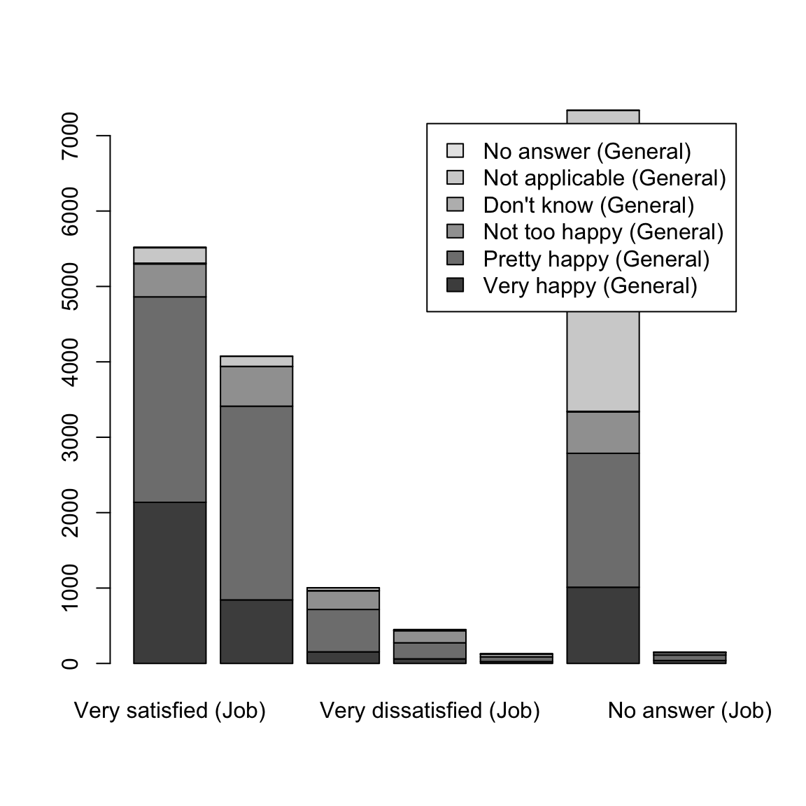
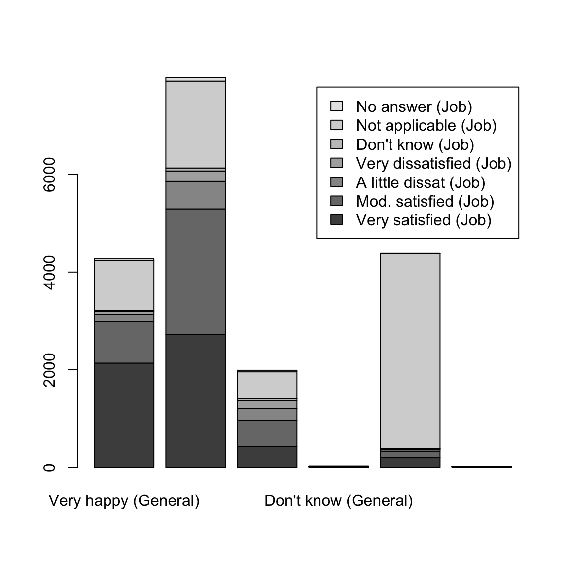
It can also be helpful to separate out the other variables, rather than stacking them, and to change the colors.
5.2.2.2 Conditional Distributions from Contingency Tables
When we look at the contingency table, a natural question we ask is whether the distribution of the data changes across the different categories. For example, for people answering Very Satisfied' for their job, there is a distribution of answers for theGeneral Happiness’ question. And similarly for `Moderately Satisfied’. We can get these by making the counts into proportions within each category.
##                           Job.or.housework
## General.happiness          Very satisfied (Job) Mod. satisfied (Job)
##   Very happy (General)             0.3870675602         0.2068204122
##   Pretty happy (General)           0.4935700054         0.6302747792
##   Not too happy (General)          0.0789712009         0.1292934249
##   Don't know (General)             0.0019923927         0.0002453386
##   Not applicable (General)         0.0369498279         0.0328753680
##   No answer (General)              0.0014490129         0.0004906771
##                           Job.or.housework
## General.happiness          A little dissat (Job) Very dissatisfied (Job)
##   Very happy (General)              0.1533864542            0.1355555556
##   Pretty happy (General)            0.5597609562            0.4733333333
##   Not too happy (General)           0.2460159363            0.3577777778
##   Don't know (General)              0.0039840637            0.0000000000
##   Not applicable (General)          0.0358565737            0.0266666667
##   No answer (General)               0.0009960159            0.0066666667
##                           Job.or.housework
## General.happiness          Don't know (Job) Not applicable (Job)
##   Very happy (General)         0.1968503937         0.1377759608
##   Pretty happy (General)       0.4803149606         0.2420278005
##   Not too happy (General)      0.3070866142         0.0748160262
##   Don't know (General)         0.0078740157         0.0010902153
##   Not applicable (General)     0.0078740157         0.5437448896
##   No answer (General)          0.0000000000         0.0005451077
##                           Job.or.housework
## General.happiness          No answer (Job)
##   Very happy (General)        0.2600000000
##   Pretty happy (General)      0.4866666667
##   Not too happy (General)     0.2133333333
##   Don't know (General)        0.0000000000
##   Not applicable (General)    0.0400000000
##   No answer (General)         0.0000000000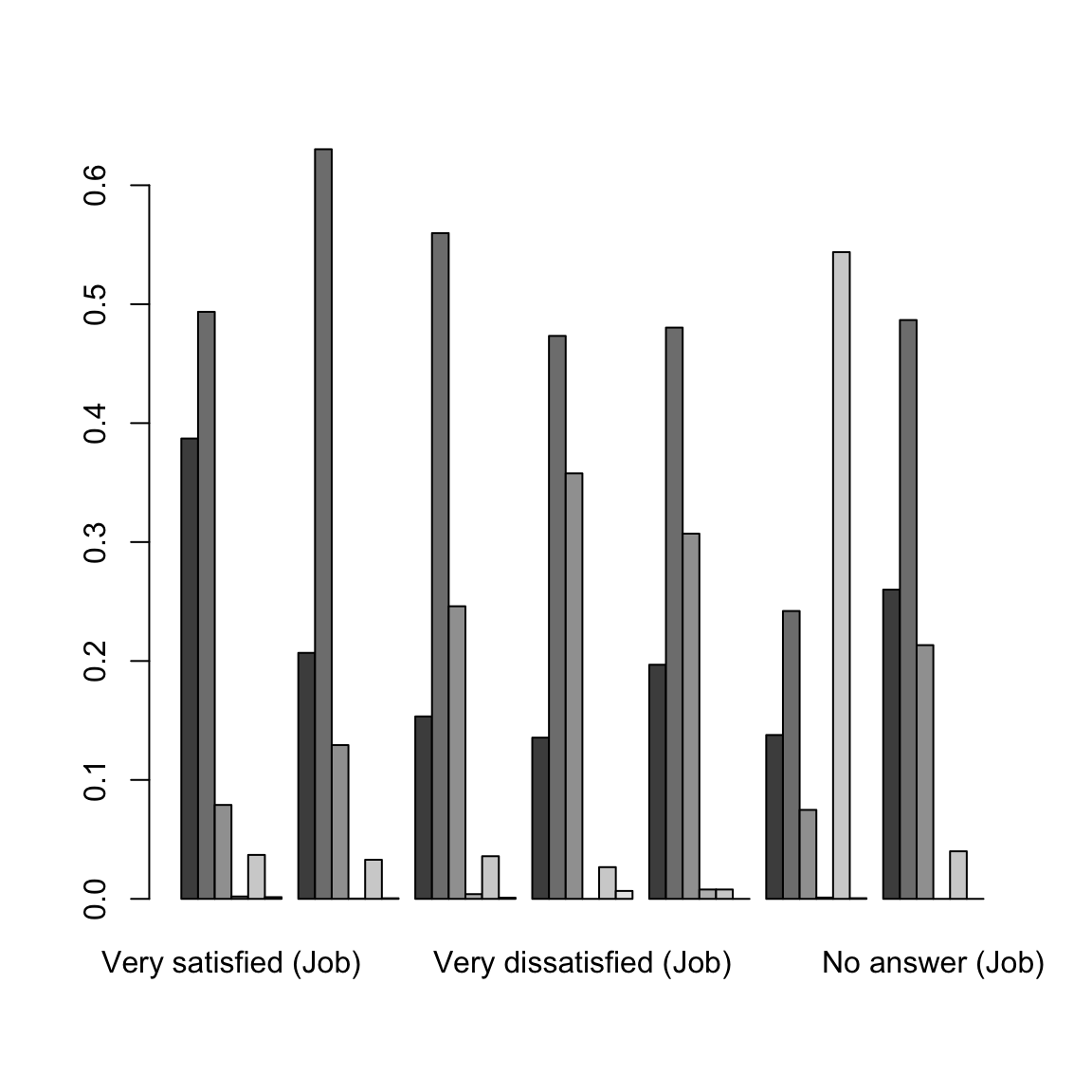
We could ask if these proportions are the same in each column (i.e. each level of Job Satisfaction'). If so, then the value forJob Satisfaction’ is not affecting the answer for `General Happiness’, and so we would say the variables are unrelated.
Looking at the barplot, what would you say? Are the variables related?
We can, of course, flip the variables around.
##                           Job.or.housework
## General.happiness          Very satisfied (Job) Mod. satisfied (Job)
##   Very happy (General)             0.5004683841         0.1974238876
##   Pretty happy (General)           0.3415214939         0.3219701717
##   Not too happy (General)          0.2189854345         0.2646911100
##   Don't know (General)             0.4400000000         0.0400000000
##   Not applicable (General)         0.0465434634         0.0305726671
##   No answer (General)              0.4444444444         0.1111111111
##                           Job.or.housework
## General.happiness          A little dissat (Job) Very dissatisfied (Job)
##   Very happy (General)              0.0360655738            0.0142857143
##   Pretty happy (General)            0.0704348916            0.0266950746
##   Not too happy (General)           0.1240582622            0.0808638875
##   Don't know (General)              0.1600000000            0.0000000000
##   Not applicable (General)          0.0082135524            0.0027378508
##   No answer (General)               0.0555555556            0.1666666667
##                           Job.or.housework
## General.happiness          Don't know (Job) Not applicable (Job)
##   Very happy (General)         0.0058548009         0.2367681499
##   Pretty happy (General)       0.0076450683         0.2225842837
##   Not too happy (General)      0.0195881467         0.2757408338
##   Don't know (General)         0.0400000000         0.3200000000
##   Not applicable (General)     0.0002281542         0.9103353867
##   No answer (General)          0.0000000000         0.2222222222
##                           Job.or.housework
## General.happiness          No answer (Job)
##   Very happy (General)        0.0091334895
##   Pretty happy (General)      0.0091490162
##   Not too happy (General)     0.0160723255
##   Don't know (General)        0.0000000000
##   Not applicable (General)    0.0013689254
##   No answer (General)         0.0000000000
Notice that flipping this question gives me different proportions. This is because we are asking different question of the data. These are what we would call Conditional Distributions, and they depend on the order in which you condition your variables. The first plots show: conditional on being in a group in Job Satisfaction, what is your probability of being in a particular group in General Happiness? That is different than what is shown in the second plot: conditional on being in a group in General Happiness, what is your probability of being in a particular group in Job Satisfaction?
5.2.3 Alluvial Plots
It can be complicated to look beyond two categorical variables. But we can create cross-tabulations for an arbitrary number of variables.
This is not the nicest output once you start getting several variables. We can also use the aggregate command to calculate these same numbers, but not making them a table, but instead a data.frame where each row is a different cross-tabulation. This isn’t helpful for looking at, but is an easier way to store and access the numbers.
wellbeingRecent$Freq <- 1
wellbeingAggregates <- aggregate(Freq ~ General.happiness +
    Job.or.housework, data = wellbeingRecent[, -2],
    FUN = sum)
head(wellbeingAggregates, 10)
## General.happiness Job.or.housework Freq
## 1 Very happy Very satisfied 2137
## 2 Pretty happy Very satisfied 2725
## 3 Not too happy Very satisfied 436
## 4 Don't know Very satisfied 11
## 5 Not applicable Very satisfied 204
## 6 No answer Very satisfied 8
## 7 Very happy Mod. satisfied 843
## 8 Pretty happy Mod. satisfied 2569
## 9 Not too happy Mod. satisfied 527
## 10 Don't know Mod. satisfied 1This format extends more easily to more variables:
wellbeingAggregatesBig <- aggregate(Freq ~ General.happiness +
    Job.or.housework + Satisfaction.with.financial.situation +
    Happiness.of.marriage + Is.life.exciting.or.dull,
    data = wellbeingRecent[, -2], FUN = sum)
head(wellbeingAggregatesBig, 5)
## General.happiness Job.or.housework Satisfaction.with.financial.situation
## 1 Very happy Very satisfied Satisfied
## 2 Pretty happy Very satisfied Satisfied
## 3 Not too happy Very satisfied Satisfied
## 4 Very happy Mod. satisfied Satisfied
## 5 Pretty happy Mod. satisfied Satisfied
## Happiness.of.marriage Is.life.exciting.or.dull Freq
## 1 Very happy Exciting 333
## 2 Very happy Exciting 54
## 3 Very happy Exciting 3
## 4 Very happy Exciting 83
## 5 Very happy Exciting 38An alluvial plot uses this input to try to track how different observations “flow” through the different variables. Consider this alluvial plot for the two variables ‘General Happiness’ and ‘Satisfaction with Job or Housework’.
library(alluvial)
alluvial(wellbeingAggregates[, c("General.happiness",
    "Job.or.housework")], freq = wellbeingAggregates$Freq,
    col = palette()[wellbeingAggregates$General.happiness])
alluvial(wellbeingAggregatesBig[, -ncol(wellbeingAggregatesBig)],
    freq = wellbeingAggregatesBig$Freq, col = palette()[wellbeingAggregatesBig$General.happiness])
Putting aside the messiness, we can at least see some big things about the data.
For example, we can see that there are a huge number of ‘Not Applicable’ for all of the questions. For some questions this makes sense, but for others is unclear why it’s not applicable (few answer Don't know' orNo answer)
What other things can you see about the data from this plots?
These are obviously self-reported measures of happiness, meaning only what the respondent says is their state; these are not external, objective measures like measuring the level of a chemical in someone’s blood (and indeed, with happiness, an objective, quantifiable measurement is hard!).
What are some possible problems in interpreting these results?
While you are generally stuck with some problems about self-reporting, there are other questions you could ask that might be more concrete and might suffer somewhat less from people instinct to say `fine’ to every question. For example, for marital happiness, you could ask questions like whether fighting more with your partner lately, feeling about partner’s supportiveness, how often you tell your partner your feelings etc., that would perhaps get more specific responses. Of course, you would then be in a position of interpreting whether that adds up to a happy marriage when in fact a happy marriage is quite different for different couples!
Based on this plot, however, it does seem reasonable to exclude some of the categories as being unhelpful and adding additional complexity without being useful for interpretation. We will exclude observations that say Not applicable' on all of these questions. We will also exclude those that do not answer or saydon’t know’ on any of these questions (considering non-response is quite important, as anyone who followed the problems with 2016 polls should know, but these are a small number of observations here).
I’ve also asked the alluvial plot to hide the very small categories, which makes it faster to plot. Again, this is slow, so I’ve created the plot off-line.
wh <- with(wellbeingRecent, which(General.happiness ==
    "Not applicable" | Job.or.housework == "Not applicable" |
    Satisfaction.with.financial.situation == "Not applicable"))
wellbeingCondenseGroups <- wellbeingRecent[-wh, ]
wellbeingCondenseGroups <- subset(wellbeingCondenseGroups,
    !General.happiness %in% c("No answer", "Don't know") &
        !Job.or.housework %in% c("No answer", "Don't know") &
        !Satisfaction.with.financial.situation %in%
            c("No answer", "Don't know") & !Happiness.of.marriage %in%
        c("No answer", "Don't know") & !Is.life.exciting.or.dull %in%
        c("No answer", "Don't know"))
wellbeingCondenseGroups <- droplevels(wellbeingCondenseGroups)
wellbeingCondenseAggregates <- aggregate(Freq ~ General.happiness +
    Job.or.housework + Satisfaction.with.financial.situation +
    Happiness.of.marriage + Is.life.exciting.or.dull,
data = wellbeingCondenseGroups, FUN = sum)alluvial(wellbeingCondenseAggregates[, -ncol(wellbeingCondenseAggregates)],
freq = wellbeingCondenseAggregates$Freq, hide = wellbeingCondenseAggregates$Freq <
quantile(wellbeingCondenseAggregates$Freq,
0.5), col = palette()[wellbeingCondenseAggregates$General.happiness])It’s still rather messy, partly because we have large groups of people for whom some of the questions aren’t applicable (‘Happiness in marriage’ only applies if you are married!) We can limit ourselves to just married, working individuals (including housework).
wh <- with(wellbeingCondenseGroups, which(Marital.status ==
    "Married" & Labor.force.status %in% c("Working fulltime",
    "Working parttime", "Keeping house")))
wellbeingMarried <- wellbeingCondenseGroups[wh, ]
wellbeingMarried <- droplevels(wellbeingMarried)
wellbeingMarriedAggregates <- aggregate(Freq ~ General.happiness +
    Job.or.housework + Satisfaction.with.financial.situation +
    Happiness.of.marriage + Is.life.exciting.or.dull,
data = wellbeingMarried, FUN = sum)alluvial(wellbeingMarriedAggregates[, -ncol(wellbeingMarriedAggregates)],
freq = wellbeingMarriedAggregates$Freq, hide = wellbeingMarriedAggregates$Freq <
quantile(wellbeingMarriedAggregates$Freq, 0.5),
col = palette()[wellbeingMarriedAggregates$General.happiness])
Cleaner example
The alluvial package comes with an example that provides a cleaner depiction of alluvial plots on several categories. They use data from the list of passangers on the Titantic disaster to demonstrate the demographic composition of those who survived.
data(Titanic)
tit <- as.data.frame(Titanic)
alluvial(tit[, 1:4], freq = tit$Freq, border = NA,
    col = ifelse(tit$Survived == "No", "red", "gray"))
Like so many visualization tools, the effectiveness of a particular plot depends on the dataset.
5.2.4 Mosaic Plots
In looking at alluvial plots, we often turn to the question of asking whether the percentage, say happy in their jobs, is very different depending on whether they report that they are generally happy. Visualizing these percentages is often done better by a mosaic plot.
Let’s first look at just 2 variables again.
mosaicplot(~General.happiness + Job.or.housework, data = wellbeingMarried,
    las = 1, col = palette())
How do we interpret this plot? Well first, like the plots above, these are showing conditional dependencies, so there is an order to these variables, based on how we put them in. First was General Happiness (x-axis). So the amount of space on the x-axis for Very Happy' is proportional to the number of people who respondedVery Happy’ on the general happiness question. Next is Job Satisfaction' (y-axis). *Within* each group of general happiness, the length on the y-axis is the proportion within that group answering each of the categories forJob Satisfaction’. That is the conditional dependencies that we saw above.
Let’s add a third variable, `Satisfaction with financial situation’.
mosaicplot(~General.happiness + Job.or.housework +
Satisfaction.with.financial.situation, data = wellbeingMarried,
las = 1, col = palette())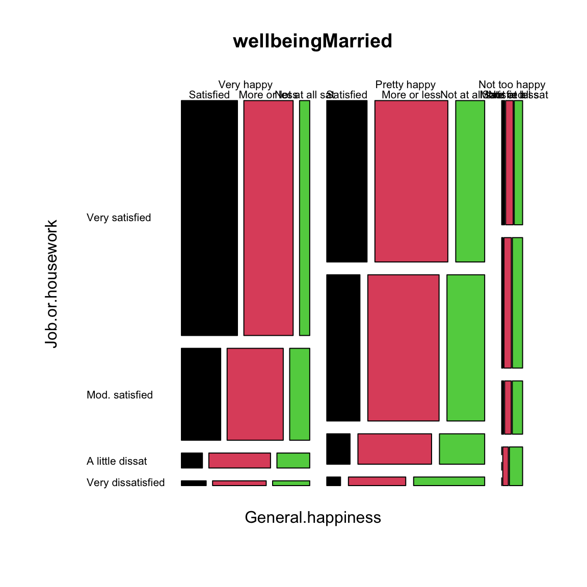 This makes another subdivision on the x-axis. This is now subsetting down to the people, for example, that are very satisfied with both Job and their General life, and looking at the distribution of `Satisfaction with financial situation’ for just those set of people.
Using this information, how do you interpret this plot? What does this tell you about people who are `Very Happy’ in general happiness?
5.2.5 Pairs plots including categorical data
We can use some of these visualizations of categorical data in our pairs plots in the gpairs function. Our college data has only 1 categorical variable, and our well-being data has only categorical variables. So to have a mix of the two, we are going to return to our flight data, and bring in some variables that we didn’t consider. We will also create a variable that indicates the cause of the delay (there is no such variable, but only the amount of delay time due to different delay causes so we will use this information to create such a variable).
We will consider only delayed flights, and use gpairs to visualize the data.
gpairs(droplevels(flightSFOSRS[whDelayed, c("AirTime",
    "DepDelay", "DayOfWeek", "DelayCause")]), upper.pars = list(conditional = "boxplot"))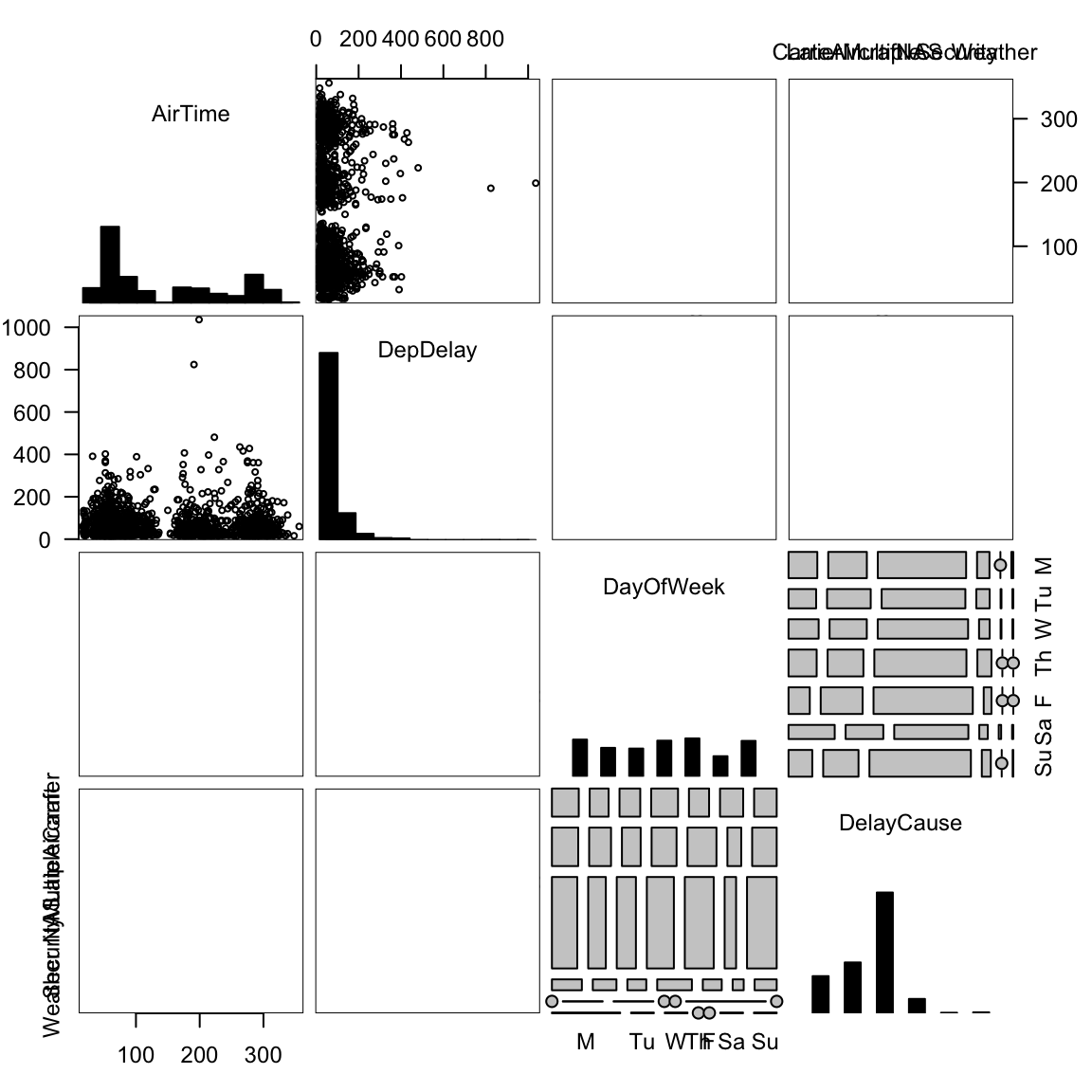
How do you interpret the different elements of this pairs plot?
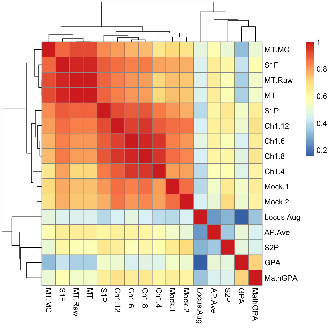
5.3 Heatmaps
Let’s consider another dataset. This will consist of “gene expression” measurements on breast cancer tumors from the Cancer Genome Project. This data measures for all human genes the amount of each gene that is being used in the tumor being measured. There are measurements for 19,000 genes but we limited ourselves to around 275 genes.
One common goal of this kind of data is to be able to identify different types of breast cancers. The idea is that by looking at the genes in the tumor, we can discover similarities between the tumors, which might lead to discovering that some patients would respond better to certain kinds of treatment, for example.
We have so many variables, that we might consider simplifying our analysis and just considering the pairwise correlations of each variable (gene) – like the upper half of the pairs plot we drew before. Rather than put in numbers, which we couldn’t easily read, we will put in colors to indicate the strength of the correlation. Representing a large matrix of data using a color scale is called a heatmap. Basically for any matrix, we visualize the entire matrix by putting a color for the value of the matrix.
In this case, our matrix is the matrix of correlations.
library(pheatmap)
corMat <- cor(breast[, -c(1:7)])
pheatmap(corMat, cluster_rows = FALSE, cluster_cols = FALSE)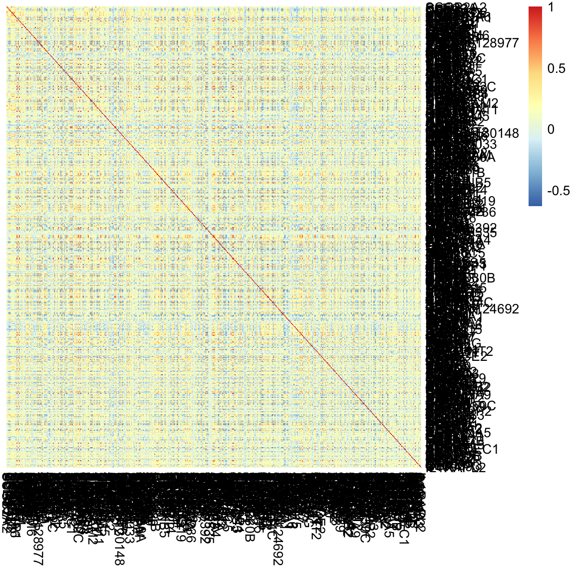
Why is the diagonal all dark red?
This is not an informative picture, however – there are so many variables (genes) that we can’t discover anything here.
However, if we could reorder the genes so that those that are highly correlated are near each other, we might see blocks of similar genes like we did before. In fact this is exactly what heatmaps usually do by default. They reorder the variables so that similar patterns are close to each other.
Here is the same plot of the correlation matrix, only now the rows and columns have been reordered.
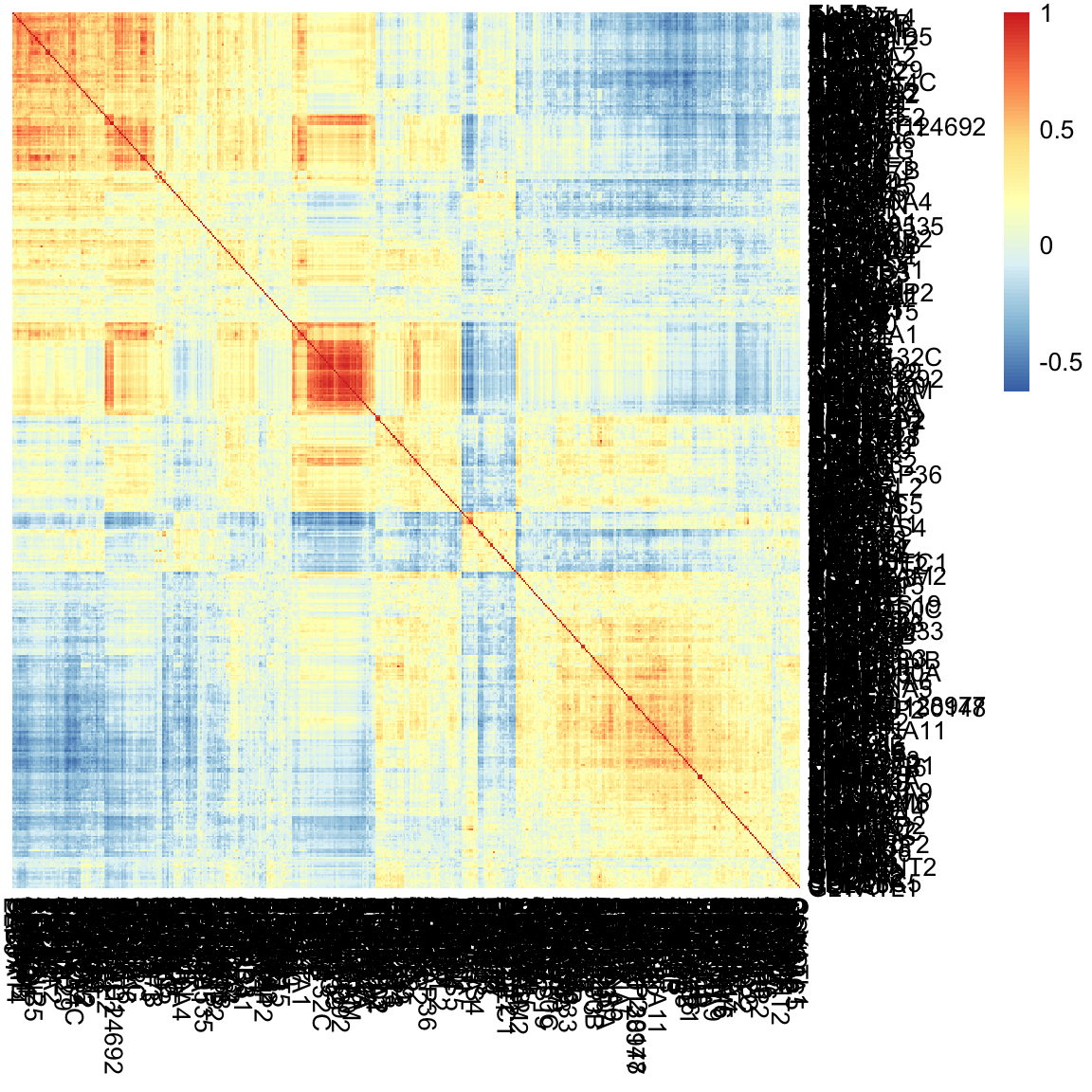
What do we see in this heatmap?
5.3.1 Heatmaps for Data Matrices
Before we get into how that ordering was determined, lets consider heatmaps more. Heatmaps are general, and in fact can be used for the actual data matrix, not just the correlation matrix.
pheatmap(breast[, -c(1:7)], cluster_rows = TRUE, cluster_cols = TRUE,
    treeheight_row = 0, treeheight_col = 0)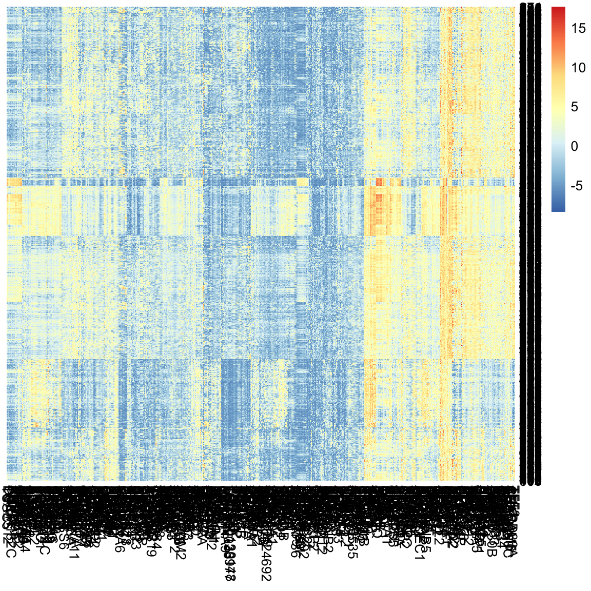
What do we see in this heatmap?
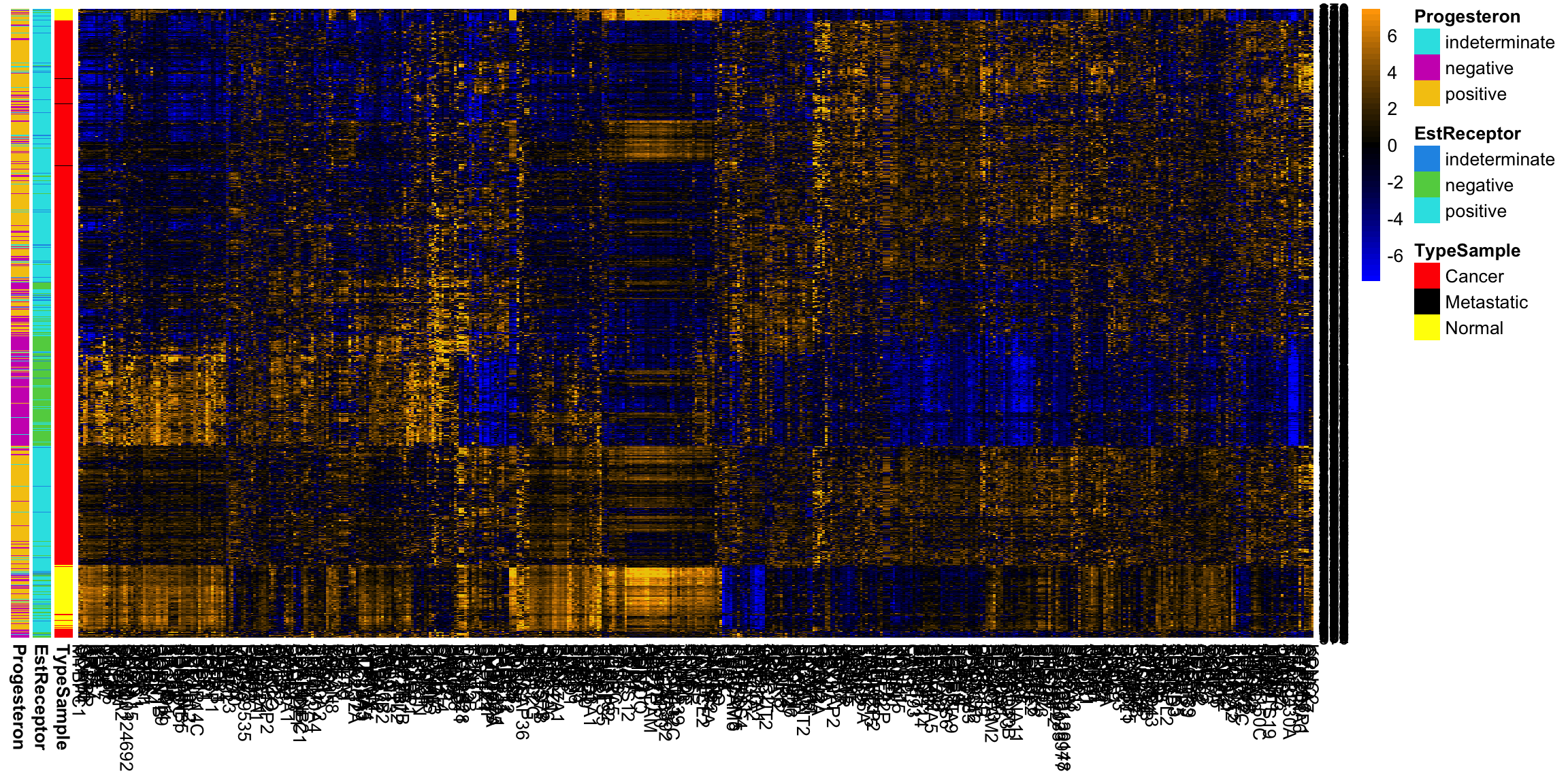
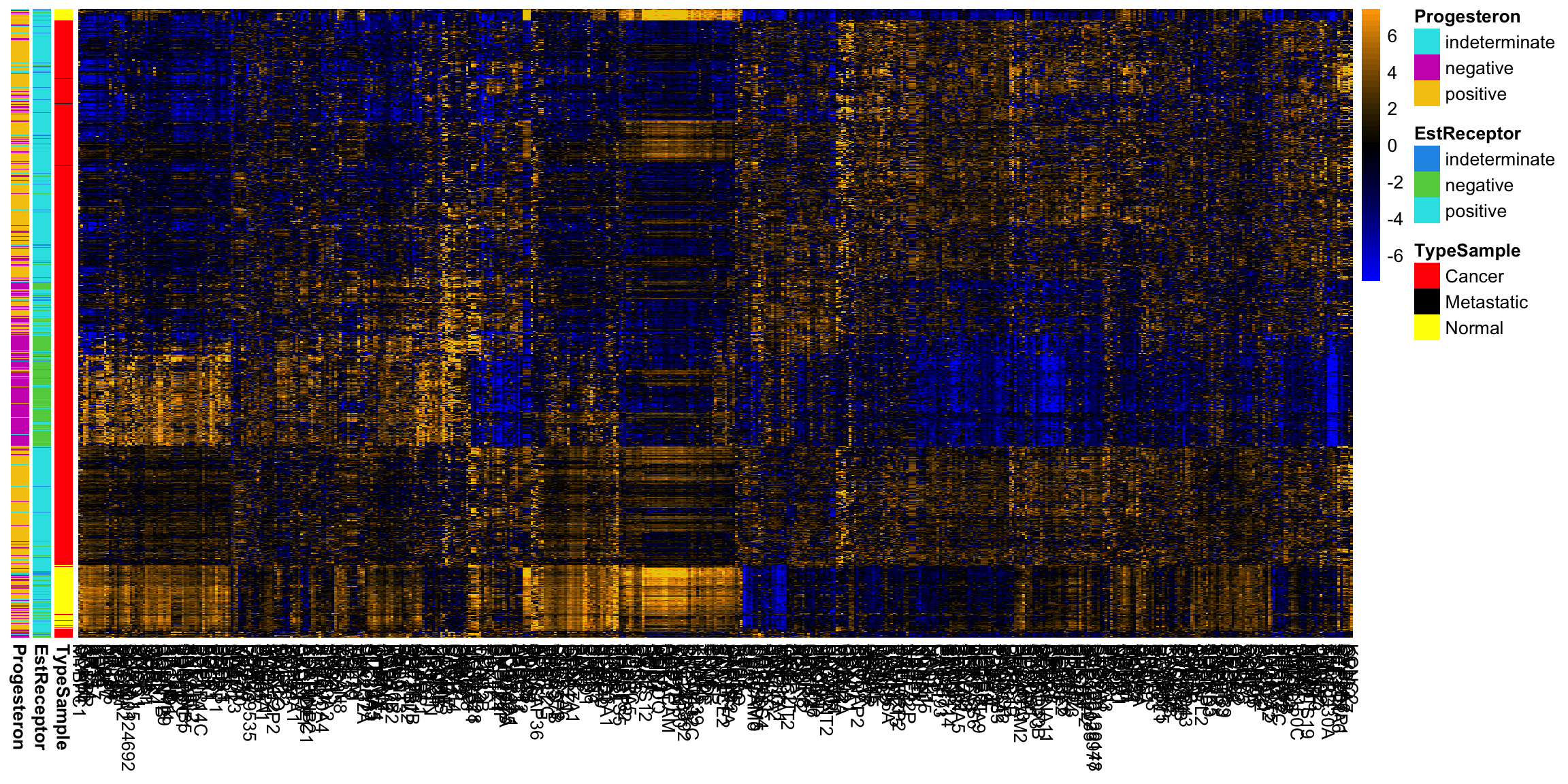
We can improve upon this heatmap. I prefer different colors for this type of data, and we can add some information we have about these samples. I am also going to change how the heatmap assigns colors to the data. Specifically, heatmap gives a color for data by binning it and all data within a particular range of values gets a particular color. By default it is based on equally spaced bins across all of the data in the matrix – sort of like a histogram. However, this can frequently backfire if you have a few outlying points. One big value will force the range to cover it. The effect of this can be that most of the data is only in a small range of colors, so you get a heatmap where everything is mostly one color, so you don’t see much. I am going to change it so that most of the bins go from the 1% to the 99% quantile of data, and then there is one end bin on each end that covers all of the remaining large values.
typeCol <- c("red", "black", "yellow")
names(typeCol) <- levels(breast$TypeSample)
estCol <- palette()[c(4, 3, 5)]
names(estCol) <- levels(breast$EstReceptor)
proCol <- palette()[5:7]
names(proCol) <- levels(breast$Progesteron)
qnt <- quantile(as.numeric(data.matrix((breast[, -c(1:7)]))),
    c(0.01, 0.99))
brks <- seq(qnt[1], qnt[2], length = 20)
head(brks)
## [1] -5.744770 -4.949516 -4.154261 -3.359006 -2.563751 -1.768496seqPal5 <- colorRampPalette(c("black", "navyblue",
"mediumblue", "dodgerblue3", "aquamarine4", "green4",
"yellowgreen", "yellow"))(length(brks) - 1)
row.names(breast) <- c(1:nrow(breast))
fullHeat <- pheatmap(breast[, -c(1:7)], cluster_rows = TRUE,
cluster_cols = TRUE, treeheight_row = 0, treeheight_col = 0,
color = seqPal5, breaks = brks, annotation_row = breast[,
5:7], annotation_colors = list(TypeSample = typeCol,
EstReceptor = estCol, Progesteron = proCol))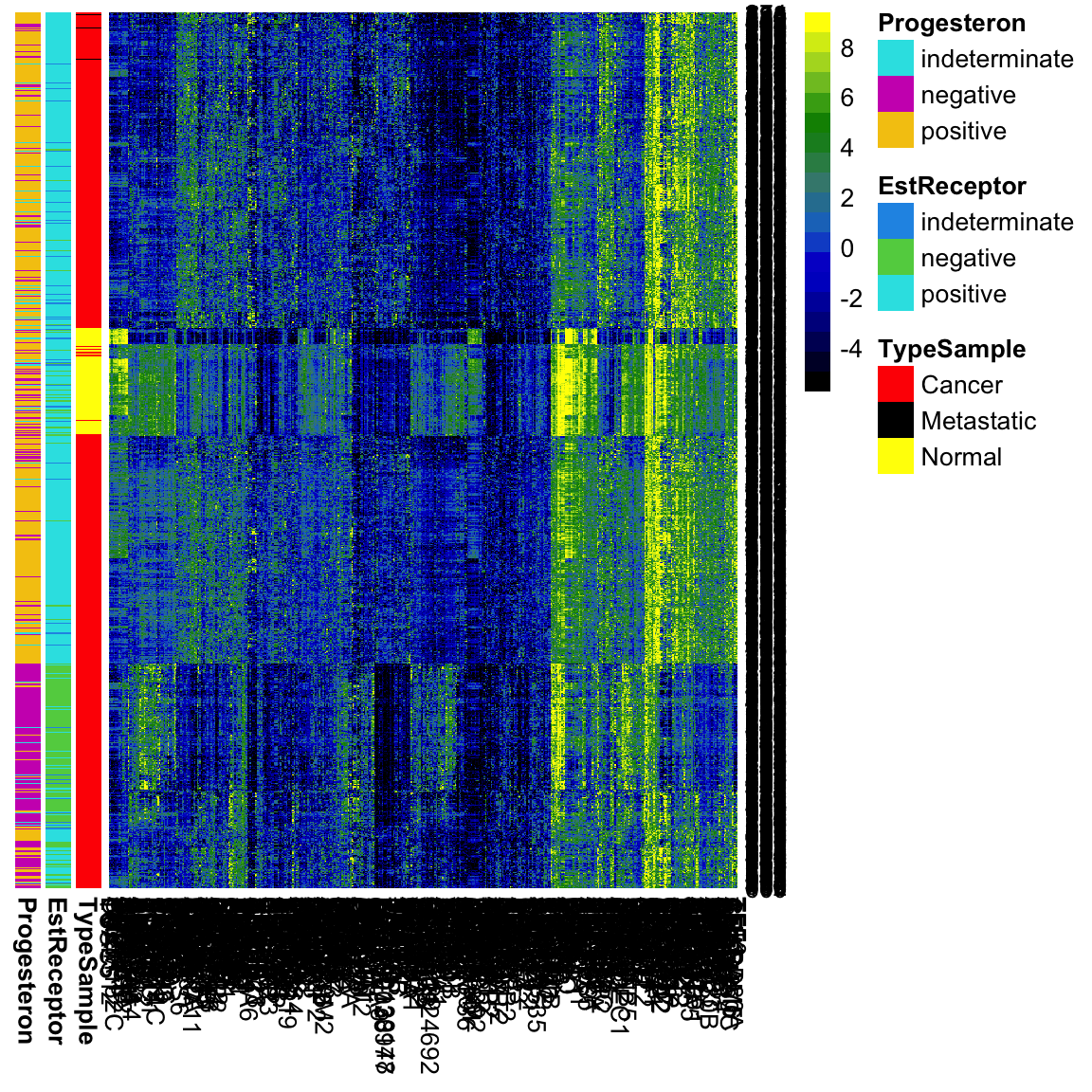
What does adding this information allow us to see now?
whCancer <- which(breast$Type != "Normal")
pheatmap(breast[whCancer, -c(1:7)], cluster_rows = TRUE,
    cluster_cols = TRUE, treeheight_row = 0, treeheight_col = 0,
    color = seqPal5, breaks = brks, annotation_row = breast[whCancer,
        5:7], annotation_colors = list(TypeSample = typeCol,
        EstReceptor = estCol, Progesteron = proCol))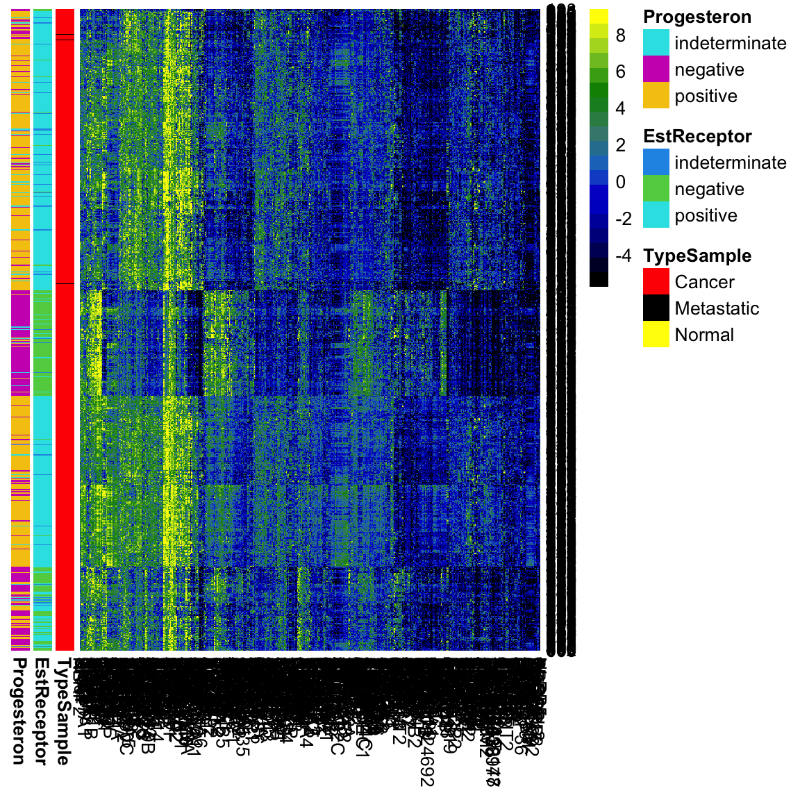
Centering/Scaling Variables
Some genes have drastic differences in their measurements for different samples. But we might also can notice that many of the genes are all high, or all low. They might show similar patterns of differences, but at a lesser scale. It would be nice to put them on the same basis. A simple way to do this is to subtract the mean or median of each variable.
Notice our previous breaks don’t make sense for this centered data. Moreover, now that we’ve centered the data, it makes sense to make the color scale symmetric around 0, and also to have a color scale that emphasizes zero.
Why this focus on being centered around zero?
breastCenteredMean <- scale(breast[, -c(1:7)], center = TRUE,
    scale = FALSE)
colMedian <- apply(breast[, -c(1:7)], 2, median)
breastCenteredMed <- sweep(breast[, -c(1:7)], MARGIN = 2,
    colMedian, "-")
qnt <- max(abs(quantile(as.numeric(data.matrix((breastCenteredMed[,
    -c(1:7)]))), c(0.01, 0.99))))
brksCentered <- seq(-qnt, qnt, length = 50)
seqPal2 <- colorRampPalette(c("orange", "black", "blue"))(length(brksCentered) -
    1)
seqPal2 <- (c("yellow", "gold2", seqPal2))
seqPal2 <- rev(seqPal2)
pheatmap(breastCenteredMed[whCancer, -c(1:7)], cluster_rows = TRUE,
    cluster_cols = TRUE, treeheight_row = 0, treeheight_col = 0,
    color = seqPal2, breaks = brksCentered, annotation_row = breast[whCancer,
        6:7], annotation_colors = list(TypeSample = typeCol,
        EstReceptor = estCol, Progesteron = proCol))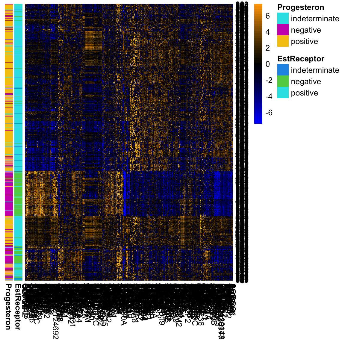
We could also make their range similar by scaling them to have a similar variance. This is helpful when your variables are really on different scales, for example weights in kg and heights in meters. This helps put them on a comparable scale for visualizing the patterns with the heatmap. For this gene expression data, the scale is more roughly similar, though it is common in practice that people will scale them as well for heatmaps.
5.3.2 Hierarchical Clustering
How do heatmaps find the ordering of the samples and genes? It performs a form of clustering on the samples. Let’s get an idea of how clustering works generally, and then we’ll return to heatmaps.
The idea behind clustering is that there is an unknown variable that would tell you the `true’ groups of the samples, and you want to find it. This may not actually be true in practice, but it’s a useful abstraction. The basic idea of clustering relies on examining the distances between samples and putting into the same cluster samples that are close together. There are countless number of clustering algorithms, but heatmaps rely on what is called hierarchical clustering. It is called hiearchical clustering because it not only puts observations into groups/clusters, but does so by first creating a hierarchical tree or dendrogram that relates the samples.
Here we show this on a small subset of the samples and genes. We see on the left the dendrogram that relates the samples (rows).41
smallBreast <- read.csv(file.path(dataDir, "smallVarBreast.csv"),
    header = TRUE, stringsAsFactors = TRUE)
row.names(smallBreast) <- 1:nrow(smallBreast)
pheatmap(smallBreast[, -c(1:7)], cluster_rows = TRUE,
    cluster_cols = FALSE, treeheight_col = 0, breaks = brks,
    col = seqPal5)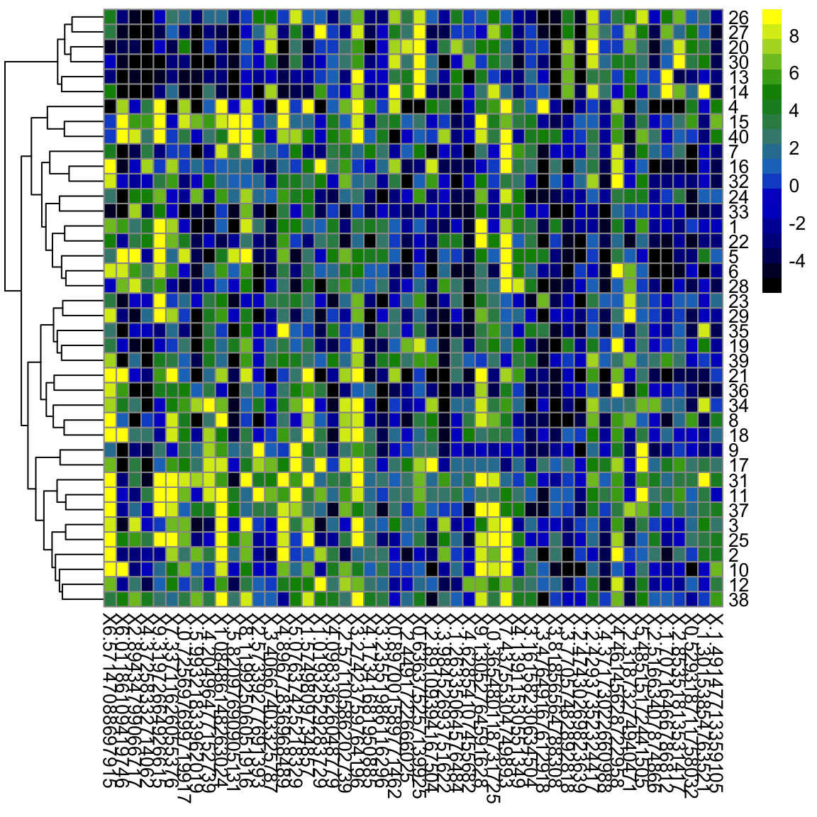
We can use the same principle for clustering the variables:
pheatmap(smallBreast[, -c(1:7)], , cluster_rows = TRUE,
    cluster_cols = TRUE, breaks = brks, col = seqPal5,
    annotation_row = smallBreast[, 5:7], annotation_colors = list(TypeSample = typeCol,
        EstReceptor = estCol, Progesteron = proCol))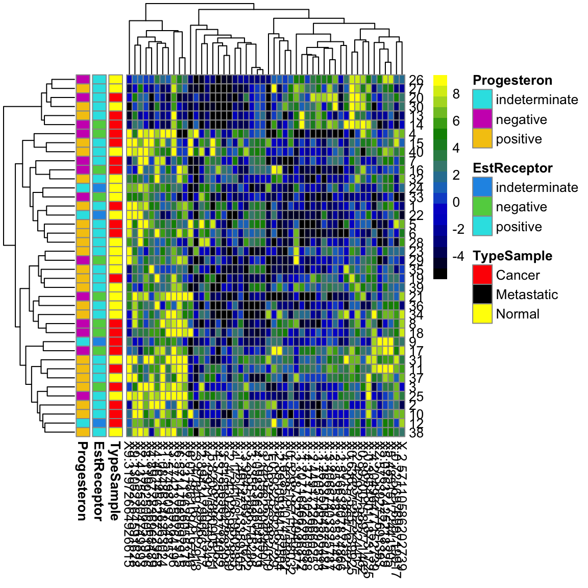
Notice that with this small subset of genes and samples, we don’t see the same discrimination between normal and cancer samples.
Where are the clusters?
If hierarchical clustering is a clustering routine, where are the clusters? The idea is that the dendrogram is just a first step toward clustering. To get a cluster, you draw a line across the dendrogram to “cut” the dendrogram into pieces, which correspond to the clusters. For the purposes of a heatmap, however, what is interesting is not the clusters, but ordering of the samples that it provides.
5.3.2.1 How Hierarchical Clustering Works
Hierarchical clustering is an iterative process, that builds the dendrogram by iteratively creating new groups of samples by either
- joining pairs of individual samples into a group
- add an individual samples to an existing group
- combine two groups into a larger group42
Step 1: Pairwise distance matrix between groups We consider each sample to be a separate group (i.e. \(n\) groups), and we calculate the pairwise distances between all of the \(n\) groups.
For simplicity, let’s assume we have only one variable, so our data is \(y_1,\ldots,y_n\). Then the standard distance between samples \(i\) and \(j\) could be \[d_{ij}=|y_i - y_j|\] or alternatively squared distance, \[d_{ij}=(y_i - y_j)^2.\] So we can get all of the pairwise distances between all of the samples (a distance matrix of all the \(n \times n\) pairs)
Step 2: Make group by joining together two closest “groups” Your available choices from the list above are to join together two samples to make a group. So we choose to join together the two samples that are closest together, and forming our first real group of samples.
Step 3: Update distance matrix between groups Specifically, say you have already joined together samples \(i\) and \(j\) to make the first true group. To join update our groups, our options from the list above are:
- Combine two samples \(k\) and \(\ell\) to make next group (i.e. do nothing with the group previously formed by \(i\) and \(j\).
- Combine some sample \(k\) with your new group
Clearly, if we join together two samples \(k\) and \(\ell\) it’s the same as above (pick two closest). But how do you decide to do that versus add sample \(k\) to my group of samples \(i\) and \(j\)? We need to decide whether a sample \(k\) is closer to the group consisting of \(i\) and \(j\) than it is to any other sample \(\ell\).
We do this by recalculating the pairwise distances we had before, replacing these two samples \(i\) and \(j\) by the pairwise distance of the new group to the other samples.
Of course this is easier said than done, because how do we define how close a group is to other samples or groups? There’s no single way to do that, and in fact there are a lot of competing methods. The default method in R is to say that if we have a group \(\mathcal{G}\) consisting of \(i\) and \(j\), then the distance of that group to a sample \(k\) is the maximum distance of \(i\) and \(j\) to \(k\)43 , \[d(\mathcal{G},k)= \max (d_{ik},d_{jk}).\] Now we have a updated \(n-1 \times n-1\) matrix of distances between all our current list of “groups” (remember the single samples form their own group).
Step 4: Join closest groups Now we find the closest two groups and join the samples in the group together to form a new group.
Step 5+: Continue to update distance matrix and join groups Then you repeat this process of joining together to build up the tree. Once you get more than two groups, you will consider all of the three different kinds of joins described above – i.e. you will also consider joining together two existing groups \(\mathcal{G}_1\) and \(\mathcal{G}_2\) that both consist of multiple samples. Again, you generalize the definition above to define the distance between the two groups of samples to be the maximum distance of all the points in \(\mathcal{G}_1\) to all the points in \(\mathcal{G}_2\), \[d(\mathcal{G}_1,\mathcal{G}_2)= \max_{i\in\mathcal{G}_1, j\in\mathcal{G}_2} d_{ij}.\]
Distances in Higher Dimensions
The same process works if instead of having a single number, your \(y_i\) are now vectors – i.e. multiple variables. You just need a definition for the distance between the \(y_i\), and then follow the same algorithm.
What is the equivalent distance when you have more variables? For each variable \(\ell\), we observe \(y_1^{(\ell)},\ldots,y_n^{(\ell)}\). And an observation is now the vector that is the collection of all the variables for the sample: \[y_i=(y_i^{(1)},\ldots,y_i^{(p)})\] We want to find the distance between observations \(i\) and \(j\) which have vectors of data \[(y_i^{(1)},\ldots,y_i^{(p)})\] and \[(y_j^{(1)},\ldots,y_j^{(p)})\] The standard distance (called Euclidean distance) is \[d_{ij}=d(y_i,y_j)=\sqrt{\sum_{\ell=1}^p (y_i^{(\ell)}-y_j^{(\ell)})^2}\] So its the cummulative (i.e. sum) amount of the individual (squared) distance of each variable. You don’t have to use this distance – there are other choices that can be better depending on the data – but it is the default.
We generally work with squared distances, which would be \[d_{ij}^2=\sum_{\ell=1}^p (y_i^{(\ell)}-y_j^{(\ell)})^2\]
5.4 Principal Components Analysis
In looking at both the college data and the gene expression data, it is clear that there is a lot of redundancy in our variables, meaning that several variables are often giving us the same information about the patterns in our observations. We could see this by looking at their correlations, or by seeing their values in a heatmap.
For the purposes of illustration, let’s consider a hypothetical situation. Say that you are teaching a course, and there are two exams:
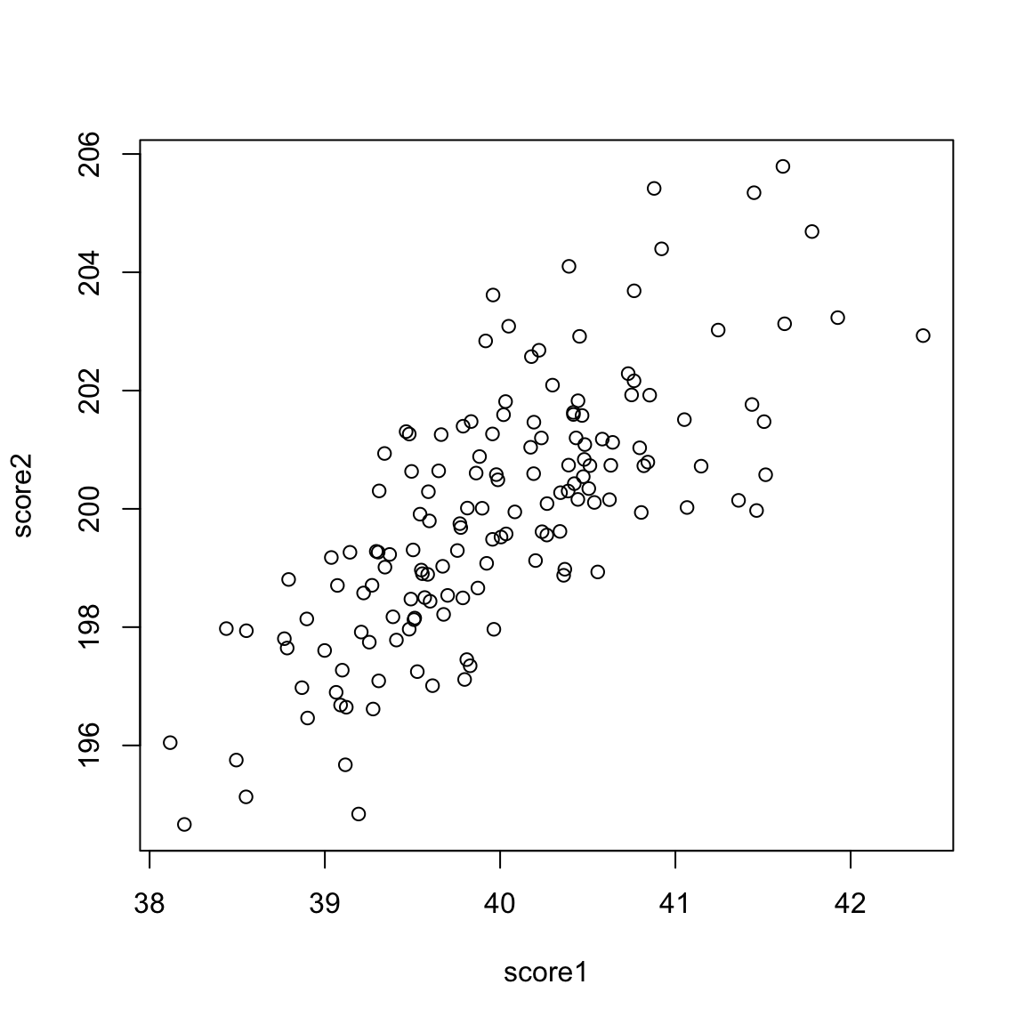
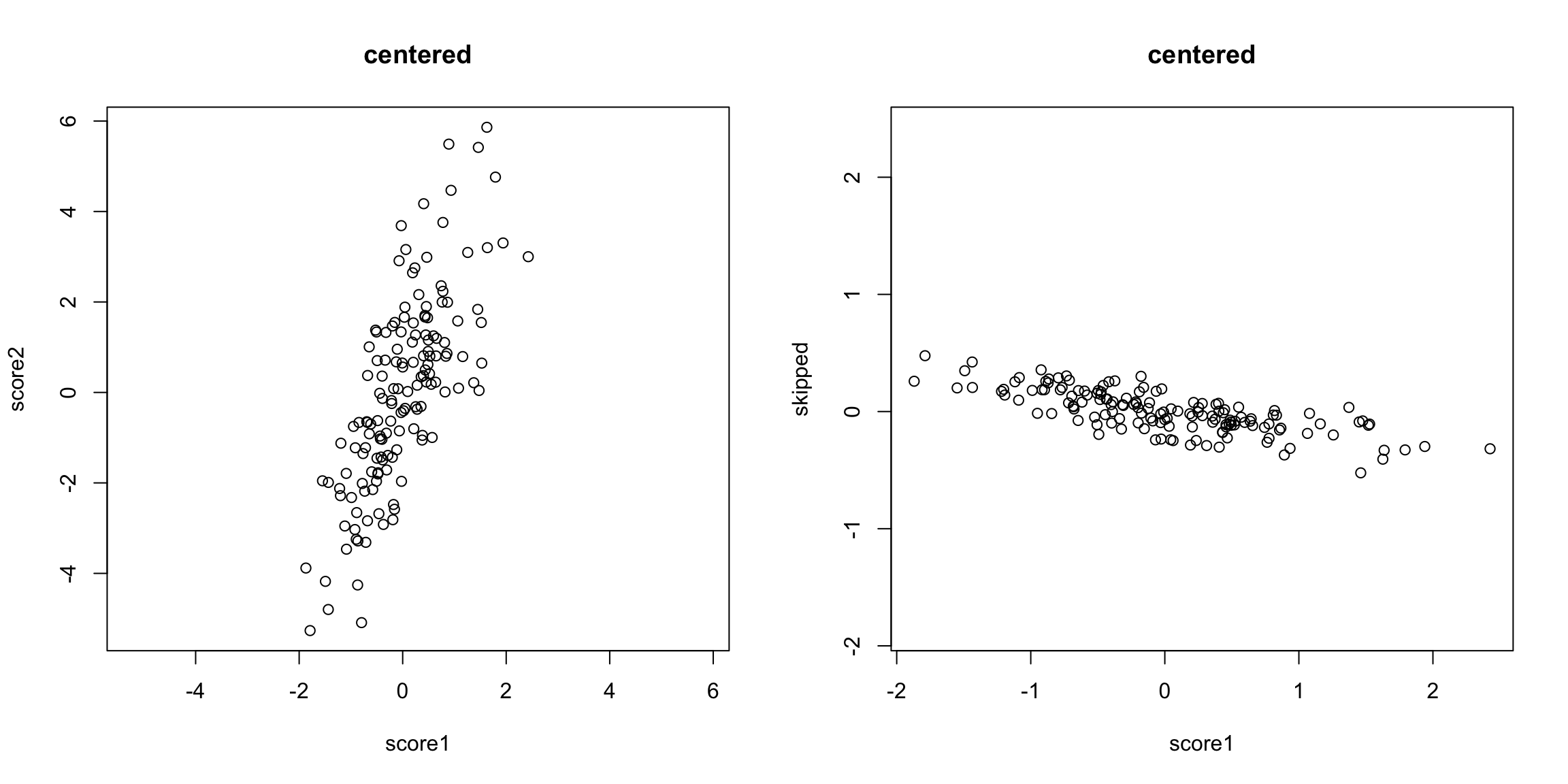
These are clearly pretty redundant information, in the sense that if I know a student has a high score in exam 1, I know they are a top student, and exam 2 gives me that same information.
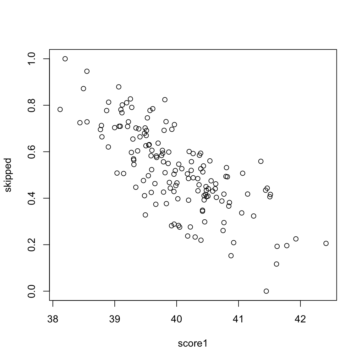
Consider another simulated example. Say the first value is the midterm score of a student, and the next value is the percentage of class and labs the student skipped. These are negatively correlated, but still quite redundant.
The goal of principal components analysis is to reduce your set of variables into the most informative. One way is of course to just manually pick a subset. But which ones? And don’t we do better with more information – we’ve seen that averaging together multiple noisy sources of information gives us a better estimate of the truth than a single one. The same principle should hold for our variables; if the variables are measuring the same underlying principle, then we should do better to use all of the variables.
Therefore, rather than picking a subset of the variables, principal components analysis creates new variables from the existing variables.
There are two equivalent ways to think about how principal components analysis does this.
5.4.1 Linear combinations of existing variables
You want to find a single score for each observation that is a summary of your variables. We will first consider as a running example the simple setting of finding a summary for a student with two grades, but the power is really when you want to find a summary for a lot of variables, like with the college data or the breast cancer data.
What is the problem with taking the mean of our two exam scores?
Let’s assume we make them have the same mean:
What problem remains?
If we are taking the mean, we are treating our two variables \(x^{(1)}\) and \(x^{(2)}\) equally, so that we have a new variable \(z\) that is given by \[z_i=\frac{1}{2}x_i^{(1)}+ \frac{1}{2}x_i^{(2)}\] The idea with principal components, then, is that we want to weight them differently to take into account the scale and whether they are negatively or positively correlated. \[z_i=a_1x_i^{(1)}+ a_2x_i^{(2)}\]
So the idea of principal components is to find the “best” constants (or coefficients), \(a_1\) and \(a_2\). This is a little bit like regression, only in regression I had a response \(y_i\), and so my best coefficients were the best predictors of \(y_i\). Here I don’t have a response. I only have the variables, and I want to get the best summary of them, so we will need a new definition of "best’’.
So how do we pick the best set of coefficients? Similar to regression, we need a criteria for what is the best set of coefficients. Once we choose the criteria, the computer can run an optimization technique to find the coefficients. So what is a reasonable criteria?
If I consider the question of exam scores, what is my goal? Well, I would like a final score that separates out the students so that the students that do much better than the other students are further apart, etc. %Score 2 scrunches most of the students up, so the vertical line doesn’t meet that criteria.
The criteria in principal components is to find the line so that the new variable values have the most variance – so we can spread out the observations the most. So the criteria we choose is to maximize the sample variance of the resulting \(z\).
In other words, for every set of coefficients \(a_1,a_2\), we will get a set of \(n\) new values for my observations, \(z_1,\ldots,z_n\). We can think of this new \(z\) as a new variable.
Then for any set of cofficients, I can calculate the sample variance of my resulting \(z\) as \[\hat{var}(z)=\frac{1}{n-1}\sum_{i=1}^n (z_i-\bar{z})^2\] Of course, \(z_i=a_1x_i^{(1)}+a_2 x_i^{(2)}\), this is actually \[\hat{var}(z)=\frac{1}{n-1}\sum_{i=1}^n (a_1x_i^{(1)}+a_2 x_i^{(2)}-\bar{z})^2\] (I haven’t written out \(\bar{z}\) in terms of the coefficients, but you get the idea.) Now that I have this criteria, I can use optimization routines implemented in the computer to find the coefficients that maximize this quantity.
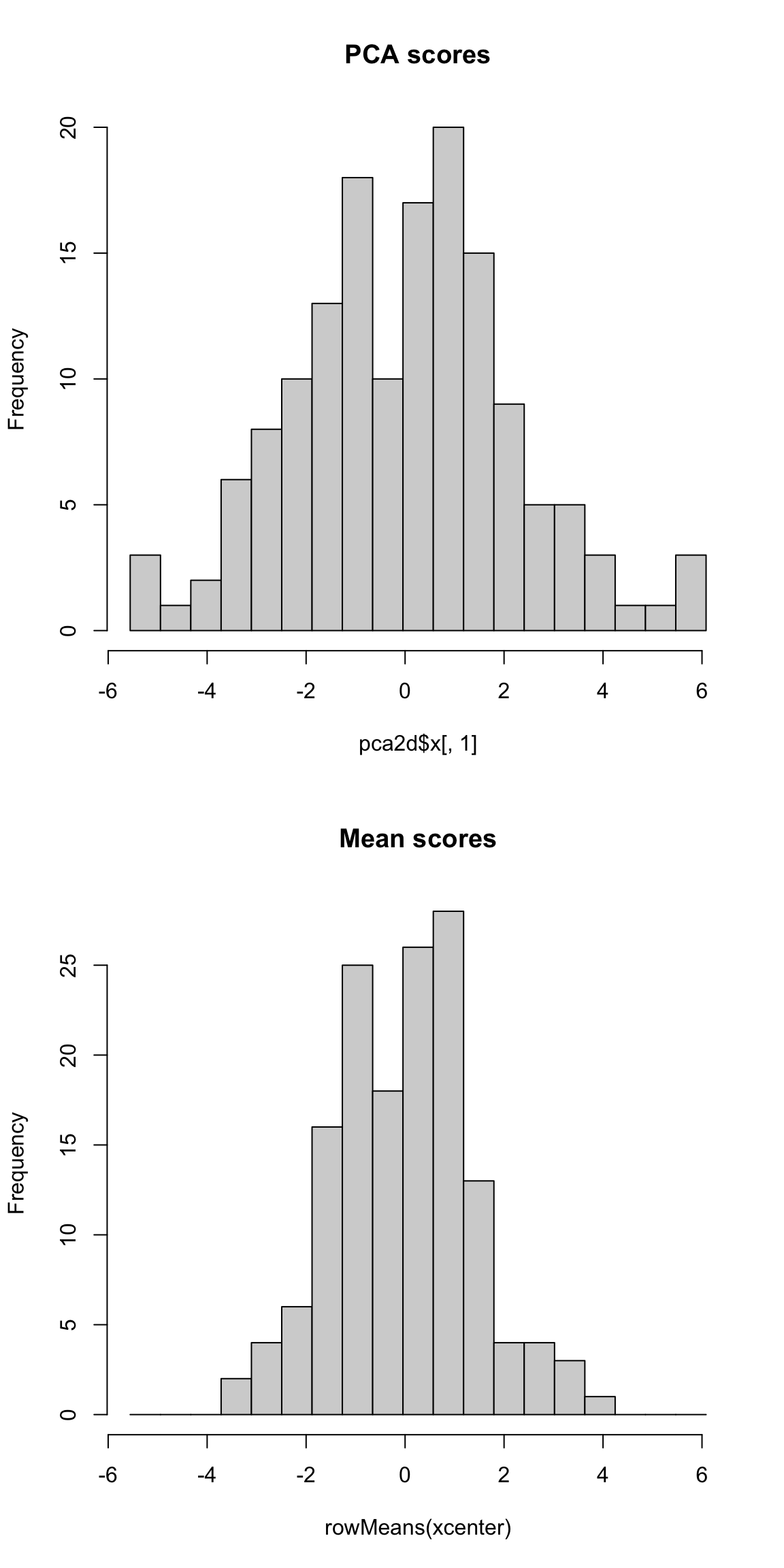
Here is a histogram of the PCA variable \(z\) and that of the mean.
Why maximize variance – isn’t that wrong?
We often talk about PCA as “preserving” the variance in our data. But in many settings we say we want low variability, so it frequently seems wrong to students to maximize the variance. But this is because frequently we think of variability as the same thing as noise. But variability among samples should only be considered noise among homogeneous samples, i.e. samples there are no interesting reasons for why they should be different. Otherwise we can have variability in our variables due to important differences between our observations, like what job title our employees have in the SF data in Chapter 2. We can see this in our data examples above, where we see different meaningful groups are separated from each other, such as cancer and normal patients. Genes that have a lot of differences between cancer and normal will have a large amount of spread. The difference in the groups is creating a large spread in our observations. Capturing the variance in PCA is capturing these meaningful differences, as we can see in our above examples.
5.4.1.1 More than 2 variables
This procedure expands easily to more than 2 variables. Specifically assume that our observation \(i\) is a vector of values, \((x_i^{(1)},\ldots,x_i^{(p)})\) where \(p\) is the number of variables. With PCA, I am looking for a linear combination of these \(p\) variables. As before, this means we want to multiply each variable by a coefficient and add them together (or subtract if the coefficient is negative) to get a new variable \(z\) for each observation, \[z_i=a_1x_i^{(1)}+\ldots+a_p x_i^{(p)}\] So finding a linear combination is equivalent to finding a set of the \(p\) constants that I will multiply my variables by.
If I take the mean of my \(p\) variables, what are my choices of \(a_k\) for each of my variables?
I can similarly find the coefficients \(a_k\) so that my resulting \(z_i\) have maximum variance.
PCA is really most powerful when considering many variables.
Unique only up to a sign change
Notice that if I multiplied all of the coefficients \(a_k\) by \(-1\), then \(z_i\) will become \(-z_i\). However, the variance of \(-z_i\) will be the same as the variance of \(z_i\), so either answer is equivalent. In general, PCA will only give a unique score \(z_i\) up to a sign change.
You do NOT get the same answer if you multiply only some \(a_k\) by \(-1\), why?
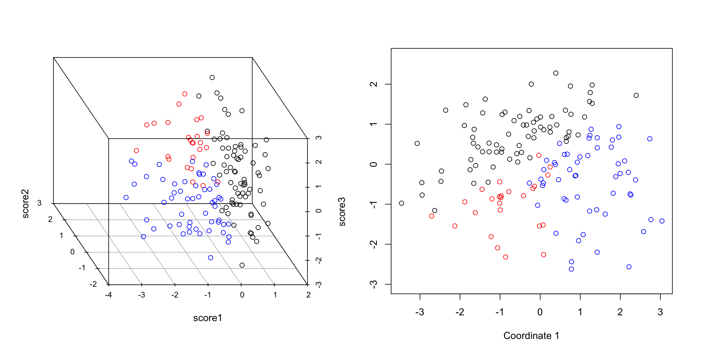
Example: Scorecard Data
Consider, for example, our scorecard of colleges data, where we previously only considered the pairwise scatterplots. There are 30 variables collected on each institution – too many to easily visualize. We will consider a PCA summary of all of this data that will incorporate all of these variables. Notice that PCA only makes sense for continuous variables, so we will remove variables (like the private/public split) that are not continuous. PCA also doesn’t handle NA values, so I have removed samples that have NA values in any of the observations.
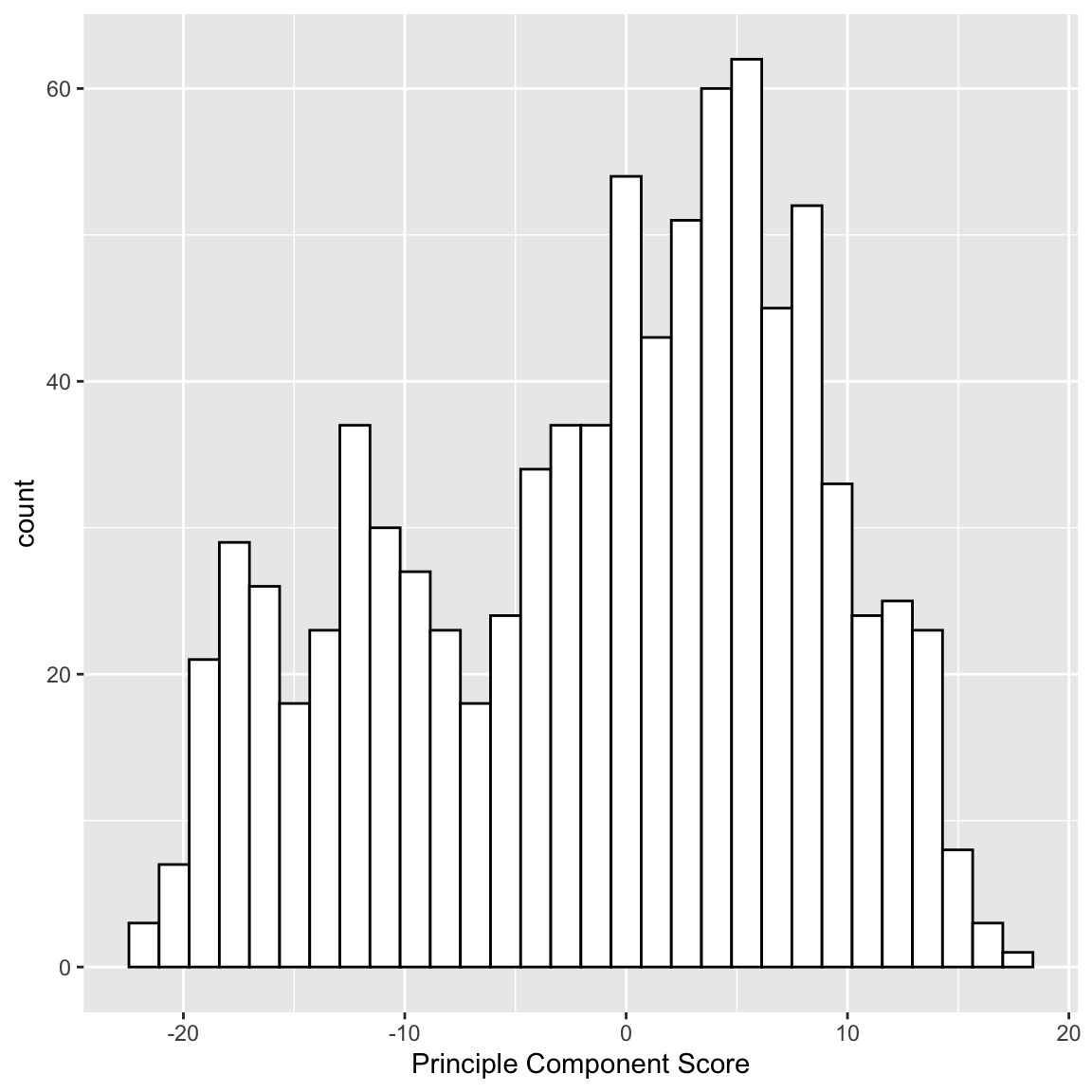
I can plot a histogram of the scores that each observation received:
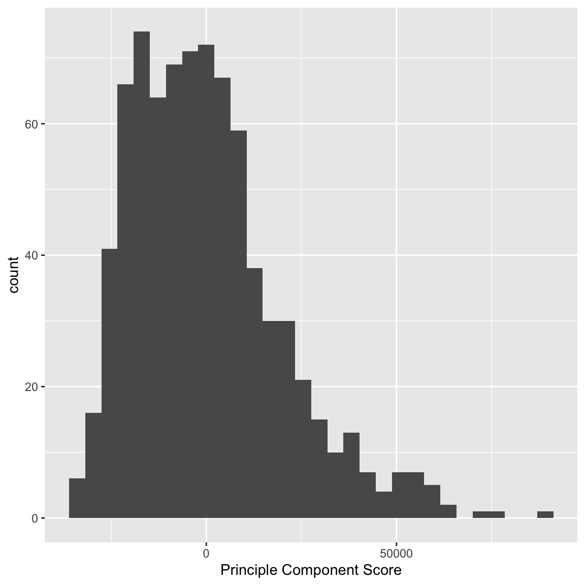
We can see that some observations have quite outlying scores. When I manually look at their original data, I see that these scores have very large (or very small) values for most of the variables, so it makes sense that they have outlying scores.
I can also compare whether public and private colleges seem to be given different scores:
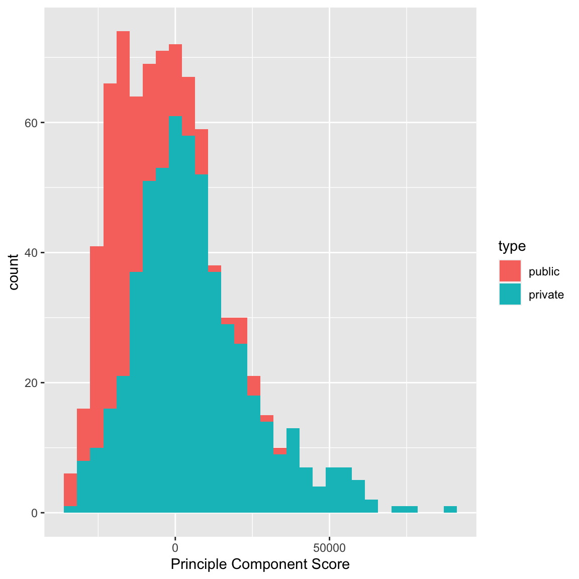
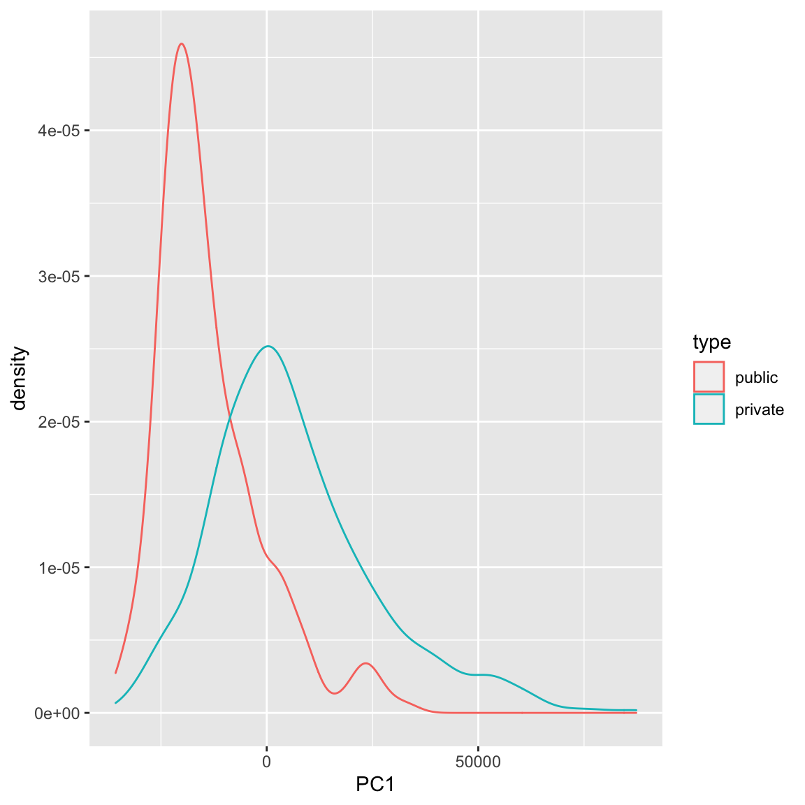
We can see some division between the two, with public seeming to have lower scores than the private. Notice that I only care about relative values here – if I multiplied all of my coefficients \(a_k\) by \(-1\), then I would flip which is lower or higher, but it would be equivalent in terms of the variance of my new scores \(z_i\). So it does not mean that public schools are more likely to have lower values on any particular variables; it does mean that public schools tend to have values that are in a different direction than private schools on some variables.
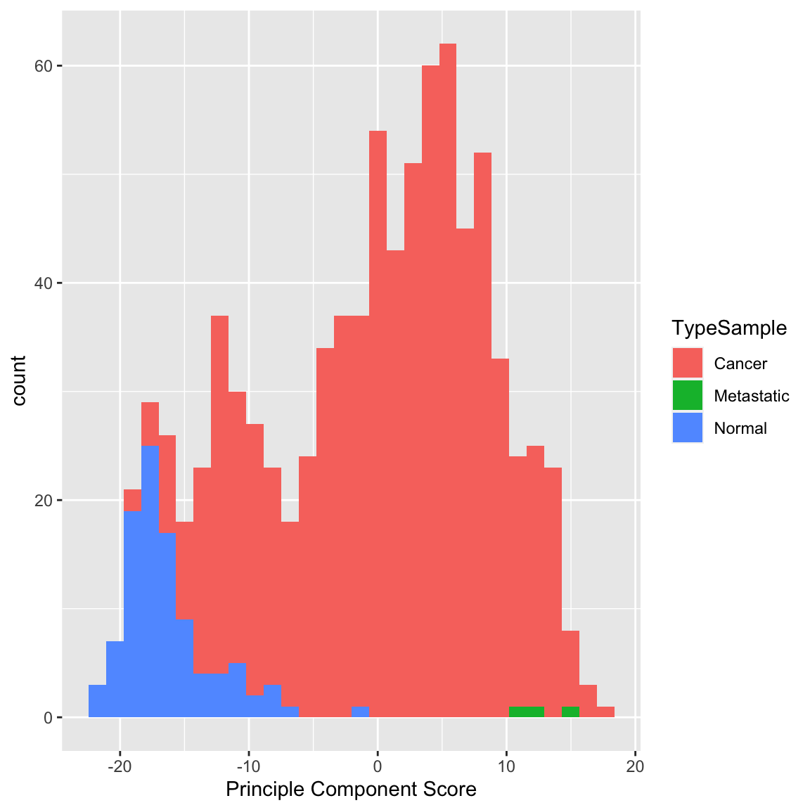
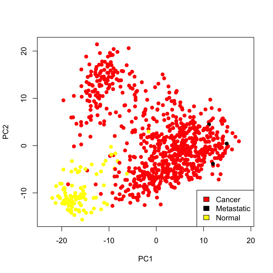
Example: Breast Cancer Data
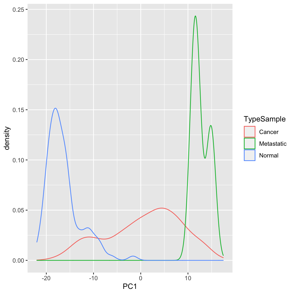
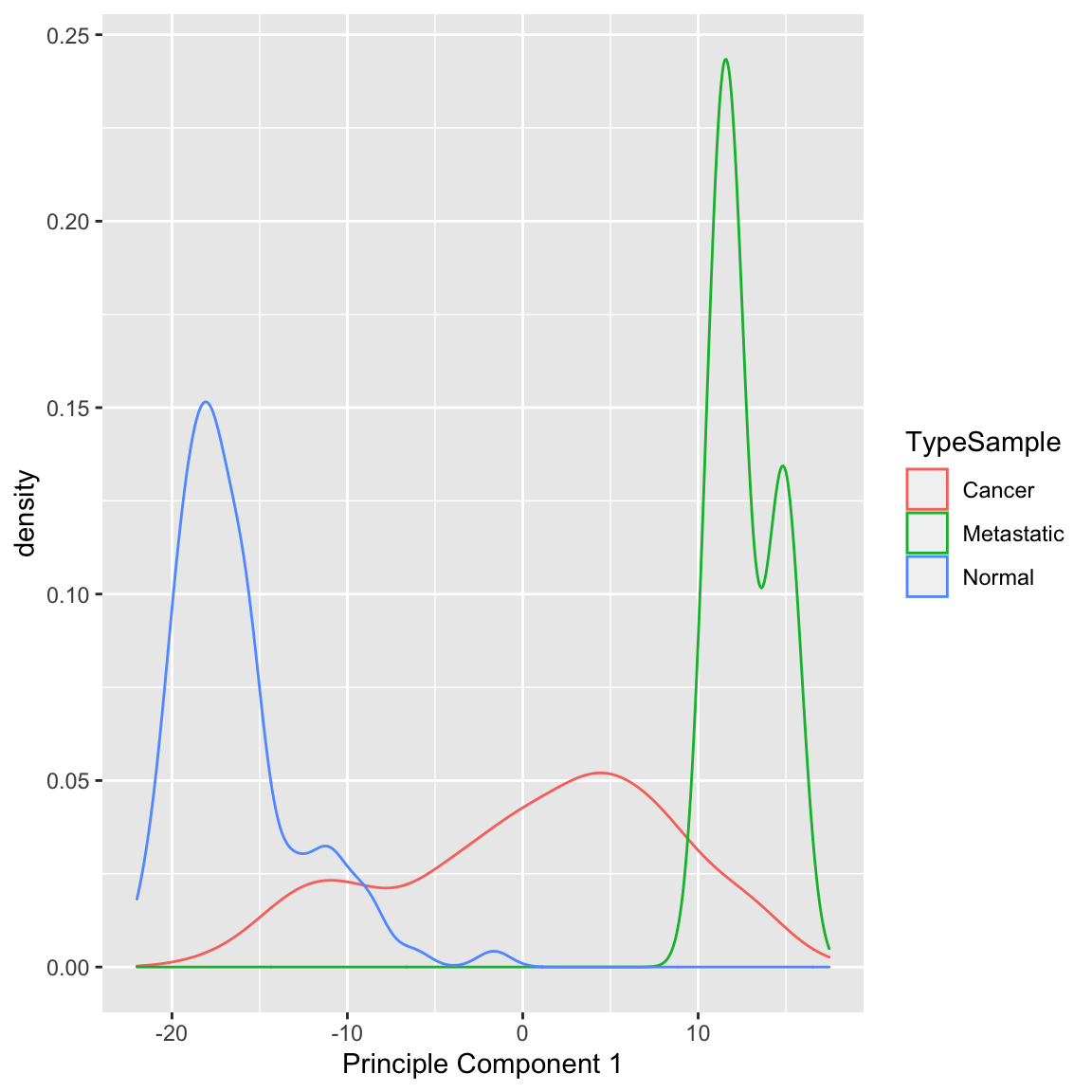
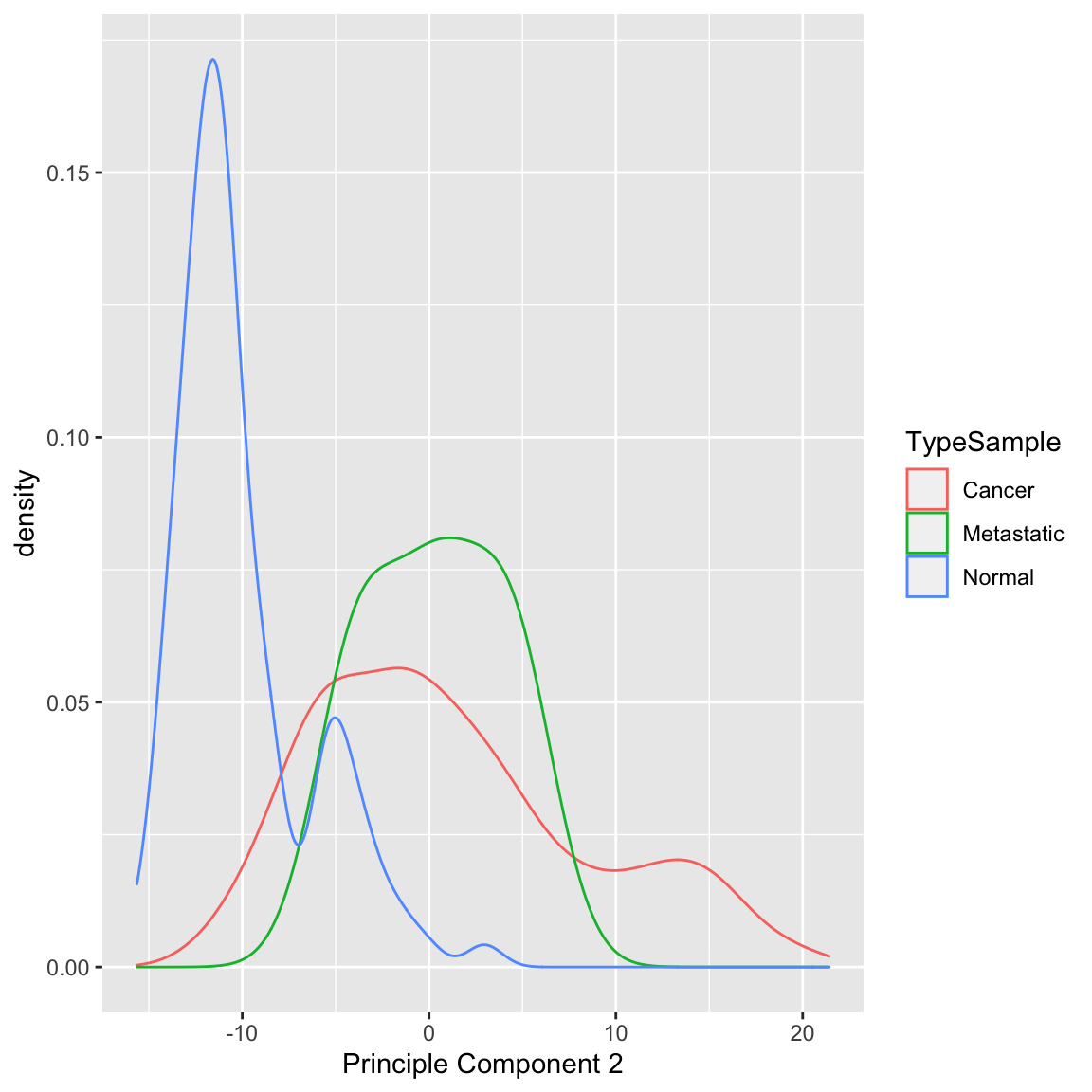
Similarly we can see a big difference between cancer and normal observations in the first two principal components.
We can see that, at least based on the PC score, there might be multiple groups in this data, because there are multiple modes. We could explore the scores of normal versus cancer samples, for example:
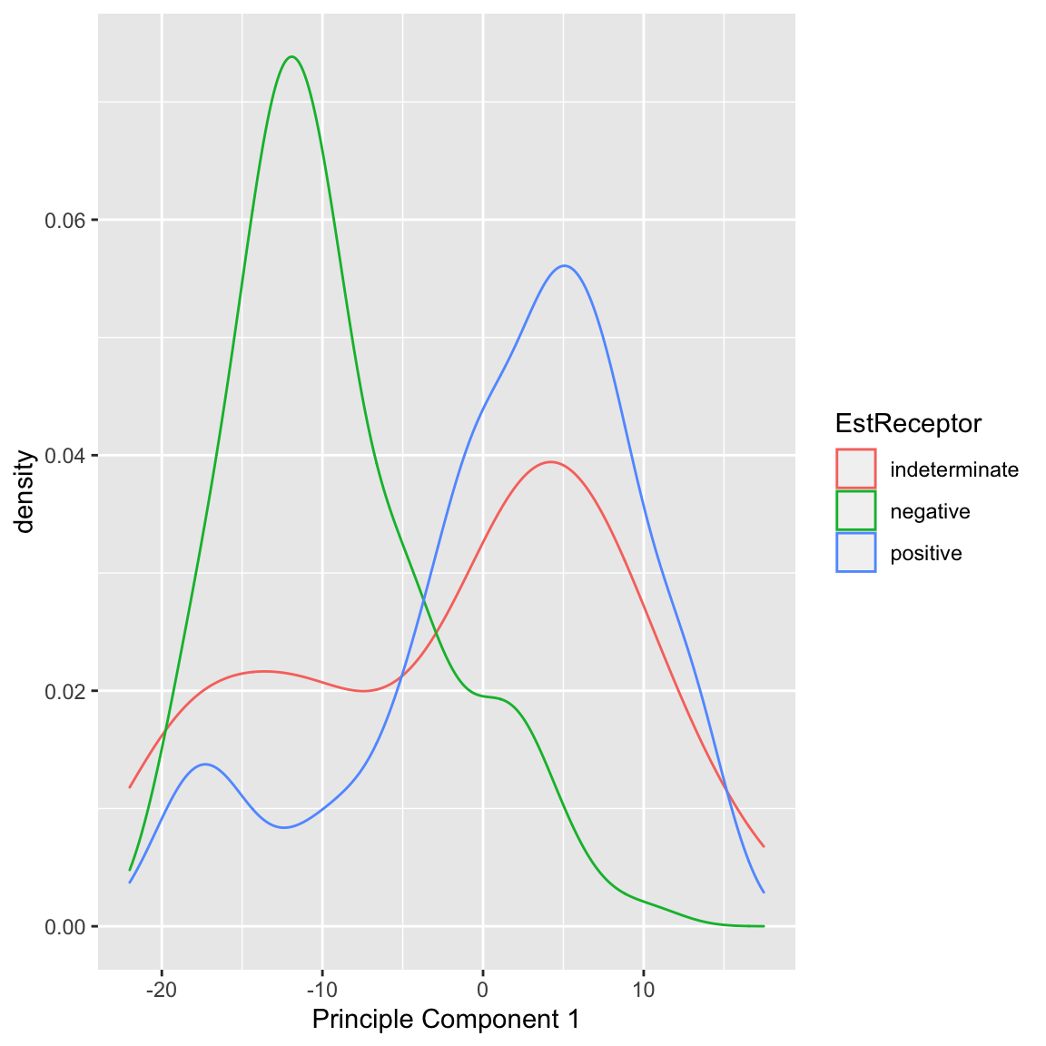
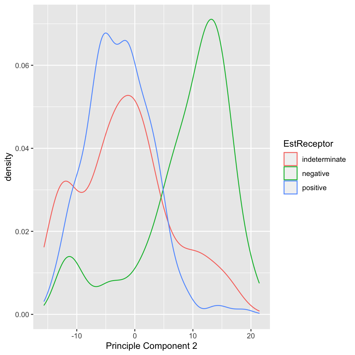
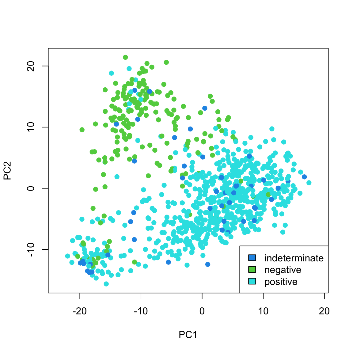
We can also see that cancer samples are really spread out; we have other variables that are particularly relevant for separating cancer samples, so we could see how they differ. For example, by separating estrogen receptor status, we see quite different distributions:
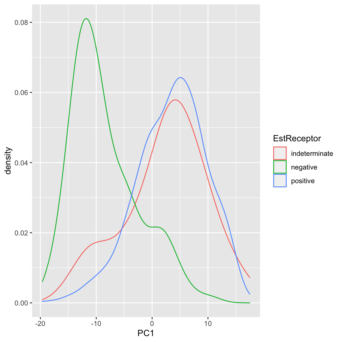
In summary, based on our PCA score, I can visually explore important patterns in my data, even with very large numbers of variables. Because I know that this is the linear combination that most spreads out my observations, hopefully large shared differences between our samples (like normal vs cancer, or outlying observations) will be detected, particularly if they are reiterated in many variables.
5.4.1.2 Multiple principal components
So far we have found a single score to summarize our data. But we might consider that a single score is not going to capture the complexity in the data. For example, for the breast cancer data, we know that the normal and cancer samples are quite distinct. But we also know that within the cancer patients, those negative on the Estrogen Receptor or Progesteron are themselves a subgroup within cancer patients, in terms of their gene measurements. Capturing these distinctions with a single score might be to difficult.
Specifically, for each observation \(i\), we have previously calculated a single score, \[\begin{align*} z=a_1x^{(1)}+\ldots+a_px^{(p)}\\ \end{align*}\]
What if instead we want two scores for each observation \(i\), i.e. \((z_i^{(1)},z_i^{(2)})\). Again, we want each score to be linear combinations of our original \(p\) variables. This gives us \[\begin{align*} z^{(1)}=a_1^{(1)}x^{(1)}+\ldots+a_p^{(1)}x^{(p)}\\ z^{(2)}=b_1^{(2)}x^{(1)}+\ldots+b_p^{(2)}x^{(p)} \end{align*}\] Notice that the coefficients \(a_1^{(1)},\ldots,a_p^{(1)}\) belong to our first PC score, \(z^{(1)}\), and the second set of coefficients \(b_1^{(2)},\ldots,b_p^{(2)}\) are entirely different numbers and belong to our second PC score, \(z^{(2)}\).
We can think of this as going from each observation having data \((x^{(1)},\ldots,x^{(p)})\) to now having \((z^{(1)},z^{(2)})\) as their summarized data. This is often called a reduced dimensionality representation of our data, because we are going from \(p\) variables to a reduced number of summary variables (in this case 2 variables). More generally, if we have many variables, we can use the principal components to go from many variables to a smaller number.
How are we going to choose \((z^{(1)},z^{(2)})\)? Previously we chose the coefficients \(a_k\) so that the result is that \(z^{(1)}\) has maximal variance. Now that we have two variables, what properties do we want them to have? They clearly cannot both maximimize the variance, since there’s only one way to do that – we’d get \(z^{(1)}=z^{(2)}\) which doesn’t give us any more information about our data!
So we need to say something about how the new variables \(z^{(1)},z^{(2)}\) relate to each other so that jointly they maximally preserve information about our original data.
How can we quantify this idea? There are ways of measuring the total variance between multiple variables \(z^{(1)}\) and \(z^{(2)}\) variables, which we won’t go into in detail. But we’ve seen that when variables are highly correlated with each other, they don’t give a lot more information about our observations since we can predict one from the other with high confidence (and if perfectly correlated we get back to \(z^{(1)}=z^{(2)}\)). So this indicates that we would want to choose our coefficients \(a_1^{(1)},\ldots,a_p^{(1)}\) and \(b_1^{(2)},\ldots,b_p^{(2)}\) so that the resulting \(z^{(1)}\) and \(z^{(2)}\) are completely uncorrelated.
How PCA does this is the following:
Choose \(a_1^{(1)}\ldots a_p^{(1)}\) so that the resulting \(z_i^{(1)}\) has maximal variance. This means it will be exactly the same as our PC that we found previously.
Choose \(b_1^{(2)},\ldots,b_p^{(2)}\) so that the resulting \(z_i^{(2)}\) is uncorrelated with the \(z_i^{(1)}\) we have already found. That does not create a unique score \(z_i^{(2)}\) (there will be many that satisfy this property). So we have the further requirement
Among all \(b_1^{(2)},\ldots,b_p^{(2)}\) that result in \(z_i^{(2)}\) uncorrelated with \(z_i^{(1)}\), we choose \(b_1^{(2)},\ldots,b_p^{(2)}\) so that the resulting \(z_i^{(2)}\) have maximal variance.
This sounds like a hard problem to find \(b_1^{(2)},\ldots,b_p^{(2)}\) that satisfies both of these properties, but it is actually equivalent to a straightforward problem in linear algebra (related to SVD or eigen decompositions of matrices).
The end result is that we wind up with two new variables for each observation and these new variables have correlation equal to zero and jointly “preserve” the maximal amount of variance in our data.
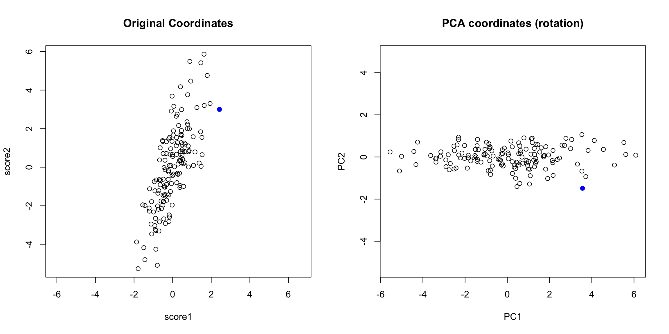
Example: College Data
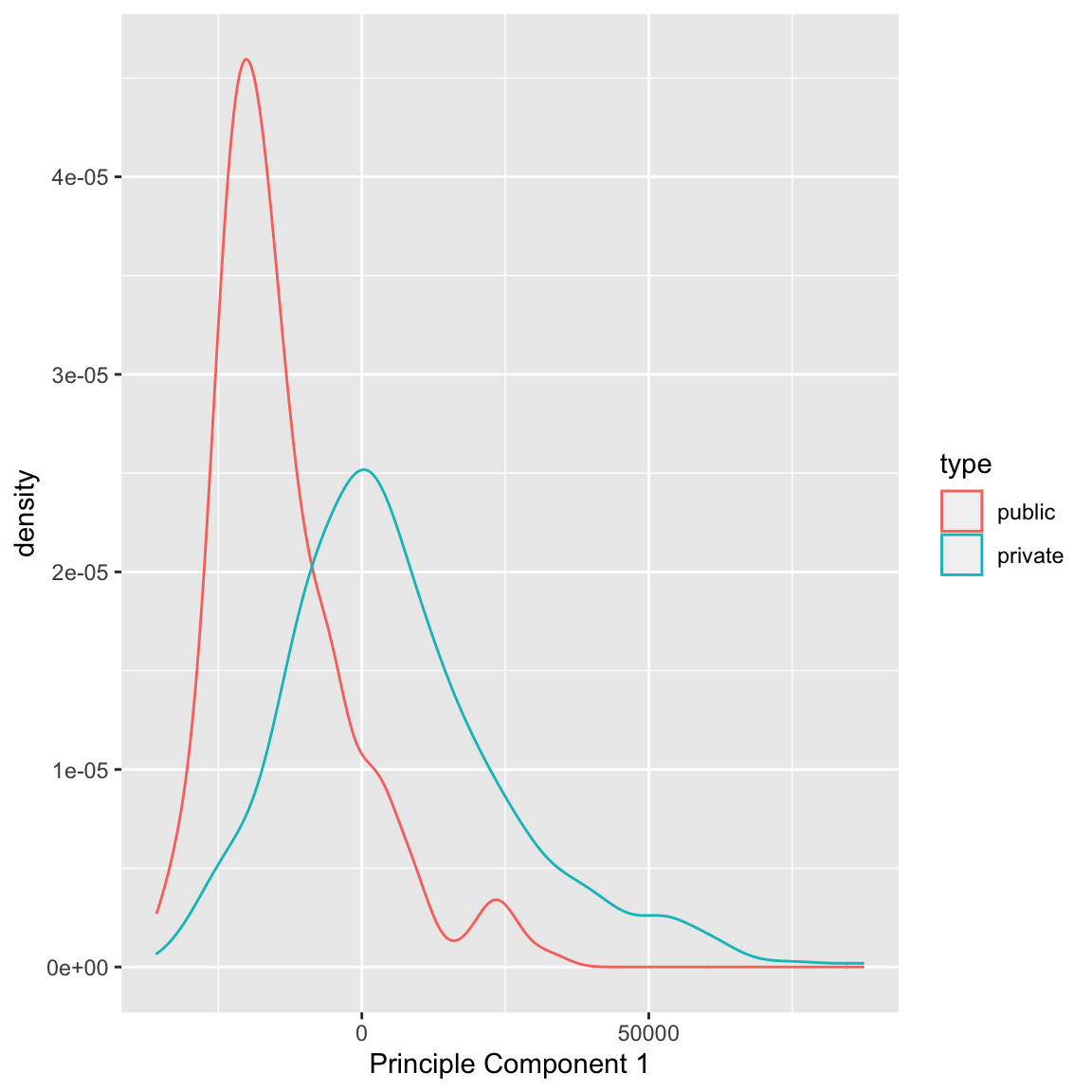
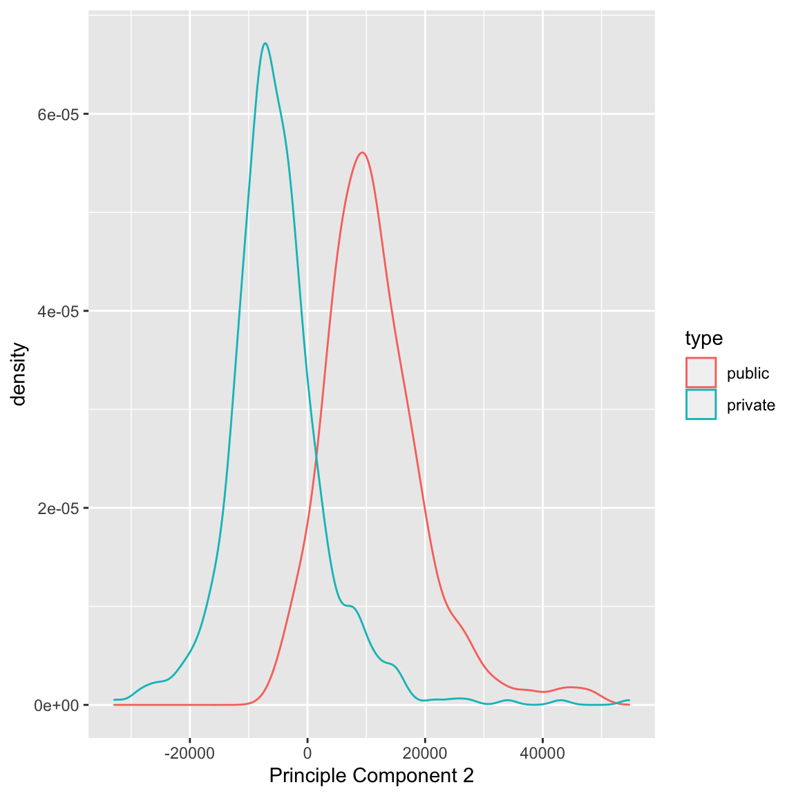
Let’s consider what going to two PC components does for our previous data examples. Previously in the college data, with one principal component we saw that there was a difference in the distribution of scores, but that was also a great deal of overlap.
Individually, we can consider each PC, and see that there is a bit more separation in PC2 than PC1
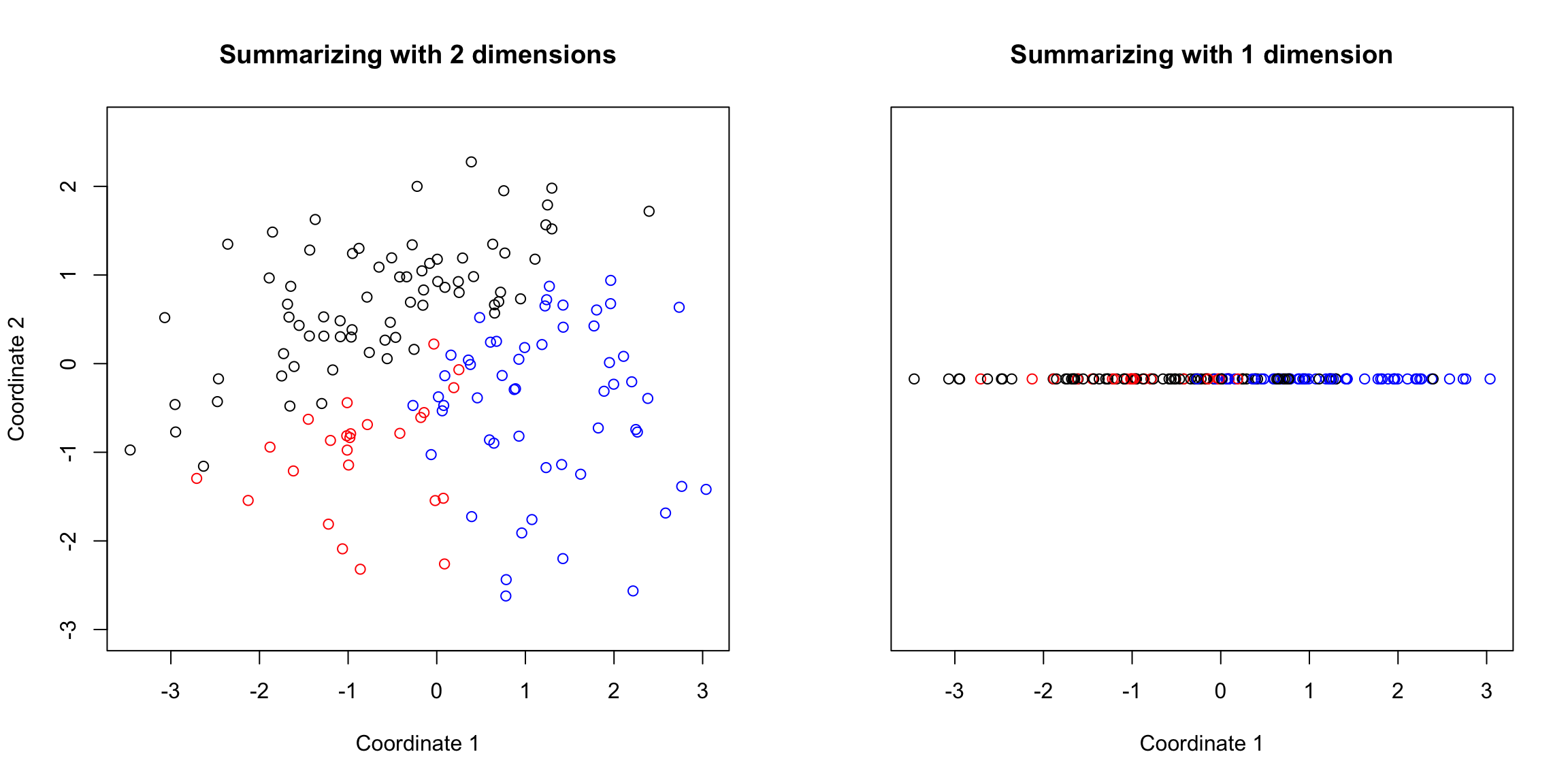
But even more importantly, we can consider these variables jointly in a scatter plot:
plot(pcaCollegeDf[, c("PC1", "PC2")], col = c("red",
    "black")[pcaCollegeDf$type], asp = 1)
legend("topright", c("public", "private"), fill = c("red",
    "black"))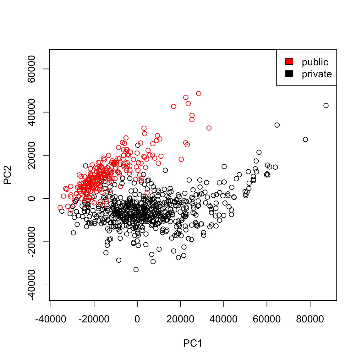
We see that now the public and private are only minimally overlapping; we’ve gained a lot of information about this particular distinction (public/private) by adding in PC2 in addition to PC1.
Remember, we didn’t use the public or private variable in our PCA; and there is no guarantee that the first PCs will capture the differences you are interested in. But when these differences create large distinctions in the variables (like the public/private difference does), then PCA is likely to capture this difference, enabling you to use it effectively as a visualization tool.
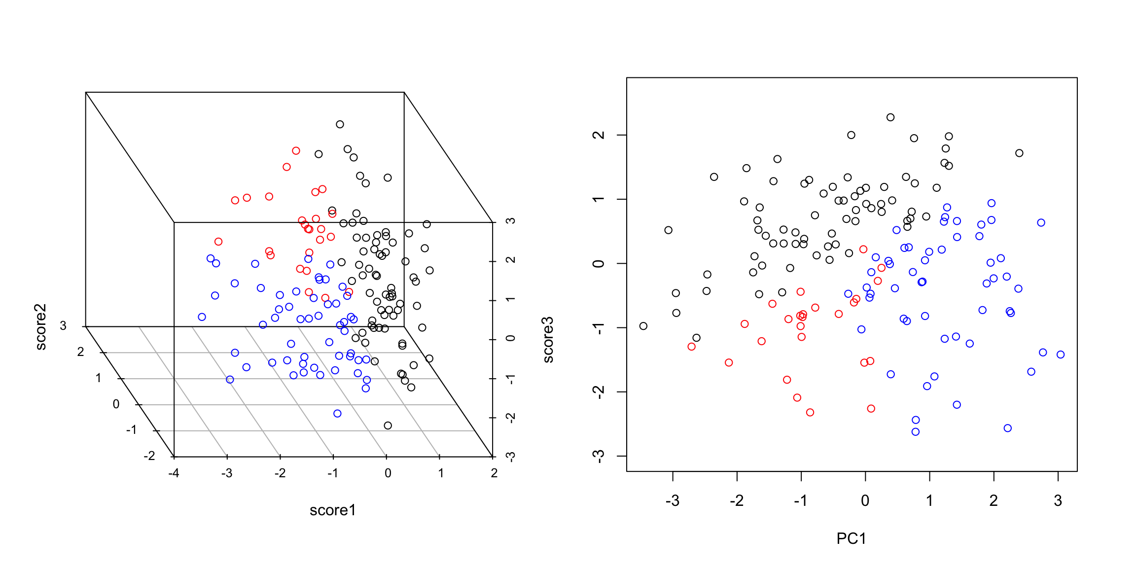
Example: Breast Cancer Data
We now turn to the breast cancer data. We can see that PC2 is probably slightly worse at separating normal from cancer compared to PC1 (and particularly doesn’t give similar scores to metastases):
It does a arguably a better job of separating our negative estrogen receptor patients:
When we consider these variables jointly in a scatter plot we see much greater separation:
What differences do you see when you use both principal components rather than either one singly?
5.4.2 Geometric Interpretation
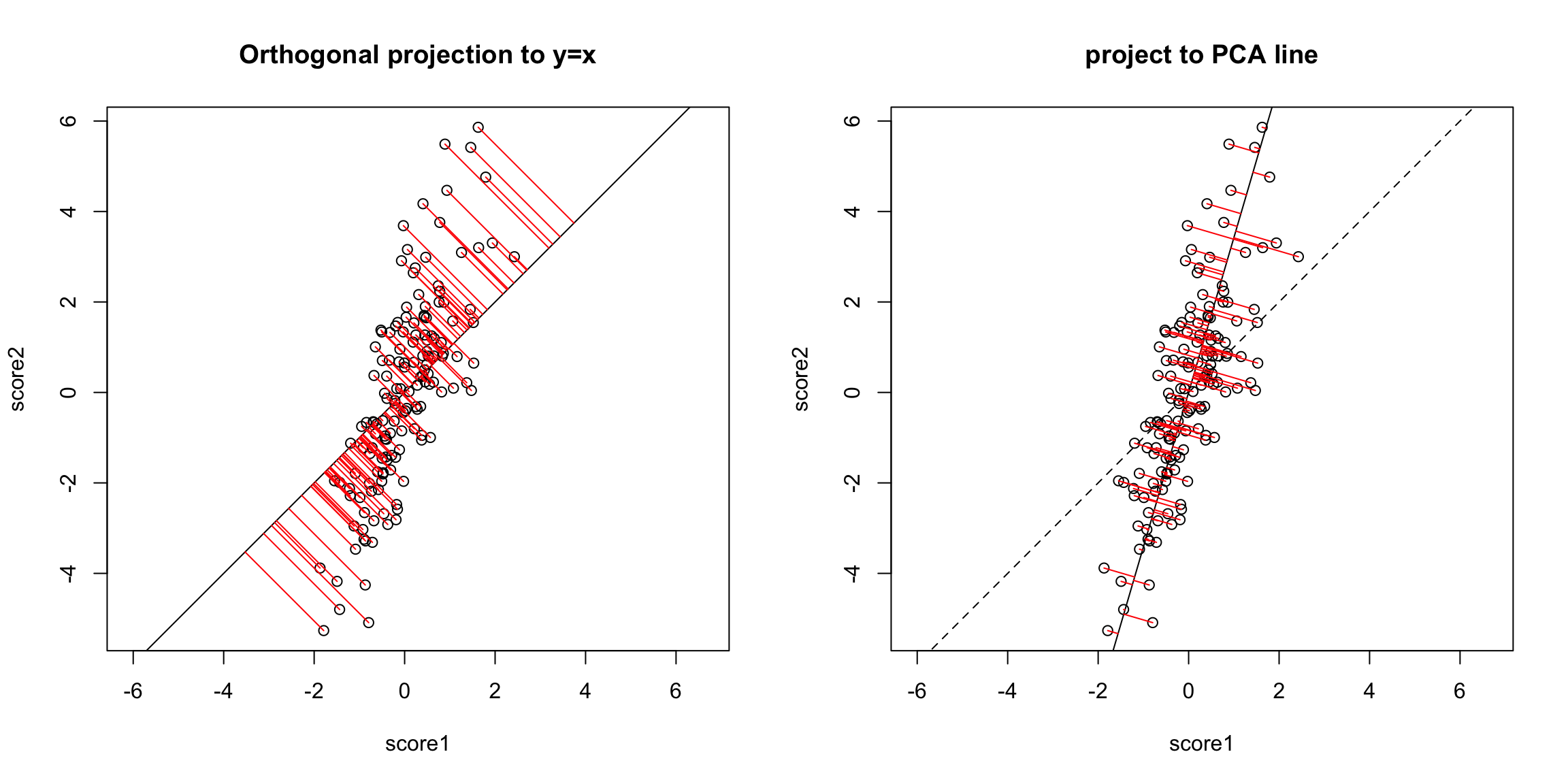
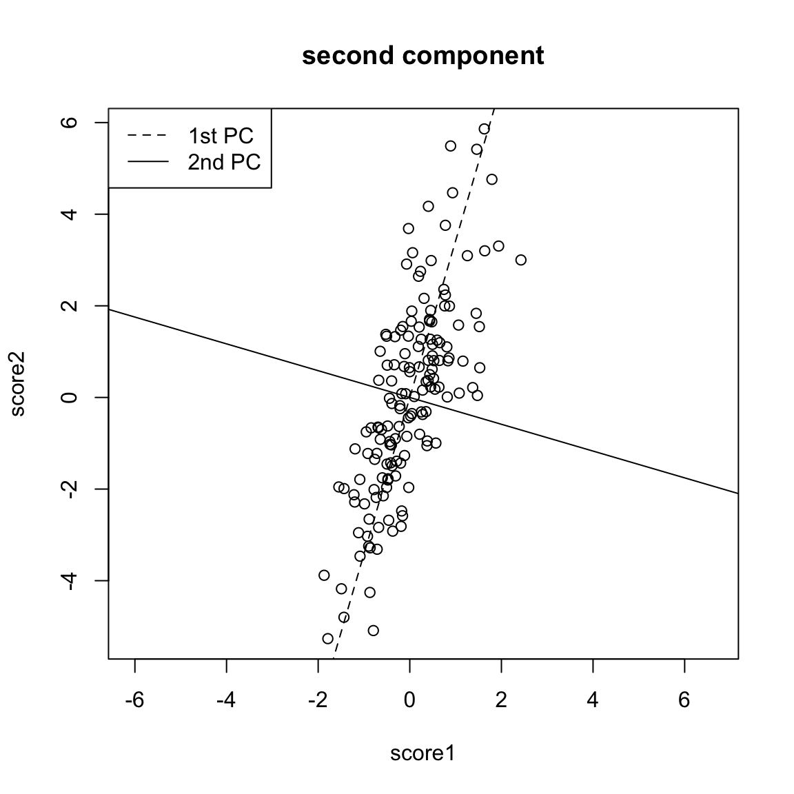
Another way to consider our redundancy is geometrically. If this was a regression problem we would “summarize” the relationship betweeen our variables by the regression line:
This is a summary of how the x-axis variable predicts the y-axis variable. But note that if we had flipped which was the response and which was the predictor, we would give a different line.
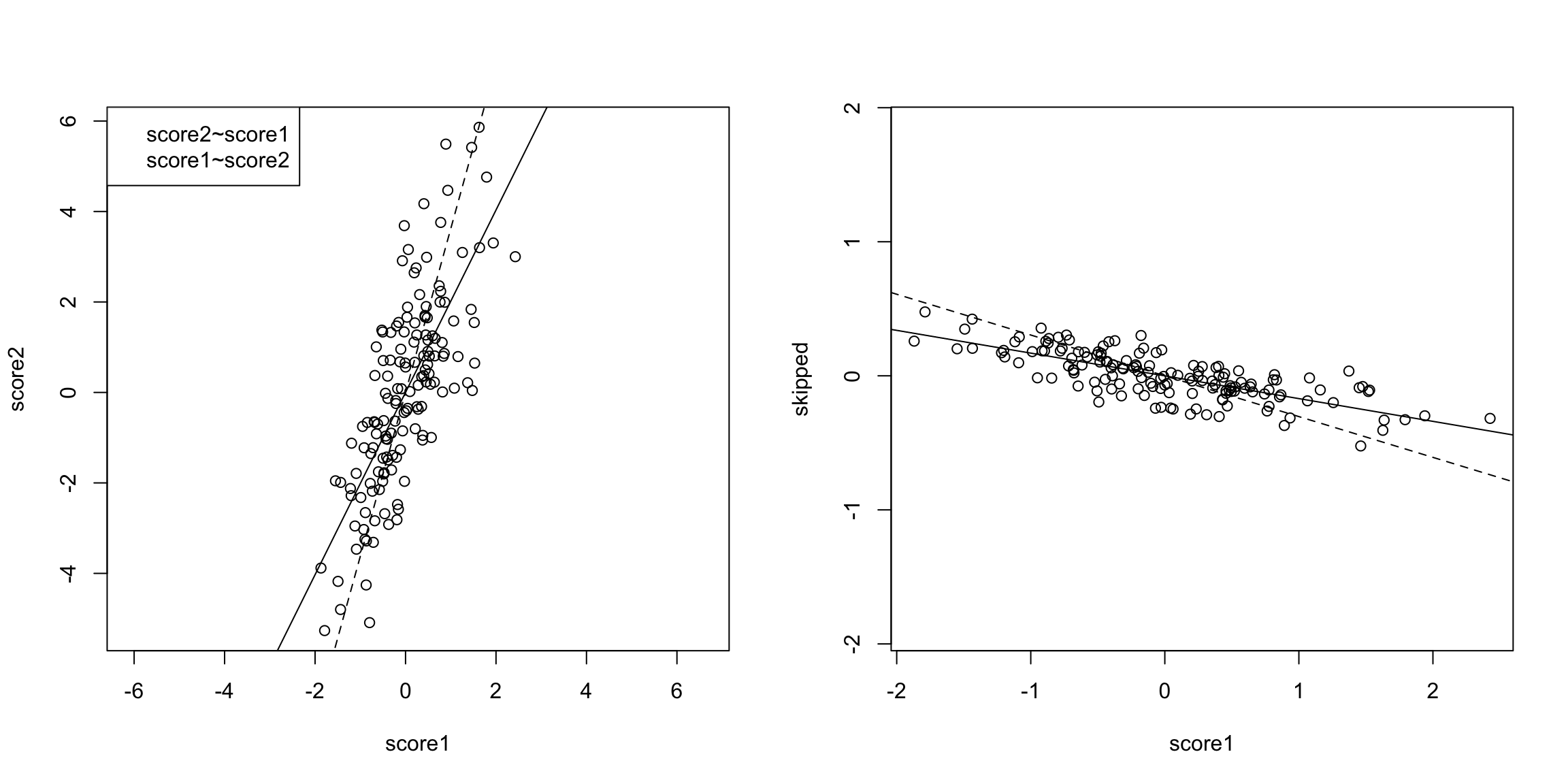
The problem here is that our definition of what is the best line summarizing this relationship is not symmetric in regression. Our best line minimizes error in the y direction. Specifically, for every observation \(i\), we project our data onto the line so that the error in the \(y\) direction is minimized.
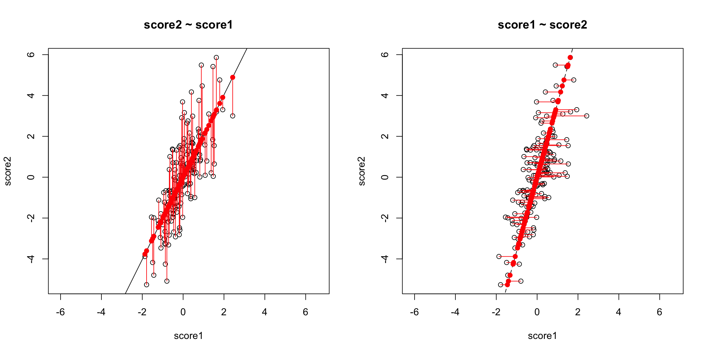
However, if we want to summarize both variables symmetrically, we could instead consider picking a line to minimize the distance from each point to the line.
By distance of a point to a line, we mean the minimimum distance of any point to the line. This is found by drawing another line that goes through the point and is orthogonal to the line. Then the length of that line segment from the point to the line is the distance of a point to the line.
Just like for regression, we can consider all lines, and for each line, calculate the average distance of the points to the line.
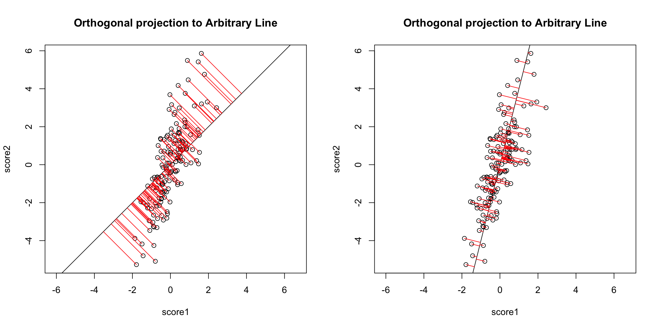
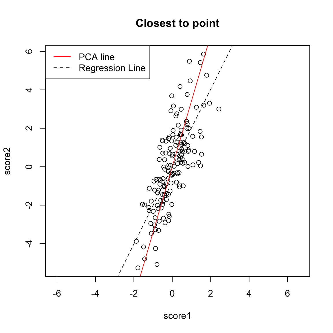
So to pick a line, we now find the line that minimizes the average distance to the line across all of the points. This is the PCA line:
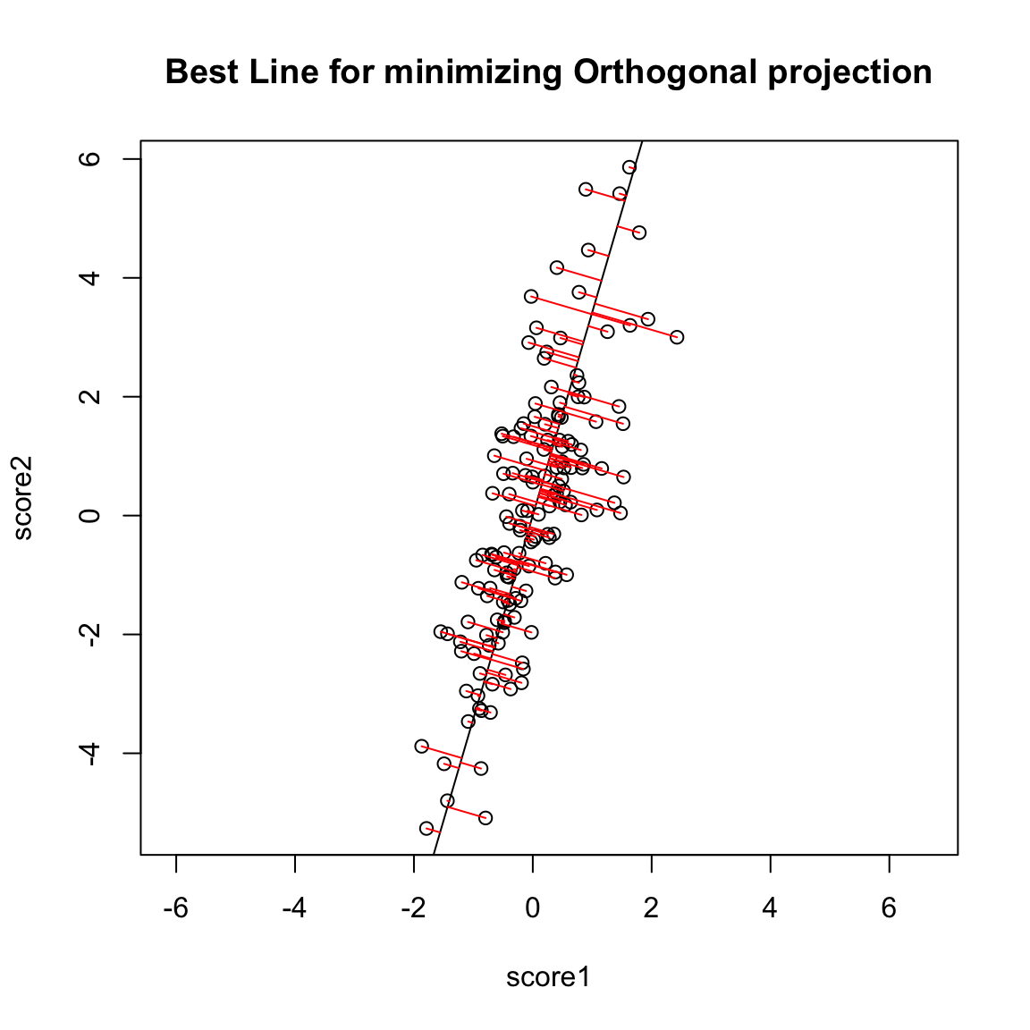
Compare this to our regression line:
Creating a new variable from the PCA line
Drawing lines through our data is all very well, but what happened to creating a new variable, that is the best summary of our two variables? In regression, we could view that our regression line gave us the “best” prediction of the average \(y\) for an \(x\) (we called it our predicted value, or \(\hat{y}\)). This best value was where our error line drawn from \(y_i\) to the regression line (vertically) intersected.
Similarly, we used lines drawn from our data point to our PCA line to define the best line summary, only we’ve seen that for PCA we are interested in the line orthogonal to our point so as to be symmetric between our two variables – i.e. not just in the \(y\) direction. In a similar way, we can say that the point on the line where our perpendicular line hits the PCA line is our best summary of the value of our point. This is called the orthogonal projection of our point onto the line. We could call this new point \((\hat{x}^{(1)},\hat{x}^{(2)}\).
This doesn’t actually give us a single variable in place of our original two variables, since this point is defined by 2 coordinates as well. Specifically, for any line \(x^{(2)}=a+b x^{(1)}\), we have that the coordinates of the projection onto the line are given by44 \[\begin{gather*} \hat{x}^{(1)}=\frac{b}{b^2+1}(\frac{x^{(1)}}{b}+x^{(2)}-a)\\ \hat{x}^{(2)}=\frac{1}{b^2+1}(b x^{(1)} + b^2 x^{(2)} + a) \end{gather*}\] (and since we’ve centered our data, we want our line to go through \((0,0)\), so \(a=0\))
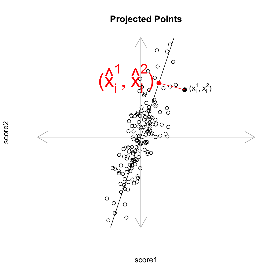
But geometrically, if we consider the points \((\hat{x}_i^{(1)},\hat{x}_i^{(2)})\) as a summary of our data, then we don’t actually need two dimensions to describe these summaries. From a geometric point of view, our coordinate system is arbitrary for describing the relationship of our points. We could instead make a coordinate system where one of the coordiantes was the line we found, and the other coordinate the orthogonal projection of that. We’d see that we would only need 1 coordinate (\(z_i\)) to describe \((\hat{x}_i^{(1)},\hat{x}_i^{(2)})\) – the other coordinate would be 0.
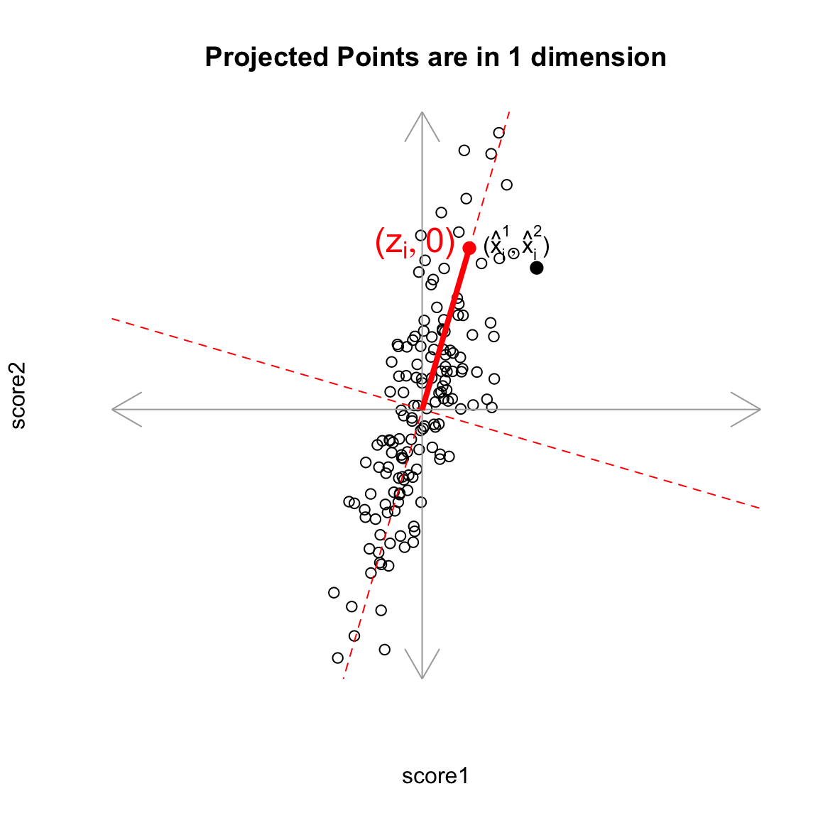
That coordiante, \(z_i\), would equivalently, from a geometric perspective, describe our projected points. And the value \(z_i\) is found as the distance of the projected point along the line (from \((0,0)\)).45 So we can consider \(z_i\) as our new variable.
Relationship to linear combinations
Is \(z_i\) a linear combination of our original \(x^{(1)}\) and \(x^{(2)}\)? Yes. In fact, as a general rule, if a line going through \((0,0)\) is given by \(x^{(2)}=b x^{(1)}\), then the distance along the line of the projection is given by46 \[z_i = \frac{1}{\sqrt{1+b2}} (x^{(1)} + b x^{(2)})\]
Relationship to variance interpretation
Finding \(z_i\) from the geometric procedure described above (finding line with minimimum orthogonal distance to points, then getting \(z_i\) from the projection of the points on to the line) is actually mathematically equivalent to finding the linear combination \(z_i=a_1 x^{(1)}+a_2 x^{(2)}\) that results in the greatest variance of our points. In other words, finding \(a_1, a_2\) to minimize \(\hat{var}(z_i)\) is the same as finding the slope \(b\) that minimizes the average distance of \((x_i^{(1)},x_i^{(2)})\) to its projected point \((\hat{x}_i^{(1)},\hat{x}_i^{(2)})\).
To think why this is true, notice that if I assume I’ve centered my data, as I’ve done above, then the total variance in my two variables (i.e. sum of the variances of each variable) is given by \[\begin{gather*}\frac{1}{n-1}\sum_i (x_i^{(1)})^2 +\frac{1}{n-1}\sum_i (x_i^{(2)})^2 \\ \frac{1}{n-1}\sum_i \left[(x_i^{(1)})^2 +(x_i^{(2)})^2\right] \end{gather*}\] So that variance is a geometrical idea once you’ve centered the variables – the sum of the squared length of the vector \(((x_i^{(1)},x_i^{(2)})\). Under the geometric interpretation your new point \((\hat{x}_i^{(1)},\hat{x}_i^{(2)})\), or equivalently \(z_i\), has mean zero too, so the total variance of the new points is given by \[\frac{1}{n-1}\sum_i z_i^2\] Since we know that we have an orthogonal projection then we know that the distance \(d_i\) from the point \((x_i^{(1)},x_i^{(2)})\) to \((\hat{x}_i^{(1)},\hat{x}_i^{(2)})\) satisfies the Pythagorean theorem, \[z_i(b)^2 + d_i(b)^2 = [x_i^{(1)}]^2 + [x_i^{(2)}]^2.\] That means that finding \(b\) that minimizes \(\sum_i d_i(b)^2\) will also maximize \(\sum_i z_i(b)^2\) because \[\sum_i d_i(b)^2= \text{constant} - \sum_i z_i(b)^2\] so minimizing the left hand size will maximize the right hand side.
Therefore since every \(z_i(b)\) found by projecting the data to a line through the origin is a linear combination of \(x_i^{(1)},x_i^{(2)}\) AND minimizing the squared distance results in the \(z_i(b)\) having maximum variance across all such \(z_i^2(b)\), then it MUST be the same \(z_i\) we get under the variance-maximizing procedure.
The above explanation is to help give understanding of the mathematical underpinnings of why they are equivalent. But the important take-home fact is that both of these procedures are the same: if we minimize the distance to the line, we also find the linear combination so that the projected points have the most variance (i.e. we can spread out the points the most).
Compare to Mean
We can use the geometric interpretation to consider what is the line corresponding to the linear combination defined by the mean, \[\frac{1}{2} x^{(1)}+\frac{1}{2} x^{(2)}\] It is the line \(y=x\),
We could see geometrically how the mean is not a good summary of our cloud of data points.
Note on Standardizing the Variables
You might say, “Why not standardize your scores by the standard deviation so they are on the same scale?” For the case of combining 2 scores, if I normalized my variables, I would get essentially the same \(z\) from the PCA linear combination and the mean.47 However, as we will see, we can extend PCA summarization to an arbitrary number of variables, and then the scaling of the variables does not have this equivalency with the mean. This is just a freak thing about combining 2 variables.
Why maximize variance – isn’t that wrong?
This geometric interpretation allows us to go back to this question we addressed before – why maximize variance? Consider this simple simulated example where there are two groups that distinguish our observations. Then the difference in the groups is creating a large spread in our observations. Capturing the variance is capturing these differences.
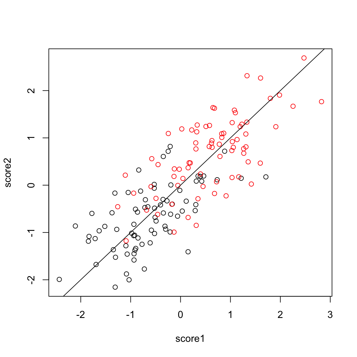
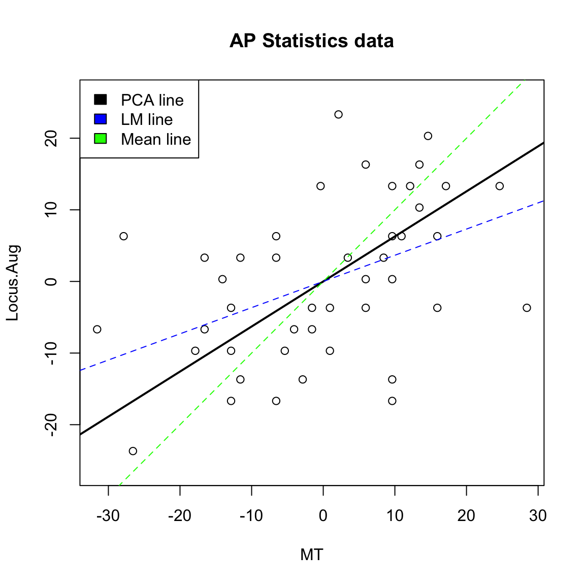
Example on real data
We will look at data on scores of students taking AP statistics. First we will draw a heatmap of the pair-wise correlation of the variables.
Not surprisingly, many of these measures are highly correlated.
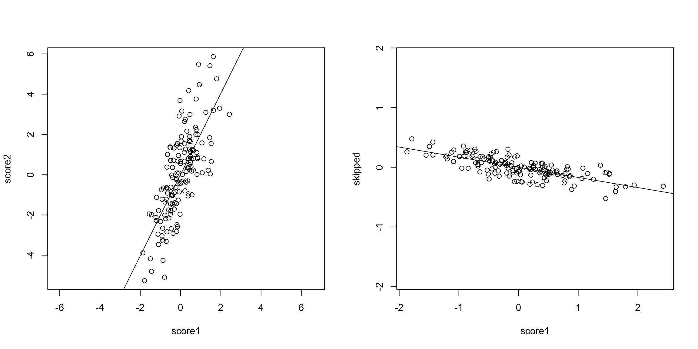
Let’s look at 2 scores, the midterm score (MT) and the pre-class evaluation (Locus.Aug) and consider how to summarize them using PCA.
5.4.2.1 More than 2 variables
We could similarly combine three measurements. Here is some simulated test scores in 3 dimensions.
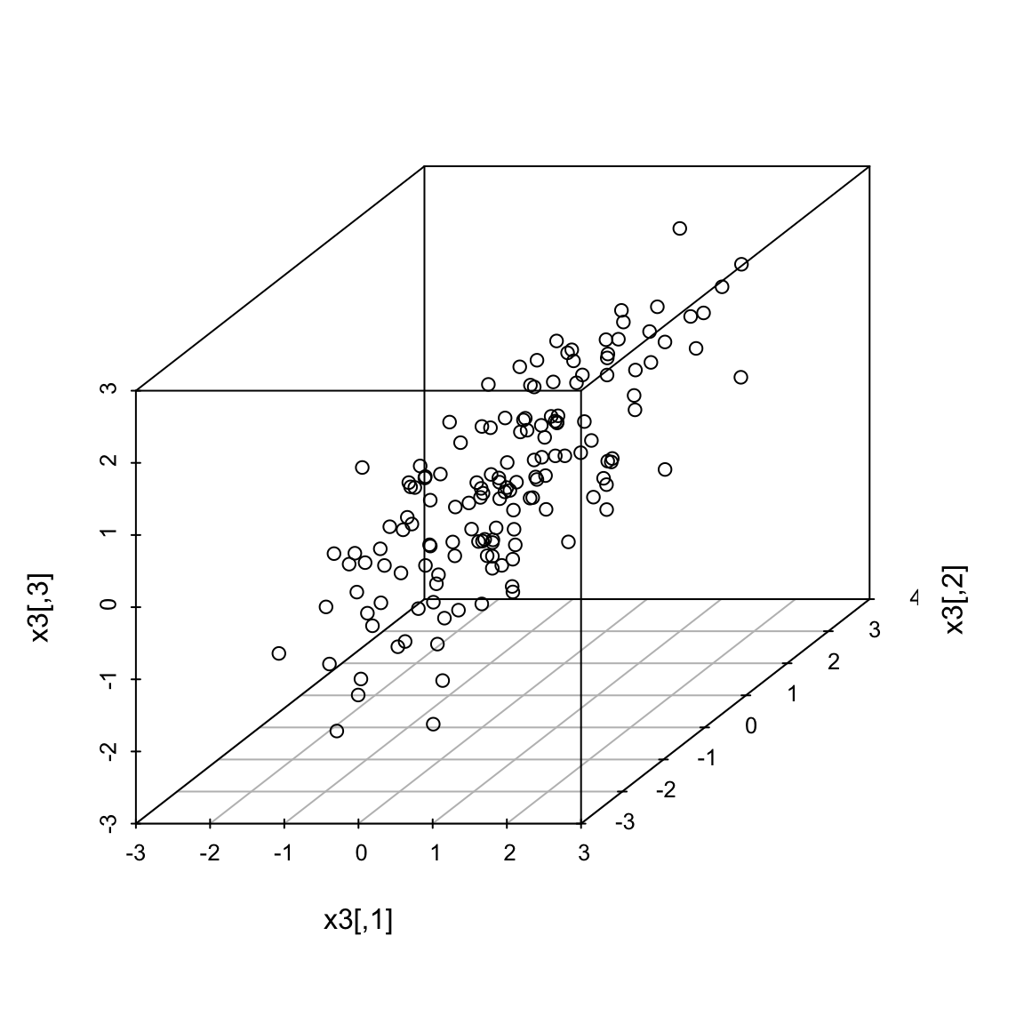
Now a good summary of our data would be a line that goes through the cloud of points. Just as in 2 dimensions, this line corresponds to a linear combination of the three variables. A line in 3 dimensions is written in it’s standard form as: \[c=b_1x_i^{(1)}+b_2 x_i^{(2)}+b_3 x_i^{(3)}\] Since again, we will center our data first, the line will be with \(c=0\).48
The exact same principles hold. Namely, that we look for the line with the smallest average distance to the line from the points. Once we find that line (drawn in the picture above), our \(z_i\) is again the distance from \(0\) of our point projected onto the line. The only difference is that now distance is in 3 dimensions, rather than 2. This is given by the Euclidean distance, that we discussed earlier.
Just like before, this is exactly equivalent to setting \(z_i= a_1x_i^{(1)}+a_2 x_i^{(2)}+a_3 x_i^{(3)}\) and searching for the \(a_i\) that maximize \(\hat{var}(z_i)\).
Many variables
We can of course expand this to as many variables as we want, but it gets hard to visualize the geometric version of it. The variance-maximizing version is easier to write out.
5.4.2.2 Adding another principal component
What if instead my three scores look like this (i.e. line closer to a plane than a line)?
I can get one line through the cloud of points, corresponding to my best linear combination of the three variables. But I might worry whether this really represented my data, since as we rotate the plot around we can see that my points appear to be closer to a lying near a plane than a single line.
For example, can you find a single line so that if you projected your data onto that line, you could separate the three groups shown?
So there’s some redundancy, in the sense that I don’t need three dimensions to geometrically represent this data, but it’s not clear that with only 1 new variable (i.e. line) we can summarize this cloud of data geometrically.
5.4.2.3 The geometric idea
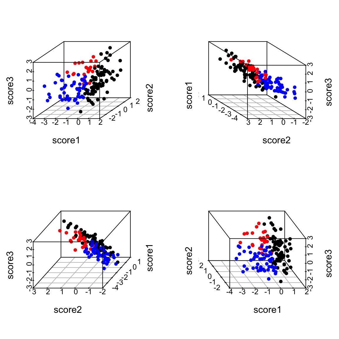
I might ask whether I could better summarize these three variables by two variables, i.e. as a plane. I can use the same geometric argument – find the best plane, so that the orthogonal projection of the points to the plane is the smallest. This is equivalent to finding two lines, rather than one, since a plane can be defined by any two lines that lie on it.
I could just search for the plane that is closest to the points, just like previously I searched for a line that is closest to the points – i.e. any two lines on the plane will do, so long as I get the right plane. But that just gives me the plane. It doesn’t give me new data points. To do that, I need coordiantes of each point projected onto the plane, like previously we projected onto the line.
I need to set up an orthogonal coordinate axis so I can define \((z_i^{(1)},z_i^{(2)})\) for each point.
Thus the new points \((z_i^{(1)},z_i^{(2)})\) represent the points after being projected on to that plane in 3d. So we can summarize the 3 dimensional cloud of points by this two dimensional cloud. This is now a summary of the 3D data. Which is nice, since it’s hard to plot in 3D. Notice, I can still see the differences between my groups, so I have preserved that important variability (unlike using just a single line):
5.4.2.4 Finding the Best Plane
I want to be smarter than just finding any coordinate system for my “best” plane – there is an infinite number of equivalent choices. So I would like the new coordinates \((z_i^{(1)},z_i^{(2)})\) to be useful in the following way: I want my first coordinate \(z_i^{(1)}\) to correspond to the coordinates I would get if I just did just 1 principal component, and then pick the next coordinates to be the orthogonal direction from the 1st principal component that also lies on the plane.49
This reduces the problem of finding the plane to 1) finding the 1st principal component, as described above, then 2) finding the “next best” direction.
So we need to consider how we find the next best direction.
Consider 2-dimensions
Let’s return to our 2-dim example to consider how we can “add” another dimension to our summary. If I have my best line, and then draw another line very similar to it, but slightly different slope, then it will have very low average distance of the points to the line. And indeed, we wouldn’t be able to find “next best” in this way, because the closest to the best line would be choosen – closer and closer until in fact it is the same as the best line.
Moreover, such a line that is close to the best doesn’t give me very different information from my best line. So I need to force “next best” to be separated and distinct from my best line. How do we do that? We make the requirement that the next best line be orthogonal from the best line – this matches our idea above that we want an orthogonal set of lines so that we set up a new coordinate axes.
In two dimensions that’s a pretty strict constraint – there’s only 1 such line! (at least that goes through the center of the points).
Return to 3 dimensions
In three dimensions, however, there are a whole space of lines to pick from that are orthogonal to the 1st PC and go through the center of the points.
Not all of these lines will be as close to the data as others lines. So there is actually a choice to be made here. We can use the same criterion as before. Of all of these lines, which minimize the distance of the points to the line? Or (equivalently) which result in a linear combination with maximum variance?
To recap: we find the first principal component based on minimizing the points’ distance to line. To find the second principal component, we similarly find the line that minimize the points’ distance to the line but only consider lines orthogonal to the the first component.
If we follow this procedure, we will get two orthogonal lines that define a plane, and this plane is the closest to the points as well (in terms of the orthogonal distance of the points to the plane). In otherwords, we found the two lines without thinking about finding the “best” plane, but in the end the plane they create will be the closest.
5.4.2.5 Projecting onto Two Principal Components
Just like before, we want to be able to not just describe the best plane, but to summarize the data. Namely, we want to project our data onto the plane. We do this again, by projecting each point to the point on the plane that has the shortest distance, namely it’s orthogonal projection.
We could describe this project point in our original coordinate space (i.e. with respect to the 3 original variables), but in fact these projected points lie on a plane and so we only need two dimensions to describe these projected points. So we want to create a new coordinate system for this plane based on the two (orthogonal) principal component directions we found.
Finding the coordiantes in 2Dim
Let’s consider the simple 2-d case again. Since we are in only 2D, our two principal component directions are equivalent to defining a new orthogonal coordinate system.
Then the new coordinates of our points we will call \((z_i^{(1)},z_i^{(2)})\). To figure out their values coordiantes of the points on this new coordinate system, we do what we did before:
- Project the points onto the first direction. The distance of the point along the first direction is \(z_i^{(1)}\)
- Project the points onto the second direction. The distance of the point along the second direction is \(z_i^{(2)}\)
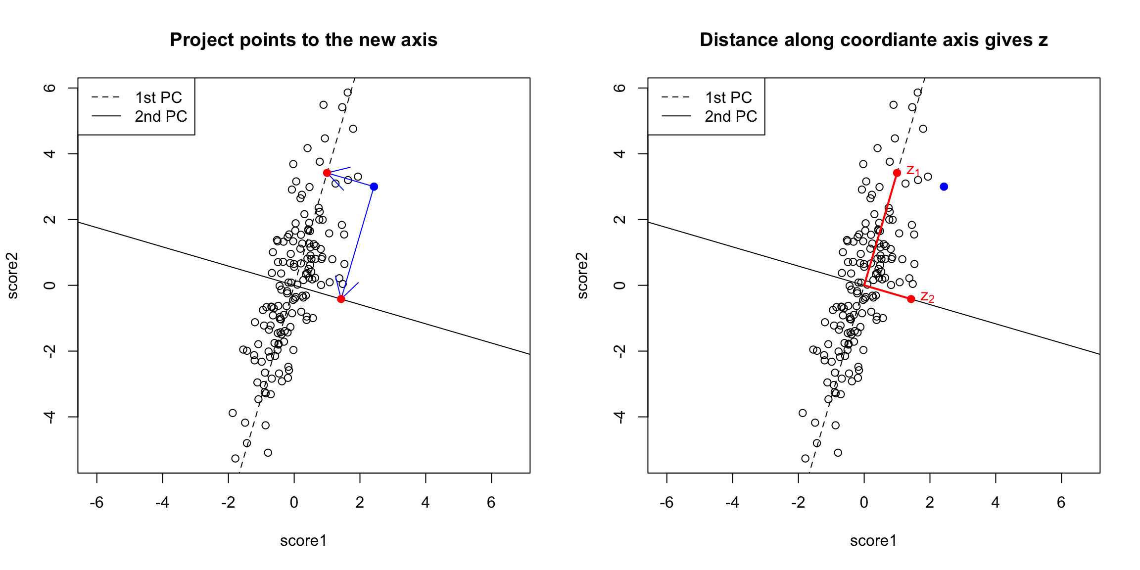
You can now consider them as new coordinates of the points. It is common to plot them as a scatter plot themselves, where now the PC1 and PC2 are the variables.
Preserving distances in 2D
In two dimensions, we completely recapture the pattern of the data with 2 principal components – we’ve just rotated the picture, but the relationship of the points to each other (i.e. their distances to each other), are exactly the same. So plotting the 2 PC variables instead of the 2 original variables doesn’t tell us anything new about our data, but we can see that the relationship of our variables to each other is quite different.
Of course this distance preserving wasn’t true if I projected only onto one principal component; the distances in the 1st PC variable are not the same as the distances in the whole dimension space.
3-dimensions and beyond
For our points in 3 dimensions, we will do the same thing: project the data points to each of our two PC directions separately, and make \(z_i^{(1)}\) and \(z_i^{(2)}\) the distance of the projection along each PC line. These values will define a set of coordinates for our points after being projected to the best plane.
But unlike our 2D example, the projection of these points to the plane don’t preserve the entire dataset, so the plot of the data based on these two coordinates is not equivalent to their position in the 3-dimensional space. We are not representing the noise around the plane (just like in 2D, where the projection of points to the line misses any noise of the points around the line). In general, if we have less principal components than the number of original variables, we will not have a perfect recapitulation of the data.
But that’s okay, because what such a plot does is summarize the 3 dimensional cloud of points by this two dimensional cloud, which captures most of the variablity of the data. Which is nice, since it’s hard to plot in 3D.
5.4.3 Interpreting PCA
5.4.3.1 Loadings
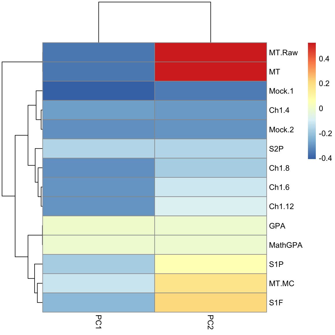
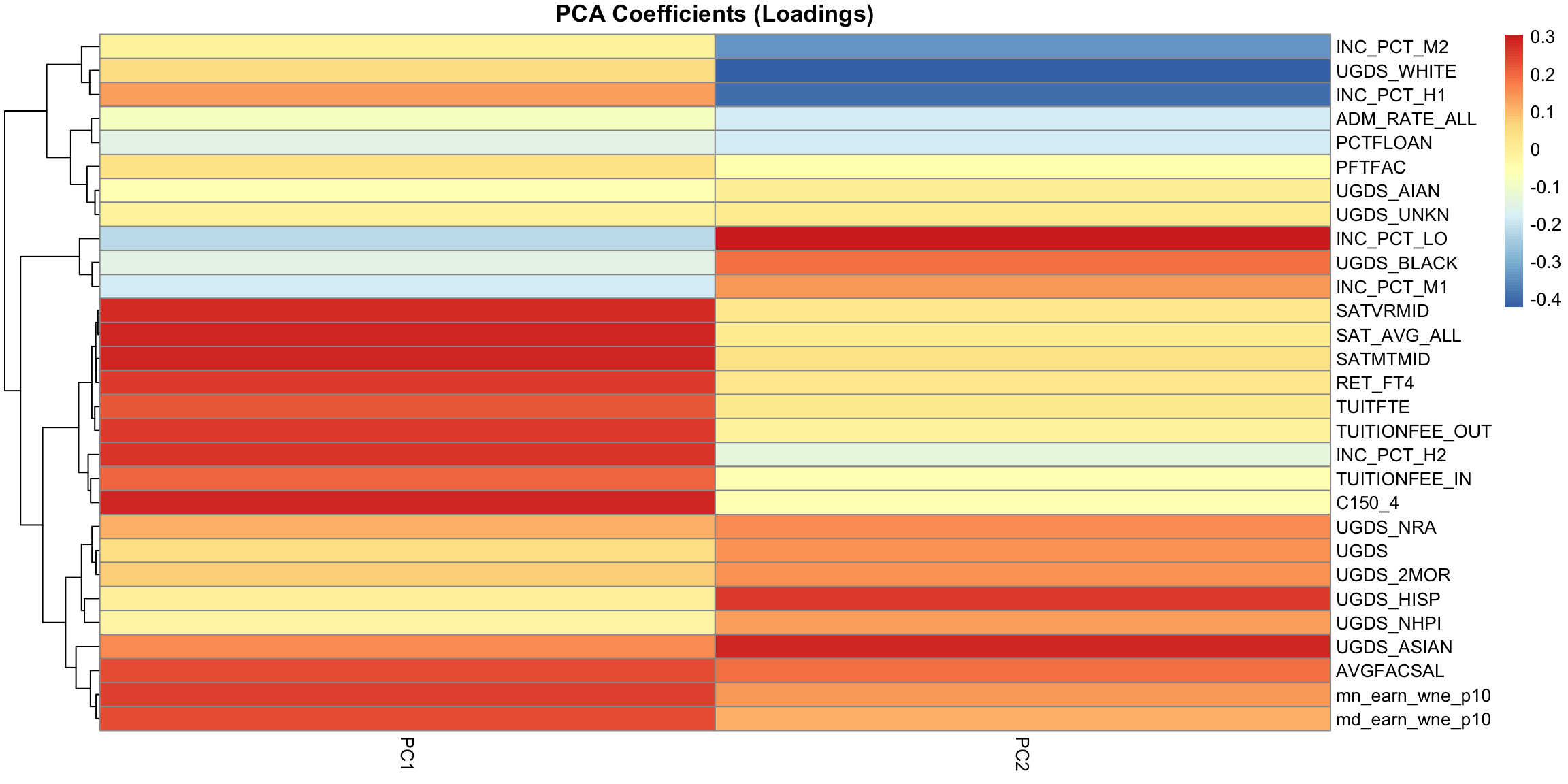
The scatterplots doen’t tell us how the original variables relate to our new variables, i.e. the coefficients \(a_j\) which tell us how much of each of the original variables we used. These \(a_j\) are sometimes called the loadings. We can go back to what their coefficients are in our linear combination
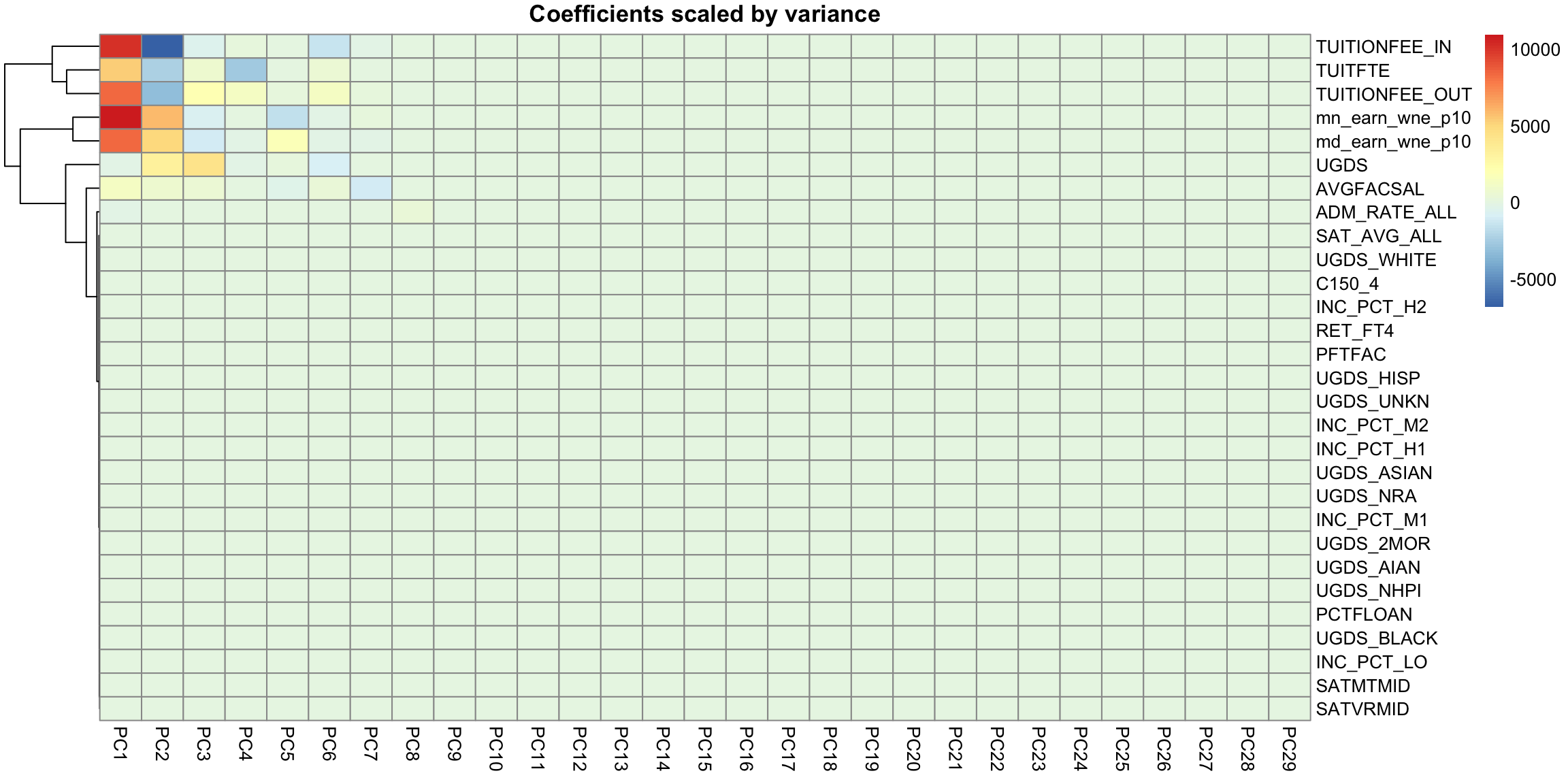
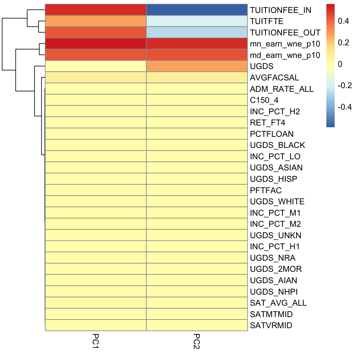 We can see that the first PC is a combination of variables related to the cost of the university (TUITFTE, TUITIONFEE_IN, TUITIONFEE_OUT are related to the tuition fees, and mn_earn_wne_p10/md_earn_wne_p10 are related to the total of amount financial aid students earn by working in aggregate across the whole school, so presumably related to cost of university); so it makes sense that in aggregate the public universities had lower PC1 scores than private in our 2-D scatter plot. Note all the coefficients in PC1 are positive, so we can think of this as roughly mean of these variables.
PC2, however, has negative values for the tuition related variables, and positive values for the financial aid earnings variables; and UGDS is the number of Undergraduate Students, which has also positive coefficients. So university with high tuition relative to the aggregate amount of financial aid they give and student size, for example, will have low PC2 values. This makes sense: PC2 is the variable that pretty cleanly divided private and public schools, with private schools having low PC2 values.
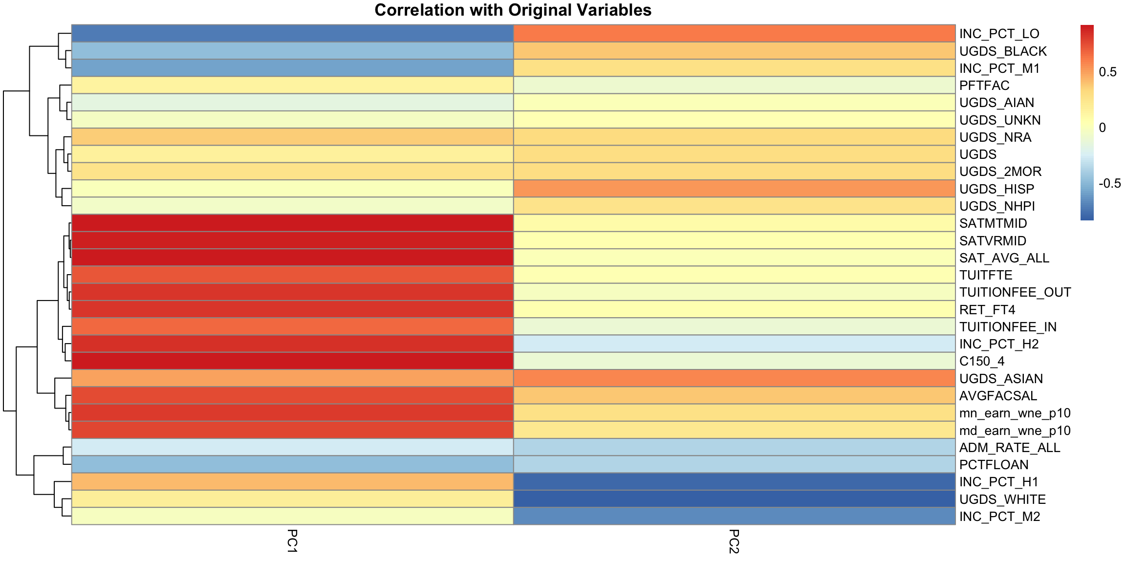
5.4.3.2 Correlations
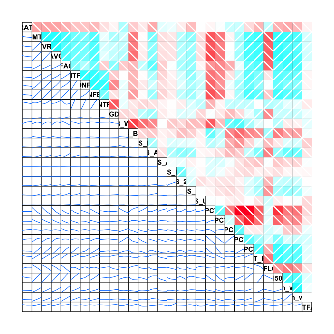
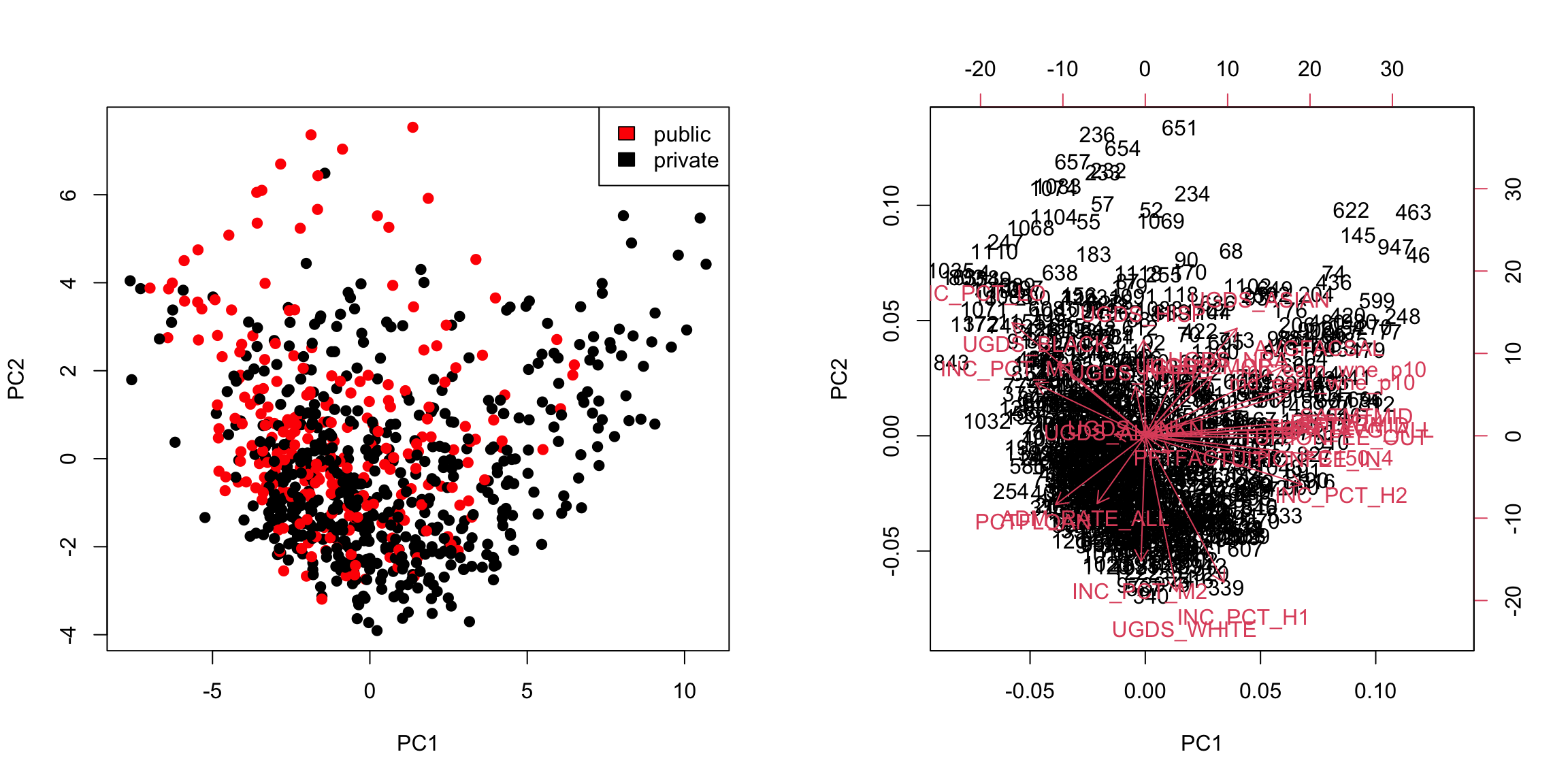
It’s often interesting to look at the correlation between the new variables and the old variables. Below, I plot the heatmap of the correlation matrix consisting of all the pair-wise correlations of the original variables with the new PCs
corPCACollege <- cor(pcaCollege$x, scale(scorecard[-whNACollege,
    -c(1:3, 12)], center = TRUE, scale = FALSE))
pheatmap(corPCACollege[1:2, ], cluster_cols = FALSE,
    col = seqPal2)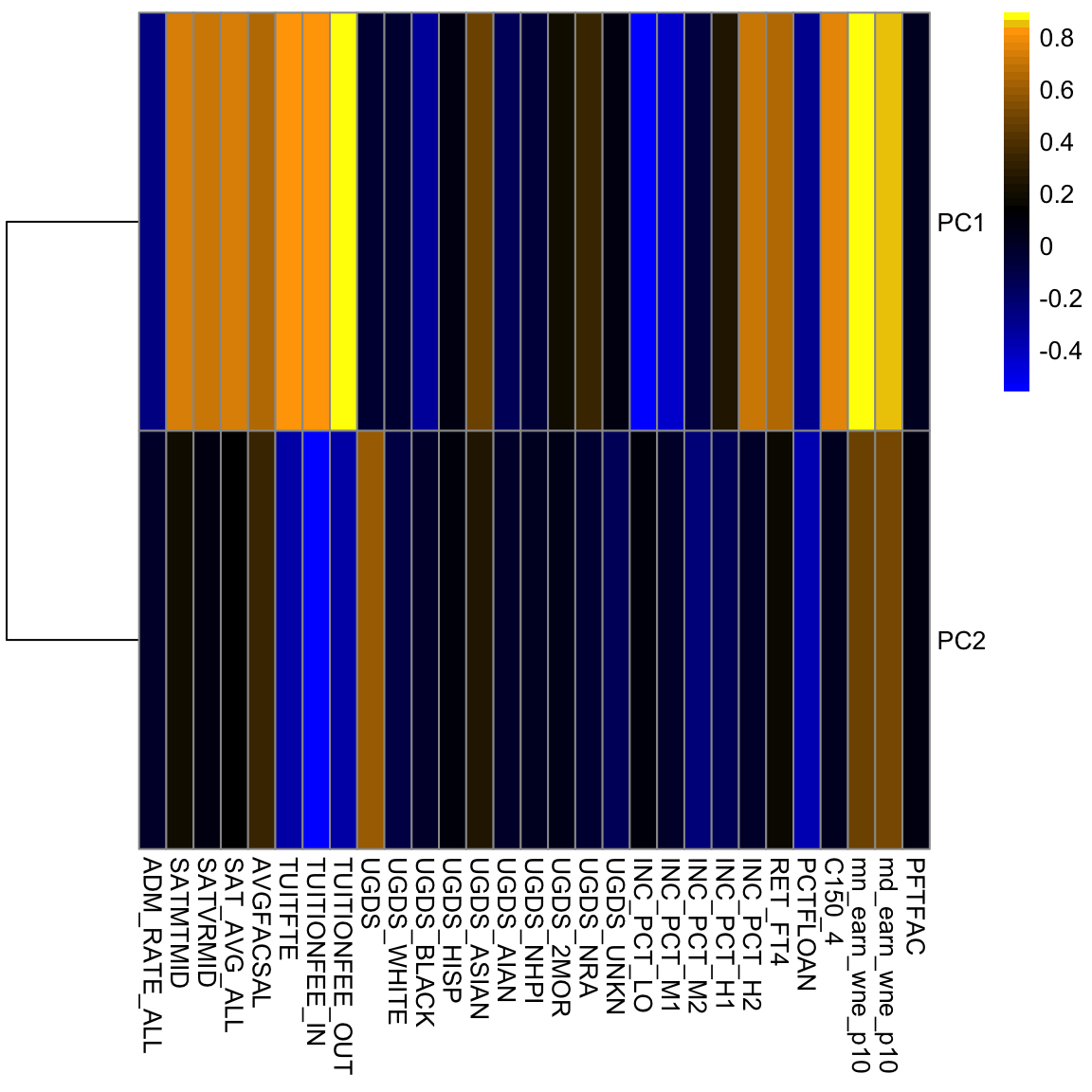
Notice this is not the same thing as which variables contributed to PC1/PC2. For example, suppose a variable was highly correlated with tuition, but wasn’t used in PC1. It would still be likely to be highly correlated with PC1. This is the case, for example, for variables like SAT scores.
5.4.3.3 Biplot
We can put information regarding the variables together in what is called a biplot. We plot the observations as points based on their value of the 2 principal components. Then we plot the original variables as vectors (i.e. arrows).
par(mfrow = c(1, 2))
plot(pcaCollege$x[, 1:2], col = c("red", "black")[scorecard$CONTROL[-whNACollege]],
asp = 1)
legend("topright", c("public", "private"), fill = c("red",
"black"))
suppressWarnings(biplot(pcaCollege, pch = 19, main = "Biplot"))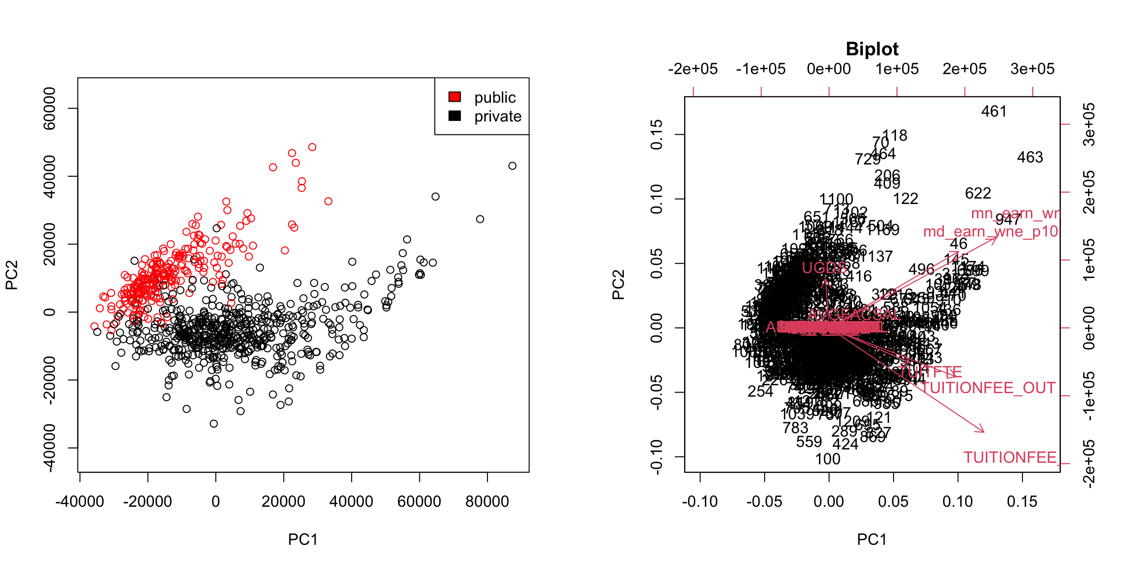 Notice that the axes values are not the same as the basic scatterplot on the left. This is because biplot is scaling the PC variables.
Interpretation of the Biplot
The arrow for a variable points in the direction that is most like that variable.50 So points that are in the direction of that vector tend to have large values of that variable, while points in the opposite direction of that vector have large negative values of that variable. Vectors that point in the same direction correspond to variables where the observations show similar patterns.
The length of the vector corresponds to how well that vector in this 2-dim plot actually represents the variable.51 So long vectors tell you that the above interpretation I gave regarding the direction of the vector is a good one, while short vectors indicate that the above interpretation is not very accurate.
If we see vectors that point in the direction of one of the axes, this means that the variable is highly correlated with the principal component in that axes. I.e. the resulting new variable \(z\) that we get from the linear combination for that principal component is highly correlated with that original variable.
So the variables around tuition fee, we see that it points in the direction of large PC1 scores meaning observations with large PC1 scores will have higher values on those variables (and they tend to be private schools). We can see that the number of undergraduates (UGDS) and the aggregate amount of financial aid go in positive directions on PC2, and tuition are on negative directions on PC2. So we can see that some of the same conclusions we got in looking at the loadings show up here.
Example: AP Scores
We can perform PCA on the full set of AP scores variables and make the same plots for the AP scores. There are many NA values if I look at all the variables, so I am going to remove Locus.Aug' (the score on the diagnostic taken at beginning of year) andAP.Ave’ (average on other AP tests) which are two variables that have many NAs, as well as removing categorical variables.
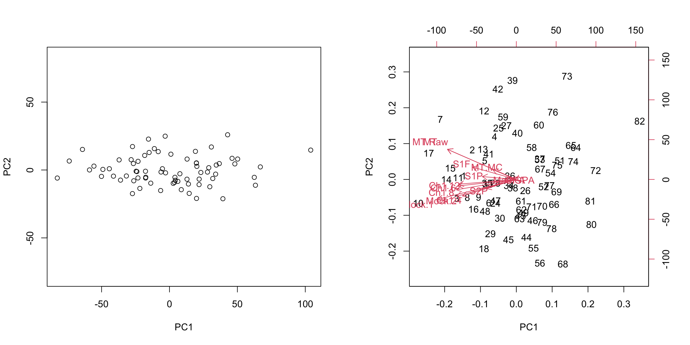
 Not surprisingly, this PCA used all the variables in this first 2 PCs and there’s no clear dominating set of variables in either the biplot or the heatmap of the loadings for the first two components. This matches the nature of the data, where all of the scores are measuring similar qualities of a student, and many are on similar scales.
5.4.3.4 Scaling
Even after centering our data, our variables are on different scales. If we want to look at the importance of variables and how to combine variables that are redundant, it is more helpful to scale each variable by its standard deviation. Otherwise, the coefficients \(a_k\) represent a lot of differences in scale of the variables, and not the redundancy in the variables. Doing so can change the PCA coordinates a lot.
There is still a slight preference for public schools to be lower on the 1st principal component, but its quite slight.
We see that many more variables contribute to the first 2 PCs after scaling them.
5.4.4 More than 2 PC coordinates
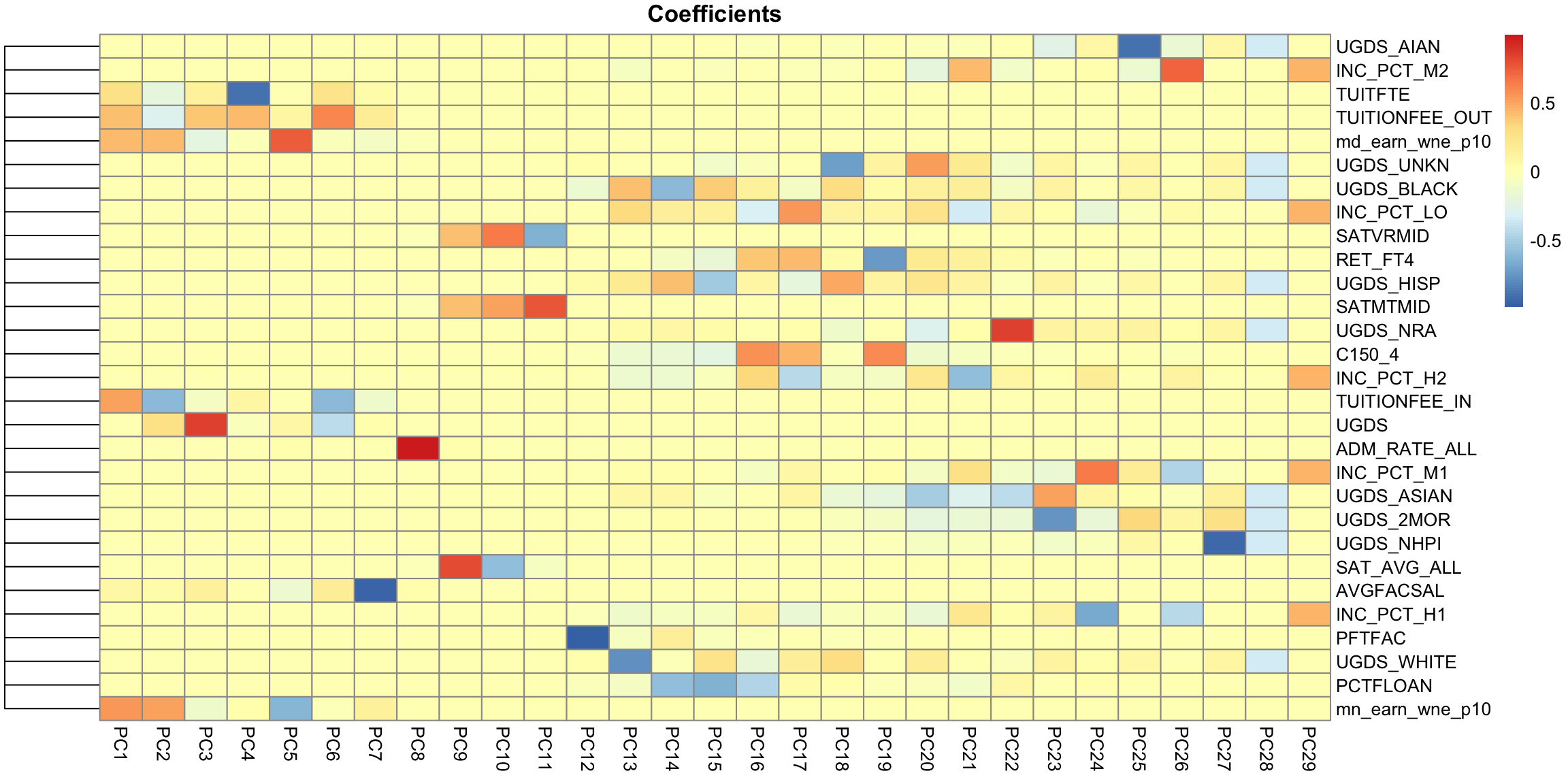
In fact, we can find more than 2 PC variables. We can continue to search for more components in the same way, i.e. the next best line, orthogonal to both of the lines that came before. The number of possible such principal components is equal to the number of variables (or the number of observations, whichever is smaller; but in all our datasets so far we have more observations than variables).
We can plot a scatter plot of the resulting third and 4th PC variables from the college data just like before.
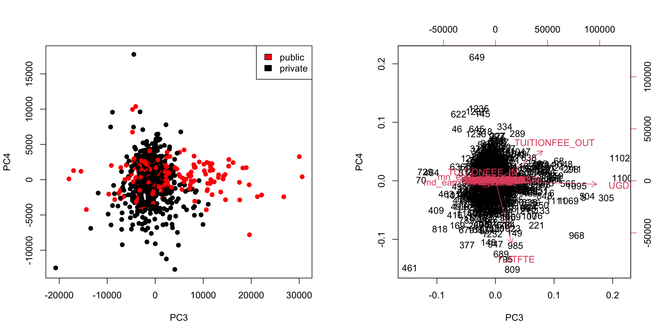
This is a very different set of coordinates for the points in 2 PCs. However, some of the same set of variables are still dominating, they are just different linear combinations of them (the two PCs lines are orthogonal to each other, but they can still just involve these variables because its such a high dimensional space).
In these higher dimensions the geometry becomes less intuitive, and it can be helpful to go back to the interpretation of linear combinations of the original variables, because it is easy to scale that up in our minds.
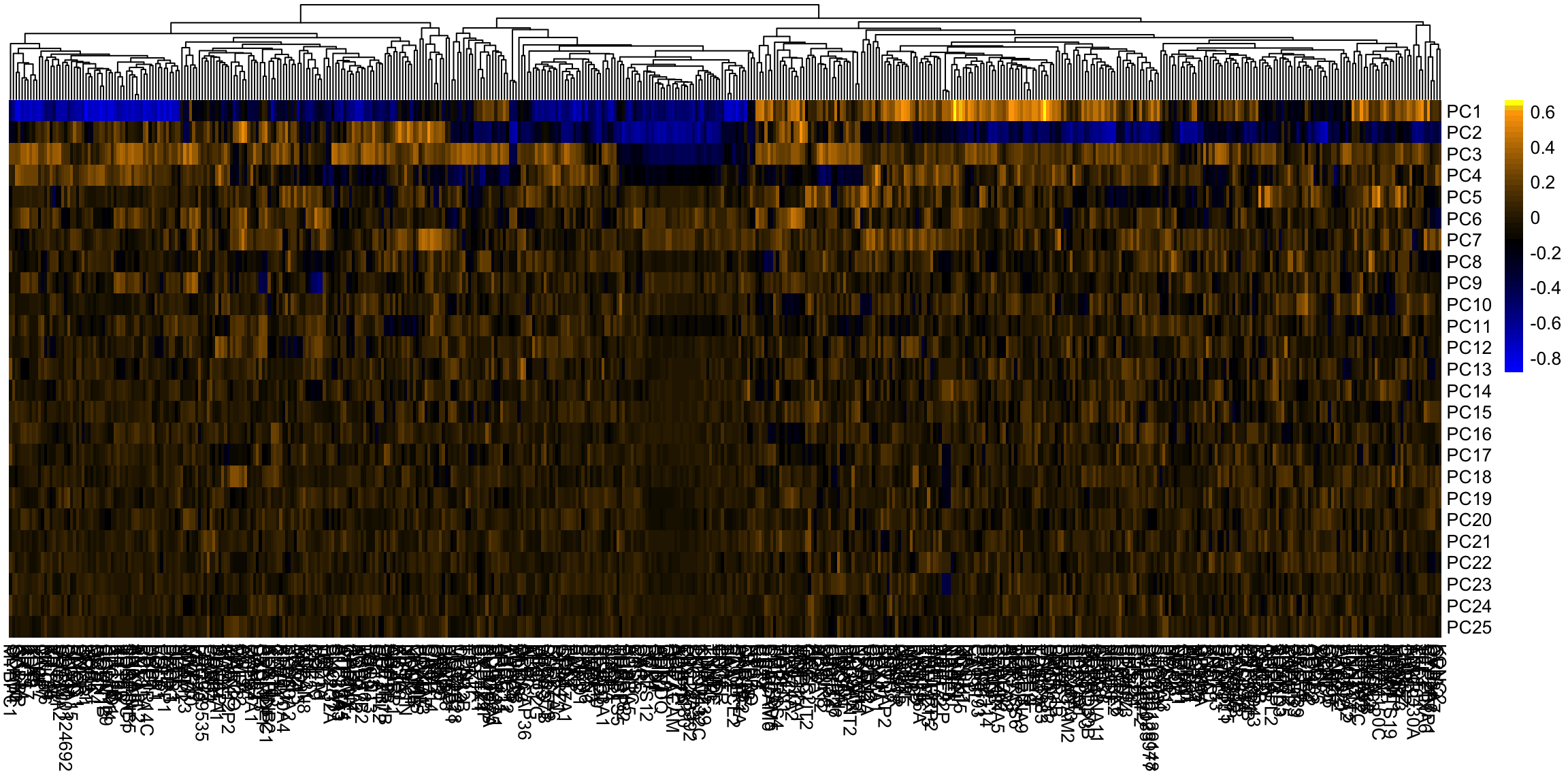
We can see this by a heatmap of all the coefficients. It’s also common to scale each set of PC coefficients by the standard deviation of the final variable \(z\) that the coefficients create. This makes later PCs not stand out so much. 52
Breast data
We can also look at the higher PCs from the breast data (with the normal samples).
If there are 500 genes and 878 observations, how many PCs are there?
We can see that there are distinct patterns in what genes/variables contribute to the final PCs (we plot only the top 25 PCs). However, it’s rather hard to see, because there are large values in later PCs that mask the pattern.
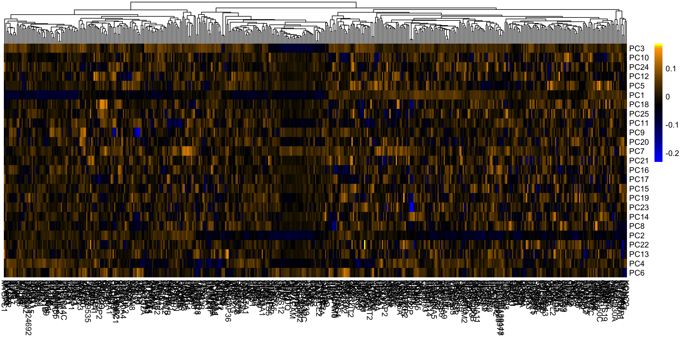
This is an example of why it is useful to scale the variables by their variance
5.4.5 How many dimensions?
If I can draw my data in 3d, then I can guess what is the right number of coordinates – not 1 but 2 in our toy example case were needed. When I have a lot of coordinates, like the college data, how can I possibly know? One technique is to look at how much variability there is in each of the coordinates – how much variance is there in the new variable created by each linear combination. If there’s not a lot of variability, then it indicates that when the points are projected onto that PC, they are huddled on top of each other, and its more likely to be noise than signal.
Consider our simple simulation example, where there was more or less a plane describing the data. If we look at the variance in each set of linear combinations we create, there is practically 0 left in the last variable, meaning that most of the representation of the points is captured in two dimensions. This is a measure of how much we are “missing” by ignoring a coordinate.
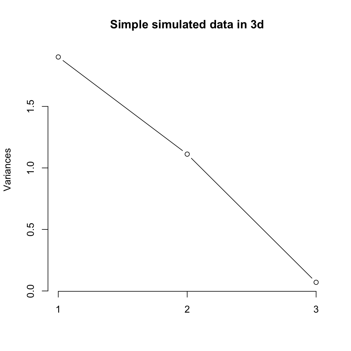
For the college data, we similarly see that the first two dimensions both have much larger amounts compared to other dimensions. The AP Statistics data is strongly in just the first dimension.
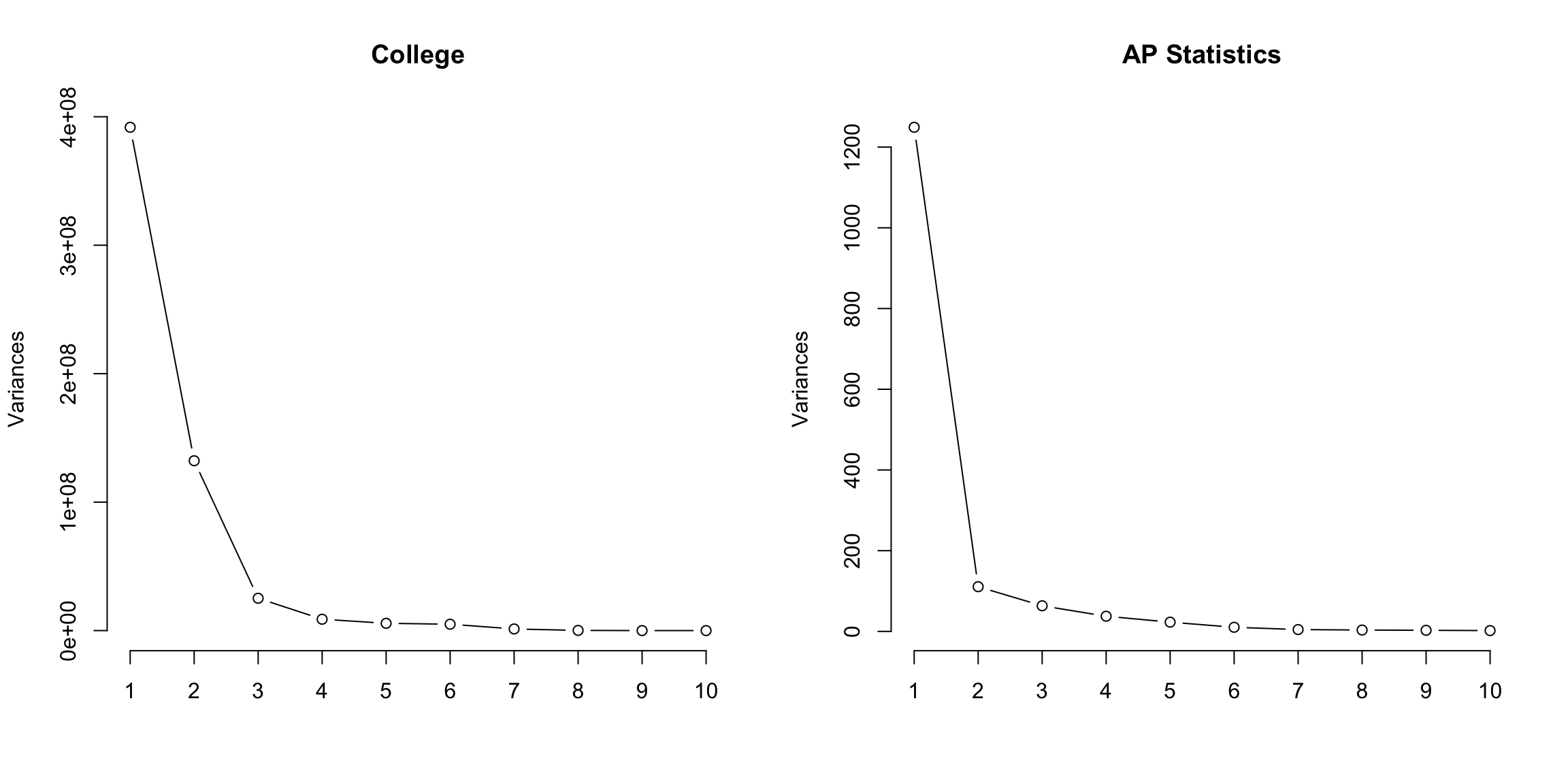
We can also plot this a percentage
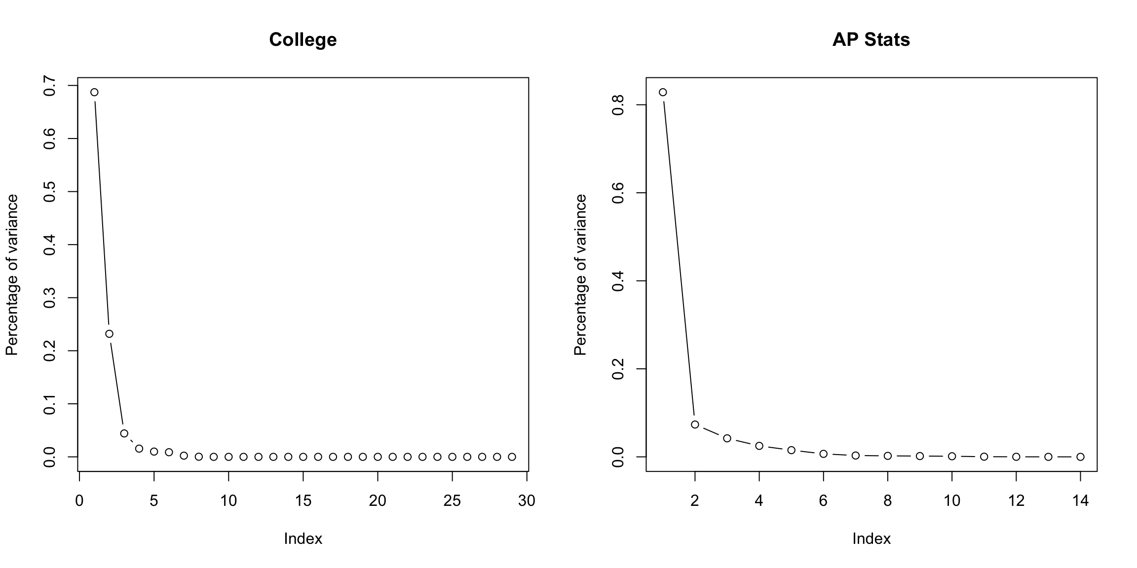
2 dimensions is not always the answer
It is just a happenstance of this data that 1-2 dimensions is summarizing the data. There is nothing magical about two dimensions, other than the fact that they are easy to plot! Looking at the top two dimensions can be misleading if there is a lot of additional variability in the other dimensions (in this case, it can be helpful to look at visualizations like pairs plots on the principal components to get an idea of what you might be missing.)
We can do a similar plot for the breast cancer data.
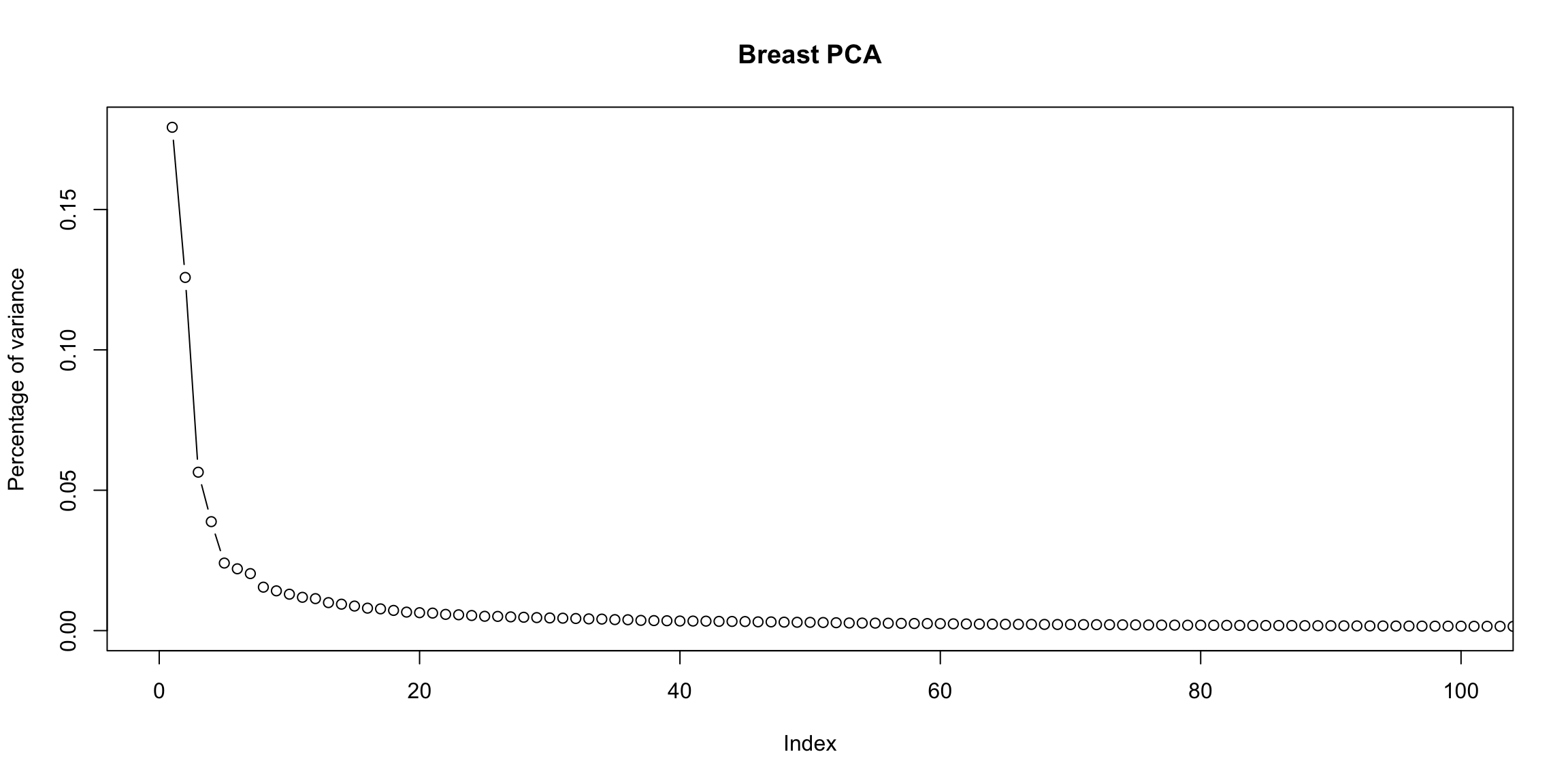
What does this tell you about the PCA?
I have also clustered the variables (columns) in this figure because otherwise it is hard to see anything, but have suppressed the drawing of the dendrogram to focus on the samples – see the next figure where we draw both.↩
This is called an agglomerative method, where you start at the bottom of the tree and build up. There are also divisive method for creating a hiearchical tree that starts at the “top” by continually dividing the samples into two group.↩
This is called complete linkage.↩
See, for example, (https://en.wikipedia.org/wiki/Distance_from_a_point_to_a_line), on Wikipedia, where they give a proof of these statements↩
From \((0,0)\), because I centered the data, so the center of the points is at \((0,0)\).↩
You can see this by using the coordinates of \(\hat{x}=(\hat{x}^{(1)},\hat{x}^{(2)})\) given above, and using the pythagorean theorem, since the points \((0,0)\), \(\hat{x}=(\hat{x}^{(1)},\hat{x}^{(2)})\), and \((x^{(1)},x^{(2)})\) form a right angled triangle. Note that it is important that our line has \(a=0\) for this calculation.↩
If the data is scaled so the two variances have the same st.deviation, then they are exactly the same up to a constant; PCA uses \(\frac{1}{\sqrt{2}}\) rather than \(\frac{1}{2}\) for the constant. But they both give equal weight to the two variables.↩
This is the standard way to write the equation for a line in higher dimensions and is symmetric in the treatment of the variables. Note the standard way you were probably taught to write a line in 2-dimensions, \(y=a+bx\) can also be written in this form with \(c=b\), \(b_1=b\), and \(b_2= -1\).↩
The first principal component direction will by definition fall on the “best” plane.↩
Specifically, if you projected the points in the biplot onto the line designated for that line, the values of the points on that line would be most correlated with the original variable.↩
Specifically the size of the correlation of the points projected onto that vector and the actual variable.↩
We haven’t discussed this, but in fact the coefficients are scaled so the sum of the square of the coefficients equal 1 (norm is one). Otherwise there’s not a unique set of coefficients, since you could always just multiply all the coefficients by a number and get larger and larger variance. So the coefficients are all on the similar scale, regardless of the original variability or importance of the PC in explaining the data.↩