Chapter 4 Curve Fitting
## Linking to ImageMagick 6.9.12.3
## Enabled features: cairo, fontconfig, freetype, heic, lcms, pango, raw, rsvg, webp
## Disabled features: fftw, ghostscript, x11
Comparing groups evaluates how a continuous variable (often called the response or independent variable) is related to a categorical variable. In our flight example, the continuous variable is the flight delay and the categorical variable is which airline carrier was responsible for the flight. We asked how did the flight delay differ from one group to the next?
However, we obviously don’t want to be constrained to just categorical variables. We want to be able to ask how a continuous variable affects another continuous variable – for example how does flight delay differ based on the time of day?
In this chapter, we will turn to relating two continuous variables. We will review the method that you’ve learned already – simple linear regression – and briefly discuss inference in this scenario. Then we will turn to expanding these ideas for more flexible curves than just a line.
4.1 Linear regression with one predictor
An example dataset
Let’s consider the following data collected by the Department of Education regarding undergraduate institutions in the 2013-14 academic year ((https://catalog.data.gov/dataset/college-scorecard)). The department of education collects a great deal of data regarding the individual colleges/universities (including for-profit schools). Let’s consider two variables, the tuition costs and the retention rate of students (percent that return after first year). We will exclude the for-profit institutes (there aren’t many in this particular data set), and focus on out-of-state tuition to make the values more comparable between private and public institutions.
dataDir <- "../finalDataSets"
scorecard <- read.csv(file.path(dataDir, "college.csv"),
    stringsAsFactors = FALSE)
scorecard <- scorecard[-which(scorecard$CONTROL ==
    3), ]
xlab = "Out-of-state tuition fee"
ylab = "Full time student retention rate"
plot(scorecard[, c("TUITIONFEE_OUT", "RET_FT4")], xlab = xlab,
    ylab = ylab)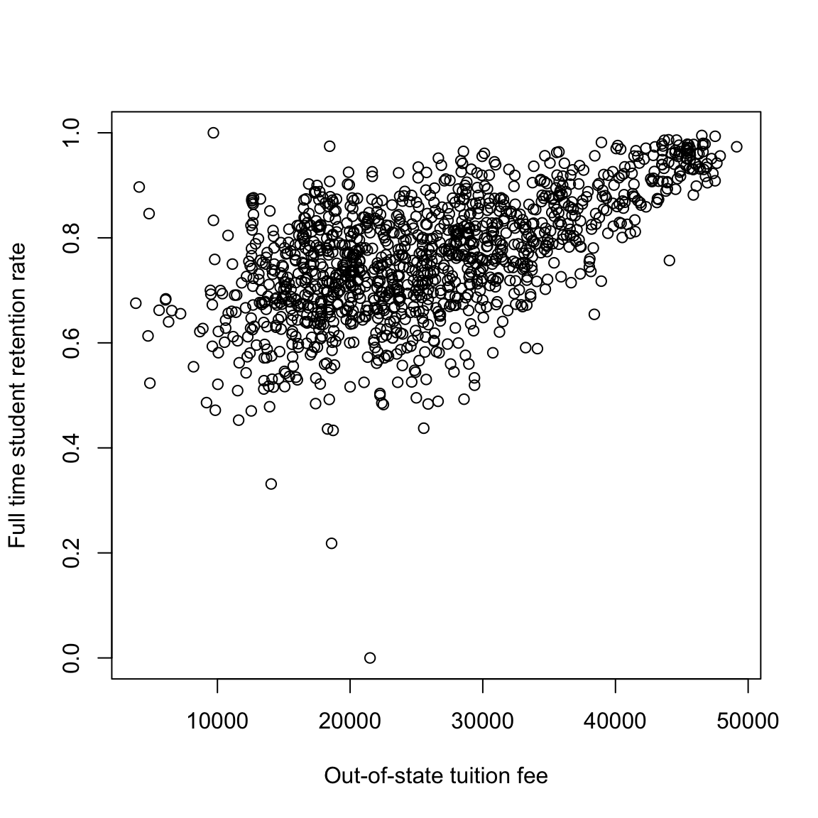
What do you observe in these relationships?
It’s not clear what’s going on with this observation with 0% of students returning after the first year, but a 0% return rate is an unlikely value for an accreditated institution and is highly likely to be an error. So for now we’ll drop that value. This is not something we want to do lightly, and points to the importance of having some understanding of the data – knowing that a priori 0% is a suspect number, for example. But just looking at the plot, it’s not particularly clear that 0% is any more “outlying” than other points; we’re basing this on our knowledge that 0% of students returning after the first year seems quite surprising. If we look at the college (Pennsylvania College of Health Sciences), a google search shows that it changed it’s name in 2013 which is a likely cause.
##         X                                  INSTNM STABBR ADM_RATE_ALL SATMTMID
## 1238 5930 Pennsylvania College of Health Sciences     PA          398      488
##      SATVRMID SAT_AVG_ALL AVGFACSAL TUITFTE TUITIONFEE_IN TUITIONFEE_OUT
## 1238      468         955      5728   13823         21502          21502
##      CONTROL UGDS UGDS_WHITE UGDS_BLACK UGDS_HISP UGDS_ASIAN UGDS_AIAN
## 1238       2 1394     0.8364     0.0445    0.0509     0.0294     7e-04
##      UGDS_NHPI UGDS_2MOR UGDS_NRA UGDS_UNKN  INC_PCT_LO  INC_PCT_M1  INC_PCT_M2
## 1238    0.0029    0.0014        0    0.0337 0.367788462 0.146634615 0.227163462
##       INC_PCT_H1  INC_PCT_H2 RET_FT4 PCTFLOAN C150_4 mn_earn_wne_p10
## 1238 0.175480769 0.082932692       0   0.6735 0.6338           53500
##      md_earn_wne_p10 PFTFAC
## 1238           53100 0.7564
scorecard <- scorecard[-which(scorecard[, "RET_FT4"] ==
0), ]
plot(scorecard[, c("TUITIONFEE_OUT", "RET_FT4")], xlab = xlab,
ylab = ylab)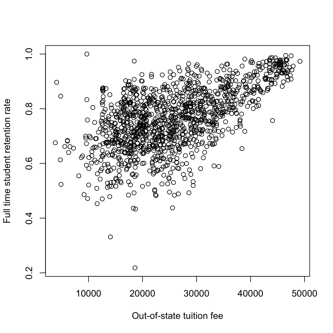
In the next plot, I do the same plot, but color the universities by whether they are private or not (red are public schools). How does that change your interpretation?
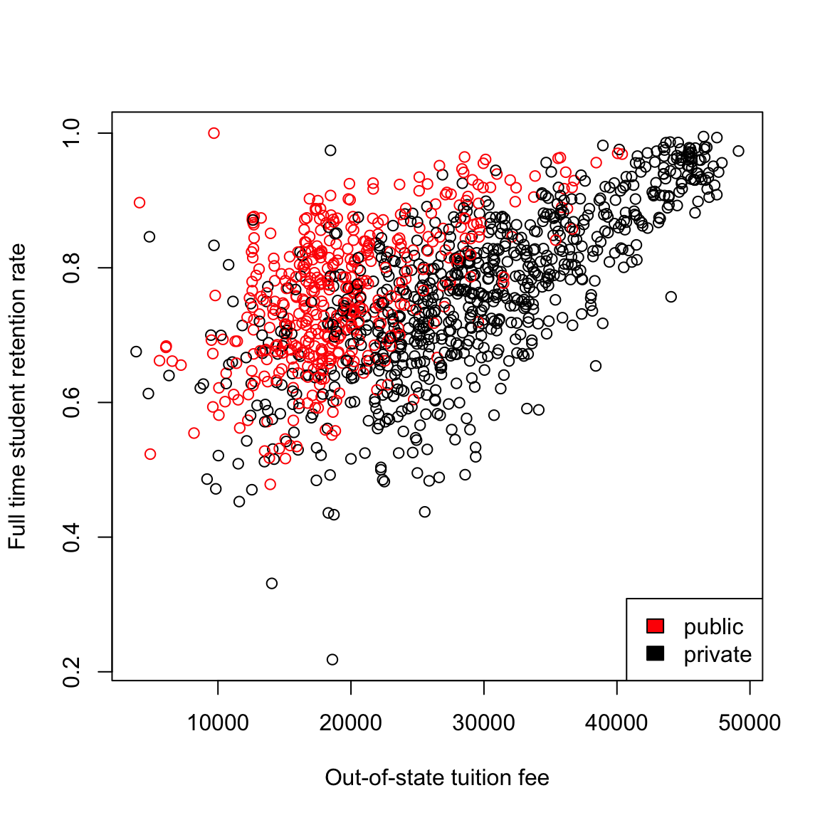
This highlights why it is very important to use more than one variable in trying to understand patterns or predict, which we will spend much more time on later in the course. But for now we are going to focus on one variable analysis, so lets make this a more valid exercise by just considering one or the other (public or private). We’ll make two different datasets for this purpose, and we’ll mainly just focus on private schools.
4.1.1 Estimating a Linear Model
These are convenient variables to consider the simplest relationship you can imagine for the two variables – a linear one: \[y = \beta_0 + \beta_1 x \] Of course, this assumes there is no noise, so instead, we often write \[y = \beta_0 + \beta_1 x + e\] where \(e\) represents some noise that gets added to the \(\beta_0 + \beta_1 x\); \(e\) explains why the data do not exactly fall on a line.33
We do not know \(\beta_0\) and \(\beta_1\). They are parameters of the model. We want to estimate them from the data.
How to estimate the line
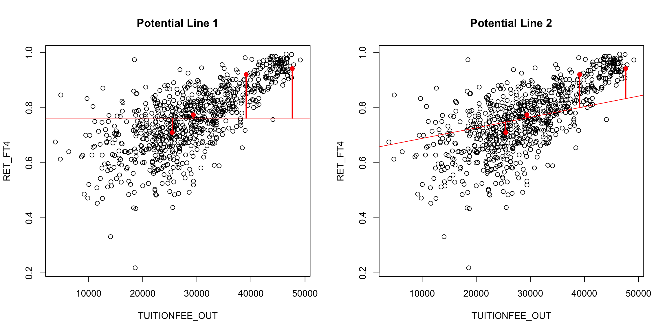
There are many possible lines, of course, even if we force them to go through the middle of the data (e.g. the mean of x,y). In the following plot, we superimpose a few “possible” lines for illustration, but any line is a potential line:
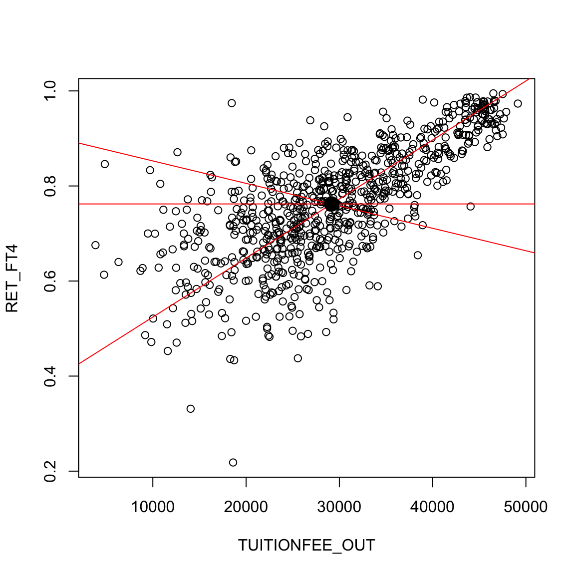
How do we decide which line is best? A reasonable choice is one that makes the smallest errors in predicting the response \(y\). For each possible \(\beta_0,\beta_1\) pair (i.e. each line), we can calculate the prediction from the line, \[\hat{y}(\beta_0,\beta_1, x)=\beta_0+\beta_1 x\] and compare it to the actual observed \(y\). Then we can say that the error in prediction for the point \((x_i,y_i)\) is given by \[y_i-\hat{y}(\beta_0,\beta_1,x_i)\]
We can imagine these errors visually on a couple of “potential” lines:
Of course, for any particular point \((x_i,y_i)\), we can choose a \(\beta_0\) and \(\beta_1\) so that \(\beta_0+\beta_1 x_i\) is exactly \(y_i\). But that would only be true for one point; we want to find a single line that seems “good” for all the points.
We need a measure of the fit of the line to all the data. We usually do this by taking the average error across all the points. This gives us a measure of the total amount of error for a possible line.
4.1.2 Choise of error (loss function)
Using our error from above (the difference of \(y_i\) and \(\hat{y}_i\)), would give us the average error of \[\frac{1}{n}\sum_{i=1}^n (y_i-\hat{y}_i)\] But notice that there’s a problem with this. Our errors are allowed to cancel out, meaning a very large positive error coupled with a very large negative error cancel each other and result in no measured error! That’s not a promising way to pick a line – we want every error to count. So we want to have a strictly positive measure of error so that errors will accumulate.
The choice of how to quantify the error (or loss) is called the loss function, \(\ell(y,\hat{y}(\beta_0,\beta_1))\). There are two common choices for this problem
- Absolute loss \[\ell(y_i,\hat{y}_i)=|y_i-\hat{y}_i(\beta_0,\beta_1)|\]
- Squared-error loss \[\ell(y_i,\hat{y}_i)=(y_i-\hat{y}_i(\beta_0,\beta_1))^2\]
Then our overall fit is given by \[\frac{1}{n}\sum_{i=1}^n \ell(y_i,\hat{y}_i(\beta_0,\beta_1))\]
4.1.3 Squared-error loss
The most commonly used loss is squared-error loss, also known as least squares regression, where our measure of overall error for any particular \(\beta_0, \beta_1\) is the average squared error, \[\frac{1}{n}\sum_{i=1}^n (y_i-\hat{y}_i(\beta_0,\beta_1))^2= \frac{1}{n}\sum_{i=1}^n (y_i-\beta_0-\beta_1x_i)^2\]
We can find the \(\beta_0\) and \(\beta_1\) that minimize the least-squared error, using the function lm in R. We call the values we find \(\hat{\beta}_0\) and \(\hat{\beta}_1\). These are estimates of the unknown \(\beta_0\) and \(\beta_1\). Below we draw the predicted line, i.e. the line we would get using the estimates \(\hat{\beta}_0\) and \(\hat{\beta}_1\):
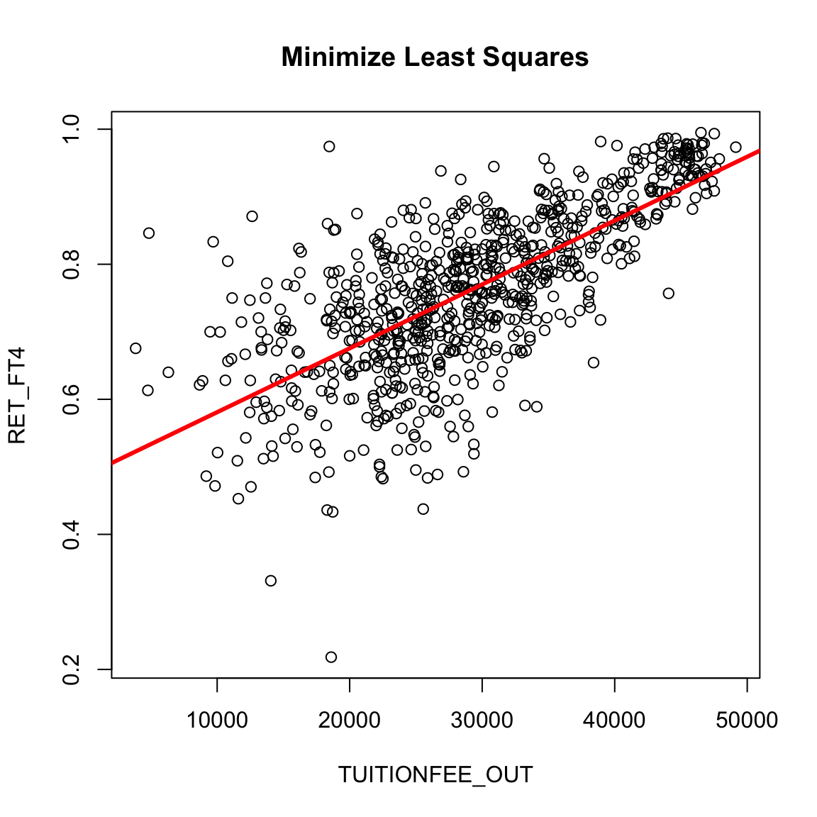
What do you notice about this line?
Calculating the least squares estimates in R
lm is the function that will find the least squares fit.
##
## Call:
## lm(formula = RET_FT4 ~ TUITIONFEE_OUT, data = private)
##
## Coefficients:
##    (Intercept)  TUITIONFEE_OUT
##      4.863e-01       9.458e-06
How do you interpret these coefficients that are printed? What do they correspond to?
How much predicted increase in do you get for an increase of $10,000 in tuition?
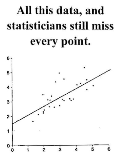
Notice, as the below graphic from the Berkeley Statistics Department jokes, the goal is not to exactly fit any particular point, and our line might not actually go through any particular point.34
The estimates of \(\beta_0\) and \(\beta_1\)
If we want, we can explicitly write down the equation for \(\hat{\beta}_1\) and \(\hat{\beta}_0\) (you don’t need to memorize these equations) \[\begin{align*} \hat{\beta}_1&=\frac{\frac{1}{n}\sum_{i=1}^n(x_i-\bar{x})(y_i-\bar{y})}{\frac{1}{n}\sum_{i=1}^n(x_i-\bar{x})^2}\\ \hat{\beta}_0&=\bar{y}-\hat{\beta}_1\bar{x} \end{align*}\]
What do you notice about the denominator of \(\hat{\beta}_1\)?
The numerator is also an average, only now it’s an average over values that involve the relationship of \(x\) and \(y\). Basically, the numerator is large if for the same observation \(i\), both \(x_i\) and \(y_i\) are far away from their means, with large positive values if they are consistently in the same direction and large negative values if they are consistently in the opposite direction from each other.
4.1.4 Absolute Errors
Least squares is quite common, particularly because it quite easily mathematically to find the solution. However, it is equally compelling to use the absolute error loss, rather than squared error, which gives us a measure of overall error as:
\[ \frac{1}{n}\sum_{i=1}^n |y_i-\hat{y}(\beta_0,\beta_1)|\]
We can’t write down the equation for the \(\hat{\beta}_0\) and \(\hat{\beta}_1\) that makes this error the smallest possible, but we can find them using the computer, which is done by the rq function in R. Here is the plot of the resulting solutions from using least-squares and absolute error loss.
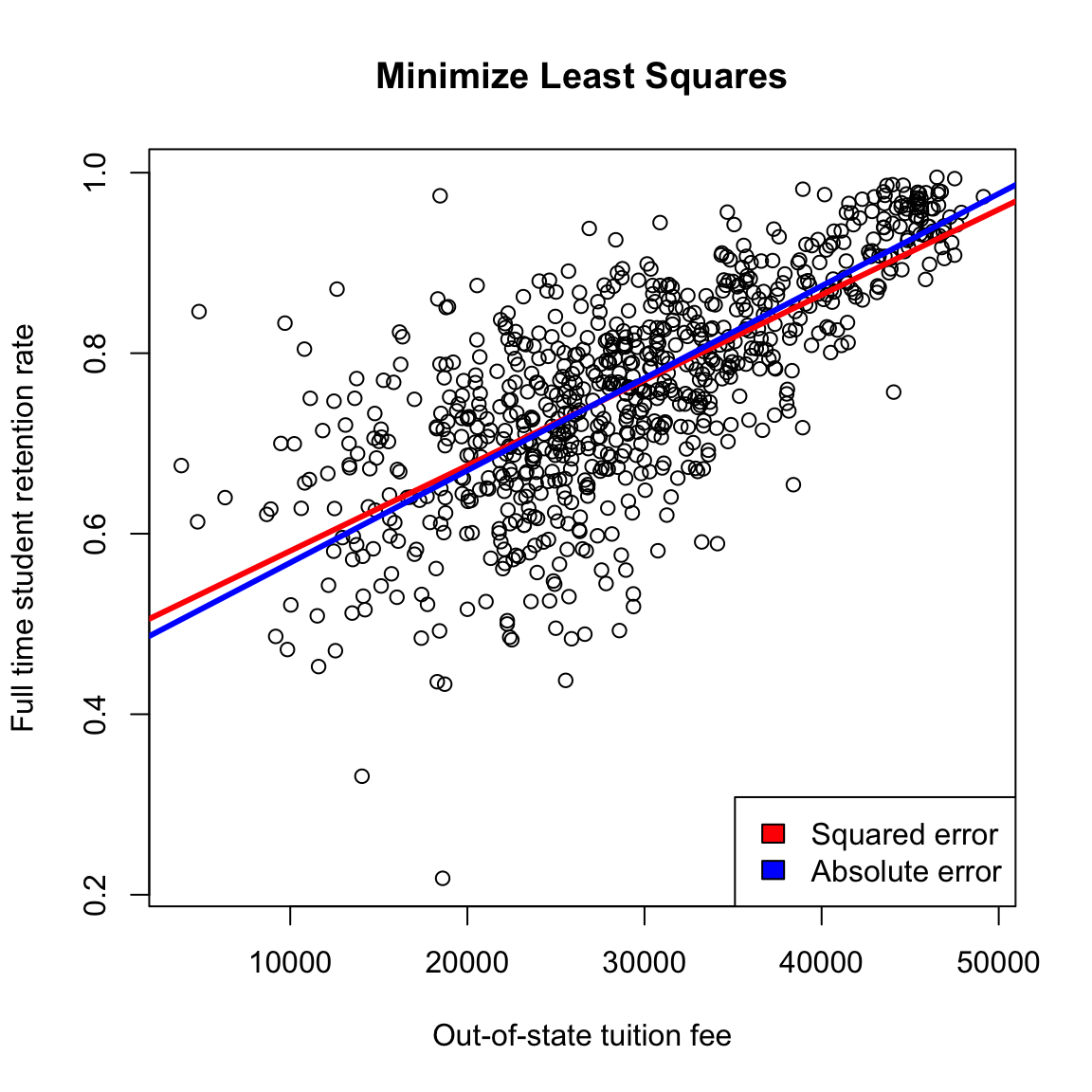
While least squares is more common for historical reasons (we can write down the solution!), using absolute error is in many ways more compelling, just like the median can be better than the mean for summarizing the distribution of a population. With squared-error, large differences become even larger, increasing the influence of outlying points, because reducing the squared error for these outlying points will significantly reduce the overall average error.
We will continue with the traditional least squares, since we are not (right now) going to spend very long on regression before moving on to other techniques for dealing with two continuous variables.
4.2 Inference for linear regression
One question of particular interest is determining whether \(\beta_1=0\).
Why is \(\beta_1\) particularly interesting? (Consider this data on college tuition – what does \(\beta_1=0\) imply)?
We can use the same strategy of inference for asking this question – hypothesis testing, p-values and confidence intervals.
As a hypothesis test, we have a null hypothesis of: \[H_0: \beta_1=0\]
We can also set up the hypothesis \[H_0: \beta_0=0\] However, this is (almost) never interesting.
Consider our data: what would it mean to have \(\beta_0=0\)?
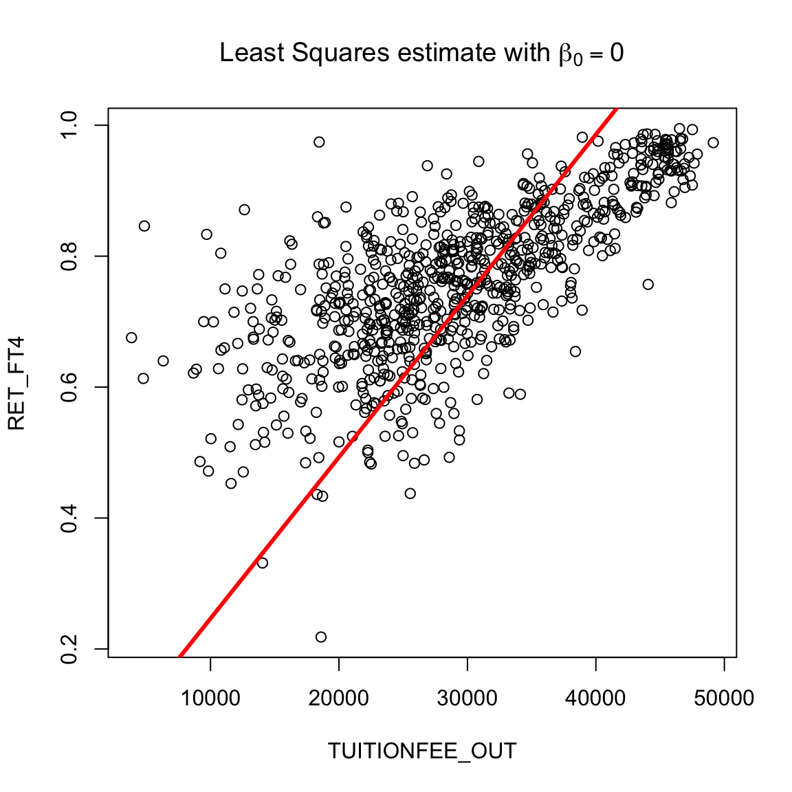
Does this mean we can just set \(\beta_0\) to be anything, and not worry about it? No, if we do not get the right intercept, our line won’t fit. Forcing the intercept to \(\beta_0=0\) will make even the “best” line a terrible fit to our data:
Rather, the point is that we just don’t usually care about interpreting that intercept. Therefore we also don’t care about doing hypothesis testing on whether \(\beta_0=0\) for most problems.
4.2.1 Bootstrap Confidence intervals
Once we get estimates \(\hat{\beta}_0\) and \(\hat{\beta}_1\), we can use the same basic idea we introduced in comparing groups to get bootstrap confidence intervals for the parameters. Previously we had two groups \(X_1,\ldots,X_{n_1}\) and the other group \(Y_1,\ldots,Y_{n_2}\) and we resampled the data within each group to get new data \(X_1^*,\ldots,X_{n_1}^*\) and \(Y_1^*,\ldots,Y_{n_2}^*\), each of the same size as the original samples. From this resampled data, we estimated our statistic \(\hat{\delta}^*\) (e.g. the difference between the averages of the two groups). We repeated this \(B\) times to get the distribution of \(\hat{\delta}^*\), which we used to create a bootstrap distribution to create confidence intervals.
We are going to do the same thing here, only now we only have one population consisting of \(N\) pairs of data \((x_i,y_i)\). We will resample \(N\) times from the data to get \[(x_1^*,y_1^*),\ldots,(x_N^*,y_N^*)\] Some pairs will show up multiple times, but notice that each pair of \(x_i\) and \(y_i\) will always be together because we sample the pairs.
To get confidence intervals, we will use this bootstrap sample to recalculate \(\hat\beta_0,\hat\beta_1\), and do this repeatedly to get the bootstrap distribution of these values.
Specifically,
- We create a bootstrap sample by sampling with replacement \(N\) times from our data \((x_1,y_1),\ldots,(x_N,y_N)\)
- This gives us a sample \((x_1^*,y_1^*),\ldots,(x_N^*,y_N^*)\) (where, remember some data points will be there multiple times)
- Run regression on \((x_1^*,y_1^*),\ldots,(x_N^*,y_N^*)\) to get \(\hat{\beta}_1^*\) and \(\hat{\beta}_0^*\)
- Repeat this \(B\) times, to get \[(\hat{\beta}_0^{(1)*},\hat{\beta}_1^{(1)*}),\ldots,(\hat{\beta}_0^{(B)*},\hat{\beta}_1^{(B)*})\]
- Calculate confidence intervals from the percentiles of these values.
I will write a small function in R that accomplishes this (you will look at this more closely in a lab):
bootstrapLM <- function(y, x, repetitions, confidence.level = 0.95) {
    stat.obs <- coef(lm(y ~ x))
    bootFun <- function() {
        sampled <- sample(1:length(y), size = length(y),
            replace = TRUE)
        coef(lm(y[sampled] ~ x[sampled]))
    }
    stat.boot <- replicate(repetitions, bootFun())
    nm <- deparse(substitute(x))
    row.names(stat.boot)[2] <- nm
    level <- 1 - confidence.level
    confidence.interval <- apply(stat.boot, 1, quantile,
        probs = c(level/2, 1 - level/2))
    return(list(confidence.interval = cbind(lower = confidence.interval[1,
        ], estimate = stat.obs, upper = confidence.interval[2,
        ]), bootStats = stat.boot))
}
We’ll now run this on the private data
privateBoot <- with(private, bootstrapLM(y = RET_FT4,
    x = TUITIONFEE_OUT, repetitions = 10000))
privateBoot$conf
## lower estimate upper
## (Intercept) 4.628622e-01 4.863443e-01 5.094172e-01
## TUITIONFEE_OUT 8.766951e-06 9.458235e-06 1.014341e-05How do we interpret these confidence intervals? What do they tell us about the problem?
Again, these slopes are very small, because we are giving the change for each $1 change in tuition. If we multiply by 10,000, this number will be more interpretable:
##      lower   estimate      upper
## 0.08766951 0.09458235 0.10143414
Note that these confidence intervals means that there are a variety of different lines that are possible under these confidence intervals. For example, we can draw some lines that correspond to different combinations of these confidence interval limits.
plot(private[, c("TUITIONFEE_OUT", "RET_FT4")], col = "black")
abline(a = privateBoot$conf[1, 1], b = privateBoot$conf[2,
    1], col = "red", lwd = 3)
abline(a = privateBoot$conf[1, 3], b = privateBoot$conf[2,
    3], col = "blue", lwd = 3)
abline(a = privateBoot$conf[1, 1], b = privateBoot$conf[2,
    3], col = "green", lwd = 3)
abline(a = privateBoot$conf[1, 3], b = privateBoot$conf[2,
    1], col = "yellow", lwd = 3)
abline(lmPrivate, lwd = 3)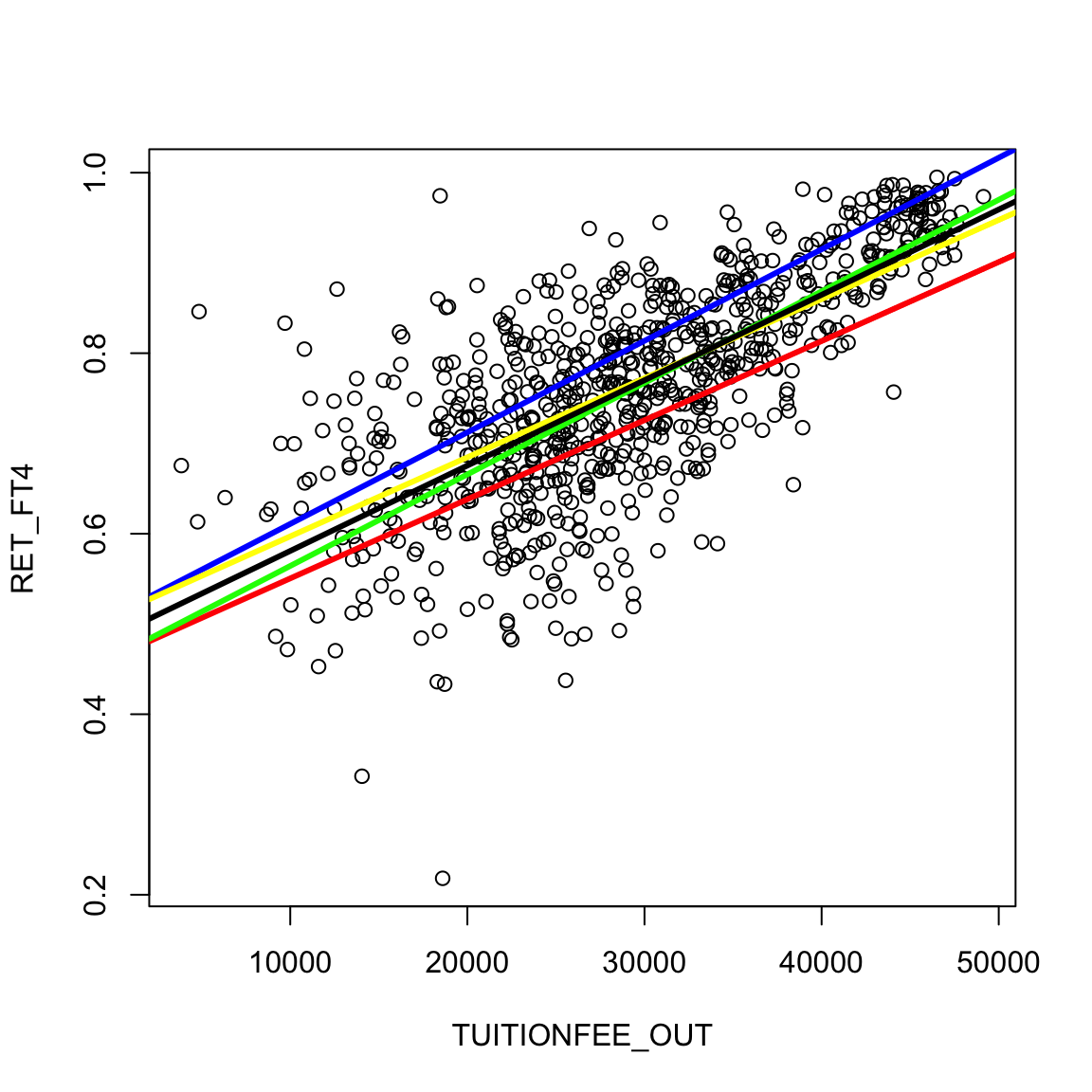
However, this is not really quite the right way to think about these two confidence intervals. If we look at these two separate confidence intervals and try to put them together, then we would think that anything covered jointly by the confidence intervals is likely. But that is not quite true. Our confidence in where the true line is located actually is narrower than what is shown, because some of the combinations of values of the two confidence intervals don’t actually ever get seen together. This is because these two statistics \(\hat\beta_0\) and \(\hat\beta_1\) aren’t independent from each other. Separate confidence intervals for the two values don’t give you that additional information.35
How does this relate to our bootstrap for two groups?
Let’s review our previous bootstrap method we used to compare groups, but restating the setup using a notation that matches our regression. In the previous chapter, we had a measurement of a continuous value (like flight delay) which we divided into two groups based on another characteristic (like airline). Previously we kept track of this by letting one group be \(X_1,\ldots,X_{n_1}\) and the other group \(Y_1,\ldots,Y_{n_2}\).
Let’s introduce a different notation. Let \(y\) be our continuous measurement, flight delay, for all our data. To keep track of which of these observations were in which group, we can instead create another variable \(x\) that gives an observation’s airline. This can equivalently store all our information (and indeed matches more closely with how you might record the data in a spreadsheet, with one column for the measurement and another column for the airline).
This means \(x\) is not continuous – it can only take 10 values corresponding to the 10 different airlines. This is not the same as the linear regression case we consider in this chapter, where \(x\) is continuous, but it gives us a similar notation to write the two problems, because now each observation in the flight data consisted of the pairs \[(x_i,y_i)\] This is similar to our regression case, only with our regression example \(x_i\) is now continuous.
In our previous notation, when we did the bootstrap, we described this as resampling values from each of our group \(X_1,\ldots,X_{n_1}\) and \(Y_1,\ldots,Y_{n_2}\), so that we created a new dataset \(X_1^*,\ldots,X_{n_1}^*\) and \(Y_1^*,\ldots,Y_{n_2}^*\) each of the same size as the original distribution.
We can see that the bootstrap we introduced here would resample \(N=n_1+n_2\) samples from the pairs of \((x_i,y_i)\), i.e. the union of the two groups. So if we applied the bootstrap strategy from this chapter to the two groups, this is a slight variation from the method in chapter 3. In particular, notice that the pair-resampling will not result in the two groups having \(n_1\) and \(n_2\) observations – it will be a random number in each group usually close to \(n_1\) and \(n_2\).
Both strategies are valid for comparing two groups, and there are arguments for both. Generally unless you have small sample sizes it will not create very large differences. The strategy in this chapter is more general – it can generalize to arbitrary numbers of variables as we will see in future chapters.
4.2.2 Parametric Models
Just as in the two-group setting, we can also consider a parametric model for creating confidence intervals. For linear regression, this is a widely-used strategy and its important to be familiar with it. Indeed, if we look at the summary of the lm function that does linear regression in R, we see a lot of information beyond just the estimates of the coefficients:
##
## Call:
## lm(formula = RET_FT4 ~ TUITIONFEE_OUT, data = private)
##
## Residuals:
##      Min       1Q   Median       3Q      Max
## -0.44411 -0.04531  0.00525  0.05413  0.31388
##
## Coefficients:
##                 Estimate Std. Error t value Pr(>|t|)
## (Intercept)    4.863e-01  1.020e-02   47.66   <2e-16 ***
## TUITIONFEE_OUT 9.458e-06  3.339e-07   28.32   <2e-16 ***
## ---
## Signif. codes:  0 '***' 0.001 '**' 0.01 '*' 0.05 '.' 0.1 ' ' 1
##
## Residual standard error: 0.08538 on 783 degrees of freedom
## Multiple R-squared:  0.5061, Adjusted R-squared:  0.5055
## F-statistic: 802.3 on 1 and 783 DF,  p-value: < 2.2e-16
We see that it automatically spits out a table of estimated values and p-values along with a lot of other stuff.
Why are there 2 p-values? What would be the logical null hypotheses that these p-values correspond to?
This output is exceedingly common – all statistical software programs do this – and these are based on a standard parametric model. This is a really ubiquitous model in data science, so its important to understand it well (and we will come back to it in multiple regression later in the semester).
Parametric Model for the data:
lm uses a standard parametric model to get the distributions of our statistics \(\hat{\beta}_0\) and \(\hat{\beta}_1\).
Recall that in fitting our line, we have already assumed a linear model: \[y = \beta_0 + \beta_1 x + e.\] This is a parametric model, in the sense that we assume there are unknown parameters \(\beta_0\) and \(\beta_1\) that describe how our data \(y\) was created.
In order to do inference (i.e. p-values and confidence intervals) we need to further assume a probability distribution for the errors \(e\). Otherwise, there’s nothing random about \(y\). Specifically, we assume
- \(e\sim N(0,\sigma^2)\), i..e normal with the same (unknown) variance \(\sigma^2\).
- The unknown errors \(e_1,\ldots,e_n\) are all independent from each other
Notice, this probability model for \(e\) implies a probability model for \(y\). For a given \(x_i\), each \(y_i\) is just a normal (\(e_i\)) with a (unknown) constant added to it (\(\beta_0+\beta_1 x_i\)). So \(y_i\) is normally distributed, with \[y_i | x_i \sim N(\beta_0+\beta_1 x_i,\sigma^2)\]
However, even though the errors \(e_i\) are assumed \(i.i.d\) the \(y_i\) are not i.i.d, why?
This assumption regarding the probability distribution of the errors allows us to know the distribution of the \(\hat{\beta}_1\) (recall \(\beta_1\) is a fixed constant, \(\hat{\beta}_1\) is an estimate based on random data, so it is a random variable and has a distribution).
We won’t show the derivation of its distribution, but since each \(y_i\) is normally distributed, \(\hat{\beta}_1\) is as well.36 \[\hat{\beta}_1 \sim N(\beta_1, \nu^2_1)\] where \[\nu^2_1=var(\hat{\beta}_1)= \frac{\sigma^2}{\sum_{i=1}^n(x_i-\bar{x})^2}\] In what follows, just try to follow the logic, you don’t need to memorize these equations or understand how to derive them.
Notice the similarities in the broad outline to the parametric t-test for two-groups. We have an statistic, \(\hat{\beta}_1\), and the assumptions of the parametric model gives us that the distribution of \(\hat{\beta}_1\) is normal with a variance that depends on the (unknown) \(\sigma^2\), i.e. the true variance in our individual data observations.
Estimating \(\sigma^2\)
Of course, we have the same problem as the t-test – we don’t know \(\sigma^2\)! But like the t-test, we can estimate \(\sigma^2\) and get an estimate of the variance of \(\hat\beta_1\) (we’ll talk more about how we estimate \(\hat{\sigma}\) in a moment) \[\hat{\nu}_1^2=\hat{var}(\hat{\beta_1})= \frac{\hat{\sigma}^2}{\sum_{i=1}^n(x_i-\bar{x})^2}\]
Hypothesis Testing
Using this knowledge, we can use the same idea as the t-test for two-groups, and create a similar test statistic for \(\hat{\beta}_1\) that standardizes \(\hat{\beta}_1\)37
\[T_1=\frac{\hat{\beta_1}}{\sqrt{\hat{var}(\hat{\beta_1})}}\]
Just like the t-test, \(T_1\) should be normally distributed38
This is exactly what lm gives us:
##
## Call:
## lm(formula = RET_FT4 ~ TUITIONFEE_OUT, data = private)
##
## Residuals:
##      Min       1Q   Median       3Q      Max
## -0.44411 -0.04531  0.00525  0.05413  0.31388
##
## Coefficients:
##                 Estimate Std. Error t value Pr(>|t|)
## (Intercept)    4.863e-01  1.020e-02   47.66   <2e-16 ***
## TUITIONFEE_OUT 9.458e-06  3.339e-07   28.32   <2e-16 ***
## ---
## Signif. codes:  0 '***' 0.001 '**' 0.01 '*' 0.05 '.' 0.1 ' ' 1
##
## Residual standard error: 0.08538 on 783 degrees of freedom
## Multiple R-squared:  0.5061, Adjusted R-squared:  0.5055
## F-statistic: 802.3 on 1 and 783 DF,  p-value: < 2.2e-16
Confidence intervals
We can also create parametric confidence intervals for \(\hat{\beta}_1\) in the same way we did for the difference in two groups: \[\hat{\beta}_1 \pm 1.96\hat{\nu}_1 \]
##                       2.5 %       97.5 %
## (Intercept)    4.663136e-01 5.063750e-01
## TUITIONFEE_OUT 8.802757e-06 1.011371e-05
How do we estimate \(\sigma^2\)? Recall that \(\sigma^2\) is the variance of the error distribution. We don’t know the true errors \(e_i\), but if we did, we know they are i.i.d and so a good estimate of \(\sigma^2\) would be the sample variance of the true errors: \[\frac{1}{n-1}\sum (e_i - \bar{e})^2\] However, these true errors are unknown.
If we knew the true \(\beta_0\) and \(\beta_1\) we could calculate the true \(e_i\), how?
Thus with the true coefficients, we could calculate \(e_i\) and therefore use the above equation to estimate \(\sigma^2\) from the data. But the coefficents \(\beta_0,\beta_1\) are also unknown, so this isn’t possible. Yet, this above thought-experiment does give us an idea for how we could estimate \(\sigma^2\). Specifically, though we don’t know \(\beta_0\) or \(\beta_1\), we have estimates of \(\beta_0\) and \(\beta_1\). Namely, we can calculate the error of our data from the estimated line, \[r_i = y_i - (\hat{\beta}_0+\hat{\beta}_1 x_i)\] The \(r_i\) are called the residuals. They are often called the errors, but they are not the actual (true) error, however (\(r_i\neq e_i\)). They are the error from the estimated line, and as a group think of them as estimates of the true error.
Using the residuals, we can take the sample variance of the residuals as a good first estimate of \(\sigma^2\), \[\frac{1}{n-1}\sum (r_i - \bar{r})^2\]
Mean of residuals, \(\bar{r}\)
In fact, it is an algebraic fact that \(\bar{r}=0\). So we can rewrite the above equation as
\[\frac{1}{n-1}\sum r_i^2\]
Be careful! Just because you “discover” in your data that \(\bar{r}=0\), this is NOT a sign your line is a good fit to the data. It is just a mathematical fact due to the way we estimated our coefficients and is always true for residuals from a least squared regression – even when the line is a lousy fit to the data.
Better estimate of \(\sigma\)
For regression, a better estimate is to divide by \(n-2\) rather than \(n-1\). Doing so makes our estimate unbiased, meaning that the average value of \(\hat{\sigma}^2\) over many repeated samples will be \(\sigma\). This is the same reason we divide by \(n-1\) in estimating the sample variance rather than \(1/n\) for the estimate of the variance of a single population.
These two facts gives us our final estimate: \[\hat{\sigma}^2=\frac{1}{n-2}\sum_i r_i^2.\]
The residuals \(r_i\) are not always great estimates of \(e_i\) (for example, they aren’t independent, they don’t have the same variance, etc). But, despite that, it turns out that \(\hat{\sigma}^2\) is a very good, reliable estimate of \(\sigma^2\), including if our assumptions about the errors being normally is wrong.
4.2.3 Assumptions
Like the t-test, the bootstrap gives a more robust method than the parametric linear model for creating confidence intervals.
The parametric linear model makes the following assumptions:
- Errors \(e_i\) are independent
- Errors \(e_i\) are i.i.d, meaning they have the same variance
- Errors are normally distributed
The bootstrap makes the same kind of assumptions as in the two group comparisons:
- The i.i.d resampling of the bootstrapped data mirrors how the actual data was generated (i.e. the actual data is i.i.d)
- The sample size is large enough that the sample distribution is close to the real distribution.
- The test statistic is well behaved (e.g. unbiased) – this is true for regression
Notice, that both methods assume the data points are independent. This is the most critical assumption for both methods. Both implicitly assume that all of the observations have the same variance (that’s part of being i.i.d). The parametric method makes the further assumption of normality of the errors (like the t-test).
In practice, we do not see much difference in these two methods for our data:
##             lower     estimate        upper
## [1,] 8.802757e-06 9.458235e-06 1.011371e-05
## [2,] 8.766951e-06 9.458235e-06 1.014341e-05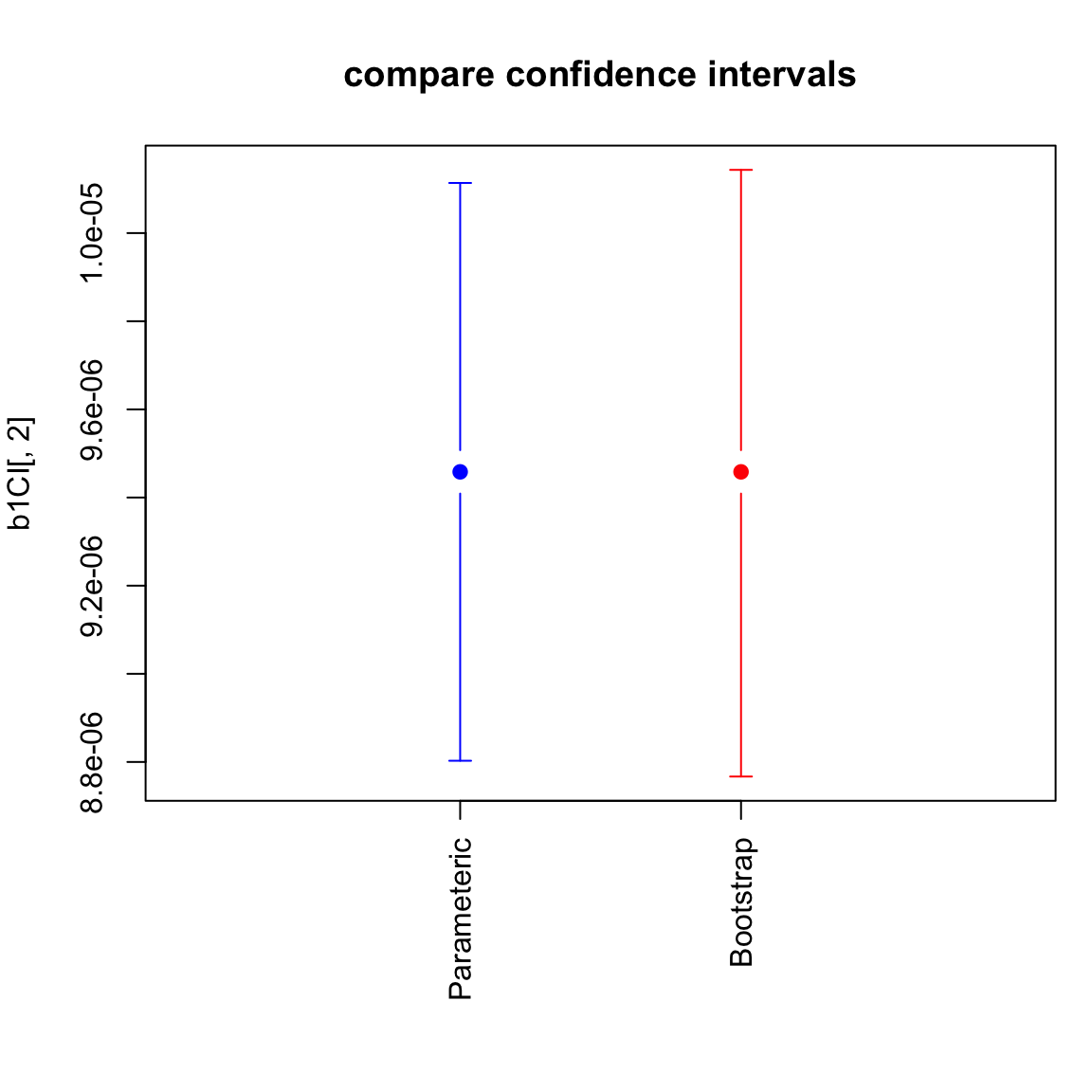
4.2.4 Prediction Intervals
In addition to evaluating the coefficients, we can also look at the prediction we would make. This is a better way than the plots we did before to get an idea of what our predictions at a particular value would actually be.
Prediction
How does our model predict a value, say for tuition of $20,000?
## (Intercept)
## 0.675509## 1
## 0.675509These predictions are themselves statistics based on the data, and the uncertainty/variability in the coefficients carries over to the predictions. So we can also give confidence intervals for our prediction. There are two types of confidence intervals.
- Confidence intervals about the predicted average response – i.e. prediction of what is the average completion rate for all schools with tuition $20,000.
- Confidence intervals about a particular future observation, i.e. prediction of any particular school that has tuition $20,000. These are actually not called confidence intervals, but prediction intervals.
Clearly, we will use the same method to predict a value for both of these settings (the point on the line), but our estimate of the precision of these estimates varies.
Which of these settings do you think would have wider CI?
##        fit       lwr       upr
## 1 0.675509 0.6670314 0.6839866## fit lwr upr
## 1 0.675509 0.5076899 0.843328We can compare these two intervals by calculating them for a large range of \(x_i\) values and plotting them:
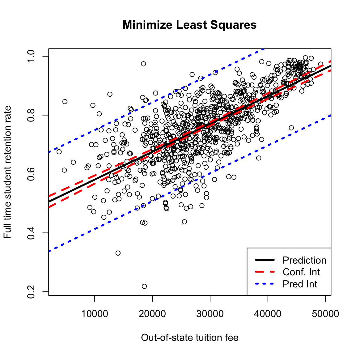
What do you notice about the difference in the confidence lines? How does it compare to the observed data?
Parametric versus Bootstrap
Notice that all of these predict commands use the parametric assumptions about the errors, rather than the bootstrap. We could bootstrap the confidence intervals for the prediction average.
How would we do that?
The prediction intervals, on the other hand, rely more on the parametric model for estimating how much variability and individual point will have.
4.3 Least Squares for Polynomial Models & Beyond
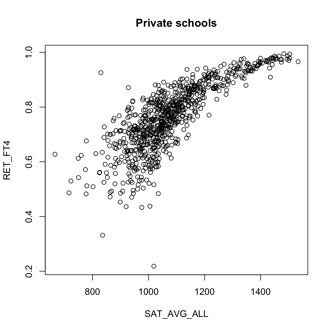
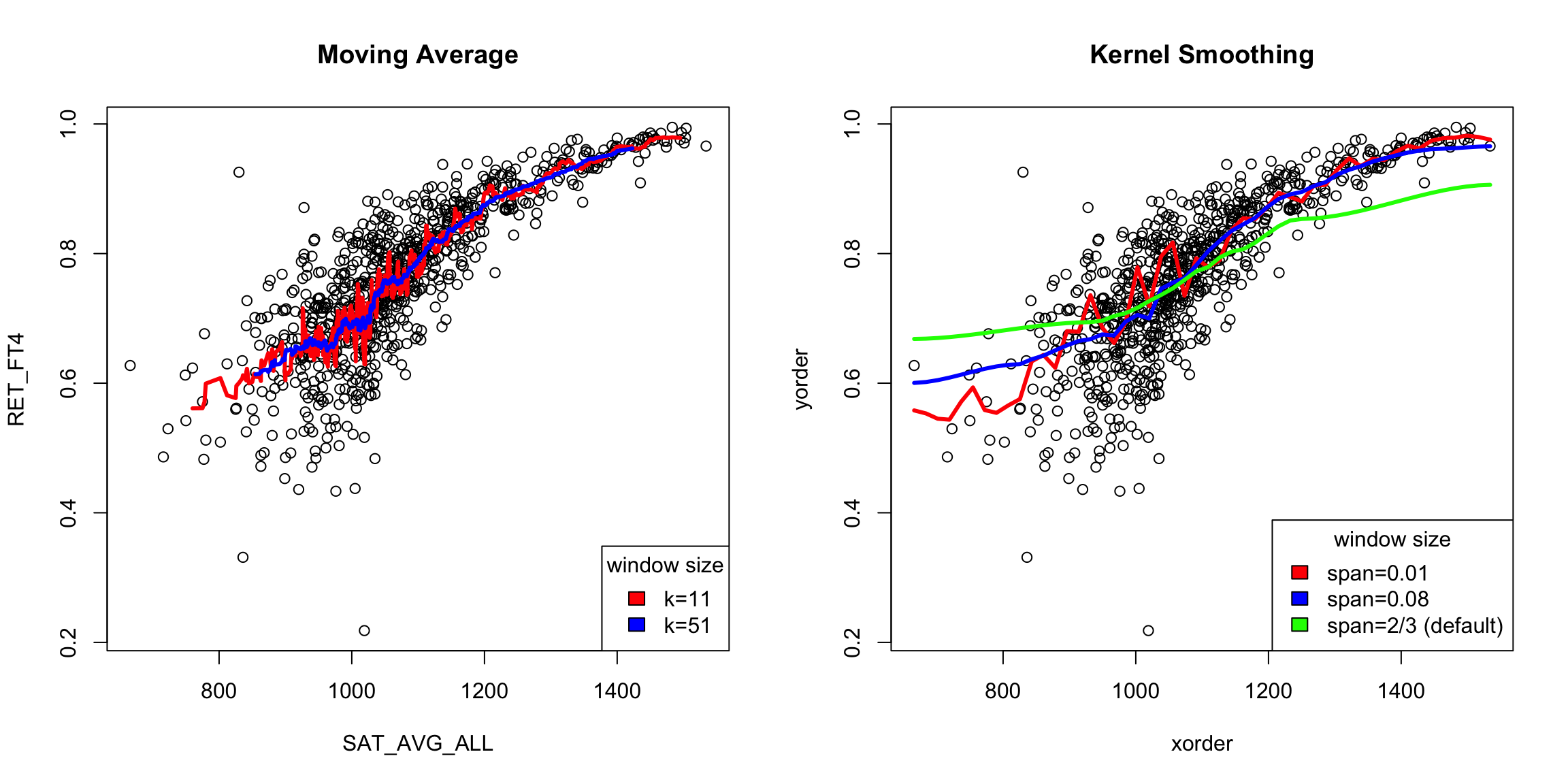
Least squares will spit out estimates of the coefficients and p-values to any data – the question is whether this is a good idea. For example, consider the variable SAT_AVG_ALL that gives the average SAT score for the school.
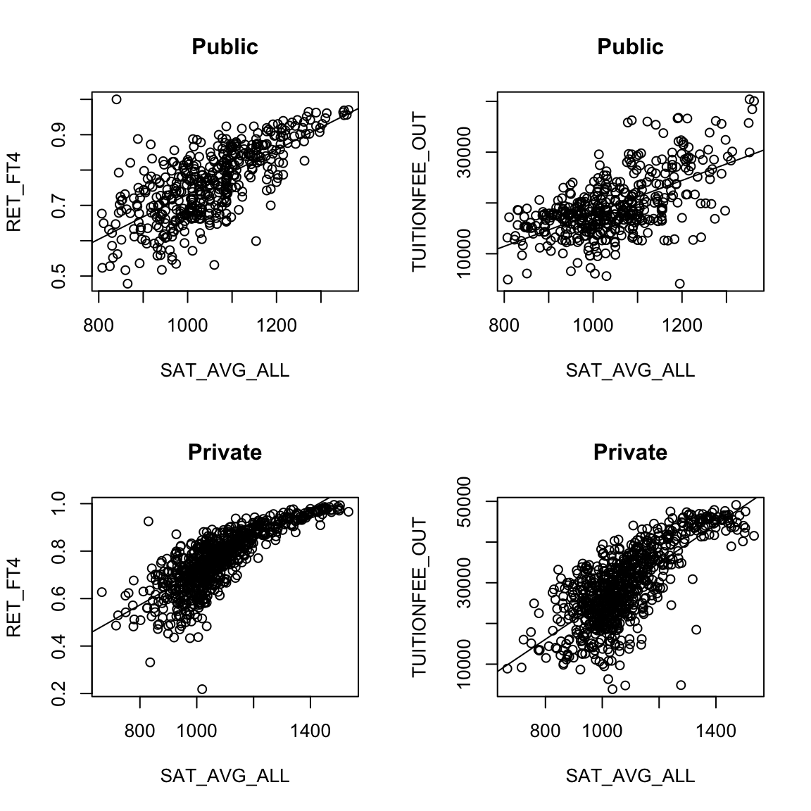
Looking at the public institutions, what do you see as it’s relationship to the other two variables?
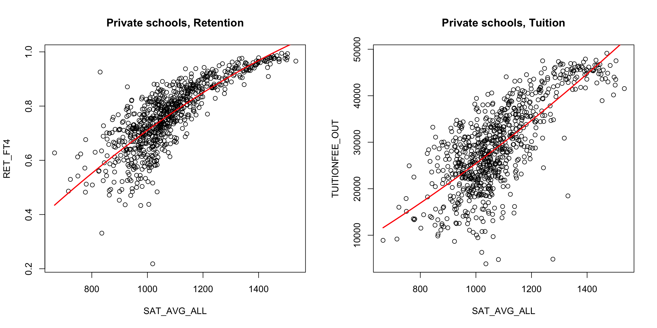
We might imagine that other functions would be a better fit to the data for the private schools.
What might be some reasonable choices of functions?
We can fit other functions in the same way. Take a quadratic function, for example. What does that look like for a model? \[y=\beta_0+\beta_1 x+\beta_2 x^2 + e\]
We can, again, find the best choices of those co-efficients by getting the predicted value for a set of coefficients: \[\hat{y}_i(\beta_0,\beta_1,\beta_2)=\beta_0+\beta_1 x_i+\beta_2 x^2_i,\] and find the error \[\ell(y_i,\hat{y}_i(\beta_0,\beta_1,\beta_2))\] and trying to find the choices that minimizes the average loss over all the observations.
If we do least squares for this quadratic model, we are trying to find the coefficients \(\beta_0,\beta_1,\beta_2\) that minimize, \[\frac{1}{n}\sum_{i=1}^n(y_i-\beta_0-\beta_1 x_i-\beta_2 x_i^2)^2\]
Here are the results:
It’s a little better, but not much. We could try other functions. A cubic function, for example, is exactly the same idea. \[\hat{y}_i(\beta_0,\beta_1,\beta_2)=\beta_0+\beta_1 x_i+\beta_2 x^2_i+\beta_3 x^3_i.\]
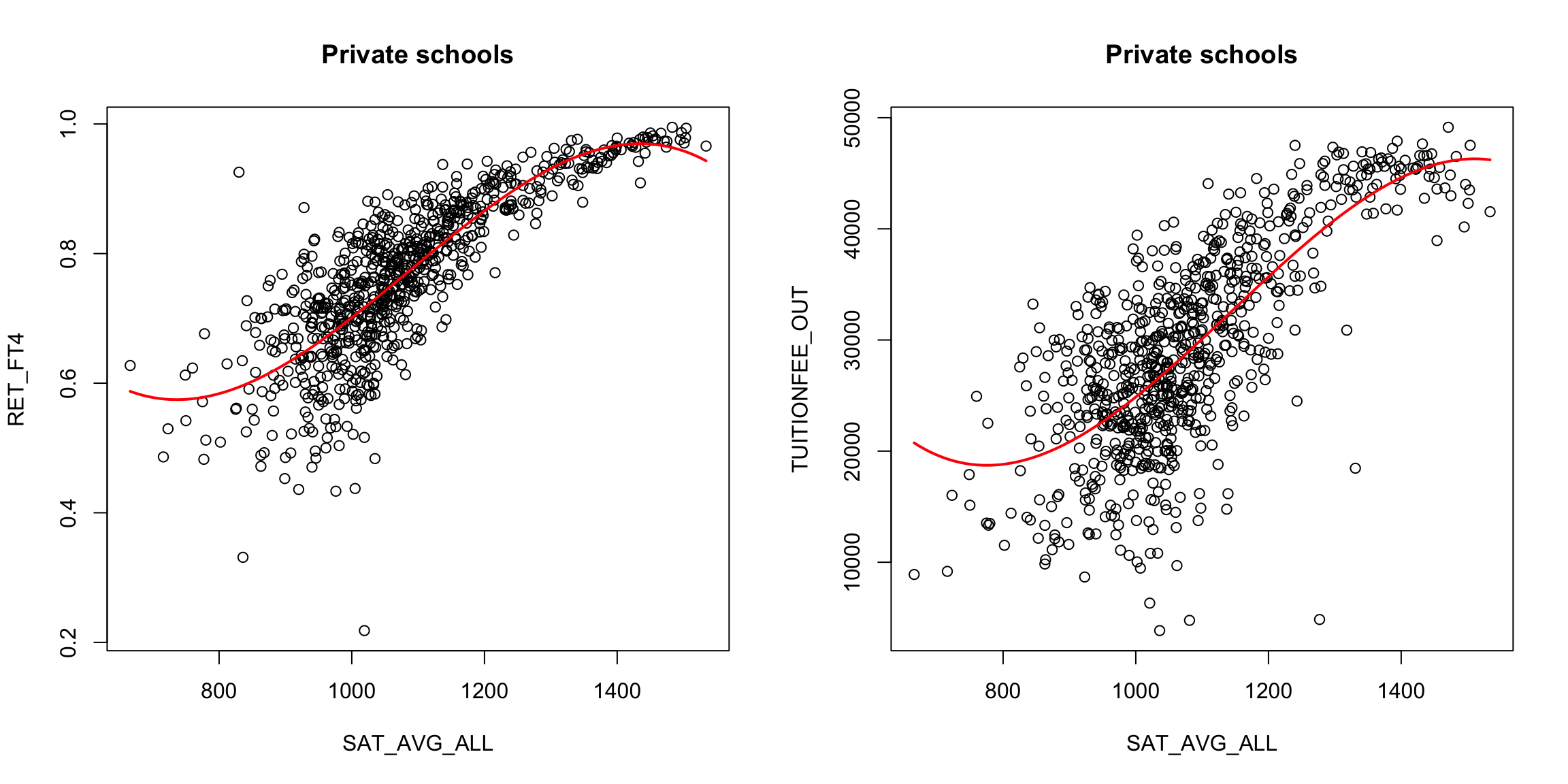
What do you think about the cubic fit?
We can, of course use other functions as well. For example, we could use log, \[y=log(x)+e\] We don’t show this model fitted to the data here, but this seems unlikely to be the right scale of the data. If we are going to search for functions to fit, we want a function that describes the shape of the curve, but we will undoubtably need more flexibility than that to match our data. In particular, this model has no parameters that we can adjust to make it match our data.
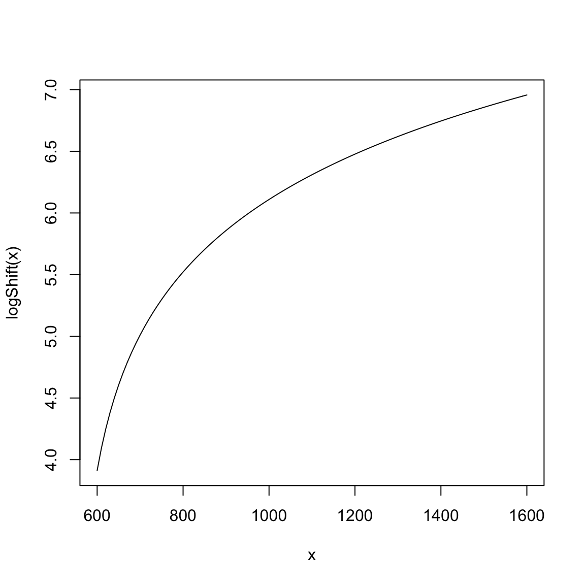
If we look at our x values, we see that they are in the range of 800-1400 (i.e. SAT scores!).Consider what the \(log\) looks like in this range:
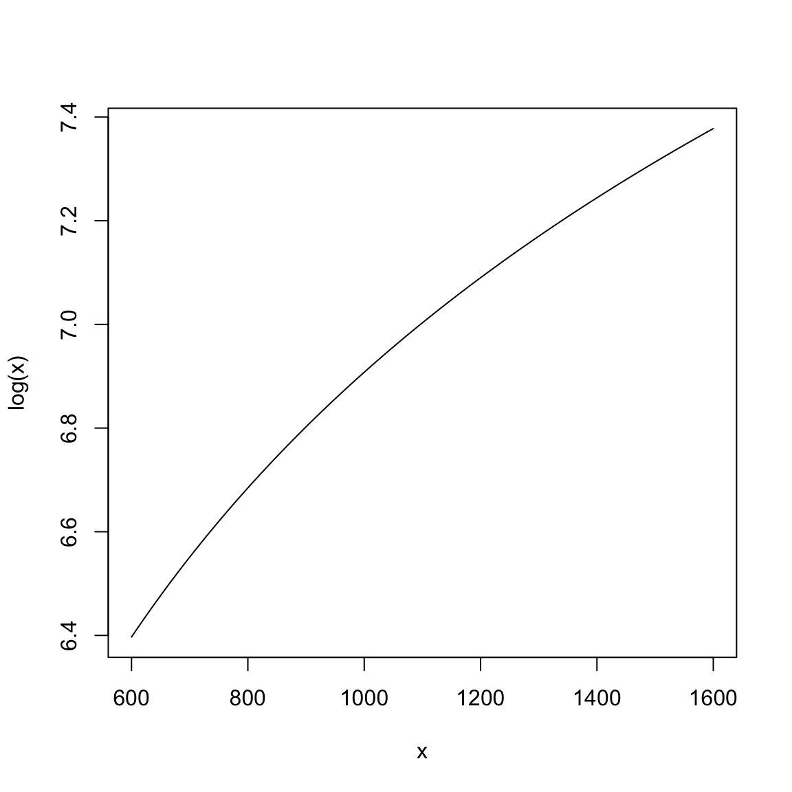
Does this seem like an effective transformation?
We could add an intercept term \[y=\beta_0+log(x)+e\]
What does adding \(\beta_0\) mean intuitively?
If we add a constant inside the log, we get flexibility in the shape.
We could play around with adjusting this model to give us appropriate parameters to work with and then fit it with least squares as well, e.g. \[y=\beta_0+log(\beta_1 x)+e\] However, we are not going to spend time on this, because it will be an arbitrary and ad hoc way to model the data.39 In general, finding some combination of standard functions to match the entire scope of the data is unlikely to work for most data sets. Instead we want something that is more flexible. We’d really like to say \[y=f(x)+e\] and just estimate \(f\), without any particular restriction on \(f\).
So we are going to think much more broadly about how to create a method that will be adaptive to our data and not require us to define functions in advance that match our data.
4.4 Local fitting
There are many strategies to estimate \(f\) without assuming what kind of function \(f\) is. Many such strategies have the flavor of estimating a series of “easy” functions on small regions of the data and then putting them together. The combination of these functions is much more complex than the “easy” functions are.
What ideas can you imagine for how you might get a descriptive curve/line/etc to describe this data?
We are going to look at once such strategy that builds up a function \(f\) as a series estimates of easy functions like linear regression, but only for a very small region.
Like with density estimation, we are going to slowly build up to understanding the most commonly used method (LOESS) by starting with simpler ideas first.
4.4.1 Running Mean or Median
Like with our development of density estimation, we will start with a similar idea to estimate \(f(x)\) by taking a “window” – a fixed width region of the \(x\)-axis – with its center at \(x\). We will identify the points captured in this window (meaning their \(x\) values are in the window), and our estimate of \(f(x)\) will be the mean (or median) of the corresponding \(y\) values of those points.
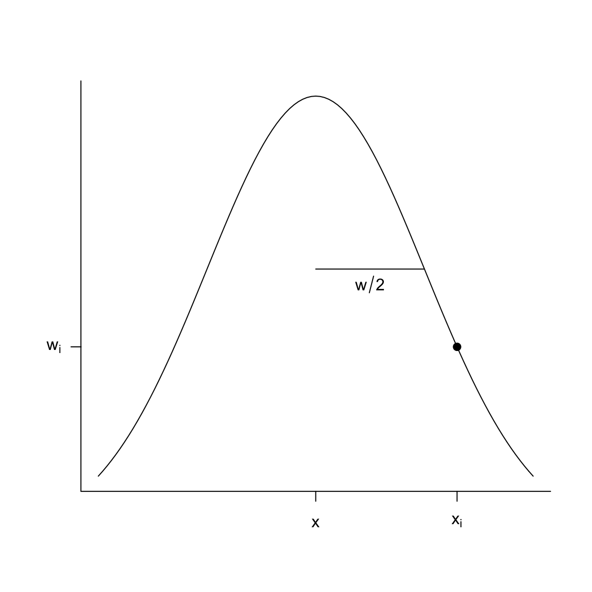
We can write this as an equation. \[\hat{f}(x)= \frac{1}{\#\text{in window}}\sum_{i: x_i \in [x-\frac{w}{2},x+\frac{w}{2} )} y_i \]
Just like with density estimation, we can do this for all \(x\), so that we slide the window over the x-axis. For this reason, this estimate is often called a “running mean” or “running median”.
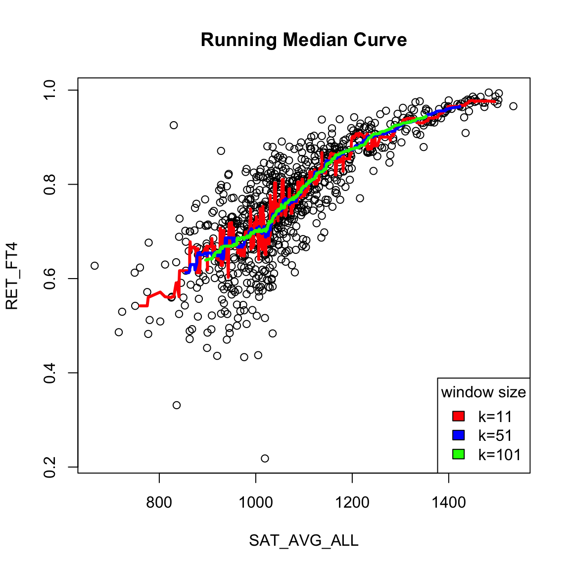
There are a lot of varieties on this same idea. For example, you could make the window not fixed width \(w\), but a window centered at \(x\) that has variable width, but a fixed number of points for all \(x\). This is what is plotted above (while it’s conceptually easy to code from scratch, there are a lot of nitpicky details, so in the above plot we used a built-in implementation which uses this strategy instead).
What do you notice when I change the number of fixed points in each window? Which seems more reasonable here?
Comparison to density estimation
If this feels familiar, it should! This is very similar to what we did in density estimation. However, in density estimation, when estimating the density \(p(x)\), we captured the data \(x_i\) that were in windows around \(x\), and calculated basically the number of points in the window to get \(\hat{p}(x)\), \[\hat{p}(x)=\frac{\#\text{ $x_i$ in window}}{nw}=\sum_{i: x_i \in [x-\frac{w}{2},x+\frac{w}{2} )} \frac{1}{n w }\] With function estimation, we are instead finding the \(x_i\) that are near \(x\) and then taking the mean of their corresponding \(y_i\) to calculate \(\hat{f}(x)\). So for function estimation, the \(x_i\) are used to determining which points \((x_i,y_i)\) to use, but the \(y_i\) are used to calculate the value. \[\begin{align*} \hat{f}(x)&= \frac{\text{sum of $y_i$ in window}}{\text{\# $x_i$ in window}}\\ &= \frac{\sum_{i: x_i \in [x-\frac{w}{2},x+\frac{w}{2} )} y_i}{\sum_{i: x_i \in [x-\frac{w}{2},x+\frac{w}{2} )} 1} \end{align*}\]
4.4.2 Kernel weighting
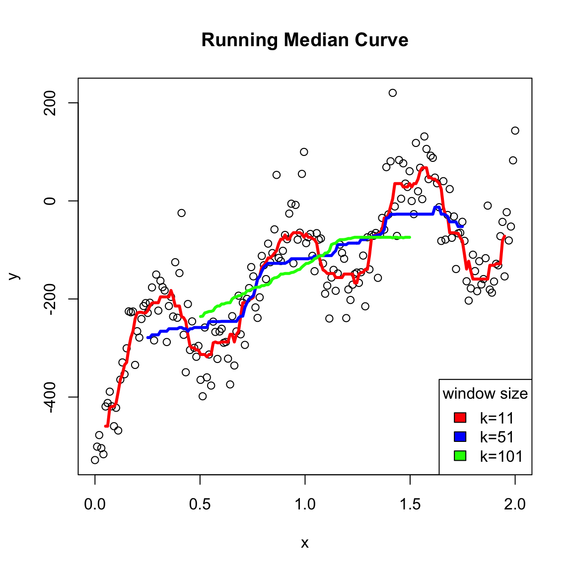
One disadvantage to a running median is that it can create a curve that is rather jerky – as you move the window you are added or taking away a point so the mean of the \(y_i\) abruptly changes. This is particularly pronounced with windows with a small number of points – changing a single \(y_i\) really affects the mean. Alternatively, if you have a wide window with many points, then adding or subtracting a single point doesn’t have a big effect, so the jerky steps are smaller, so less noticable (though still there!). But the downside of wide windows is that then your estimate of \(f(x)\) at any point \(x\) will be the result of the average of the \(y\) values from points that are quite far away from the \(x\) you are interested in, so you won’t capture trends in the data.
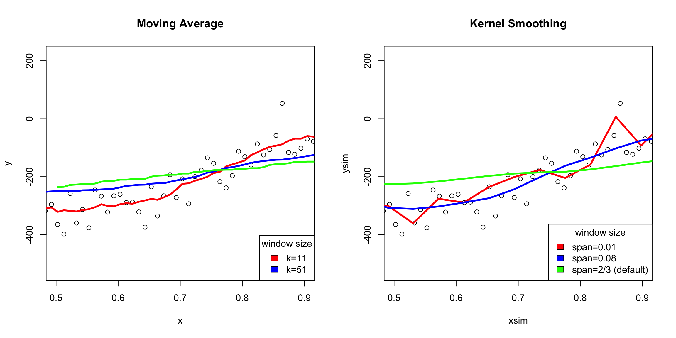
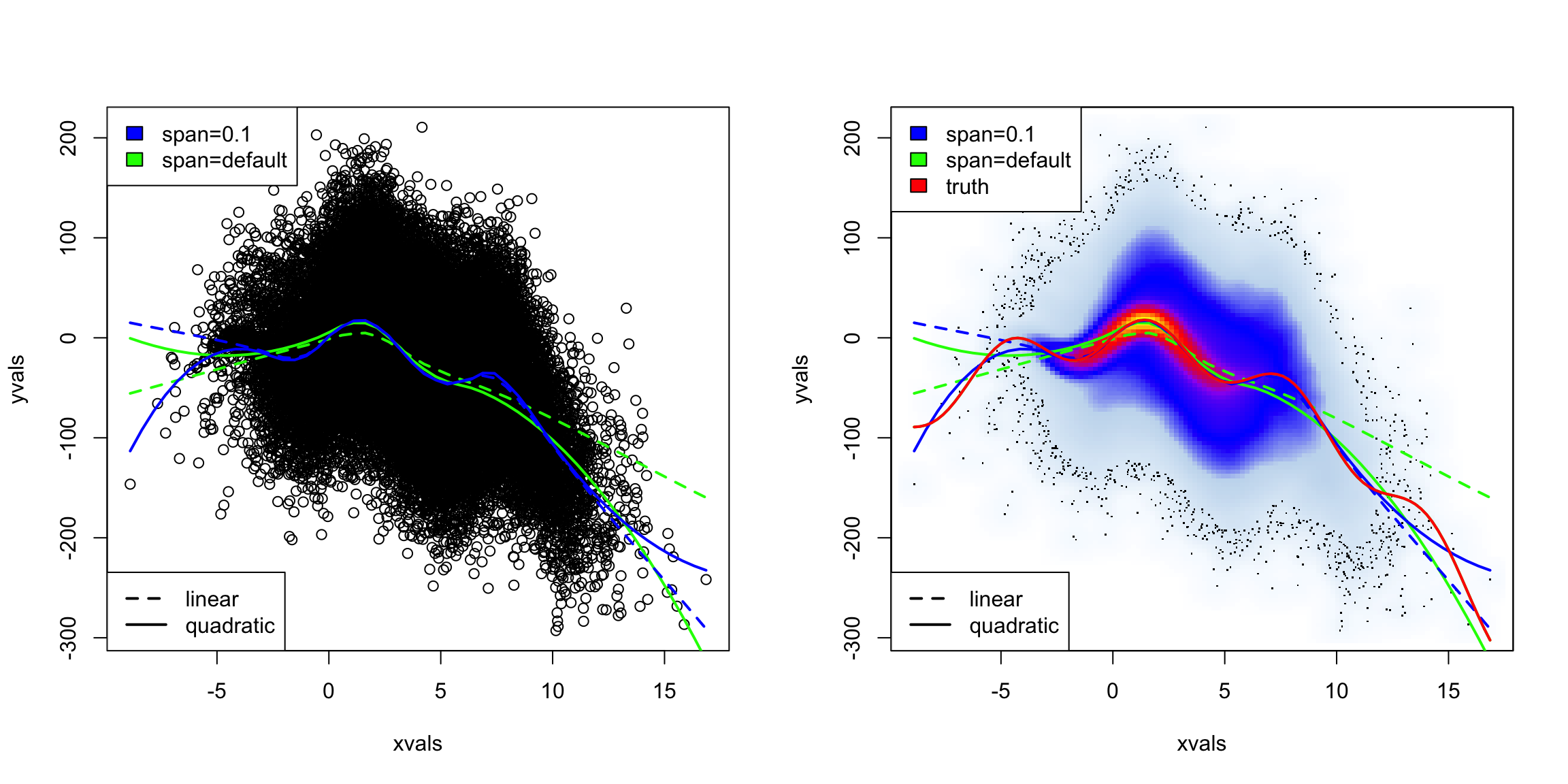
You can see this in this simulated data I created which has a great deal of local changes:
We’ve already seen a similar concept when we talked about kernel density estimation, instead of histograms. There we saw that we could describe our windows as weighting of our points \(x_i\) based on their distance from \(x\). We can do the same idea for our running mean: \[\begin{align*} \hat{f}(x)&= \frac{\sum_{i: x_i \in [x-\frac{w}{2},x+\frac{w}{2} )} y_i}{\sum_{i: x_i \in [x-\frac{w}{2},x+\frac{w}{2} )} 1}\\ &= \frac{\sum_{i=1}^n y_i f(x,x_i)}{\sum_{i=1}^n f(x,x_i)} \end{align*}\] where again, \(f(x,x_i)\) weights each point by \(1/w\) \[f(x,x_i)=\begin{cases} \frac{1}{w} & x_i\in [x-\frac{w}{2},x+\frac{w}{2} ) \\ 0 & otherwise \end{cases}\] (notice the constant \(1/w\) cancels out, but we leave it there to look like the kernel density estimation).
This is called the Nadaraya-Watson kernel-weighted average estimate or kernel smoothing regression.
Again, once we write it this way, it’s clear we could again choose different weighting functions, like the gaussian kernel, similar to that of kernel density estimation. Just as in density estimation, you tend to get smoother results if our weights aren’t abruptly changing from \(0\) once a point moves in or out of the window. So we will use the same idea, where we weight our point \(i\) based on how close \(x_i\) is to the \(x\) for which we are trying to estimate \(f(x)\). And just like in density estimation, a gaussian kernel is the common choice for how to decide the weight:
Here’s how the gaussian kernel smoothing weights compare to a rolling mean (i.e. based on fixed windows) on the very wiggly simulated data I made
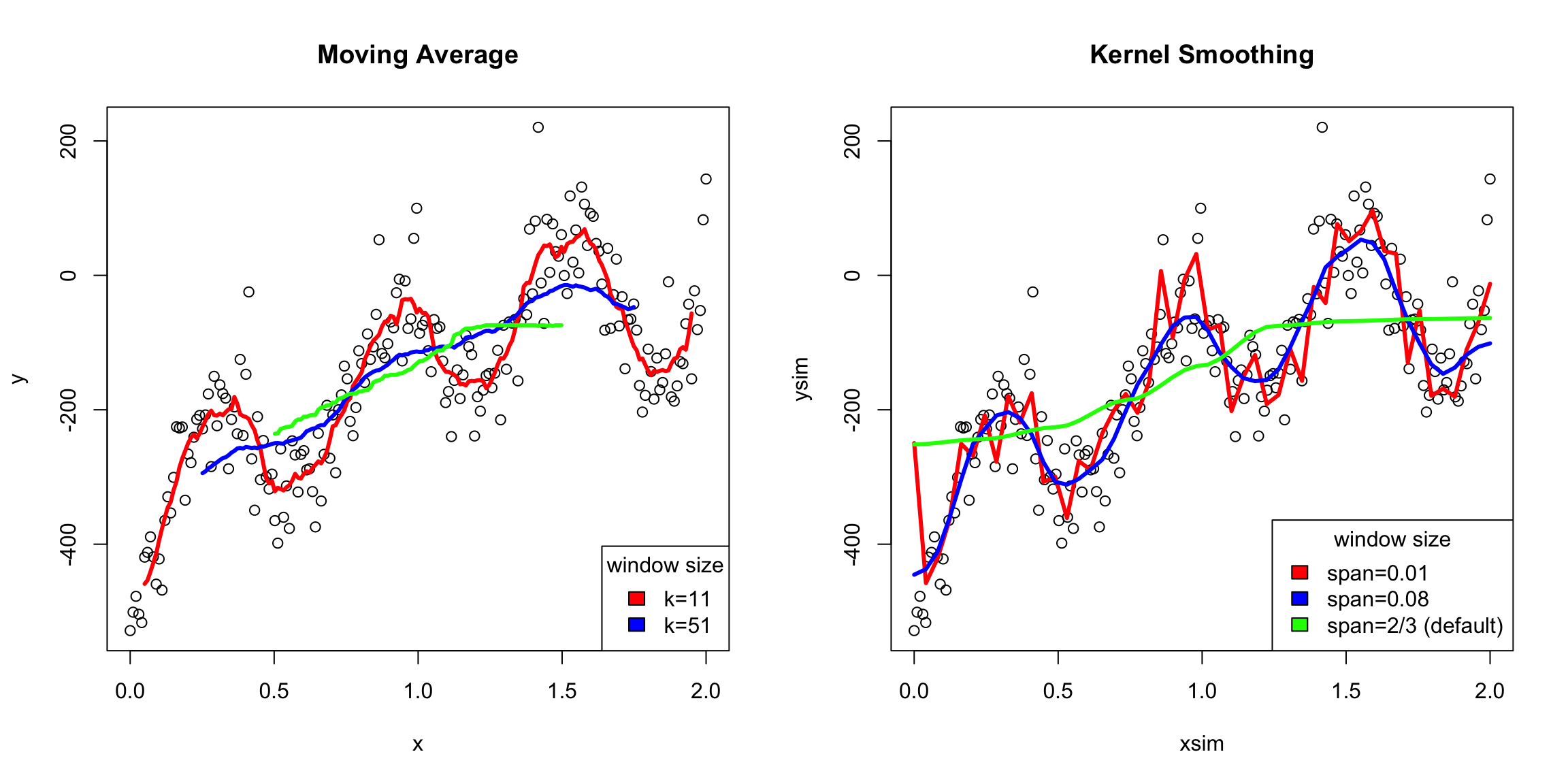
It’s important to see that both methods can overflatten the curve or create overly wiggly curves depending on how you change the choices of the algorithms. But the difference is that the moving average will always have these tiny bumps if you zoom in, while the kernel smoothing won’t
Window width
The span argument tells you what percentage of points are used in predicting \(x\) (like bandwidth in density estimation)40. So there’s still an idea of a window size; it’s just that within the window, you are giving more emphasis to points near your \(x\) value.
Notice that one advantage is that you can define an estimate for any \(x\) in the range of your data – the estimated curve doesn’t have to jump as you add new points. Instead it transitions smoothly.
What other comparisons might you make here?
Weighted Mean
If we look at our estimate of \(f(x)\), we can actually write it more simply as a weighted mean of our \(y_i\) \[\begin{align*} \hat{f}(x)&= \frac{\sum_{i=1}^n y_i f(x,x_i)}{\sum_{i=1}^n f(x,x_i)}\\ &= \sum_{i=1}^n w_i(x) y_i \end{align*}\] where \[w_i(x)=\frac{f(x,x_i)}{\sum_{i=1}^n f(x,x_i)}\] are weights that indicate how much each \(y_i\) should contribute to the mean (and notice that these weights sum to one). The standard mean of all the points is equivalent to choosing \(w_i(x)=1/n\), i.e. each point counts equally.
4.4.3 Loess: Local Regression Fitting
In the previous section, we use kernels to have a nice smooth way to decide how much impact the different \(y_i\) have in our estimate of \(f(x)\). But we haven’t changed the fact that we are essentially taking just a mean of the nearby \(y_i\) to estimate \(f(x)\).
Let’s go back to our simple windows (i.e. rectangular kernel). When we estimate \(f(x)\), we are doing the following:
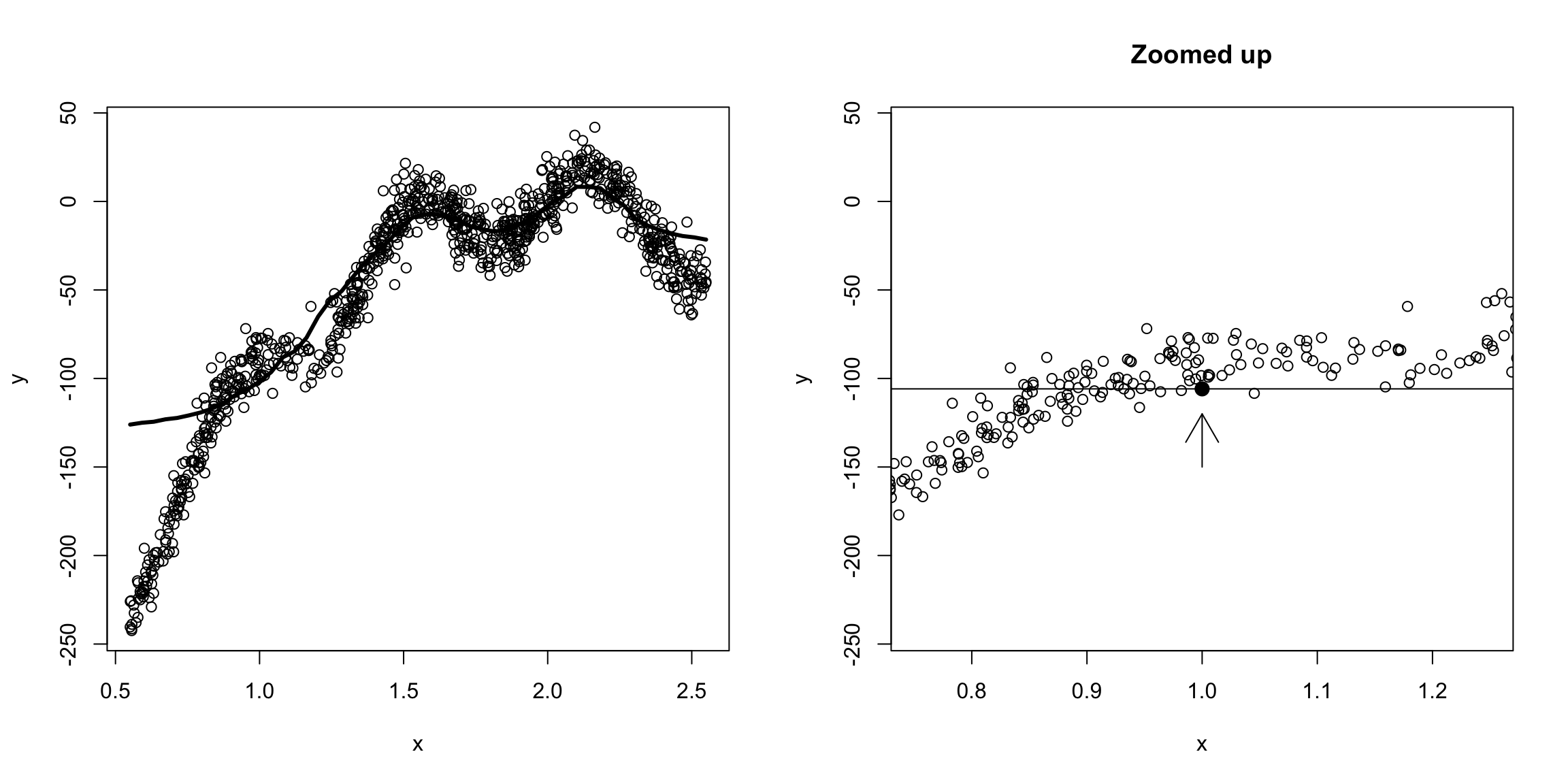
We see that for our prediction \(\hat{f}(x)\) at \(x=1\), we are not actually getting into where the data is because of the in balance of how the \(x_i\) values are distributed. That’s because the function is changing around \(x=1\); weighting far-away points would help some, we’re basically trying to “fit” a constant line to what clearly is changing in this window.
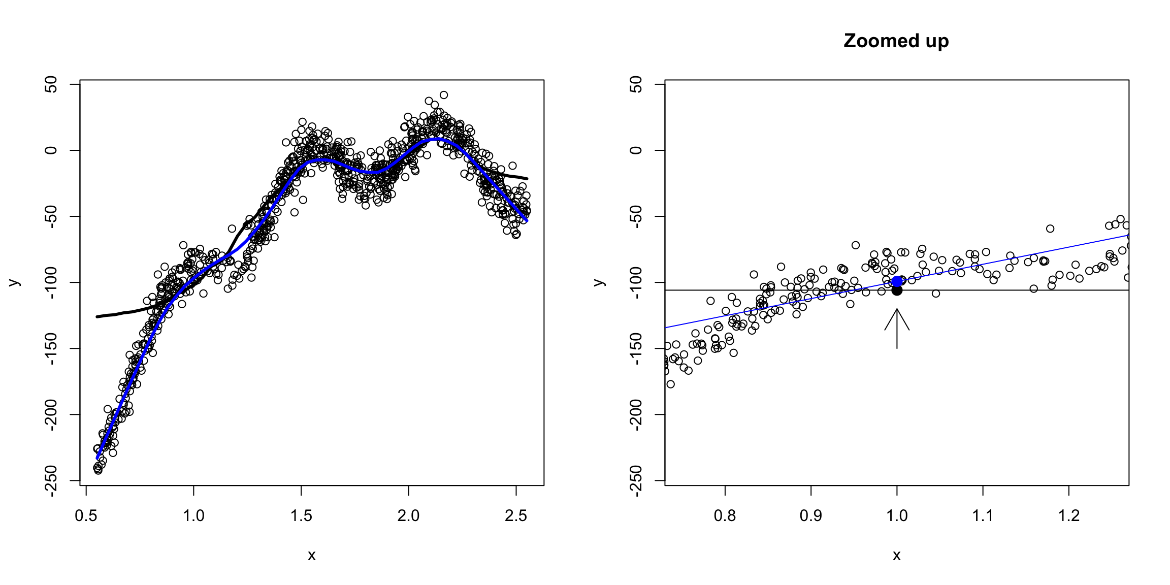
We could do this for every \(x\), as our window keeps moving, so we would never actually be fitting a polynomial across the entire function. So while we wouldn’t think a line fit the overall data very well, locally around \(x=1\) it would be more reasonable to say it is roughly like a line:
We could go even further and say a quadratic would be better:
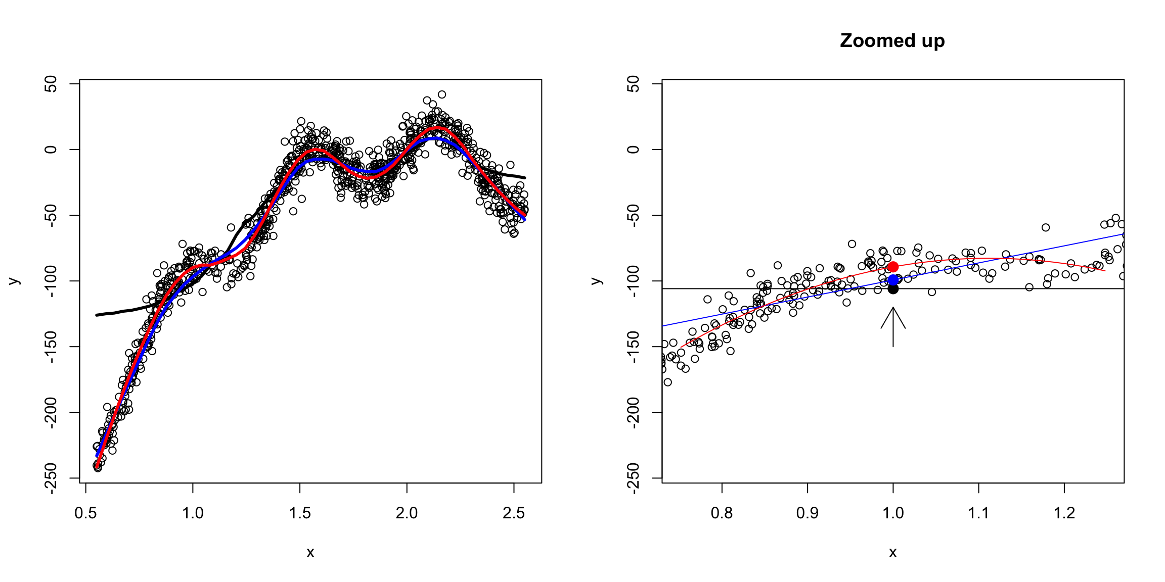
In short, we are saying, to estimate \(f(x)\) locally some simple polynomials will work well, even though they don’t work well globally.
So we now have the choice of the degree of the polynomial and the span/window size.
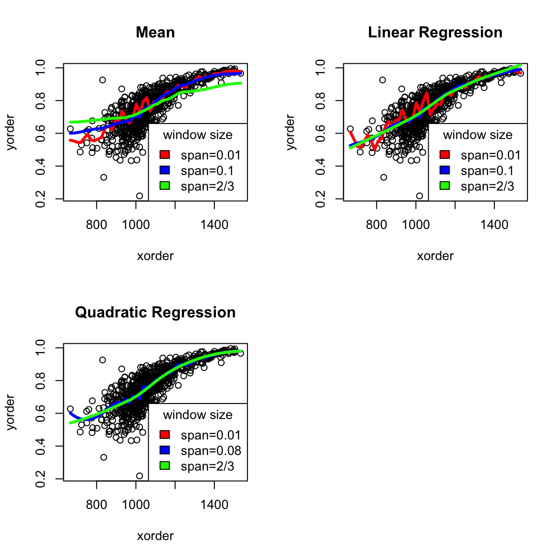
What conclusions would you draw about the difference between choosing the degree of the fit (mean/linear/quadratic)?
Generally degree is chosen to be 2, as it usually gives better fitting estimates, while the span parameter might be tweaked by the user.
4.5 Big Data clouds
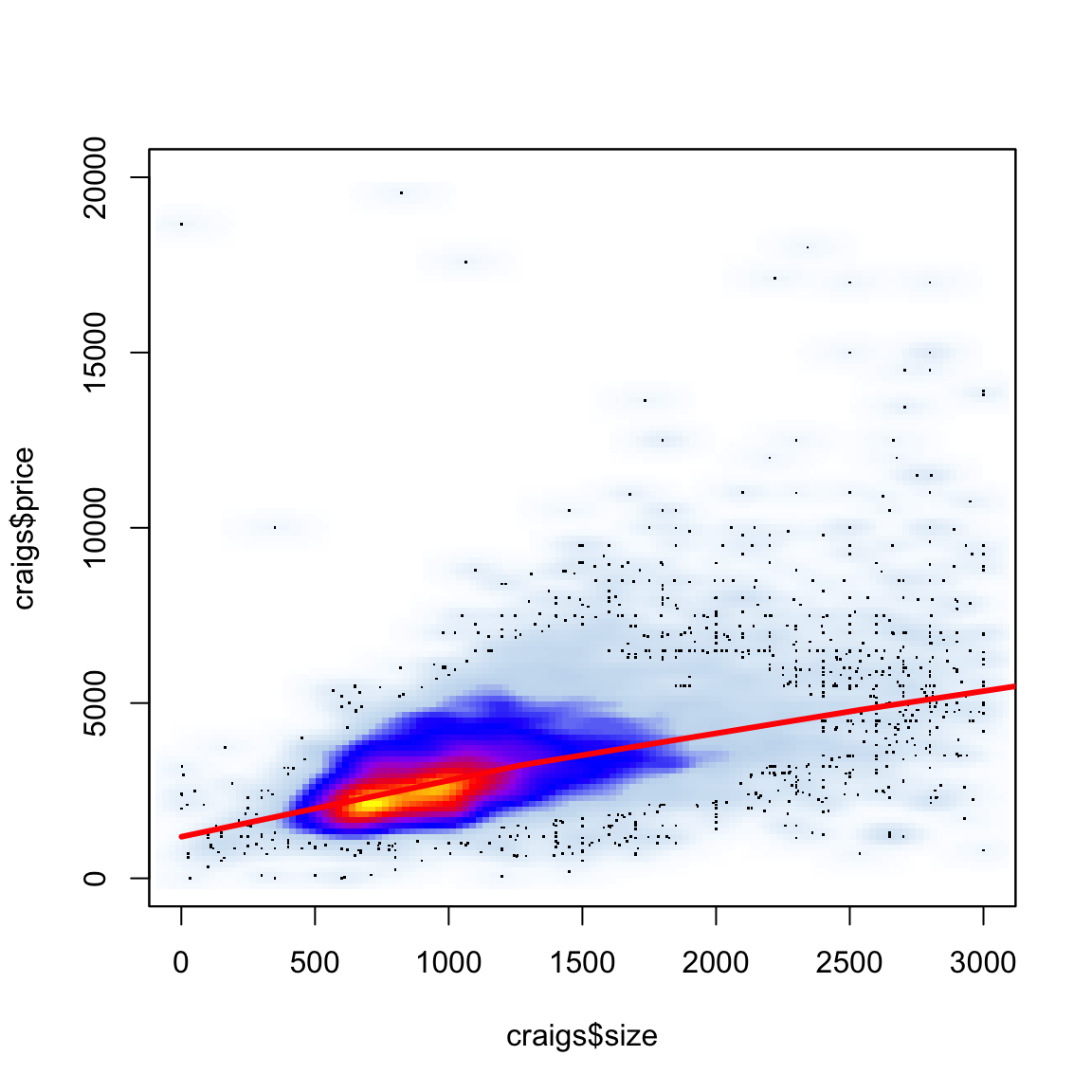
It can be particularly helpful to have a smooth scatter for visualization when you have a lot of data points. Consider the following data on craigs list rentals that you saw in lab. We would suspect that size would be highly predictive of price, and indeed if we plot price against size that’s pretty clear.
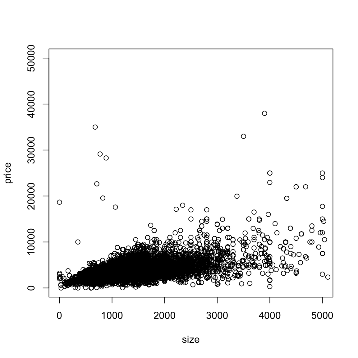
But, because of the number of points, we can’t really see much of what’s going on. In fact our eye is drawn to outlying (and less representative) points, while the rest is just a black smear where the plots are on top of each other.
We can add a loess smooth curve to get an idea of where the bulk of the data lie. We’ll zoom in a bit closer as well by changing the x and y limits of the axes.
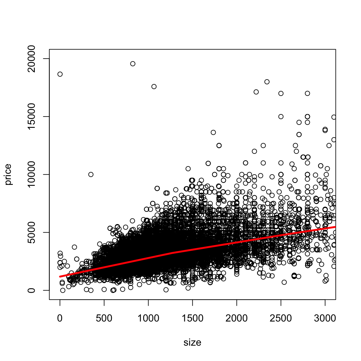
What does this tell you about the data?
4.5.1 2D density smoothing plots
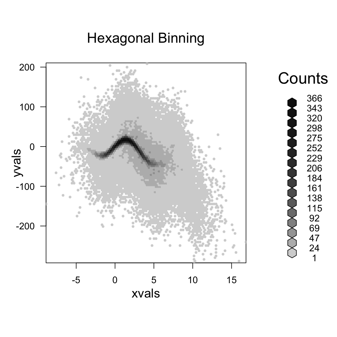
If we really want to get a better idea of what’s going on under that smear of black, we can use 2D density smoothing plots. This is the same idea as density smoothing plots for probability densities, only for 2D. Imagine that instead of a histogram along the line, a 2D histogram. This would involve griding the 2D plane into rectangles (instead of intervals) and counting the number of points within each rectangle. The high of the bars (now in the 3rd dimension) would give a visualization of how many points there are in different places in the plot.
Then just like with histograms, we can smooth this, so that we get a smooth curve over the 2 dimensions.
A 3D picture of this would be cool, but difficult to actually see information, axes, etc. So its common to instead smash this information into 2D, by representing the 3rd dimension (the density of the points) by a color scale instead.
Here is an example of such a visualization of a 2D histogram (the hexbin package)
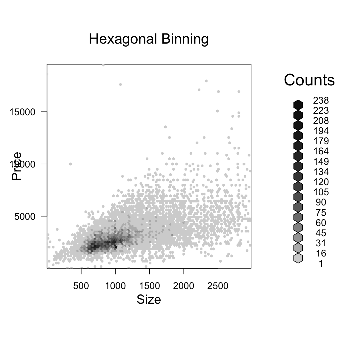
We can use a smoother version of this and get more gradual changes (and a less finicky function) using the smoothScatter function
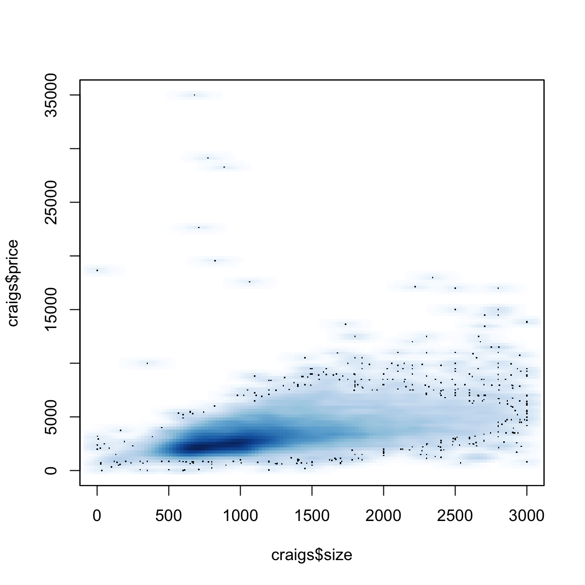
What do these colors tell you? How does this compare to the smooth line? What do you see about those points that grabbed our eye before (and which the loess line ignored)?
Simulated Example
For this data, it turned out that the truth was pretty linear. But many times, the cloud of data can significantly impair our ability to see the data. We can simulate a more complicated function with many points.
4.6 Time trends
Let’s look at another common example of fitting a trend – time data. In the following dataset, we have the average temperatures (in celecius) by city per month since 1743.
##           dt AverageTemperature AverageTemperatureUncertainty    City
## 1 1849-01-01             26.704                         1.435 Abidjan
## 2 1849-02-01             27.434                         1.362 Abidjan
## 3 1849-03-01             28.101                         1.612 Abidjan
## 4 1849-04-01             26.140                         1.387 Abidjan
## 5 1849-05-01             25.427                         1.200 Abidjan
## 6 1849-06-01             24.844                         1.402 Abidjan
##         Country Latitude Longitude
## 1 Côte D'Ivoire    5.63N     3.23W
## 2 Côte D'Ivoire    5.63N     3.23W
## 3 Côte D'Ivoire    5.63N     3.23W
## 4 Côte D'Ivoire    5.63N     3.23W
## 5 Côte D'Ivoire    5.63N     3.23W
## 6 Côte D'Ivoire    5.63N     3.23W
Given the scientific consensus that the planet is warming, it is interesting to look at this data, limited though it is, to see how different cities are affected.
Here, we plot the data with smoothScatter, as well as plotting just some specific cities
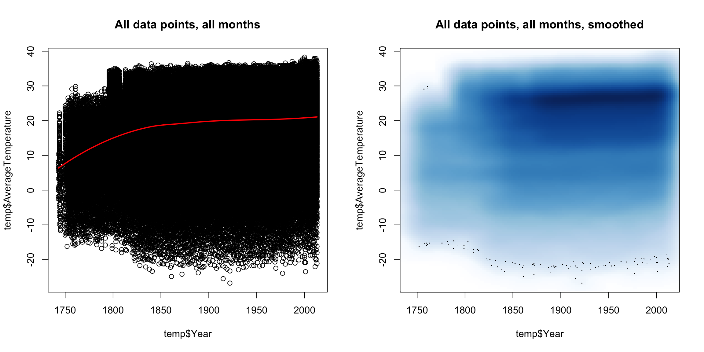
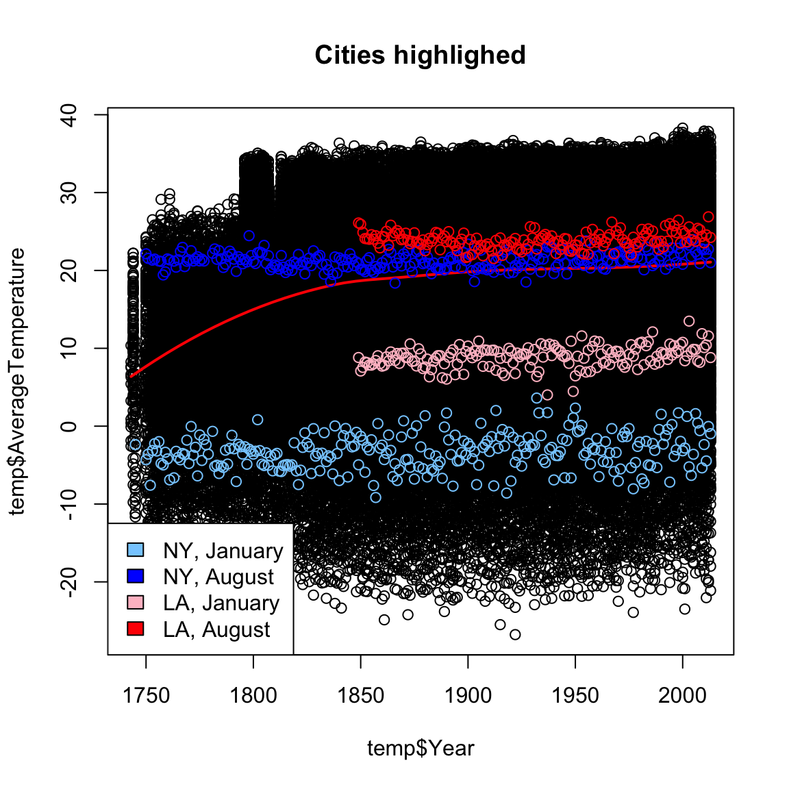
This is a very uninformative plot, despite our best efforts.
Why was it uninformative?
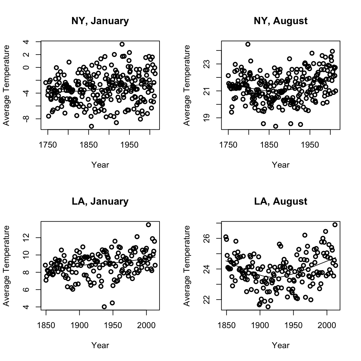
We can consider for different cities or different months how average temperatures have changed. We use the function scatter.smooth that both plots the points and places a loess curve on top.
Loess Prediction Intervals
We can even calculate (parametric) confidence intervals around these curves (based on a type of t-statistic for kernel smoothers), with a bit more lines of code. They are called prediction intervals, because they are confidence intervals for the prediction at each point.
In fact, since it’s a bit annoying, I’m going to write a little function to do it.
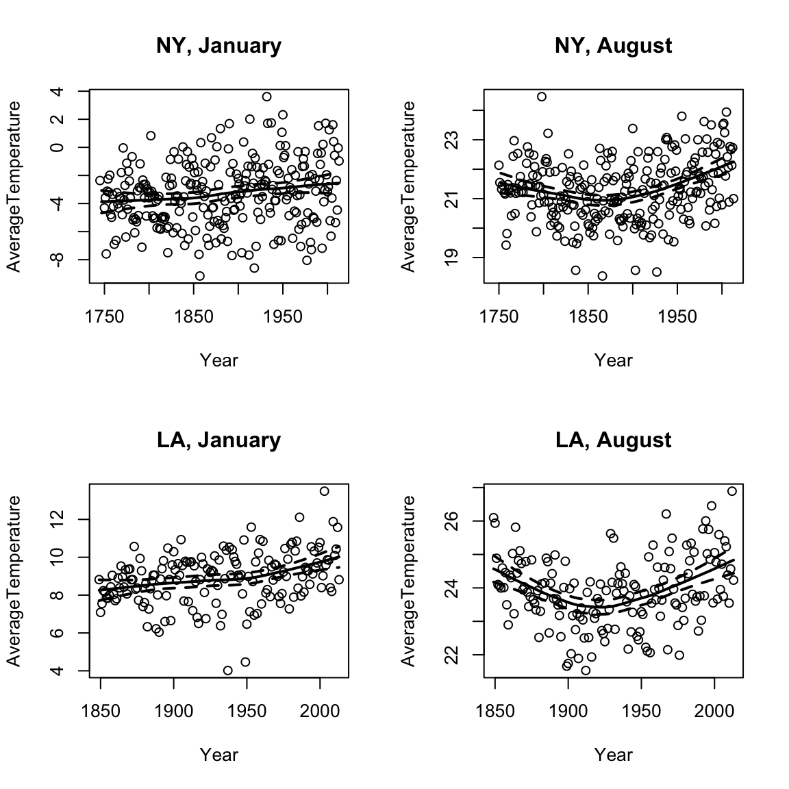
Look at the code above. In what way does it look like t-statistic intervals?
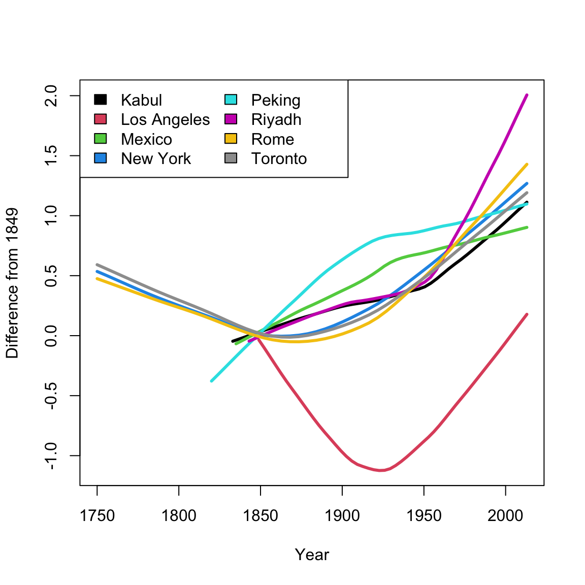
Comparing Many Cities
Smooth scatter plots can be useful to compare the time trends of many groups. It’s difficult to plot each city, but we can plot their loess curve. I will write a function to automate this. For ease of comparison, I will pick just a few cities in the northern hemisphere.
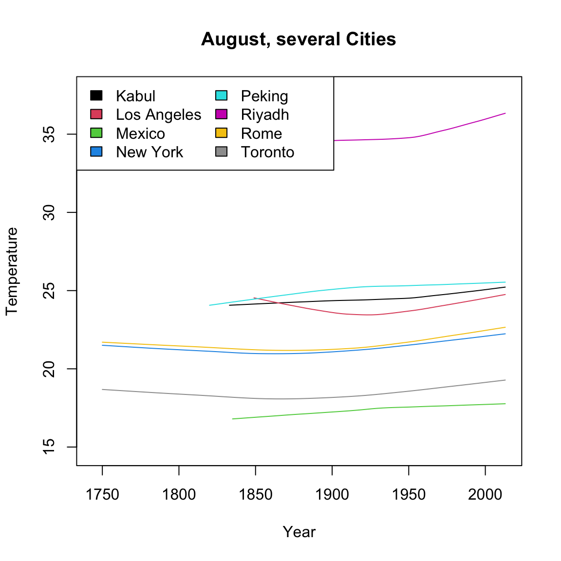
What makes these curves so difficult to compare?
Notice that because these cities have a different baseline temperature, that is a big part of what the plot shows – how the different lines are shifted from each other. We are interested in instead how they compare when changing over time. So instead, I’m going to subtract off their temperature in 1849 before we plot, so that we plot not the temperature, but the change in temperature since 1849, i.e. change relative to that temperature.
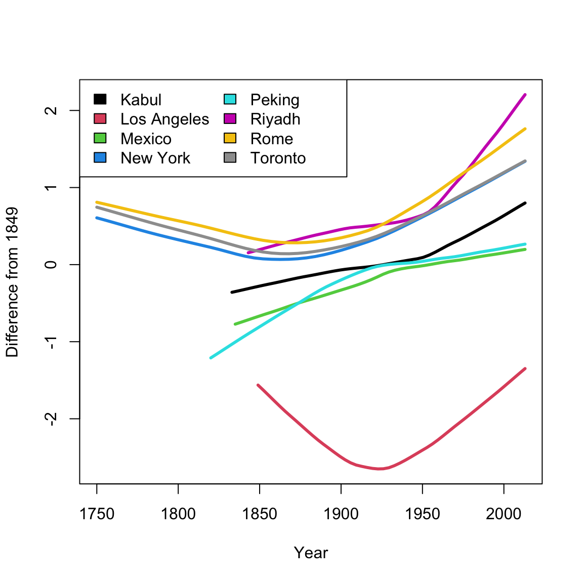
That still didn’t accomplish my goal of having a similar baseline. Why not? Consider the following plots of the data from each of the 8 cities, where I highlight the 1849 temperature in blue.
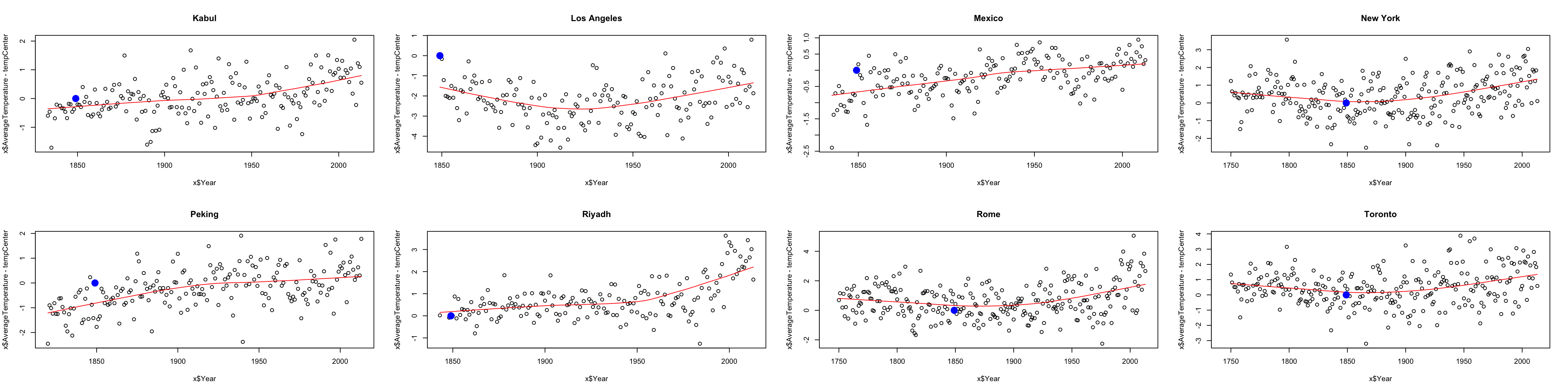
We see that in fact, the temperature in any particular year is variable around the overall “trend” we see in the data. So by subtracting off 1849, we are also subtracting off that noise. We would do better to find, using loess, the value of the function that predicts that trend in 1849 (in green below):
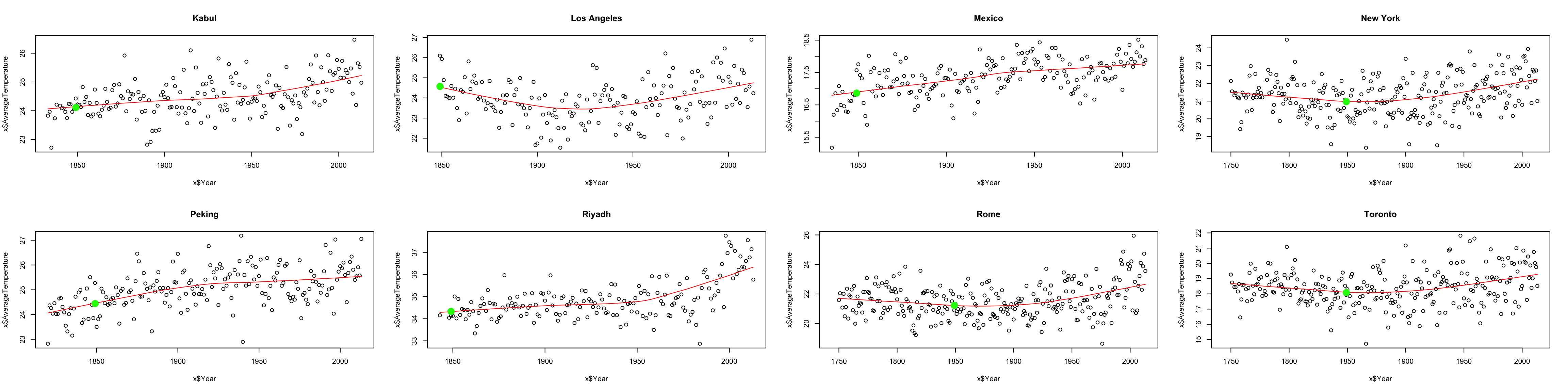
Notice how much better that green point is as a reference point. Now we can subtract off that value instead, and use that as our baseline:
Notice how difficult it can be to compare across different cities; what we’ve shown here is just a start. The smoothed curves make it easier to compare, but also mask the variability of the original data. Some curves could be better representations of their cities than others. I could further try to take into account the scale of the change – maybe some cities temperature historically vary quite a lot from year to year, so that a difference in a few degrees is less meaningful. I could also plot confidence intervals around each curve to capture some of this variability.
It is useful to remember that adding noise is not the only option – this is a choice of a model.↩
The above graphic comes from the 1999 winner of the annual UC Berkeley Statistics department contest for tshirt designs↩
You can actually have joint confidence regions that demonstrate the dependency between these values, but that is beyond this class.↩
If you look at the equation of \(\hat{\beta}_1\), then we can see that it is a linear combination of the \(y_i\), and linear combinations of normal R.V. are normal, even if the R.V. are not independent.↩
In fact, we can also do this for \(\hat{\beta}_0\), with exactly the same logic, but \(\beta_0\) is not interesting so we don’t do it in practice.↩
with the same caveat, that when you estimate the variance, you affect the distribution of \(T_1\), which matters in small sample sizes.↩
This can be useful if you have a pre-existing physical model that describes the process that created the data, e.g. from physics or chemistry↩
There’s a lot of details about span and what points are used, but we are not going to worry about them. What I’ve described here gets at the idea↩