Chapter 2 Data Distributions
We’re going to review some basic ideas about distributions you should have learned in Data 8 or STAT 20. In addition to review, we introduce some new ideas and emphases to pay attention to:
- Continuous distributions and density curves
- Tools for visualizing and estimating distributions: boxplots and kernel density estimators
- Types of samples and how they effect estimation
2.1 Basic Exporatory analysis
Let’s look at a dataset that contains the salaries of San Francisco employees.1 We’ve streamlined this to the year 2014 (and removed some strange entries with negative pay). Let’s explore this data.
dataDir <- "../finalDataSets"
nameOfFile <- file.path(dataDir, "SFSalaries2014.csv")
salaries2014 <- read.csv(nameOfFile, na.strings = "Not Provided")
dim(salaries2014)
## [1] 38117 10## [1] "X" "Id" "JobTitle" "BasePay"
## [5] "OvertimePay" "OtherPay" "Benefits" "TotalPay"
## [9] "TotalPayBenefits" "Status"## JobTitle Benefits TotalPay Status
## 1 Deputy Chief 3 38780.04 471952.6 PT
## 2 Asst Med Examiner 89540.23 390112.0 FT
## 3 Chief Investment Officer 96570.66 339653.7 PT
## 4 Chief of Police 91302.46 326716.8 FT
## 5 Chief, Fire Department 91201.66 326233.4 FT
## 6 Asst Med Examiner 71580.48 344187.5 FT
## 7 Dept Head V 89772.32 311298.5 FT
## 8 Executive Contract Employee 88823.51 310161.0 FT
## 9 Battalion Chief, Fire Suppress 59876.90 335485.0 FT
## 10 Asst Chf of Dept (Fire Dept) 64599.59 329390.5 FTLet’s look at the column ‘TotalPay’ which gives the total pay, not including benefits.
How might we want to explore this data? What single number summaries would make sense? What visualizations could we do?
##    Min. 1st Qu.  Median    Mean 3rd Qu.    Max.
##       0   33482   72368   75476  107980  471953
Notice we have entries with zero pay! Let’s investigate why we have zero pay by subsetting to just those entries.
## [1] 48## X Id JobTitle BasePay OvertimePay OtherPay
## 34997 145529 145529 Special Assistant 15 0 0 0
## 35403 145935 145935 Community Police Services Aide 0 0 0
## 35404 145936 145936 BdComm Mbr, Grp3,M=$50/Mtg 0 0 0
## 35405 145937 145937 BdComm Mbr, Grp3,M=$50/Mtg 0 0 0
## 35406 145938 145938 Gardener 0 0 0
## 35407 145939 145939 Engineer 0 0 0
## Benefits TotalPay TotalPayBenefits Status
## 34997 5650.86 0 5650.86 PT
## 35403 4659.36 0 4659.36 PT
## 35404 4659.36 0 4659.36 PT
## 35405 4659.36 0 4659.36 PT
## 35406 4659.36 0 4659.36 PT
## 35407 4659.36 0 4659.36 PT## X Id JobTitle BasePay OvertimePay
## Min. :145529 Min. :145529 Length:48 Min. :0 Min. :0
## 1st Qu.:145948 1st Qu.:145948 Class :character 1st Qu.:0 1st Qu.:0
## Median :145960 Median :145960 Mode :character Median :0 Median :0
## Mean :147228 Mean :147228 Mean :0 Mean :0
## 3rd Qu.:148637 3rd Qu.:148637 3rd Qu.:0 3rd Qu.:0
## Max. :148650 Max. :148650 Max. :0 Max. :0
## OtherPay Benefits TotalPay TotalPayBenefits Status
## Min. :0 Min. : 0 Min. :0 Min. : 0 Length:48
## 1st Qu.:0 1st Qu.: 0 1st Qu.:0 1st Qu.: 0 Class :character
## Median :0 Median :4646 Median :0 Median :4646 Mode :character
## Mean :0 Mean :2444 Mean :0 Mean :2444
## 3rd Qu.:0 3rd Qu.:4649 3rd Qu.:0 3rd Qu.:4649
## Max. :0 Max. :5651 Max. :0 Max. :5651It’s not clear why these people received zero pay. We might want to remove them, thinking that zero pay are some kind of weird problem with the data we aren’t interested in. But let’s do a quick summary of what the data would look like if we did remove them:
##        X                Id           JobTitle            BasePay
##  Min.   :110532   Min.   :110532   Length:38069       Min.   :     0
##  1st Qu.:120049   1st Qu.:120049   Class :character   1st Qu.: 30439
##  Median :129566   Median :129566   Mode  :character   Median : 65055
##  Mean   :129568   Mean   :129568                      Mean   : 66652
##  3rd Qu.:139083   3rd Qu.:139083                      3rd Qu.: 94865
##  Max.   :148626   Max.   :148626                      Max.   :318836
##   OvertimePay        OtherPay         Benefits        TotalPay
##  Min.   :     0   Min.   :     0   Min.   :    0   Min.   :     1.8
##  1st Qu.:     0   1st Qu.:     0   1st Qu.:10417   1st Qu.: 33688.3
##  Median :     0   Median :   700   Median :28443   Median : 72414.3
##  Mean   :  5409   Mean   :  3510   Mean   :24819   Mean   : 75570.7
##  3rd Qu.:  5132   3rd Qu.:  4105   3rd Qu.:35445   3rd Qu.:108066.1
##  Max.   :173548   Max.   :342803   Max.   :96571   Max.   :471952.6
##  TotalPayBenefits      Status
##  Min.   :     7.2   Length:38069
##  1st Qu.: 44561.8   Class :character
##  Median :101234.9   Mode  :character
##  Mean   :100389.8
##  3rd Qu.:142814.2
##  Max.   :510732.7
We can see that in fact we still have some weird pay entires (e.g. total payment of $1.8). This points to the slippery slope you can get into in “cleaning” your data – where do you stop?
A better observation is to notice that all the zero-entries have "Status’’ value of PT, meaning they are part-time workers.
##        X                Id           JobTitle            BasePay
##  Min.   :110533   Min.   :110533   Length:22334       Min.   : 26364
##  1st Qu.:116598   1st Qu.:116598   Class :character   1st Qu.: 65055
##  Median :122928   Median :122928   Mode  :character   Median : 84084
##  Mean   :123068   Mean   :123068                      Mean   : 91174
##  3rd Qu.:129309   3rd Qu.:129309                      3rd Qu.:112171
##  Max.   :140326   Max.   :140326                      Max.   :318836
##   OvertimePay        OtherPay         Benefits        TotalPay
##  Min.   :     0   Min.   :     0   Min.   :    0   Min.   : 26364
##  1st Qu.:     0   1st Qu.:     0   1st Qu.:29122   1st Qu.: 72356
##  Median :  1621   Median :  1398   Median :33862   Median : 94272
##  Mean   :  8241   Mean   :  4091   Mean   :35023   Mean   :103506
##  3rd Qu.: 10459   3rd Qu.:  5506   3rd Qu.:38639   3rd Qu.:127856
##  Max.   :173548   Max.   :112776   Max.   :91302   Max.   :390112
##  TotalPayBenefits    Status
##  Min.   : 31973   Length:22334
##  1st Qu.:102031   Class :character
##  Median :127850   Mode  :character
##  Mean   :138528
##  3rd Qu.:167464
## Max. :479652## X Id JobTitle BasePay
## Min. :110532 Min. :110532 Length:15783 Min. : 0
## 1st Qu.:136520 1st Qu.:136520 Class :character 1st Qu.: 6600
## Median :140757 Median :140757 Mode :character Median : 20557
## Mean :138820 Mean :138820 Mean : 31749
## 3rd Qu.:144704 3rd Qu.:144704 3rd Qu.: 47896
## Max. :148650 Max. :148650 Max. :257340
## OvertimePay OtherPay Benefits TotalPay
## Min. : 0.0 Min. : 0.0 Min. : 0.0 Min. : 0
## 1st Qu.: 0.0 1st Qu.: 0.0 1st Qu.: 115.7 1st Qu.: 7359
## Median : 0.0 Median : 191.7 Median : 4659.4 Median : 22410
## Mean : 1385.6 Mean : 2676.7 Mean :10312.3 Mean : 35811
## 3rd Qu.: 681.2 3rd Qu.: 1624.7 3rd Qu.:19246.2 3rd Qu.: 52998
## Max. :74936.0 Max. :342802.6 Max. :96570.7 Max. :471953
## TotalPayBenefits Status
## Min. : 0 Length:15783
## 1st Qu.: 8256 Class :character
## Median : 27834 Mode :character
## Mean : 46123
## 3rd Qu.: 72569
## Max. :510733So it is clear that analyzing data from part-time workers will be tricky (and we have no information here as to whether they worked a week or eleven months). To simplify things, we will make a new data set with only full-time workers:
2.1.1 Histograms
Let’s draw a histogram of the total salary for full-time workers only.
hist(salaries2014_FT$TotalPay, main = "Total Pay",
    xlab = "Pay (in dollars)")
abline(v = mean(salaries2014_FT$TotalPay), lty = "dashed")
abline(v = median(salaries2014_FT$TotalPay))
legend("topright", legend = c("Median", "Mean"), lty = c("solid",
    "dashed"))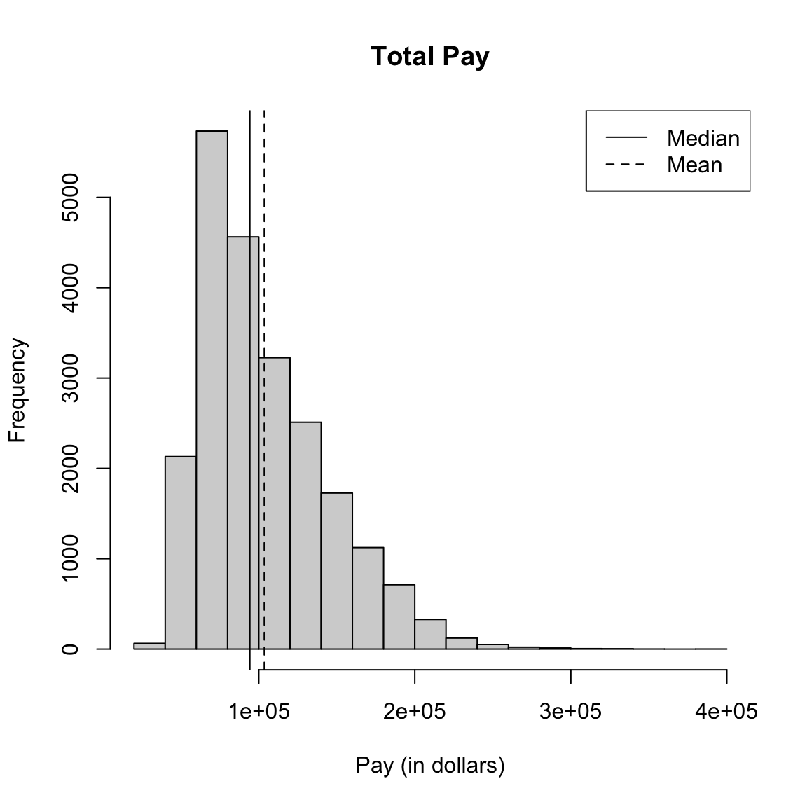
What do you notice about the histogram? What does it tell you about the data?
How good of a summary is the mean or median here?
2.1.1.1 Constructing Frequency Histograms
How do you construct a histogram? Practically, most histograms are created by taking an evenly spaced set of \(K\) breaks that span the range of the data, call them \(b_1\leq b_2 \leq ... \leq b_K\), and counting the number of observations in each bin.2 Then the histogram consists of a series of bars, where the x-coordinates of the rectangles correspond to the range of the bin, and the height corresponds to the number of observations in that bin.
2.1.1.1.1 Breaks of Histograms
Here’s two more histogram of the same data that differ only by the number of breakpoints in making the histograms.
par(mfrow = c(2, 2))
hist(salaries2014_FT$TotalPay, main = "Total Pay, default breaks",
    xlab = "Pay (in dollars)")
hist(salaries2014_FT$TotalPay, main = "Total Pay, breaks=100",
    xlab = "Pay (in dollars)", breaks = 100)
hist(salaries2014_FT$TotalPay, main = "Total Pay, breaks=1000",
    xlab = "Pay (in dollars)", breaks = 1000)
hist(salaries2014_FT$TotalPay, main = "Total Pay, Zoomed-in",
    xlab = "Pay (in dollars)", xlim = c(0, 1e+05),
    breaks = 1000)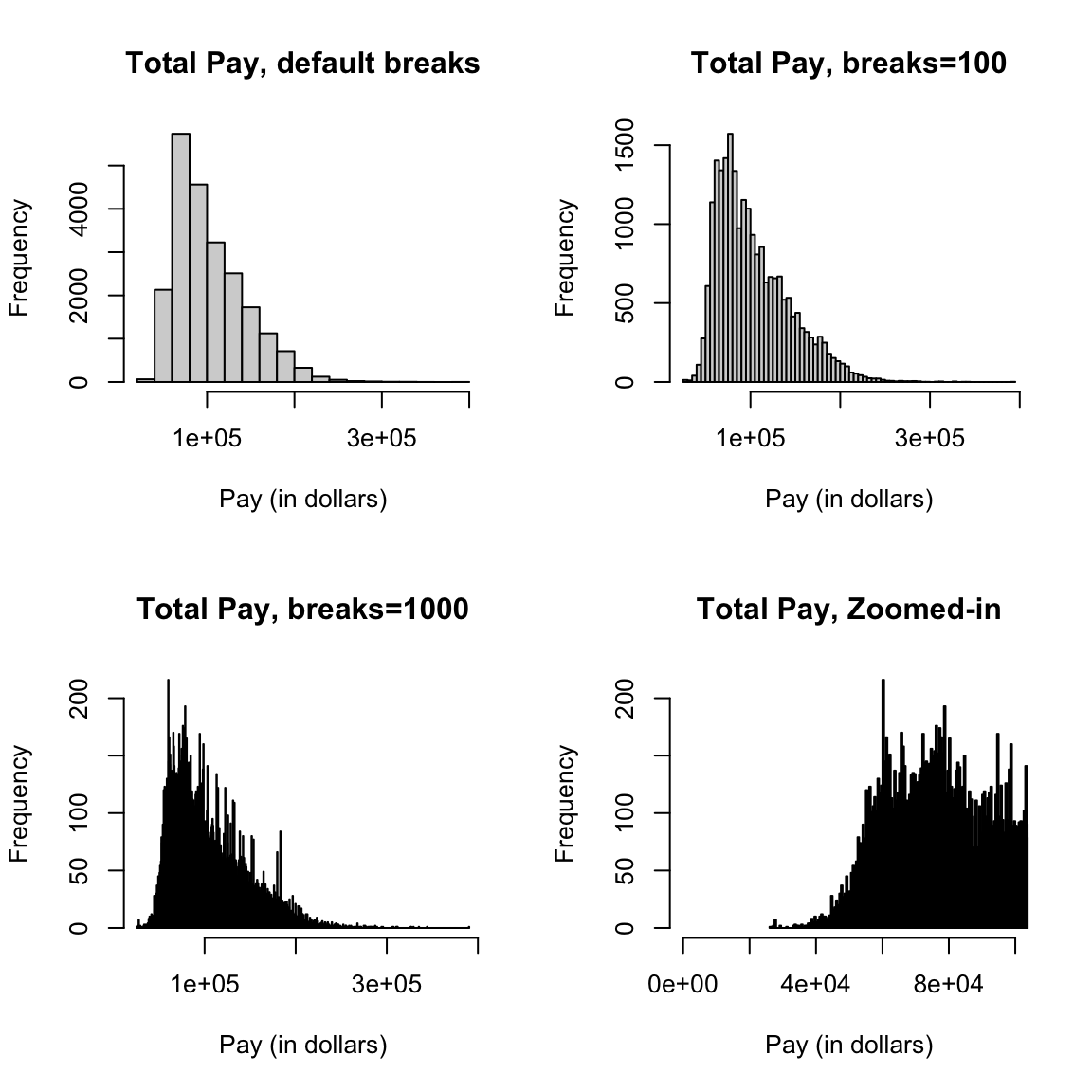
What seems better here? Is there a right number of breaks?
What if we used a subset, say only full-time firefighters? Now there are only 738 data points.
salaries2014_FT_FF <- subset(salaries2014_FT, JobTitle ==
    "Firefighter" & Status == "FT")
dim(salaries2014_FT_FF)
## [1] 738 10par(mfrow = c(2, 2))
hist(salaries2014_FT_FF$TotalPay, main = "Firefighters, default breaks",
xlab = "Pay (in dollars)")
hist(salaries2014_FT_FF$TotalPay, main = "Firefighters, breaks=30",
xlab = "Pay (in dollars)", breaks = 30)
hist(salaries2014_FT_FF$TotalPay, main = "Firefighters, breaks=100",
xlab = "Pay (in dollars)", breaks = 100)
hist(salaries2014_FT_FF$TotalPay, main = "Firefighters, breaks=1000",
xlab = "Pay (in dollars)", breaks = 1000)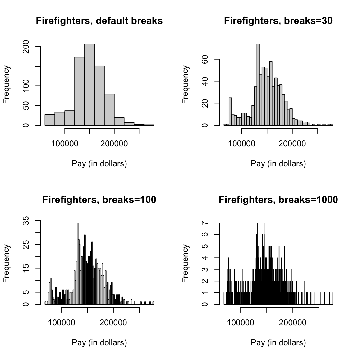
2.1.1.2 Density Histograms
The above are called frequency histograms, because we plot on the y-axis (the height of the rectangles) the count of the number of observations in each bin. Density histograms plot the height of rectangles so that the area of each rectangle is equal to the proportion of observations in the bin. If each rectangle has equal width, say \(w\), and there are \(n\) total observations, this means for a bin \(k\), it’s height is given by \[w*h_k=\frac{\# \text{observations in bin $k$}}{n}\] So that the height of a rectangle for bin \(k\) is given by \[h_k=\frac{\# \text{observations in bin $k$}}{w \times n}\] In other words, the density histogram with equal-width bins will look like the frequency histogram, only the heights of all the rectangles will be divided by \(w n\).
We will return to the importance of density histograms more when we discuss continuous distributions.
2.1.2 Boxplots
Another very useful visualization can be a boxplot. A boxplot is like a histogram, in that it gives you a visualization of how the data are distributed. However, it is a much greater simplification of the distribution.
Box: It plots only a box for the bulk of the data, where the limits of the box are the 0.25 and 0.75 quantiles of the data (or 25th and 75th percentiles). A dark line across the middle is the median of the data.
Whiskers: In addition, a boxplot gives additional information to evaluate the extremities of the distribution. It draws “whiskers” out from the box to indicate how far out is the data beyond the 25th and 75th percentiles. Specifically it calculates the interquartitle range (IQR), which is just the difference between the 25th and 75th percentiles: \[IQR=\text{3rd Qu.} - \text{1st Qu.}\] It then draws the whiskers out an additional 1.5 IQR distance from the boxes OR to the smallest/largest data point (whichever is closest to the box). \[\text{lower whisker}: max(\text{1st Qu.}-1.5IQR, \text{Min})\] \[\text{upper whisker}: min(\text{3rd Qu.}+1.5IQR, \text{Max})\]
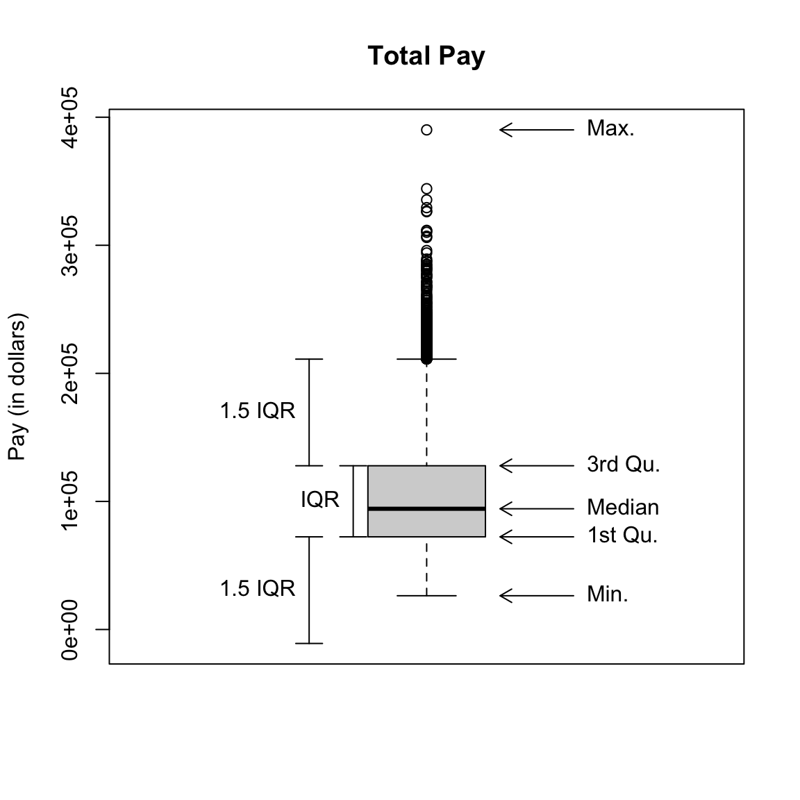
Any data points outside of this range of the whiskers are ploted individually. These points are often called “outliers” based the 1.5 IQR rule of thumb. The term outlier is usually used for unusual or extreme points. However, we can see a lot of data points fall outside this definition of “outlier” for our data; this is common for data that is skewed, and doesn’t really mean that these points are “wrong”, or “unusual” or anything else that we might think about for an outlier.3
Whiskers Why are the whiskers set like they are? Why not draw them out to the min and max?4 The motivation is that the whiskers give you the range of ``ordinary" data, while the points outside the whiskers are “outliers” that might be wrong or unrepresentative of the data. As mentioned above, this is often not the case in practice. But that motivation is still reasonable. We don’t want our notion of the general range of the data to be manipulated by a few extreme points; 1.5 IQR is a more stable, reliable (often called “robust”) description of the data.
Taking off the explanations from the plot and going back to our data, our boxplot is given by:
par(mfrow = c(1, 1))
boxplot(salaries2014_FT$TotalPay, main = "Total Pay",
    ylab = "Pay (in dollars)")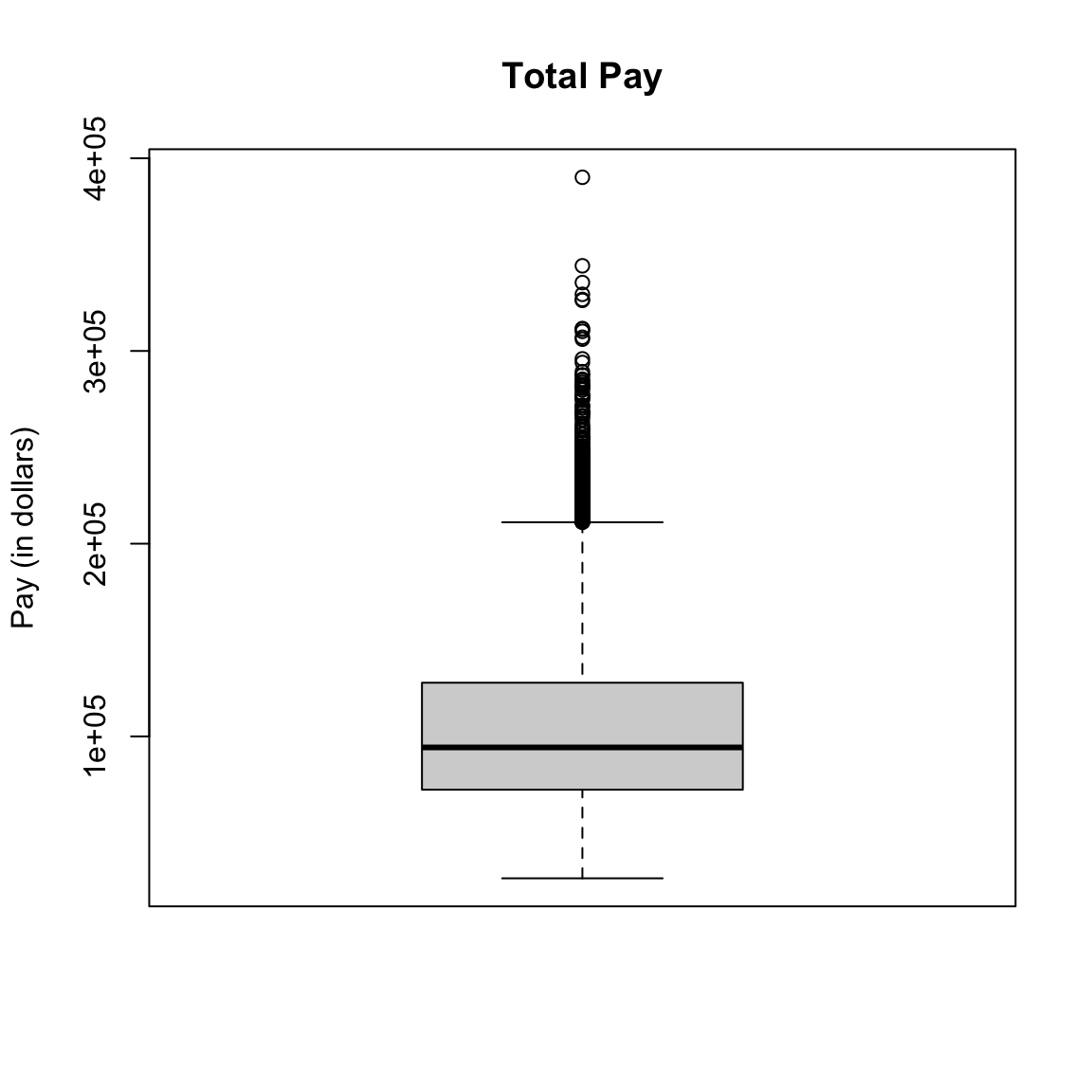
You might think, why would I want such a limited display of the distribution, compared to the wealth of information in the histogram? I can’t tell at all that the data is bimodal from a boxplot, for example.
First of all, the boxplot emphasizes different things about the distribution. It shows the main parts of the bulk of the data very quickly and simply, and emphasizes more fine grained information about the extremes (“tails”) of the distribution.
Furthermore, because of their simplicity, it is far easier to plot many boxplots and compare them than histograms. For example, I have information of the job title of the employees, and I might be interested in comparing the distribution of salaries with different job titles (firefighters, teachers, nurses, etc). Here I will isolate only those samples that correspond to the top 10 most numerous full-time job titles and do side-by-side boxplots of the distribution within each job title for all 10 jobs.
tabJobType <- table(subset(salaries2014_FT, Status ==
    "FT")$JobTitle)
tabJobType <- sort(tabJobType, decreasing = TRUE)
topJobs <- head(names(tabJobType), 10)
salaries2014_top <- subset(salaries2014_FT, JobTitle %in%
    topJobs & Status == "FT")
salaries2014_top <- droplevels(salaries2014_top)
dim(salaries2014_top)
## [1] 5816 10par(mar = c(10, 4.1, 4.1, 0.1))
boxplot(salaries2014_top$TotalPay ~ salaries2014_top$JobTitle,
main = "Total Pay, by job title, 10 most frequent job titles",
xlab = "", ylab = "Pay (in dollars)", las = 3)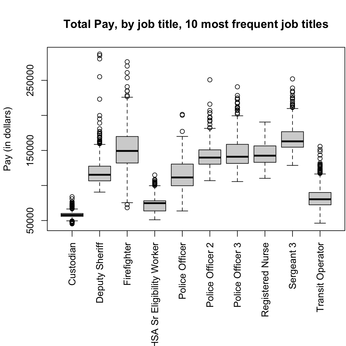
This would be hard to do with histograms – we’d either have 10 separate plots, or the histograms would all lie on top of each other. Later on, we will discuss “violin plots” which combine some of the strengths of both boxplots and histograms.
Notice that the outliers draw a lot of attention, since there are so many of them; this is common in large data sets especially when the data are skewed. I might want to mask all of the “outlier” points as distracting for this comparison,
boxplot(TotalPay ~ JobTitle, data = salaries2014_top,
    main = "Total Pay, by job title, 10 most frequent job titles",
    xlab = "", ylab = "Pay (in dollars)", las = 3,
    outline = FALSE)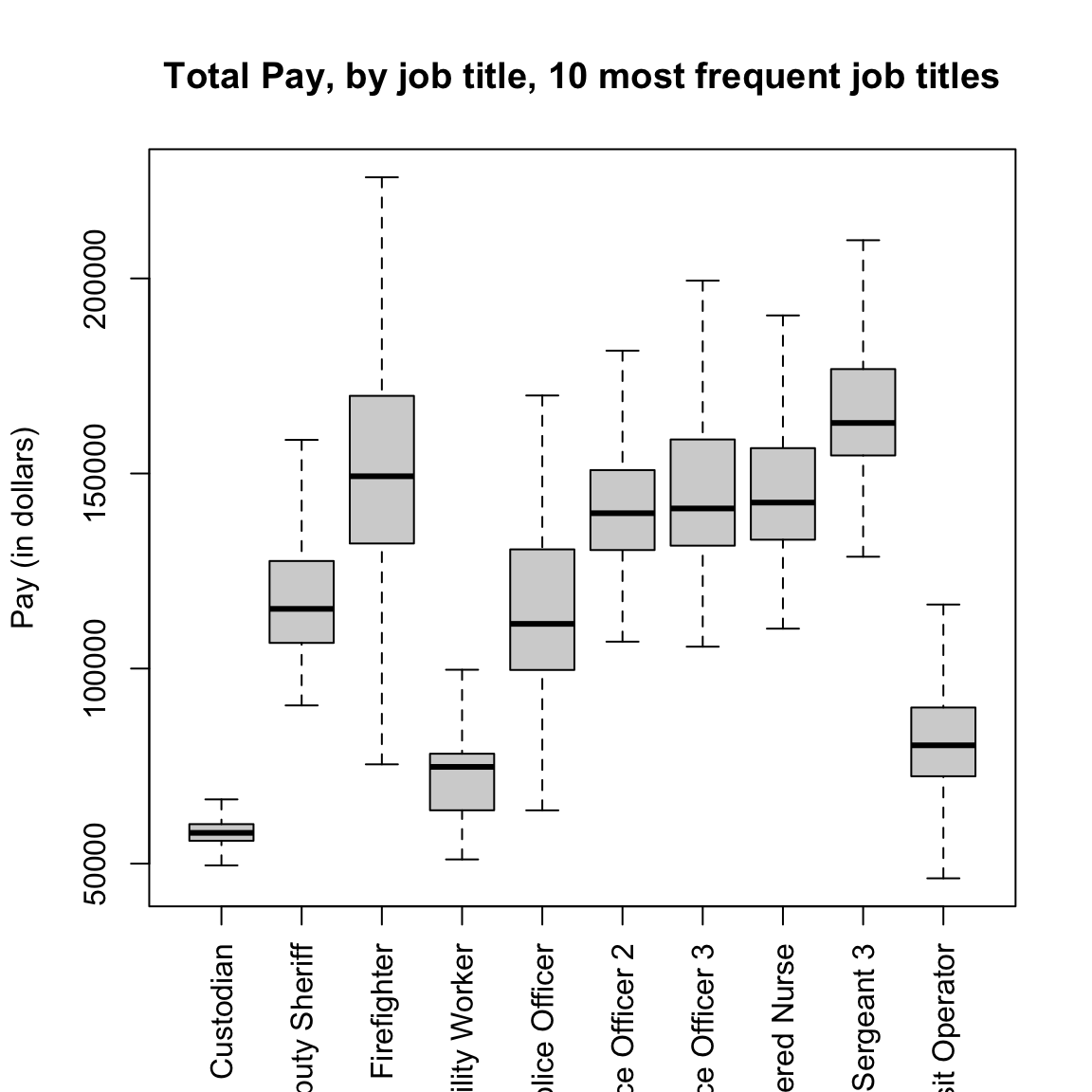
2.1.3 Descriptive Vocabulary
Here are some useful terms to consider in describing distributions of data or comparing two different distributions.
- Symmetric
- refers to equal amounts of data on either side of the `middle’ of the data, i.e. the distribution of the data on one side is the mirror image of the distribution on the other side. This means that the median of the data is roughly equal to the mean.
- Skewed
- refers to when one `side’ of the data spreads out to take on larger values than the other side. More precisely, it refers to where the mean is relative to the median. If the mean is much bigger than the median, then there must be large values on the right-hand side of the distribution, compared to the left hand side (right skewed), and if the mean is much smaller than the median then it is the reverse.
- Spread
- refers to how spread out the data is from the middle (e.g. mean or median).
- Heavy/light tails
- refers to how much of the data is concentrated in values far away from the middle, versus close to the middle.
As you can see, several of these terms are mainly relevant for comparing two distributions.5
Here are the histograms of some simulated data that demonstrate these features
set.seed(1)
par(mfrow = c(2, 2))
hist(rgamma(1000, shape = 2), main = "Right Skew")
hist(rnorm(1000), main = "Symmetric")
breaks = seq(-20, 20, 1)
hist(rnorm(1000), main = "Light tails", xlim = c(-20,
    20), breaks = breaks, freq = TRUE)
x <- rcauchy(1000)
hist(x[abs(x) <= 20], main = "Heavy tails", xlim = c(-20,
    20), breaks = breaks, freq = TRUE)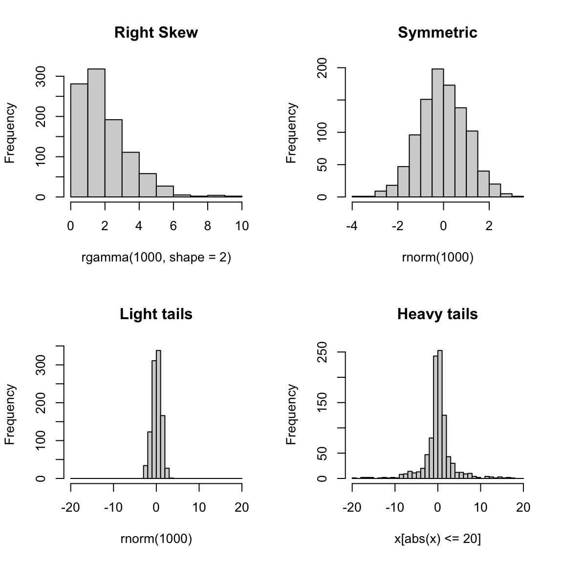
2.1.4 Transformations
When we have skewed data, it can be difficult to compare the distributions because so much of the data is bunched up on one end, but our axes stretch to cover the large values that make up a relatively small proportion of the data. This is also means that our eye focuses on those values too.
This is a mild problem with this data, particularly if we focus on the full-time workers, but let’s look quickly at another dataset that really shows this problem.
2.1.4.1 Flight Data from SFO
This data consists of all flights out of San Francisco Airport in 2016 in January (we will look at this data more in the next module).
## [1] 13207 64## [1] "Year" "Quarter" "Month"
## [4] "DayofMonth" "DayOfWeek" "FlightDate"
## [7] "UniqueCarrier" "AirlineID" "Carrier"
## [10] "TailNum" "FlightNum" "OriginAirportID"
## [13] "OriginAirportSeqID" "OriginCityMarketID" "Origin"
## [16] "OriginCityName" "OriginState" "OriginStateFips"
## [19] "OriginStateName" "OriginWac" "DestAirportID"
## [22] "DestAirportSeqID" "DestCityMarketID" "Dest"
## [25] "DestCityName" "DestState" "DestStateFips"
## [28] "DestStateName" "DestWac" "CRSDepTime"
## [31] "DepTime" "DepDelay" "DepDelayMinutes"
## [34] "DepDel15" "DepartureDelayGroups" "DepTimeBlk"
## [37] "TaxiOut" "WheelsOff" "WheelsOn"
## [40] "TaxiIn" "CRSArrTime" "ArrTime"
## [43] "ArrDelay" "ArrDelayMinutes" "ArrDel15"
## [46] "ArrivalDelayGroups" "ArrTimeBlk" "Cancelled"
## [49] "CancellationCode" "Diverted" "CRSElapsedTime"
## [52] "ActualElapsedTime" "AirTime" "Flights"
## [55] "Distance" "DistanceGroup" "CarrierDelay"
## [58] "WeatherDelay" "NASDelay" "SecurityDelay"
## [61] "LateAircraftDelay" "FirstDepTime" "TotalAddGTime"
## [64] "LongestAddGTime"This dataset contains a lot of information about the flights departing from SFO. For starters, let’s just try to understand how often flights are delayed (or canceled), and by how long. Let’s look at the column `DepDelay’ which represents departure delays.
##    Min. 1st Qu.  Median    Mean 3rd Qu.    Max.    NA's
##   -25.0    -5.0    -1.0    13.8    12.0   861.0     413
Notice the NA’s. Let’s look at just the subset of some variables for those observations with NA values for departure time (I chose a few variables so it’s easier to look at)
naDepDf <- subset(flightSF, is.na(DepDelay))
head(naDepDf[, c("FlightDate", "Carrier", "FlightNum",
    "DepDelay", "Cancelled")])
## FlightDate Carrier FlightNum DepDelay Cancelled
## 44 2016-01-14 AA 209 NA 1
## 75 2016-01-14 AA 218 NA 1
## 112 2016-01-24 AA 12 NA 1
## 138 2016-01-22 AA 16 NA 1
## 139 2016-01-23 AA 16 NA 1
## 140 2016-01-24 AA 16 NA 1## FlightDate Carrier FlightNum DepDelay Cancelled
## Length:413 Length:413 Min. : 1 Min. : NA Min. :1
## Class :character Class :character 1st Qu.: 616 1st Qu.: NA 1st Qu.:1
## Mode :character Mode :character Median :2080 Median : NA Median :1
## Mean :3059 Mean :NaN Mean :1
## 3rd Qu.:5555 3rd Qu.: NA 3rd Qu.:1
## Max. :6503 Max. : NA Max. :1
## NA's :413So, the NAs correspond to flights that were cancelled (Cancelled=1).
2.1.4.1.1 Histogram of flight delays
Let’s draw a histogram of the departure delay.
par(mfrow = c(1, 1))
hist(flightSF$DepDelay, main = "Departure Delay", xlab = "Time (in minutes)")
abline(v = c(mean(flightSF$DepDelay, na.rm = TRUE),
    median(flightSF$DepDelay, na.rm = TRUE)), lty = c("dashed",
    "solid"))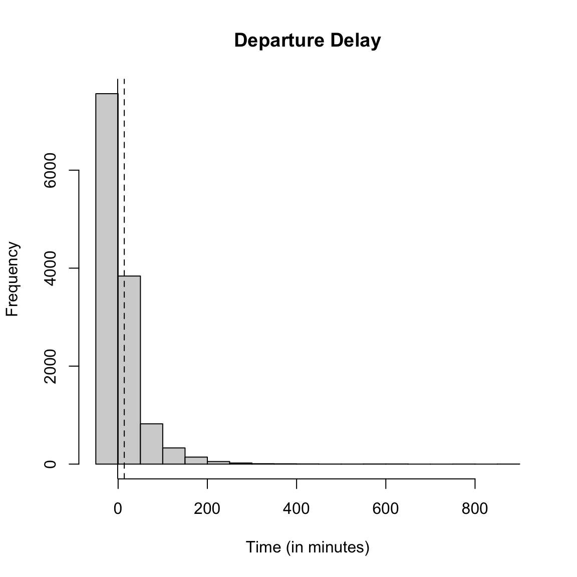
What do you notice about the histogram? What does it tell you about the data?
How good of a summary is the mean or median here? Why are they so different?
Effect of removing data
What happened to the NA’s that we saw before? They are just silently not plotted.
What does that mean for interpreting the histogram?
We could give the cancelled data a `fake’ value so that it plots.
flightSF$DepDelayWithCancel <- flightSF$DepDelay
flightSF$DepDelayWithCancel[is.na(flightSF$DepDelay)] <- 1200
hist(flightSF$DepDelayWithCancel, xlab = "Time (in minutes)",
    main = "Departure delay, with cancellations=1200")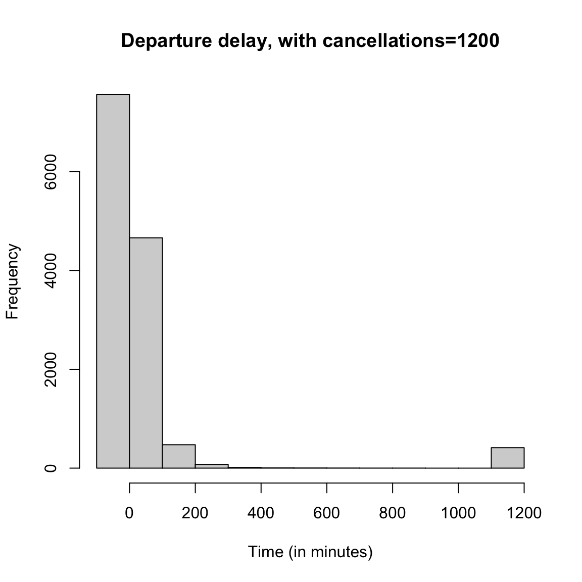
Boxplots
If we do boxplots separated by carrier, we can see the problem with plotting the "outlier’’ points
boxplot(flightSF$DepDelay ~ flightSF$Carrier, main = "Departure Delay, by airline carrier",
    ylab = "Time (in minutes)")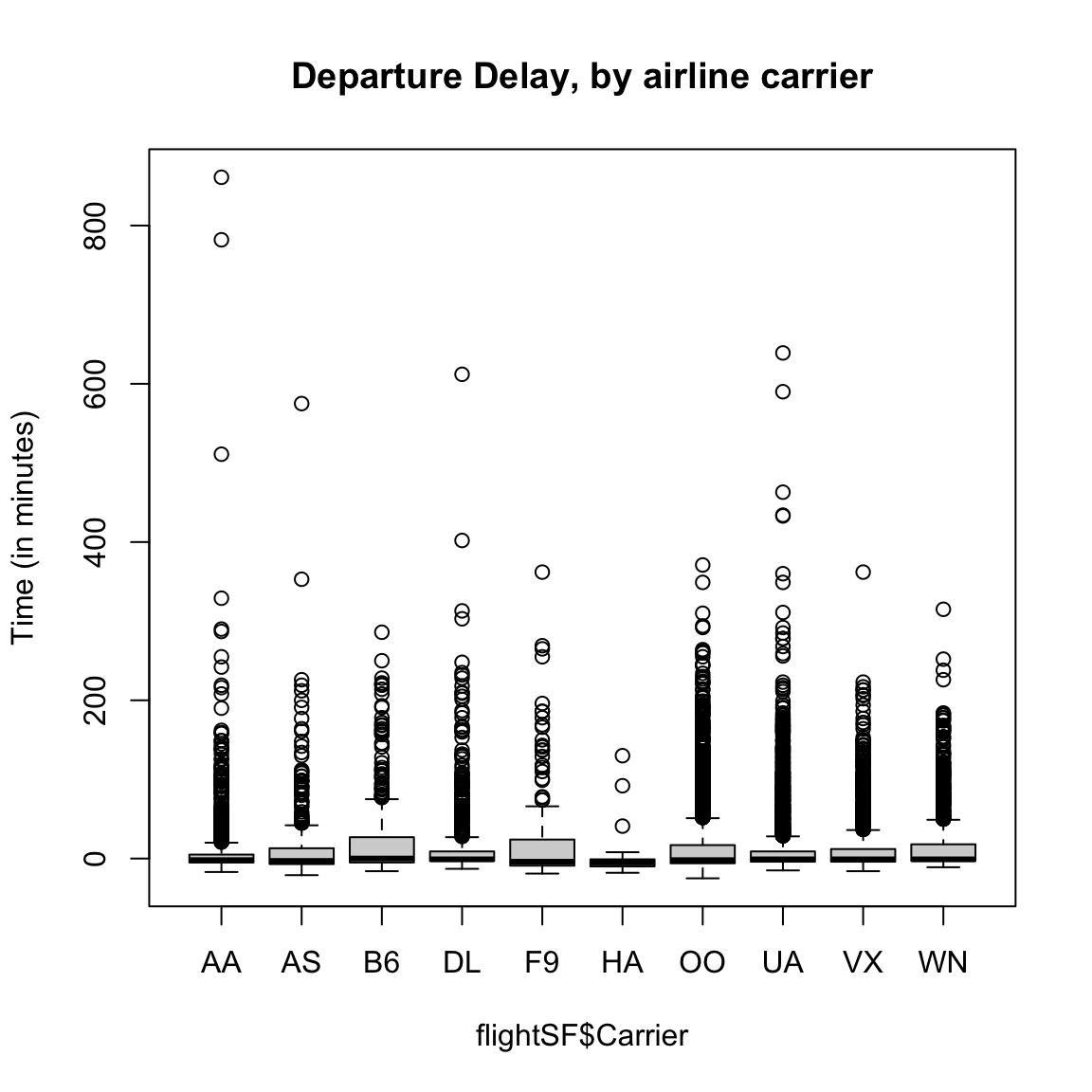
Here is the same plot suppressing the outlying points:
boxplot(flightSF$DepDelay ~ flightSF$Carrier, main = "Departure Delay, by airline carrier",
    ylab = "Time (in minutes)", outline = FALSE)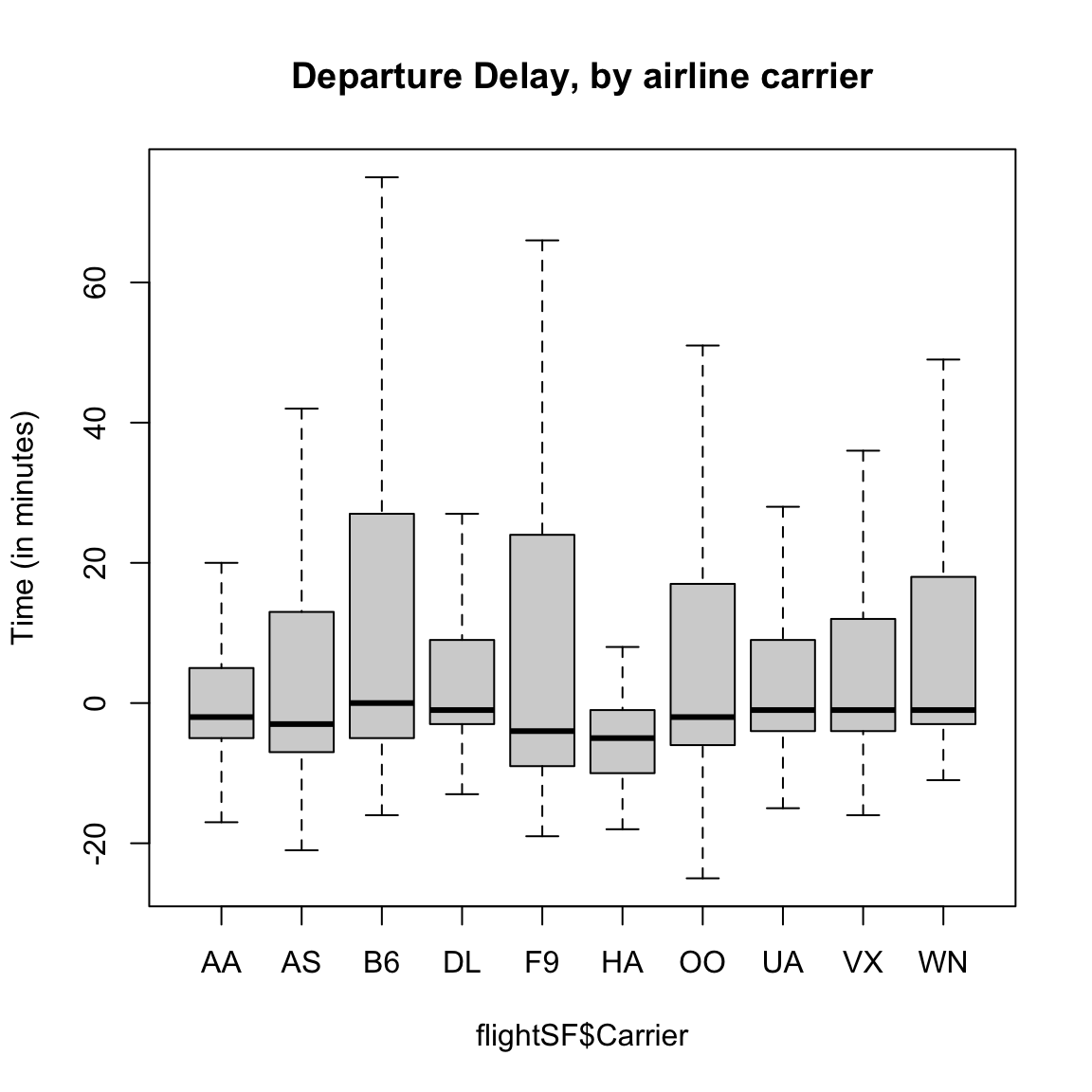
2.1.4.2 Log and Sqrt Transformations
In data like the flight data, we can remove these outliers for the boxplots to better see the median, etc, but it’s a lot of data we are removing – what if the different carriers are actually quite different in the distribution of these outer points? This is a problem with visualizations of skewed data: either the outlier points dominate the visualization or they get removed from the visualization.
A common way to get around this is to transform our data, which simply means we pick a function \(f\) and turn every data point \(x\) into \(f(x)\). For example, a log-transformation of data point \(x\) means that we define new data point \(y\) so that \[y=\log(x).\]
A common example of when we want a transformation is for data that are all positive, yet take on values close to zero. In this case, there are often many data points bunched up by zero (because they can’t go lower) with a definite right skew.
Such data is often nicely spread out for visualization purposes by either the log or square-root transformations.
ylim <- c(-3, 3)
curve(log, from = 0, to = 10, ylim = ylim, ylab = "Transformed",
    xlab = "Original")
curve(sqrt, from = 0, to = 10, add = TRUE, col = "red")
legend("bottomright", legend = c("log", "sqrt"), fill = c("black",
    "red"))
title(main = "Graph of log and sqrt functions")![]()
These functions are similar in two important ways. First, they are both monotone increasing, meaning that the slope is always positive. As a result, the rankings of the data points are always preserved: if \(x_1 > x_2\) then \(f(x_1) > f(x_2)\), so the largest data point in the original data set is still the largest in the transformed data set.
The second important property is that both functions are concave, meaning that the slope of \(f(x)\) gets smaller as \(f\) increases. As a result, the largest data points are pushed together while the smallest data points get spread apart. For example, in the case of the log transform, the distance between two data points depends only on their ratio: \(\log(x_1) - \log(x_2) = \log(x_1/x_2)\). Before transforming, 100 and 200 were far apart but 1 and 2 were close together, but after transforming, these two pairs of points are equally far from each other. The log scale can make a lot of sense in situations where the ratio is a better match for our “perceptual distance,” for example when comparing incomes, the difference between making $500,000 and $550,000 salary feels a lot less important than the difference between $20,000 and $70,000.
Let’s look at how this works with simulated data from a fairly skewed distribution (the Gamma distribution with shape parameter 1/10):
y <- rgamma(10000, scale = 1, shape = 0.1)
par(mfrow = c(1, 2))
hist(y, main = "Original data", xlab = "original scale",
    breaks = 50)
hist(log(y), main = "Log of data", xlab = "log-scale",
breaks = 50)![]()
Note that in this case, after transforming the data they are even a bit left-skewed because the tiny data points are getting pulled very far apart: \(\log(x) = -80\) corresponds to \(x = e^{-80} = 1.8\times 10^{-35}\), and \(\log(x) = -40\) to \(x = 4.2\times 10^{-18}\). Still, it is much less skewed than before.
Does it make sense to use transformations? Doesn’t this mess-up our data?
Notice an important property is that these are monotone functions, meaning we are preserving the rank of our data – we are not suddenly inverting the relative order of the data. But it does certainly change the meaning when you move to the log-scale. A distance on the log-scale of ‘2’ can imply different distances on the original scale, depending on where the original data was located.6
2.1.4.3 Transforming our data sets
Our flight delay data is not so obliging as the simulated data, since it also has negative numbers. But we could, for visualization purposes, shift the data before taking the log or square-root. Here I compare the boxplots of the original data, as well as that of the data after the log and the square-root.
addValue <- abs(min(flightSF$DepDelay, na.rm = TRUE)) +
    1
par(mfrow = c(3, 1))
boxplot(flightSF$DepDelay + addValue ~ flightSF$Carrier,
    main = "Departure Delay, original", ylab = "Time")
boxplot(log(flightSF$DepDelay + addValue) ~ flightSF$Carrier,
    main = "Departure Delay, log transformed", ylab = paste("log(Time+",
        addValue, ")"))
boxplot(sqrt(flightSF$DepDelay + addValue) ~ flightSF$Carrier,
    main = "Departure Delay, sqrt-transformed", ylab = paste("sqrt(Time+",
addValue, ")"))![]()
Notice that there are fewer `outliers’ and I can see the differences in the bulk of the data better.
Did the data become symmetrically distributed or is it still skewed?
2.2 Probability Distributions
Let’s review some basic ideas of sampling and probability distributions that you should have learned in Data 8/STAT 20, though we may describe them somewhat more formally than you have seen before. If any of these concepts in this section are completely new to you or you are having difficulty with some of the mathematical formalism, I recommend that you refer to the online book for STAT 88 by Ani Adhikari that goes into these ideas in great detail.
In the salary data we have all salaries of the employees of SF in 2014. This a census, i.e. a complete enumeration of the entire population of SF employees.
We have data from the US Census that tells us the median household income in 2014 in all of San Fransisco was around $72K.7 We could want to use this data to ask, what was the probability an employee in SF makes less than the regional median household number?
We really need to be more careful, however, because this question doesn’t really make sense because we haven’t defined any notion of randomness. If I pick employee John Doe and ask what is the probability he makes less than $72K, this is not a reasonable question, because either he did or didn’t make less than that.
So we don’t actually want to ask about a particular person if we are interested in probabilities – we need to have some notion of asking about a randomly selected employee. Commonly, the randomness we will assume is that a employee is randomly selected from the full population of full-time employees, with all employees having an equal probability of being selected. This is called a simple random sample.
Now we can ask, what is the probability of such a randomly selected employee making less than $72K? Notice that we have exactly defined the randomness mechanism, and so now can calculate probabilities.
This kind of sampling is called a simple random sample and is what most people mean when they say “at random” if they stop to think about it. However, there are many other kinds of samples where data are chosen randomly, but not every data point is equally likely to be picked. There are, of course, also many samples that are not random at all.
Notation and Terminology
We call the salary value of a randomly selected employee a random variable. We can simplify our notation for probabilities by letting the variable \(X\) be short hand for the value of that random variable, and make statements like \(P(X>20K)\). We call the complete set of probabilities of a random variable \(X\) the probability distribution of \(X\). Once you know all the probabilities of \(X\) you can calculate more general statements. For example, assuming \(X\) only takes on values of increments of $1K, we have \[P(10K\leq X \leq 20K)=P(X=10K)+P(X=11K)+...+P(X=20K)\] So the probability distribution of \(X\) provides the entire set of possible probabilities we can calculate for \(X\). We will frequently speak of the distribution of a random variable \(X\), and it’s important to remember that if we know the distribution of \(X\) we know everything there is to know about \(X\).
2.2.1 Definition of a Probability Distribution
Let’s take a moment and pull together some formal ideas about probability distributions. Formal probability is not the main focus of this class, and hopefully much of this is review, but it’s important to have some background and be comfortable with the notation and vocabulary.
What is a probability distribution? We’ve said that it is the complete set of probabilities of a random variable. For example, if we roll a six-sided dice and assume each side is equally likely, we would have the following distribution of probabilities of the possible outcomes:
| \(k\) | Probability |
|---|---|
| 0 | \(1/6\) |
| 1 | \(1/6\) |
| 2 | \(1/6\) |
| \(\ldots\) | |
| 6 | \(1/6\) |
This is similar to our simple random sample of SF employee salaries – each empolyee salary is a possible outcome and each is equally likely (though obviously too long to write down as a table!).
But we don’t have to have equal probabilities for each outcome to be a probability distribution. Here’s a random variable that takes on the values \(0\), \(1\) or \(2\) with different probabilities:
| \(k\) | Probability |
|---|---|
| 0 | 0.5 |
| 1 | 0.25 |
| 2 | 0.25 |
These tables give us the distribution of the random variable.
Formal Definitions
Let’s discuss probability distributions more formally and with mathematical notation.
A random variable \(X\) designates the outcome of the random experiment. The sample space \(\Omega\) are all the possible values that our random variable \(X\) can take. For the dice example \(\Omega=\{1,\ldots,6\}\). A random draw from the SF salaries has an \(\Omega\) equal to all of the salaries in our dataset. \(\Omega\) could also be non-numeric values. For example, we could have a bag of M&Ms and randomly draw an M&M and record the color of the M&M. \(X\) would be the color and our sample space \(\Omega=\{ \text{red},\text{blue},\ldots\}\).
An event is something we take the probability of. You often hear “event” used to describe a possible outcome of a random experiment. However, an event is actually more than just the specific outcomes that are possible (\(\Omega\)). This is because we can be interested in the probability of an outcome that is a combination of values of \(\Omega\), like the probability of rolling an odd number. In that case the event actually corresponds to a set of three values in \(\Omega\), \(\{1,3,5\}\). So an event is defined as any subset of the values of \(\Omega\). Usually we will write an event as “\(X=2\)” or “\(X\in \{1,3,5\}\)” or more informally as “dice is odd”. We can sometimes emphasize that this concerns the outcome of a random experiment by saying a “random event”
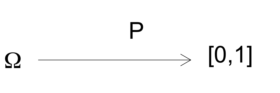
A probability distribution is a function \(P\) that gives a value between \(0\) and \(1\), inclusive, to every possible event. The value that \(P\) assigns to an event is called the probability of the event and we write it like \(P(X=2)\) or \(P(X\in \{1,3,5\})\)8 or \(P(\text{dice is odd})\). The requirements on this function \(P\) to be a probability is that
\(P\) is gives a value for all subsets of \(\Omega\). This ensures that all possible events have a probability (the probability could be zero!)
\(P\) gives values only in \([0,1]\) This ensures we don’t have negative probabilities or probabilities greater than 1. This is pretty intuitive to our idea of probability.
\(P(X\in \Omega)=1\) This one might be harder to parse the notation, but it means the probability you will see an outcome from \(\Omega\) is \(1\). This is like saying the probability that my dice rolls some number between 1 and 6 is \(1\). This rule ensures that every possible observed outcome has been included in \(\Omega\) – there’s no “missing” probability.
Translating words into probabilities and events
Remember that an “event” corresponds to a set of possible outcomes. We often use words to describe events, but it’s helpful to go back and forth between words and the set of outcomes that correspond to the event. Furthermore in manipulating probabilities, we will often be interested in multiple events, like “dice rolls odd” or “dice rolls number greater than 4”, and want to put them together, like “what is the probability that the dice rolls an odd number OR the dice rolls a number greater than 4”.
To think how to work with such a question, we want to convert between our words to a mathematical notation. We will assign events a variable like \[A=\text{``dice rolls odd"}=X\in\{1,3,5\}\] and \[B=\text{``dice rolls number greater than 4"}=X\in\{5,6\}.\] Then “OR” refers to either the outcome observed is in \(A\) or the outcome observed is in \(B\) (or both!): \[A\cup B=X\in\{1,3,5,6\}\] and our probability is defined as \[P(A\cup B).\] Alternatively, we might ask “what is the probability that the dice rolls an odd number AND the dice rolls a number greater than 4”. The AND refers to an outcome that is in both \(A\) and \(B\): \[A\cap B=\{X=6\}\] and the probability is written \[P(A\cap B).\]
We call two events \(A\) and \(B\) are mutually exclusive if they don’t share any outcomes, \[A \cap B=\emptyset\] For example \[A=\text{Dice rolls an odd number}= X\in\{1,3,5\}\] and \[B=\text{Dice rolls an even number}=X\in \{2,4,6\}\] are mutually exclusive events because the union of their two sets is empty.
Finally we might ask questions about an event described in the negative, like “the dice is NOT even”. Again, we have \[A=\text{"the dice is even"}=X\in\{2,4,6\}\] The NOT is the complement of \(A\), \[A^{C}= \Omega \backslash A=\text{"the dice is NOT even"}=X\in\{1,3,5\}.\]
Properties of Probabilities
We can now talk about a couple of important properties of \(P\) you should be familiar with for calculating the probability of multiple events.
- If \(A\) and \(B\) are mutually exclusive events, then \[P(A \cup B)= P(A) + P(B).\] This can be extended to many mutually exclusive events \(A, B, C, \ldots\) \[P(A \cup B \cup C \ldots)= P(A)+P(B)+P(C)\]
Otherwise, for general events \(A\) and \(B\) \[P(A \cup B)= P(A)+P(B) - P(A\cap B)\]
\(P(A^C)= 1-P(A)\)
Notice these rules allow me to do things like \[P(\text{Dice rolls an odd number})=P(X\in\{1,3,5\})=P(X=1)+P(X=2)+P(X=3)=3/6\] Similarly I can make some complicated questions simple by using the negative of an event
\[P(\text{Dice is NOT one})=P(X\in\{2,3,4,5,6\})=1-P(X=1)=1-1/6=5/6\] In this case it is not overly complicated to figure out \(P(X\in\{2,3,4,5,6\})\), since its the sum of the individual outcomes and each outcome has the same probability. But if there are a lot of outcomes, each with a different probability, \(1-P(X=1)\) is much easier to work with.
How would you calculate the following probabilities of a single random sample from the SF salaries?
\(P(\text{income}=\$72K)\)
\(P(\text{income}\leq \text{ \$72K})\)
\(P(\text{income}> \text{ \$200K})\)
2.2.1.1 Probabilities and Histograms
In the section on histograms we plotted frequency histograms of the SF data, where the height of each bin is the number of observations falling in the interval of the bin. Histograms of a data also have a relationship to the probability distribution of a single random sample from the data. Specifically, if the interval of a histogram bin is \((b_1,b_2]\), the probability a single sample from the data lies in this range is \[P(b_1 < X \leq b_2).\] This probability is \[P(b_1 < X \leq b_2) = \frac{\# \text{data in }(b_1,b_2]}{n}\] The numerator of this fraction is the height of the corresponding of a frequency histogram. So the histogram gives us a visualization of what values are most probable.
I’m going to plot these probabilities for each bin of our histogram, for both large and small size bins. 9
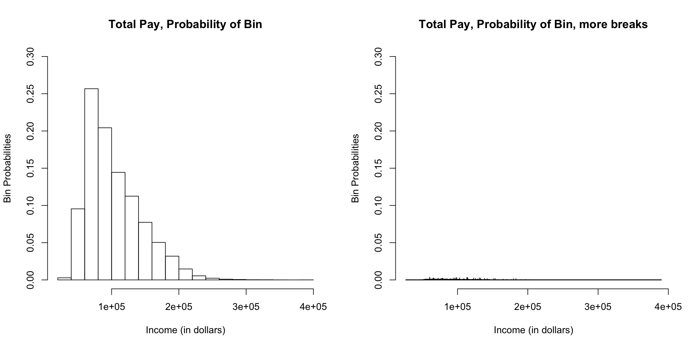
What happens as I decrease the size of the bins?
However, be careful because this plot is for instructive purposes, and is not what we usually use to visualize a distribution (we will show more visualizations later). In particular, this plot is not the same thing as a density histogram that you have probably learned about. A density histogram requires that the area of a bin is equal to the probability of being in our bin. We will learn more about why density histograms are defined in this way when we discuss continuous distributions below, but density histograms are what should be considered as the primary tool to visualize a probability distribution. To motivate why density histograms are more useful, however, you should note a density histograms will not drop to zero values as you make the bins smaller, so you can get the sense of the spread of probabilities in the distribution more independently from the choice of the size of the bin.
2.2.1.2 Probability Mass Function (pmf)
Notice that we’ve subtly switched in how we describe a probability distribution. Previously I implied that a probability distribution was the complete set of probabilities of the values in \(\Omega\) – that is what my tables I initially showed above were. But we see that the actual definition of a probability distribution is a function that gives a probability to every event. We’ve learned that events involve combinations of values of \(\Omega\), so there are a lot more events than there are values in \(\Omega\). We’ll explain now why we can go back and forth between these concepts.
The function that gives the probabilities of the all the values in \(\Omega\) is a separate quantity called the probability mass function often abbreviated as “pmf.” An example from our simple table above has a probability mass function \(p\) given by \[p(k)=P(X=k)=\begin{cases} 1/2, & k=0 \\ 1/4, & k=1\\ 1/4 & k=2 \end{cases}\]
The probability mass function is a function that goes from the values in \(\Omega\) to a value in \([0,1]\)
As we will see later, not all probability distributions have probability mass functions. But if they do, I can actually go back and forth between the probability mass function \(p\) and the probability distribution \(P\). By which I mean if I know one, then I can figure out the other. Clearly, if I know my probability distribution \(P\), I can define the probability mass function \(p\). But what is more interesting is that if I know \(p\), I can get \(P\), i.e. I can get the probability of any event. How?
Any event \(X\in \{\nu_1,\nu_2,\ldots\}\) is a set of outcomes where the \(\nu_i\) are some values in \(\Omega\). If we let \(A=X\in \{\nu_1,\nu_2,\ldots\}\), we can write \(A=X\in \nu_1 \cup X\in \nu_2 \cup \ldots\). Moreover, \(X\in \nu_1\) and \(X\in \nu_2\) are clearly mutually exclusive events because \(X\) can only take on one of those two possibilities. So for any event \(A\) we can write \[\begin{align*} P(A)&=P(X\in \{\nu_1,\nu_2,\ldots\})\\ &=P(X\in \nu_1 \cup X\in \nu_2 \cup \ldots)\\ &=P(X\in \nu_1)+P(X\in \nu_2 )+\ldots \end{align*}\]
So we can get the entire probability distribution \(P\) from our probability mass function \(p\). Which is fortunate, since it would be quite difficult to write down the probability of all events – just enumerating all events is not feasible in complicated settings.
Properties of a Probability Mass Function (pmf)
We need some restrictions about how the probabilities of the events combine together. Otherwise we could have the following probability distribution \[P(X=k)=\begin{cases} 1, & k=0 \\ 1, & k=1\\ 1 & k=2 \end{cases}\] Every possible outcome has probability 1 of occurring! The following example is less obvious, but still a problem \[P(X=k)=\begin{cases} 3/4, & k=0 \\ 3/4, & k=1\\ 3/4 & k=2 \end{cases}\] This would imply that the probability of the event \(X\in \{1,2\}\) (we get either a \(1\) OR a \(2\)) would be, \[P(X\in \{1,2\})=P(X=1)+P(X=2)=1.5 >1\]
These examples will violate the basic properties of \(P\).
This means that the properties of \(P\) (the probability distribution) imply a valid probability mass function \(p\) has certain properties:
- \(p\) is defined for all values of \(\Omega\)
- \(p(k)\) is in \([0,1]\)
- \(\sum_{k \in \Omega}p(k) = 1\)
2.2.2 More Examples of Probability Distributions
A random variable \(X\) is the outcome of a “random experiments” (or we could say “random process”). The only random experiments we’ve discussed so far is rolling a dice and randomly drawing a sample from a fixed population on which we have data (SF Full Time Employees). There are other kinds of descriptions of random processes. Here are two simple examples,
- You flip a coin 50 times and count the number of heads you get. The number of heads is a random variable (\(X\)).
- You flip a coin until you get a head. The number of times it takes to get a head is a random variable (\(Y\)).
These descriptions require multiple random actions, but still result in a single outcome. This outcome is a random variable because if we repeated the process we would get a different number. We could ask questions like
- What is the probability you get out of 50 flips you get 20 or more heads, \(P(X\geq 20)\)
- What is the probability it takes at least 20 flips to get a head, \(P(Y\geq 20)\)
In both examples, the individual actions that make up the random process are the same (flipping a coin), but the outcome of interest describes random variables with different distributions. For example, if we assume that the probability of heads is 0.5 for every flip, we have:
- \(P(X\geq 20)=0.94\)
- \(P(Y\geq 20)=1.91 \times 10^{-6}\)
Where did these numbers come from? When we were dealing with a simple random sample from a population, we had a very concrete random process for which we could calculate the probabilities. Similarly, when we flip coins, if we make assumptions about the coin flipping process (e.g. that we have a 0.5 probability of a head on each flip), we can similarly make precise statements about the probabilities of these random variables. These are standard combinatoric exercises you may have seen. For example, the probability that you get your first head in the 5th flip (\(Y=5\)) is the same as saying you have exactly four tails and then a head. If the result of each flip is independent of each other, then you have (0.5 x 4) as the probability of four tails in a row, and then (0.5) as the probability of the final head, resulting in the total probability being \(P(Y=5)=(0.5)^4(0.5)=(0.5)^5.\)
We can write down the entire the probability mass function \(p(k)\) of both of these random variables (i.e. the probabilities of all the possible outcomes) for both of these two examples as a mathematical equation. These distributions are so common the distributions have a name:
- Binomial Distribution \[p(k)=P(X = k) = \frac{n!}{k!(n-k)!} p^k (1-p)^{n-k}\] where \(n\in \{1,2,\ldots\}\) is equal to the number of flips (50), \(0\leq p\leq1\) is the probability of heads (\(0.5\)), and \(k\in \{0,1,\ldots,50\}\)
- Geometric Distribution \[p(k)=P(Y = k) = (1-p)^{k-1}p\] where \(0\leq p\leq1\) is the probability of heads (\(0.5\)) and \(k\in \{1,\ldots\}\).
Recall that we showed that knowledge of the pmf gives us knowledge of the entire probability distribution. Thus the above equations define the binomial and geometric distributions.
There are many standard probability distributions and they are usually described by their probability mass functions. These standard distributions are very important in both probability and statistics because they come up frequently.
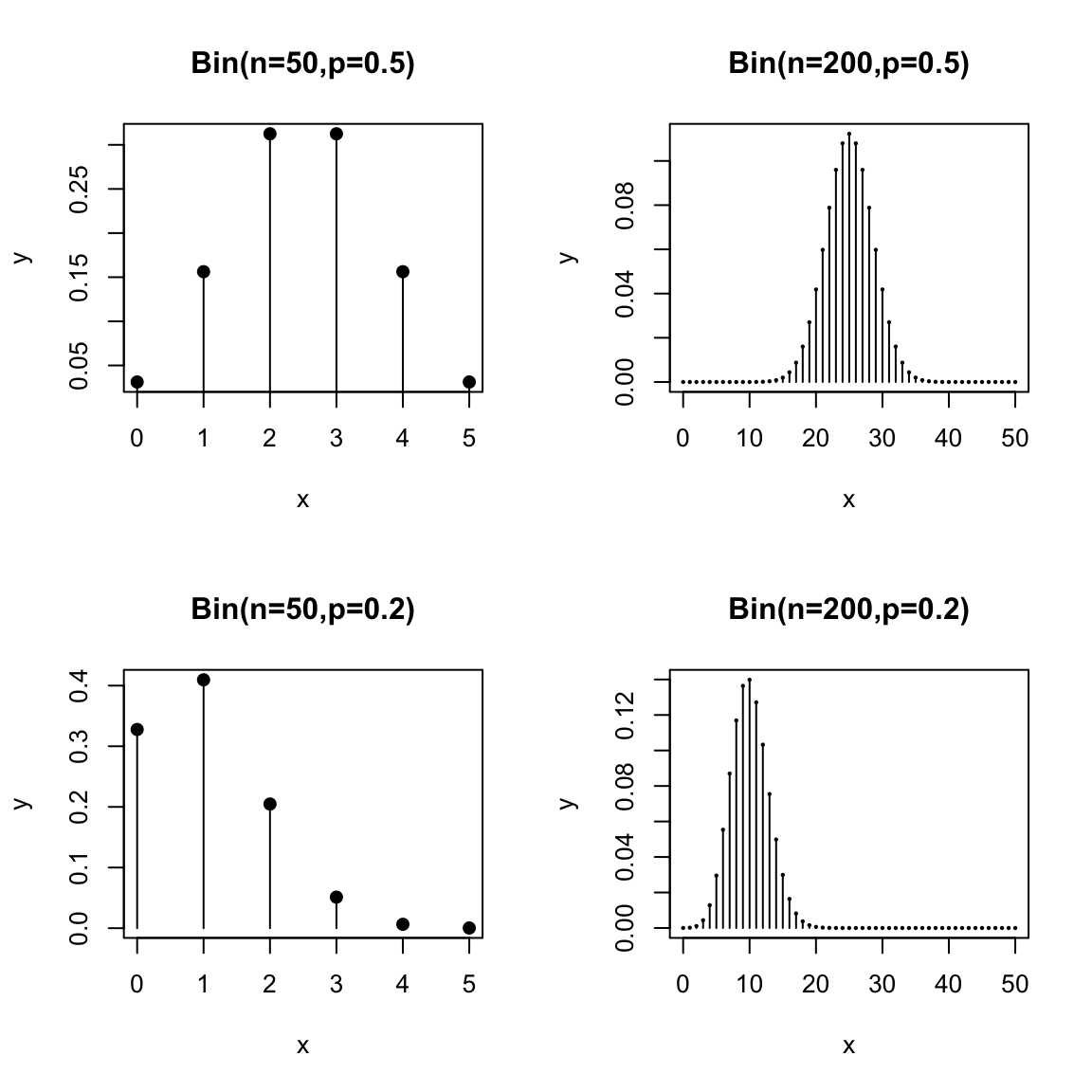
We can visualize pmfs and see how their probabilities change for different choices of parameters. Here is a plot of the binomial pmf for \(n=5\) and \(p=0.1\)
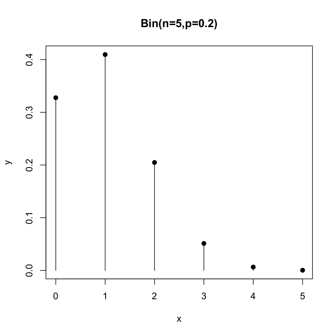 Notice that the lines are just there to visualize, but the actual values are the points
Here is the geometric distribution:
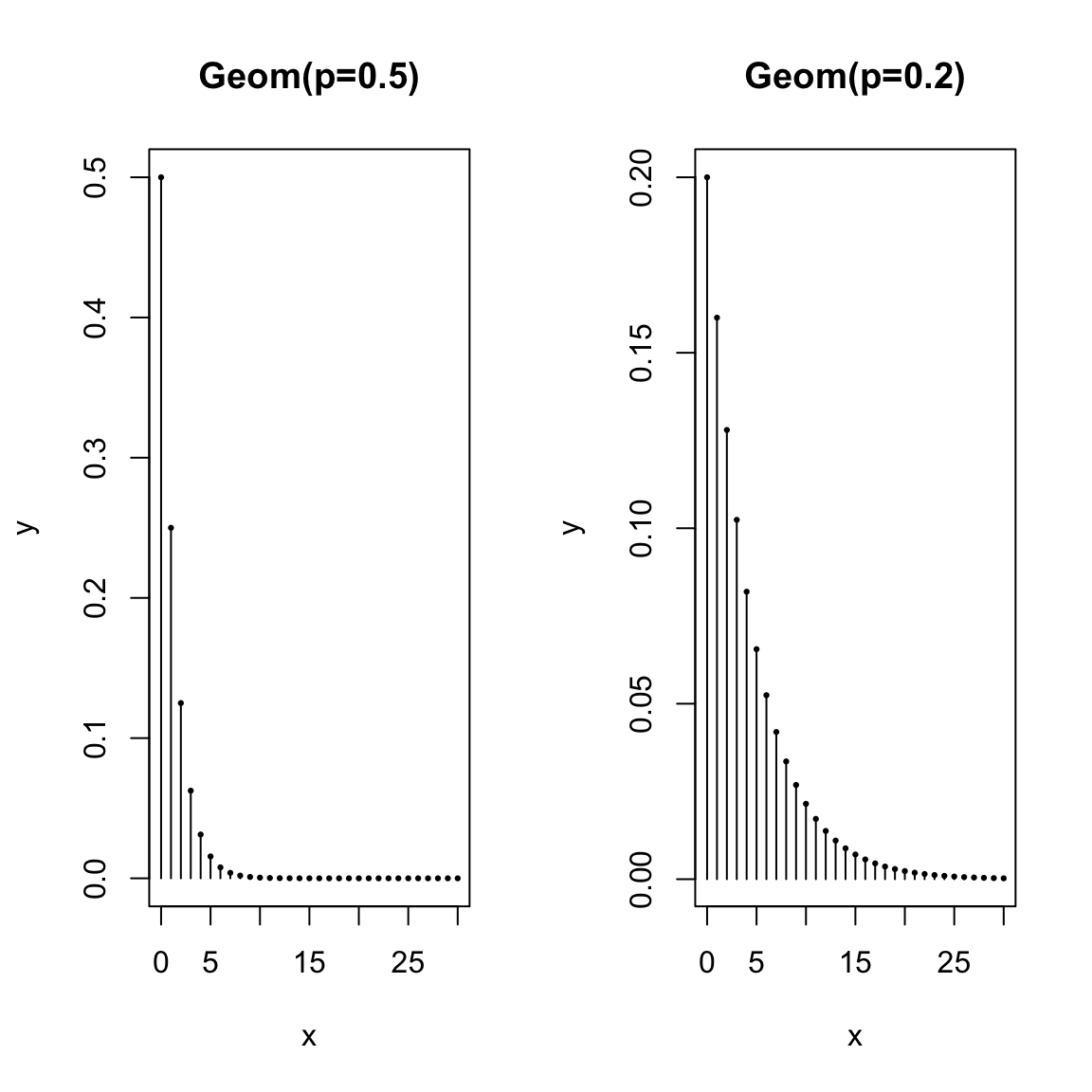
Think about the shape of the pmfs of these distributions. How do they change as you change \(p\)? What would you expect to happen if \(p=0.9\)?
Relationship to Histograms? Notice with the lines drawn, the pdf start to look a bit like histograms. Histograms show the probability of being within an interval, where the area of the rectangle is the probability. Of course, there’s no probability of being between 1 and 2 for the binomial distribution (you can’t get 1.5 heads!), so in fact if we drew a “histogram” for this distribution, it would look similar, only the height would have to account for the size of the bins of the histogram, so would not be the actual probability of being equal to any point. We can think of these visualizations being like histograms with “infinitely small” sized bins. And we can interpret them similarly, in the sense of understanding the shape and spread of the distribution, whether it is symmetric, etc.
Common features of probability mass functions (pmfs)
Notice some common features of these pmfs. \(k\) corresponds to the possible values the random variables can take on. So to get a specific probability, like \(P(X=5)\), you would substitute \(5\) in for \(k\) in the equation. Also \(k\) can only take on specific values. The set of all of these values is our sample space \(\Omega\). For the binomial the sample space is \(\Omega=\{0,1,\ldots,50\}\) and for the geometric distribution the sample space is \(\Omega=\{1,\ldots\}\) (an infinite sample space).
There are also other variables in the equation, like \(p\) (and \(n\) for the binomial distribution). These are called parameters of the distribution. These are values that you set depending on your problem. For example, in our coin problem, the probability of a head was \(p=0.5\) and the total number of flips was \(n=50\). However, this equation could be also be used if I changed my setup and decided that \(n=2000.\) It is common for a standard distribution to have parameters that you need to set. This allows for a single expression that can be used for multiple settings. However, it’s important to recognize which values in the equation are parameters defined by your setting (\(p\) and \(n\)) and which is specific to probability you decided to calculate (\(k\)). In the end you need all of them defined, of course, to calculate a specific probability.
Similar to \(k\), sometimes parameters can only take on a limited range of values. \(p\) for example has to be between \(0\) and \(1\) (it’s a probability of heads – makes sense!), and \(n\) needs to be a positive integer. The set of values allowed for parameters is called the parameter space.
Notation conventions
Please be aware that the choice of variables for all of these equations and for the random variable is arbitrary! Here are some common variations to be ready for
- We can use many different variables for the random variable, usually capitalized. Commonly they are at the end of the alphabet, \(X\), \(Y\), \(Z\), and even \(U\), \(V\), and \(W\).
- I used “k” in the probability mass function to indicate the particular outcome of which we want to calculate the probability. This is common (especially for the distributions we are considering right now). But it’s also common to write \(p(x)=P(X=x)\). The capital letter, e.g. \(X\), is for keeping track of the random variable and the lower case letter (of the same letter, e.g. \(x\)) is for indicating the particular outcome of which we want to calculate the probability. That outcome we are calculating the probability of is also called a realization of \(X\). This notation can be confusing, but as we’ll see it is also a notation that is easier to expand to multiple random variables e.g. \[P(X=x, Y=y, Z=z),\] without needing to introduce a large number of additional variables. Otherwise we start to run out of letters and symbols once we have multiple random variables – we don’t want statements like \(P(W=v, X=y, Z=u)\) because it’s hard to remember which value goes with which random variable.
- The choice of variables for the parameters change a good bit from person to person. It is common that they are Greek letters (\(\alpha\), \(\beta\), \(\theta\), \(\psi\), \(\phi\), \(\lambda\), \(\mu\),\(\sigma\),\(\tau\), \(\pi\) are all common). This helps the parameters stand out from the other variables floating around in the equation. This is obviously not a universal rule, as the two distributions above clearly demonstrate (\(p\) for a probability is a quite common choice of parameter…)
- The choice of \(p(k)\) for the pmf is common, but it can also be a different letter. It’s not uncommon to see \(f(k)\) or \(g(k)\).
- A probability distribution is a function generally called \(P\), and this is why we write \(P(X=2)\). \(P\) is pretty universal – so you don’t even have to explain \(P\) denotes a probability distribution when you write \(P(X=2)\). But even this we could change to another letter, like \(Q\); in this case we’d write \(Q(X=2)\) and it would still be a probability. Doing so is mainly when we might want to consider multiple distributions, and we need different letters to keep them apart.
Probability Calculations In R
Calculations with these standard probability distributions are built into R. Specifically functions dbinom and dgeom calculate \(P(X=k)\) for the binomial and geometric distributions.
## [1] 1.088019e-12## [1] 0.125and the functions pbinom and pgeom calculate \(P(X\leq k)\) for these distributions
## [1] 0.05946023## [1] 0.9999981How can you put these results together to get \(P(X\geq 20)\)?
2.2.2.1 Modeling real-life settings
We can also have situations in life that are usefully thought of as a random variables but are not well described as the result of sampling from a population:
- Suppose 5% of adults experience negative side-effects from a drug which result in a negative side effect. A research study enrolls 200 adults using this drug. The number of people in the study experiencing these negative side-effects can be considered a random variable.
- A polling company wants to survey people who have do not have college diplomas about their job experiences; they will call random numbers until they reach someone without a college diploma, and once they identify someone will ask their questions. The number of people the polling company will have to call before reaching someone without a college diploma can be considered as a random variable.
- A call center generally receives an average of 180 calls per day in 2023. The actual number of calls in a particular day can be considered as a random variable.
Already, we can see that analyzing these real life situations through the lens of probability is tricky, since our descriptions are clearly making simplifications (shouldn’t the volume of calls be more on some days of the weeks than others?). We could make more complicated descriptions, but there will be a limit. This is always a non-trivial consideration. At the same time, it can be important to be able to quantify these values to be able to ask questions like: do we need more staff members at the call center? Is our polling strategy for identifying non-college graduates feasible, or will it take too long? We just have to be careful that we consider the limitations of our probability model and recognize that it is not equivalent to the real-life situation.
The other tricky question is how to make these real-life situations quantifiable – i.e. how can we actually calculate probabilities? However, if you look at our examples, the first two actually look rather similar to the two coin-flipping settings we described above:
- Suppose we let “coin is heads” be equated to “experience negative side-effects from the drug”, and “the total number of coin flips” be “200 adults using this drug”. Then our description is similar to the binomial coin example. In this case the probability \(p\) of heads is given as \(p=0.05\) and \(n=200\). And \(X\) is the number of people in the study experiencing negative side-effects.
- Suppose we let a “coin flip” be equated to “call a random number”, and “coin is heads” be equated to “reach someone without a college diploma”. Then this is similar to our description of the geometric distribution, and our random variable \(Y\) is the number of random numbers that will need to be called in order to reach someone without a college diploma. Notice, however, that the geometric distribution has a parameter \(p\), which in this case would translate into “the probability that a random phone number is that of a person without a college diploma”. This parameter was not given in the problem, so we can’t calculate any probabilities for this problem. A reasonable choice of \(p\) would be the proportion of the entire probability that does not have a college diploma, an estimate of which we could probably grab from government survey data.
The process of relating a probability distribution to a real-life setting is often referred to as modeling, and it will never be a perfect correspondence – but can still be useful! We will often spend a lot of time considering how the model deviates from reality, because being aware of a model’s shortcomings allows us to think critically about whatever we calculate. But it doesn’t mean it is a bad practice to model real life settings. Notice how in this last example of the polling survey, by translating it to a precise probability distribution, it becomes clear what additional information (\(p\)) we need to be able to make the probability calculations for this problem.
Returning to our examples, the example of the call center is not easily captured by the two distributions above, but is often modeled with what is called a Poisson distribution
- Poisson Distribution \(P(Z=k)= \frac{\lambda^k e^{-\lambda k}}{k!}\) where \(\lambda>0\).
When modeling a problem like the call center, the needed parameter \(\lambda\) is the rate of the calls per the given time frame, in this case \(\lambda=180\).
2.2.3 Conditional Probability and Independence
Previously we asked about the population of all FT employees, so that \(X\) is the random variable corresponding to income of a randomly selected employee from that population. We might want to consider asking questions about the population of employees making less than $72K. For example, low-income in 2014 for an individual in San Francisco was defined by the same source as $64K – what is the probability of a random employee making less than $72K to be considered low income?
We can write this as \(P(X \leq 64 \mid X <72)\), which we say as the probability a employee is low-income given that or conditional on the employee makes less than the median income. A probability like \(P(X \leq 64 \mid X <72)\) is often called a conditional probability.
How would we compute a probability like this?
Note that this is a different probability than \(P(X \leq 64)\).
How is this different? What changes in your calculation?
Once we condition on a portion of the population, we’ve actually defined a new random variable. We could call this new random variable a new variable like \(Y\), but we usually notated it as \(X \mid X > 72K\). Since it is a random variable, it has a new probability distribution, which is called the conditional distribution. We can plot the histogram of this conditional distribution:
condPop <- subset(salaries2014_FT, TotalPay < 72000)
par(mfrow = c(1, 1))
hist(condPop$TotalPay, main = "Conditional Distribution, less than $72K",
    xlab = "Pay (in dollars)")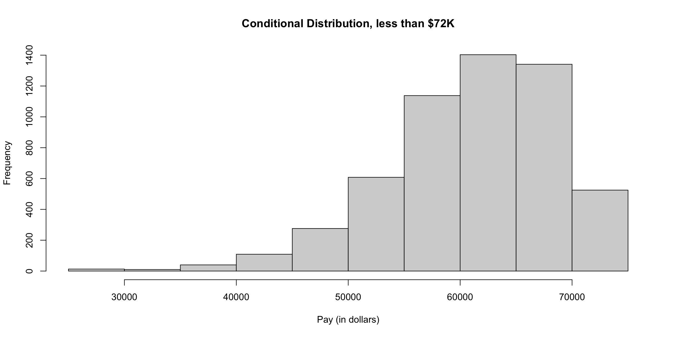
We can think of the probabilities of a conditional distribution as the probabilities we would get if we repeatedly drew \(X\) from its marginal distribution but only “keeping” it when we get one with \(X<72K\).
Consider the flight data we looked at briefly above. Let \(X\) for this data be the flight delay, in minutes, where if you recall NA values were given if the flight was cancelled.
How would you state the following probability statements in words? \[P(X>60 | X \neq \text{NA})\] \[P(X>60 | X \neq \text{NA} \& X>0)\]
Conditional probability versus population
Previously we limited ourselves to only full-time employees, which is also a subpopulation of the entire set of employees. Why weren’t those conditional probabilities too? It’s really a question of what is our reference point, i.e. how have we defined our full population. When we write a conditional probability, we keeping our reference population the same, but writing questions that consider a subpopulation of it. This allows us, for example, to write statements regarding different subpopulations in the same sentence and compare them, for example \(P(X \leq 64 \mid X <72)\) versus \(P(X \leq 64 \mid X > 72)\), because the full population space is the same between the two statements (full-time employees), while the conditional statement makes clear that we are considering a subpopulation.
2.2.3.1 Formal Notation for Conditional Probabilities
Our more formal notation of probability distributions can be extended to condition probabilities. We’ve already seen that a probability is a value given to a random event. Our conditional probabilities deal with two random events. The conditional probability \[P(X \leq 64 \mid X <72)\] involves the event \(A=X \leq 64\) and \(B=X<72\). Our conditional probability is thus \(P(A|B)\).
Note that \(P(A|B)\) (outcome is in \(A\) given outcome is in \(B\)) is different from \(P(A \cap B)\) (outcome is in both \(A\) and \(B\)=) or \(P(A\cup B)\) (outcome is in either \(A\) or \(B\)). Remember the conditional distribution is really just a completely distribution than \(P\) – we cannot create an event from \(\Omega\) (or combination of events) whose probability would (always) be equal to \(P(A | B)\). We noted above that we could call this new distribution \(Q\) and just write \(Q(A)\) with possibly a different sample space \(\Omega\) and definitely completely different values assigned to \(A\) than \(P\) would provide. However, there is an important property that links \(P(A|B)\) to \(P(A \cap B)\): \[P(A \cap B)=P(A|B)P(B)\] You can also see this written in the equivalent form \[P(A|B)=\frac{P(A \cap B)}{P(B)}\] This formula relates our conditional probability distribution to our probability distribution \(P\). So there’s not an event whose probability using \(P\) equals \(P(A|B)\), we can make calculations of the distribution of \(A|B\) using the distribution \(P\). This is an important reason why we don’t just create a new distribution \(Q\) – it helps us remember that we can go back and forth between these distributions.
For example, for the dice example, we can say something like \[\begin{align*} P(X\in\{1,2,3\} | X\in \{2,4,5\})&= \frac{P(X\in\{1,2,3\} \cap X\in \{2,4,5\})}{P(X\in \{2,4,5\})}\\ &=\frac{1/6}{3/6}=1/3 \end{align*}\]
We can compare this to \[P(X\in\{1,2,3\})=P(X=1)+P(X=2)+P(X=3)=3/6=1/2\] So of all rolls where the outcome has \(X\) in \(\{2,4,5\}\) the probability of \(X\) being in \(\{1,2,3\}\) is smaller than if we consider all rolls of the dice.
2.2.3.2 Independence
If we are considering two events, we frequently talk about events being independent. Informally, we say two events are independent if whether one event happens doesn’t affect whether the other event happens. For example, if we roll a dice twice, we don’t expect the fact the first die rolled is an odd number to affect whether the second rolled is even (unless someone is cheating!). So if we model these two dice rolls as a random process, we’d usually assume these two events are independent.
However we might have two events describing the outcome of a single role of the dice. We’ve seen many examples above, where we might have an event \(X\in\{1,2,3\}\) and \(X\in \{2,4,5\}\) and consider the joint probability of these \[P(X\in\{1,2,3\} \cap X\in \{2,4,5\})\] or the conditional probability \[P(X\in\{1,2,3\} | X\in \{2,4,5\})\] We can similarly consider whether these two events are independent. It’s clearly a trickier question to answer on the same role of the dice, but it doesn’t seem like it should be independent. Clearly if you know whether “dice is odd” should have an effect on whether “dice is even” when it’s the same dice roll!
The formal definition of independence allows us to answer this question. Two events \(A\) and \(B\) are defined as independent if \[P(A \cap B)=P(A)P(B)\] Notice that this means that if two events are independent \[P(A|B)= \frac{P(A \cap B)}{P(B)}=\frac{P(A)P(B)}{P(B)}=P(A)\] So if \(A\) is independent from \(B\), the probability of \(A\) is the same regardless of the outcome of \(B\).
2.2.4 Expectation and Variance
The last formal probability idea I want to review is the expectation and variance of a distribution. These are things we can calculate from a probability distribution that describe the probability distribution, similar to how we can calculate summary statistics from data to summarize the dataset.
Expectation
The expectation or mean of a distribution is defined as \[E(X)=\sum_{k \in \Omega} k \space p(k)\] where \(E(X)\) stands for the expectation of \(X\).10
For example, for our dice example \(\Omega=\{1,2,3,4,5,6\}\) and \(p(k)=1/6\) for all \(k\). So we have \[\begin{align*} E(X)=\sum_{k \in \Omega} k \space p(k)&=1 P(X=1)+2P(X=2)+\ldots+ 6P(X=6)\\ &=1/6(1+2+\ldots+6)\\ &=21/6=3.5 \end{align*}\] Notice that because each outcome is equally likely in this example, the expectation is just the mean of all the values in \(\Omega\); this is why the expectation of a distribution is also called the mean of the distribution.
Consider our earlier simple example where we don’t have equal probabilities, \[p(k)=P(X=k)=\begin{cases} 1/2, & k=0 \\ 1/4, & k=1\\ 1/4 & k=2 \end{cases}\] In this case \[\begin{align*} E(X)=\sum_{k \in \Omega} k \space p(k)&= 0P(X=0)+1P(X=1)+2P(X=2)\\ &=0+1/4+1/2\\ &=3/4 \end{align*}\] This is smaller than the average of the values in \(\Omega\) (which would be 1). This is because we have more probability on zero, which pulls down our expectation. In the case of unequal probabilities, the expectation can be considered a weighted mean, meaning it gives different weights to different possible outcomes depending on how likely they are.
Variance
Just as there is a mean defined for a probability distribution, there is also a variance defined for a probability distribution. It has the same role as the sample variance of data – to describe the spread of the data. It has a similar definition \[var(X)=E(X-E(X))^2=\sum_{k \in \Omega} (k - E(X))^2 p(k)\] The variance of a probability distribution measures the average distance a random draw from the distribution will be from the mean of the distribution – a measure of spread of the distribution.
Notice the similarity to the equation for the variance for data: \[\frac{1}{n-1}\sum_{i=1}^n (X_i- \bar{X})^2=\sum_{i=1}^n (X_i- \bar{X})^2 \frac{1}{n-1}\] The equations are pretty much equivalent, except that for the variance of a probability distribution we weight different values differently based on how likely they are, while the data version weighs each observation equally.11
Properties of Expectation and Variance
The following properties are important to know for calculations involving expectation and variance
- \(E(a+bX)=a+bE(X)\)
- \(var(a+bX)=b^2var(X)\) – adding a constant to a random variable doesn’t change the variance
- Generally, \(E(g(X))\neq g(E(X))\) and \(var(g(X))\neq g(var(X))\)
- \(var(X)=E(X-E(X))^2=E(X^2)-[E(X)]^2\)
2.3 Continuous Distributions
Our discussions so far primarily relied on probability from discrete distributions. This often has meant that the complete set of possible values (the sample space \(\Omega\)) that can be observed is a finite set of values. For example, if we draw a random sample from our salary data we know that only the 35711 unique values of the salaries in that year can be observed – not all numeric values are possible. We saw this when we asked what was the probability that we drew a random employee with salary exactly equal to $72K.
We also saw the geometric distribution where the sample space \(\Omega=\{1,2,3,\ldots\}\). The geometric distribution is also a discrete distribution, even though \(\Omega\) is infinite. This is because we cannot observe \(1.5\) or more generally the full range of values in any interval – the distribution does not allow continuous values.12
However, it can be useful to think about probability distributions that allow for all numeric values in a range (i.e. continuous values). These are continuous distributions.
Continuous distributions are useful even for settings when we know the actual population is finite. For example, suppose we wanted to use this set of data about SF salaries to make decisions about policy to improve salaries for a certain class of employees. It’s more reasonable to think that there is an (unknown) probability distribution that defines what we expect to see for that data that is defined on a continuous range of values, not the specific ones we see in 2014. We might reasonably assume the sample space of such a distribution is \(\Omega=[0,\infty).\) Notice that this definition still kept restrictions on \(\Omega\) – only non-negative numbers; this makes sense because these are salaries. But the probability distribution on \(\Omega=[0,\infty)\) would still be a continuous distribution because its a restriction to an interval and thus takes on all the numeric values in that interval.
Of course some data are “naturally” discrete, like the set of job titles or the number of heads in a series of coin tosses, and there no rational way to think of them being continuous.
2.3.1 Probability with Continuous distributions
Many of the probability ideas we’ve discussed carry forward to continuous distributions. Specifically, our earlier definition of a probability distribution is universal and includes continuous distributions. But some probability ideas become more complicated/nuanced for continuous distributions. In particular, for a discrete distribution, it makes sense to say \(P(X=72K)\) (the probability of a salary exactly equal to \(72K\)). For continuous distributions, such an innocent statement is actually fraught with problems.
To see why, remember what you know about a probability distributions. In particular, a probability must be between 0 and 1, so \[0 \leq P(X=72,000)\leq 1\] Moreover, this is a property of any probability statement, not just ones involving `\(=\)’: e.g. \(P(X\leq 10)\) or \(P(X\geq 0)\). This is a fundamental rule of a probability distribution that we defined earlier, and thus also holds true for continuous distributions as well as discrete distributions.
Okay so far. Now another thing you learned is if I give all possible values that my random variable \(X\) can take (the sample space \(\Omega\)) and call them \(v_1,\ldots,v_K\), then if I sum up all these probabilities they must sum exactly to \(1\), \[P(\Omega)=\sum_{i=1}^K P(X=v_i) =1\]
Well this becomes more complicated for continuous values – this leads us to an infinite sum since we have an infinite number of possible values. If we give any positive probability (i.e. \(\neq 0\)) to each point in the sample space, then we won’t `sum’ to one.13 These kinds of concepts from discrete probability just don’t translate over exactly to continuous random variables.
To deal with this, continuous distributions do not allow any positive probability for a single value: if \(X\) has a continuous distribution, then \(P(X=x)=0\) for any value of \(x\).
Instead, continuous distributions only allow for positive probability of an interval: \(P(x_1\leq X \leq x_2)\) can be greater than 0.
Note that this also means that for continuous distributions \(P(X\leq x)= P(X < x).\) Why?
Key properties of continuous distributions
- \(0\leq P(A)\leq 1\), inclusive.
- Probabilities are only calculated for events that are intervals, not individual points/outcomes.
- \(P(\Omega)=1\).
Giving zero probability for a single value isn’t so strange if you think about it. Think about our flight data. What is your intuitive sense of the probability of a flight delay of exactly 10 minutes – and not 10 minutes 10 sec or 9 minutes 45 sec? You see that once you allow for infinite precision, it is actually reasonable to say that exactly 10 minutes has no real probability that you need worry about.
For our salary data, of course we don’t have infinite precision, but we still see that it’s useful to think of ranges of salary – there is no one that makes exactly $72K, but there is 1 employee within $1 dollar of that amount, and 6 employees within $10 dollars of that amount. These are all equivalent salaries in any practical discussion of salaries.
What if you want the chance of getting a 10 minute flight delay? Well, you really mean a small interval around 10 minutes, since there’s a limit to our measurement ability anyway. This is what we also do with continuous distributions: we discuss the probability in terms of increasingly small intervals around 10 minutes.
The mathematics of calculus give us the tools to do this via integration. In practice, the functions we want to integrate are not tractable anyway, so we will use the computer. We are going to focus on understanding how to think about continuous distributions so we can understand the statistical question of how to estimate distributions and probabilities (rather than the more in-depth probability treatment you would get in a probability class).
2.3.2 Cummulative Distribution Function (cdfs)
For discrete distributions, we can completely describe the distribution of a random variable by describing the probability mass function. In other words, knowing \(P(X=v_i)\) for all possible values of \(v_i\) in the sample space \(\Omega\) completely defines the probability distribution.
However, we just said that \(P(X=x)=0\) for any value of \(x\), so clearly the probability mass function doesn’t make sense for continuous distributions, and certainly doesn’t define the distribution. Indeed, continuous distributions are not considered to have a probability mass function.
Are we stuck going back to basics and defining the probability of every possible event? All events with non-zero probability can be described as a combination of intervals, so it suffices to define the probably of every single possible interval. This is still a daunting task since there are an infinite number of intervals, but we can use the simple fact that \[P(x_1 < X \leq x_2)=P(X\leq x_2) - P(X \leq x_1)\]
Why is this true? (Use the case of discrete distribution to reason it out)
Thus rather than define the probably of every single possible interval, we can tackle the simpler task to define \(P(X \leq x)\) for every single \(x\) on the real line. That’s just a function of \(x\) \[F(x)=P(X \leq x)\] \(F\) is called a cumulative distribution function (cdf) and it has the property that if you know \(F\) you know \(P\), i.e. you can go back and forth between them.
While we will focus on continuous distributions, discrete distributions can also be defined in the same way by their cumulative distribution function instead of their probability mass functions. In fact cumulative distribution functions are the most general way to numerically describe a probability distribution^[More specifically, for all real-valued probability distributions, where \(\Omega\) is a subset of \(R^p\).
Here are some illustrations of different \(F\) functions for \(x\) between \(-3\) and \(3\):
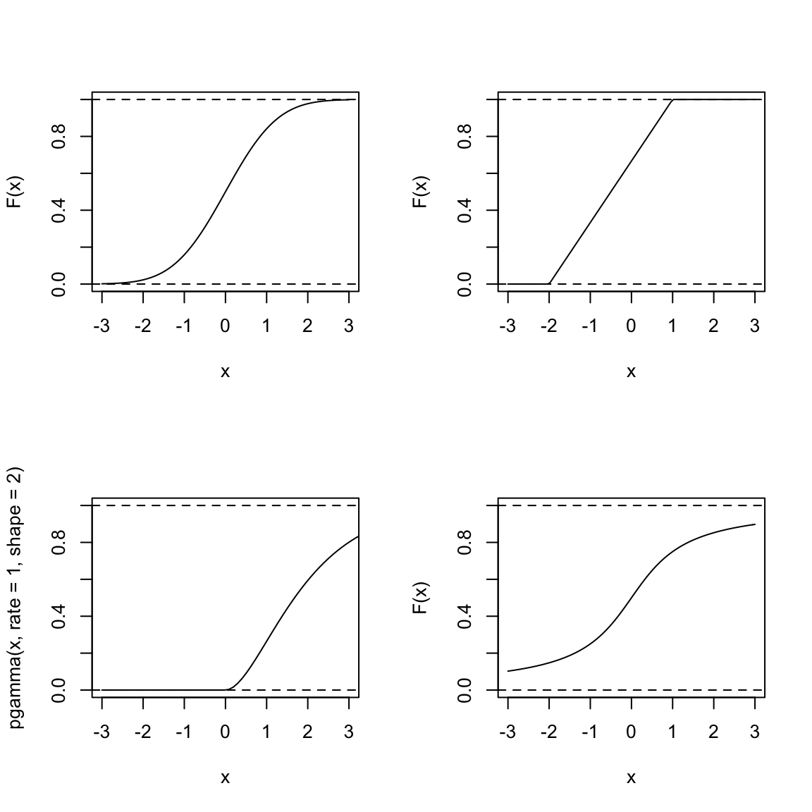
Consider the following questions about a random variable \(X\) defined by each of these distributions:
Which of these distributions is likely to have values of \(X\) less than \(-3\)?
For which is it equally likely for \(X\) to be positive or negative?
What is \(P(X>3)\) – how would you calculate that from the cdfs pictured above? Which of the above distributions are likely to have \(P(X>3)\) be large?
What is \(\lim_{x\rightarrow \infty} F(x)\) for all cdfs? What is \(\lim_{x\rightarrow -\infty} F(x)\) for all cdfs? Why?
2.3.3 Probability Density Functions (pdfs)
You see from these questions at the end of the last section, that you can make all of the assessments we have discussed (like symmetry, or compare if a distribution has heavier tails than another) from the cdf. But it is not the most common way to think about the distribution. More frequently the probability density function (pdf) is more intuitive. It is similar to a histogram in the information it gives about the distribution and is the continuous analog of the probability mass functions for discrete distributions.
Formally, the pdf \(p(x)\) is the derivative of \(F(x)\): if \(F(x)\) is differentiable \[p(x)=\frac{d}{dx}F(x).\] If \(F\) isn’t differentiable, the distribution doesn’t have a density, which in practice you will rarely run into for continuous variables.14
Conversely, \(p(x)\) is the function such that if you take the area under its curve for an interval (a,b), i.e. take the integral of \(p(x)\), that area gives you probability of that interval: \[\int_{a}^b p(x)=P(a\leq X \leq b) = F(b)-F(a)\]
More formally, you can derive \(P(X\leq v)=F(v)\) from \(p(x)\) as \[F(v)=\int_{-\infty}^v p(x)dx.\]
Let’s look at an example with the following pdf, which is perhaps vaguely similar to our flight or salary data, though on a different scale of values for \(X\), \[p(x)=\frac{1}{4} x e^{-x/2}\]
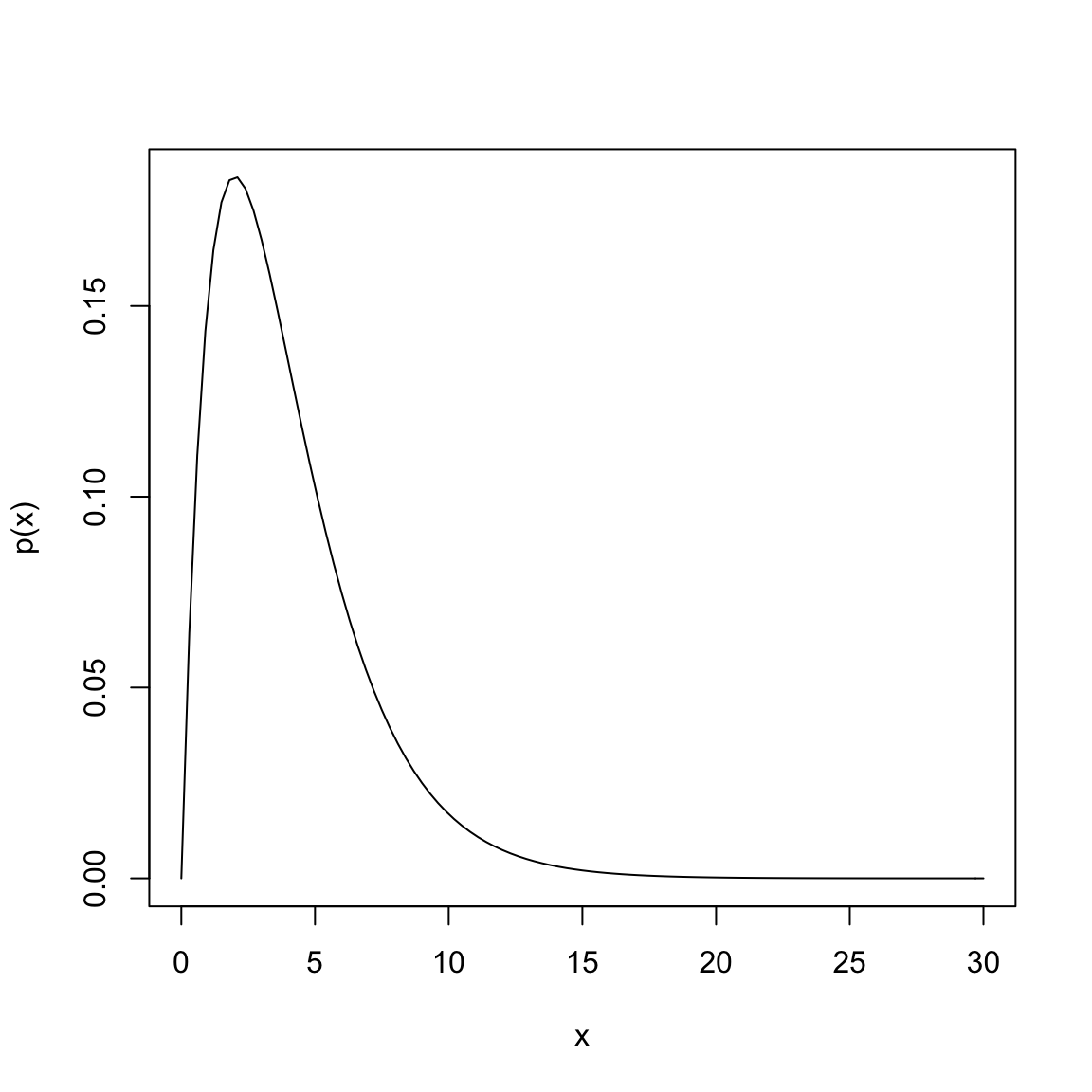
Suppose that \(X\) is a random variable from a distribution with this pdf. Then to find \(P(5\leq X \leq 10)\), I find the area under the curve of \(p(x)\) between 5 and 10, by taking the integral of \(p(x)\) over the range of \((5, 10)\): \[\int_{5}^{10} \frac{1}{4} x e^{-x/2}\]
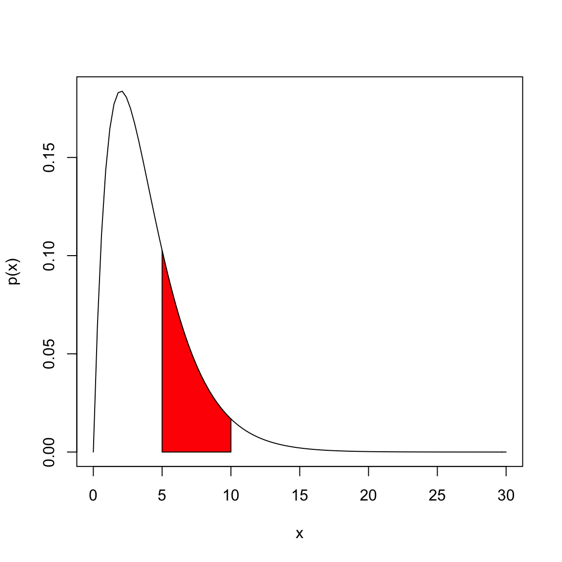
In this case, we can actually solve the integral through integration by parts (which you may or may not have covered), \[\int_{5}^{10} \frac{1}{4} x e^{-x/2}= (-\frac{1}{2}x e^{-x/2}- e^{-x/2} )\Biggr|_{5}^{10}=(-\frac{1}{2}(10) e^{-10/2}- e^{-10/2} ) - (-\frac{1}{2}(5) e^{-5/2}- e^{-5/2} )\] Evaluating this gives us \(P(5\leq X \leq 10)=0.247\). Most of the time, however, the integrals of common distributions that are used as models for data have pdfs that cannot be integrated by hand, and we rely on the computer to evaluate the integral for us.
Recall above that same rule from discrete distribution applies for the total probability, namely that the probability of \(X\) being in the entire sample space must be \(1\). For continuous distributions the sample space is generally the whole real line (or a specific interval). What does this mean in terms of the total area under the curve of \(p(x)\)?
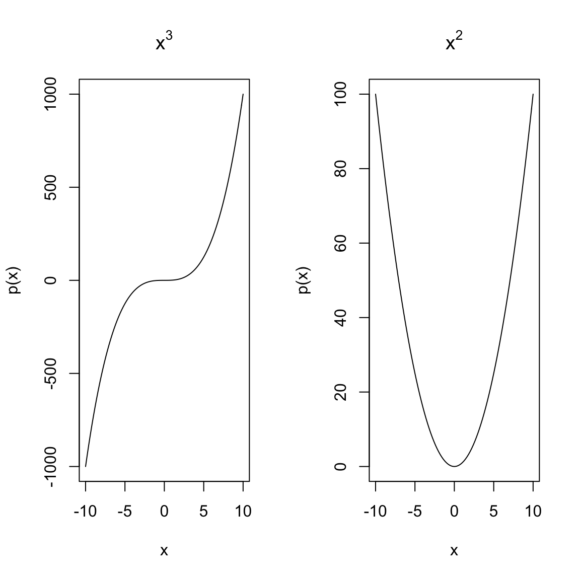
The following plots show functions that cannot be pdfs, at least not over the entire range of \(\Omega=(-\infty,\infty)\), why?
What if I restrict \(\Omega=[-10,10]\), could these functions be pdfs?
Interpreting density curves
“Not much good to me” you might think – you can’t evaluate \(p(x)\) and get any probabilities out. It just requires the new task of finding an area. However, finding areas under curves is a routine integration task, and even if there is not an analytical solution, the computer can calculate the area. So pdfs are actually quite useful.
Moreover, \(p(x)\) is interpretable, just not as a direct tool for probability calculations. For smaller and smaller intervals you are getting close to the idea of the “probability” of \(X=72K\). For this reason, where discrete distributions use \(P(X=72K)\), the closest corresponding idea for continuous distributions is \(p(72,000)\): though \(p(72,000)\) is not a probability like \(P(X=72,000)\) the value of \(p(x)\) gives you an idea of more likely regions of data.
More intuitively, the curve \(p(x)\) corresponds to the idea of of a histogram of data. It’s shape tells you about where the data are likely to be found, just like the bins of the histogram. We see for our example of \(\bar{X}\) that the histogram of \(\bar{X}\) (when properly plotted on a density scale) approaches the smooth curve of a normal distribution. So the same intuition we have from the discrete histograms carry over to pdfs.
Properties of pdfs
- A probability density function gives the probability of any interval by taking the area under the curve
- The total area under the curve \(p(x)\) must be exactly equal to 1.
- Unlike probabilities, the value of \(p(x)\) can be \(\geq 1\) (!).
This last one is surprising to people, but \(p(x)\) is not a probability – only the area under it’s curve is a probability.
To understand this, consider this very simple density function: \[p(x)=\begin{cases}1 & x\in [0,1]\\0 & x>1, x<0\end{cases}\]
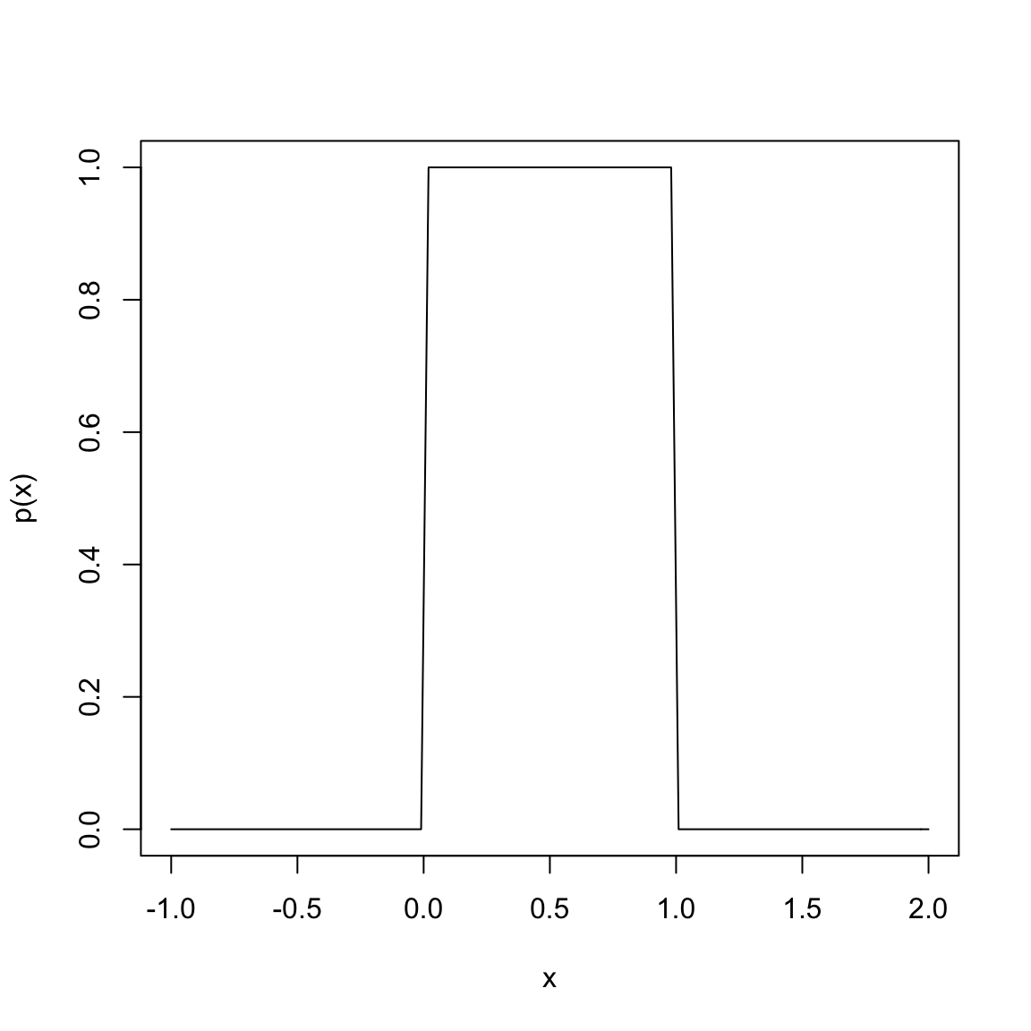
This is a density function that corresponds to a random variable \(X\) that is equally likely for any value between 0 and 1.
Why does this density correspond to being equally likely for any value between 0 and 1?
What is the area under this curve? (Hint, it’s just a rectangle, so…)
This distribution is called a uniform distribution on [0,1], some times abbreviated \(U(0,1)\).
Suppose instead, I want density function that corresponds to being equally likely for any value between \(1/4\) and \(1/2\) (i.e. \(U(1/4,1/2)\)).
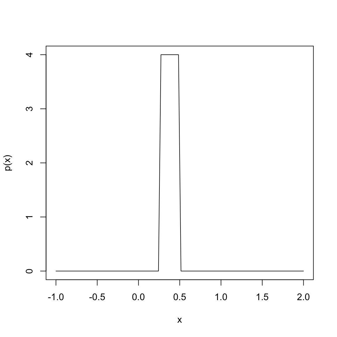
Again, we can easily calculate this area and confirm it is equal to \(1\). This is why \(p(x)\) must be able to take on values greater than 1 – if \(p(x)\) was required to be less than one, you couldn’t get the total area of this rectangle to be \(1\).
You can see that the scale of values that \(X\) takes on matters to the value of \(p(x)\). If \(X\) is concentrated on a small interval, then the density function will be quite large, while if it is diffuse over a large area the value of the density function will be small.
Example: Changing the scale of measurements:
Suppose my random variable \(X\) are measurements in centimeters, with a normal distribution, \(N(\mu=100\text{cm}, \sigma^2=100\text{cm}^2 )\).
What is the standard deviation?
Then I decide to convert all the measurements to meters (FYI: 100 centimeters=1 meter).
What is now the mean? And standard deviation?
Expectation and Variance
The density has a similar role in calculation expectations and variances as the pmf for discrete distributions \[E(X)=\int_{\Omega}x p(x) dx\] \[var(X)=\int_{\Omega}(x-E(X))^2 p(x) dx\]
We basically replace the sum with an integral. We won’t be doing these calculations in this class (they are generally intractable), but it is important to know that the same definitions and properties of variance and expectation carry over.
2.3.4 Examples of Continuous Distributions
Let’s look at some examples of common probability distributions to make the pdf more concrete.
The most well-known probability distribution is the normal distribution with pdf \[p(x)=\frac{1}{\sqrt{2\pi\sigma^2}}e^{-\frac{(x-\mu)^2}{2\sigma^2}}\] It’s a mouthful, but easy for a computer to evaluate. It has two parameters that define the distribution: its mean \(\mu\) and variance \(\sigma^2\) (recall the variance is the standard deviation squared). We often write a normal distribution as \(N(\mu,\sigma^2)\) to indicate its parameters. A standard normal distribution is \(\mu=0\),\(\sigma^2=1\), written \(N(0,1)\)
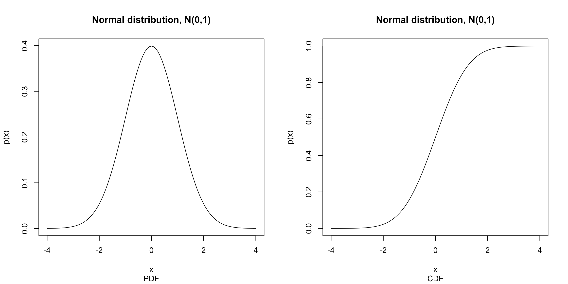
The cdf of the normal – the integral of this equation – is intractable to write down, but again easy for a computer to approximate to arbitrarily good precision.
For a normal distribution, the probability of being within 1 standard deviation of \(\mu\) is roughly 0.68 and the probability of being within 2 standard deviations of \(\mu\) is roughly 0.95.
## [1] 0.6826895## [1] 0.9544997What is the probability that a observed random variable from a \(N(\mu,\sigma^2)\) distribution is less than \(\mu\) by more than \(2\sigma\)?
Other distributions Here are some examples of some pdfs from some two common continuous distributions other than the normal:
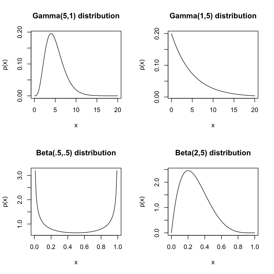
These are all called parametric distributions. The discrete distributions we introduced earlier (the Binomial, Geometric, and Poisson) are also parametric distributions, only instead of a probability density function, they have probability mass functions. You should look back on the introduction of those distributions to see the discussion of important aspects of the notation for parametric distributions which will also be true for continuous distributions. We make a few more comments illustrated by these examples:
- that `a’ parametric distribution is actually a family of distributions that differ by changing the parameters. For example, a normal distribution has two parameters, the mean and the standard deviation. All possible normal distributions can be created by combinations a mean and a standard deviation parameter. We say “the” normal distribution to encompass all of these distributions.
- Unlike the normal, many distributions have very different shapes for different parameters
- Continuous distributions can be limited to an interval or region (i.e. \(\Omega\) does not take on all values of the real line). They are still considered continuous distributions because the range of points that have positive probability is still a continuous range.
2.4 Distributions of Sample Data
Usually the data we work with is a sample from a population, not the complete population. Moreover our data is not usually a single observation drawn from a population but many observations. We designate the number of observations with \(n\) or \(N\). This means we have \(n\) random variables, \(X_1,\ldots,X_n\).
2.4.1 The Sampling Distribution
We are often are often interested in features of the total population, like the mean salary of employees, and we want to use our sample to estimate it. The logical way to do this is to take the mean of our sample. But we know it won’t be exactly the same as the true population. In fact, for different samples we’d get different values of the sample mean. How can I be confident about what is the true mean? What if I was very unlucky and my \(\bar{X}\) was very far from the truth?
As a thought experiment, I could think, what if I had done it another time and gotten another sample \(X_1^*,\ldots,X_n^*\) (I use \(*\) to indicate it’s different)? I would get a different \(\bar{X}^*\) and it wouldn’t equal my previous \(\bar{X}\). Nor would it equal the true mean of the population. I could ask myself, is it similar to \(\bar{X}\)? How much do they vary?
I could carry this further and do this many times: get a lot of samples of size \(n\), each time take the mean. I would get a lot of \(\bar{X}^*\) values. Let’s call them \[\bar{X}^{*(1)},\ldots,\bar{X}^{*(B)}.\] None of them would be exactly equal to the true population mean, but this would start to give me a good idea of how likely I am to get a “weird” value from a sample.
This describes the sampling distribution of \(\bar{X}\), and is very important in statistics. It’s how we think probabilistically about an estimate. We can make probability statements from this distribution to answer questions about how likely it is that our estimate is far from the truth.
I can do this with the salary data, creating many samples of size 1,000 and calculating the mean of each sample. Here’s a histogram of the \(\bar{X}^{*(1)},\ldots,\bar{X}^{*(B)}\) this creates
sampleSize <- 1000
sampleMean <- replicate(n = 10000, expr = mean(sample(salaries2014_FT$TotalPay,
    size = sampleSize, replace = TRUE)))
hist(sampleMean, xlab = "Mean Pay", main = paste("Sampling distribution of mean of",
    sampleSize, "observations"))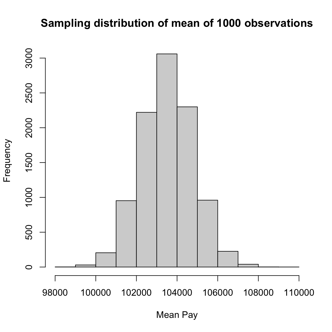
Note that the sampling distribution of the mean is very different from the histogram of the actual population of salary data:
par(mfrow = c(1, 2))
hist(sampleMean, xlab = "Mean Pay", main = paste("Sampling distribution of mean of",
    sampleSize, "observations"))
hist(salaries2014_FT$TotalPay, main = "Histogram of Pay in Population")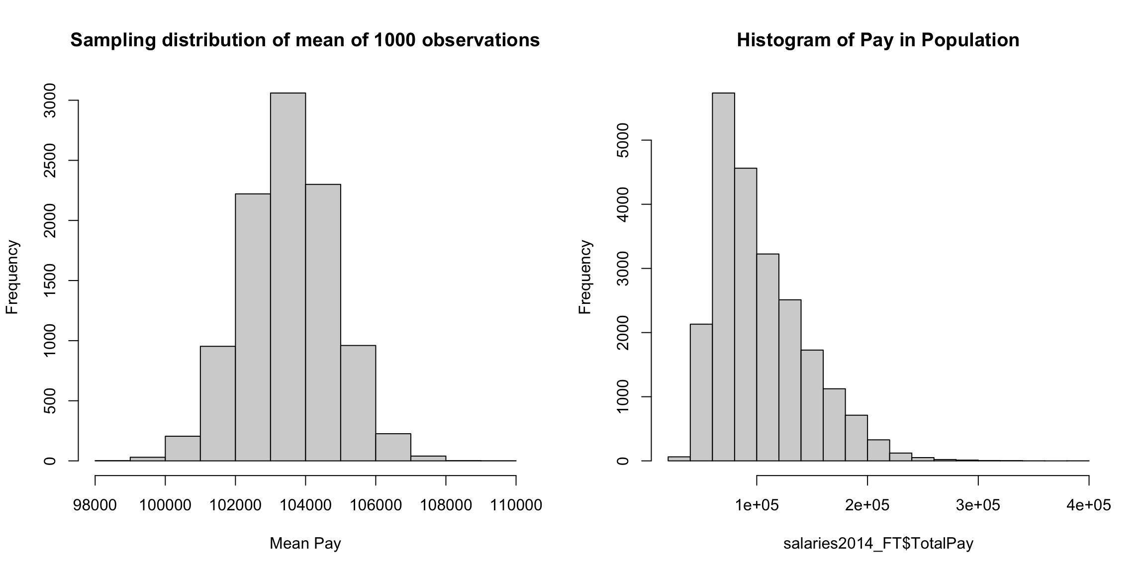
It is also different from the histogram of a single sample (which does look like the histogram of the population), so this is not due to a difference between the sample and the true population.
singleSample <- sample(salaries2014_FT$TotalPay, size = sampleSize,
    replace = TRUE)
par(mfrow = c(1, 2))
hist(sampleMean, xlab = "Mean Pay", main = paste("Sampling distribution of mean of",
    sampleSize, "observations"))
hist(singleSample, main = paste("Histogram of Pay from a Sample of size",
    sampleSize))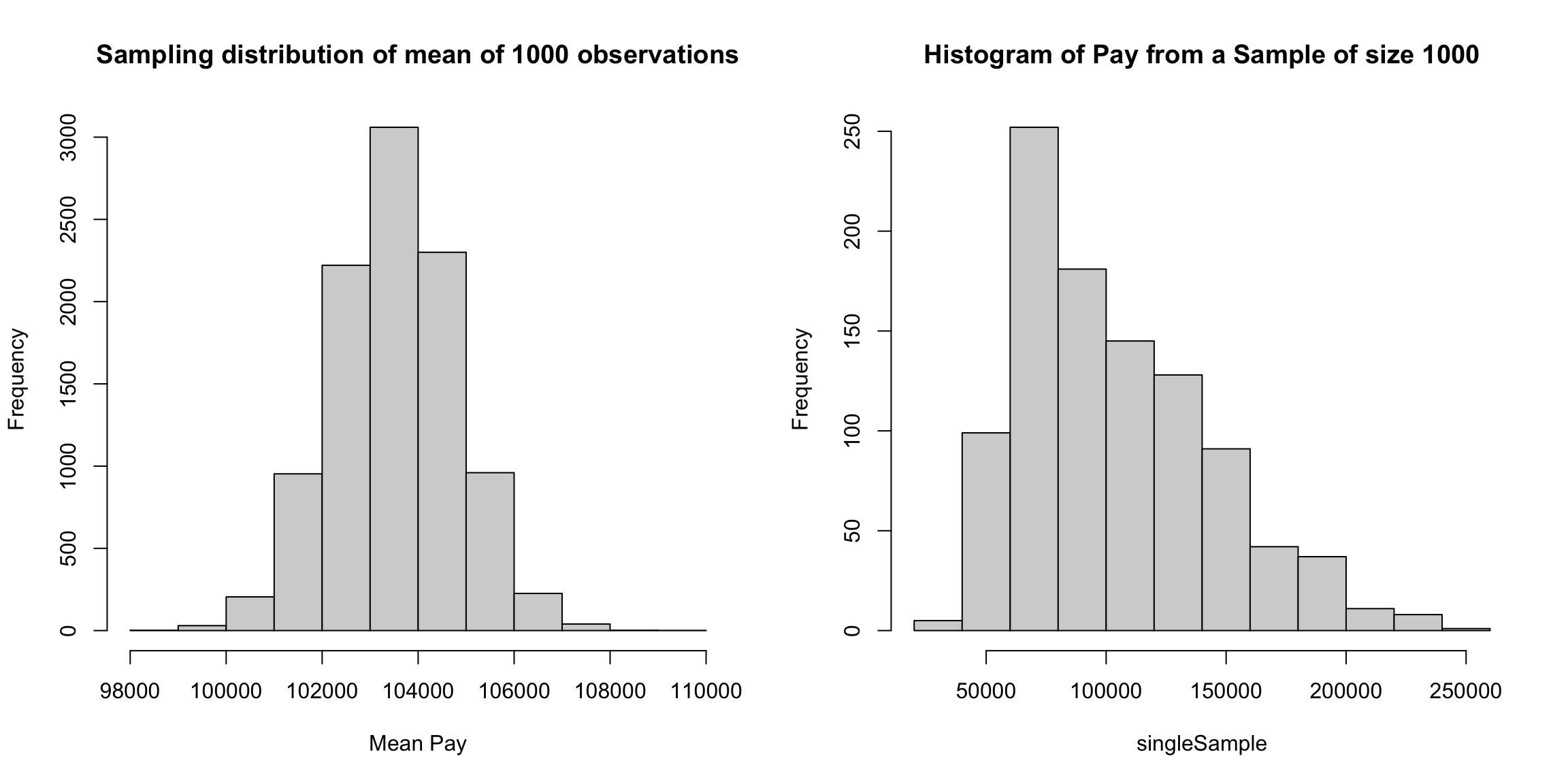
It is due to the fact that the sampling distribution of the mean is quite different from the distribution of the data that created these means. We will discuss this further, when we discuss the CLT below, but it is very important to keep distinct the distribution of the individual data points, and the distribution of summary statistics that are created from the data.
What Probability? Why is \(\bar{X}\) random? It is random because the draws from the population are random, and this induces \(\bar{X}\) to be random. So \(\bar{X}\) is a random variable that has a distribution, as we have seen above in our simulation.
I emphasized above that we need a precise definition of random mechanisms to create probability statements. What does that look like for a sample of data? To make precise probability statements on \(\bar{X}\), I need a description of how each of the \(X_1,\ldots,X_n\) samples was chosen from the population. We’ll discuss this more below, but you have already seen a simple random sample in previous classes, where each observation has equal probability of being selected. This is what we modelled with the salary data.
Moving Beyond the Thought Experiment The sampling distribution of an estimate is an important “thought experiment”. But to be clear, we only get one sample \(X_1,\ldots,X_n\) and one mean \(\bar{X}.\) Our sample data gave us \(\bar{X}\), and we will never get to compare our \(\bar{X}\) with these other potential \(\bar{X}^*\) to see if the value we got was strange or unusual.
If we knew the true population distribution, we could say something about the sampling distribution of \(\bar{X}.\) (How to do that is for a higher probability class, but these are common questions answered in probability). But that kind of defeats the point – if we knew the true distribution, we wouldn’t need to draw a sample from it.
However, sometimes probability theory can say something about the sampling distribution without knowing the population distribution. We need to make some assumptions, but they are usually much less than knowing the entire distribution.
What kind of assumptions? Well, it depends. Here’s some examples:
knowing the parametric distribution, but not the exact parameters. e.g. I assume each \(X_i\sim Bin(n,p)\), but I don’t know \(p\).
knowing how the data was collected, e.g. \(X_1,\ldots,X_n\) are from a Simple Random Sample
knowing that \(X_1,\ldots,X_n\) are independently drawn from the same distribution, but not knowing the distribution they come from.
Obviously some of these assumptions require more knowledge than others, and how many assumptions are needed are an important consideration in learning data analysis tools.
2.4.2 Types of Samples
We said above that we need to know the random mechanism for how the samples were selected to be able to make statements about the sampling distribution of estimates created from the data.
A common description of how samples might be chosen from a population is a simple random sample. We previously described this for a single sample (\(n=1\)) drawn from the population, and in that case it means each member of the population has equal probability of being selected. We won’t describe the details of how to extend to \(n\) samples (you should have seen that in previous classes), but the basic idea is the sample is created by repeated draws from the same population.
Alternatively, we might not specify how the samples were drawn, but specify certain characteristics of the resulting random variables, \(X_1,\ldots,X_n\). The most common assumption is that they are independent and identically distributed (i.i.d). This means every \(X_i\) was drawn from the same distribution \(P\), and that they were drawn independently from every other \(X_j\). Note this means from our definitions above that we can say \[P(X_1=x_1,\ldots,X_n=x_n)=P(X_1=x_1)P(X_2=x_2)\ldots P(X_n=x_n)\] SRS and i.i.d samples are the most common examples, and have very similar properties so that we can almost think of SRS as a special case of i.i.d samples. However, there are subtle issues that make a SRS not exactly a i.i.d sample. A SRS is the result of successive draws, meaning that you remove a member from the population once you draw it. This means the resulting data has a small amount of correlation between the data, but for large \(n\) the correlation becomes negligible.
Some datasets might be a sample of the population with no easy way to describe the process of how the sample was chosen from the population, for example data from volunteers or other convenience samples that use readily available data rather than randomly sampling from the population. Having convenience samples can make it quite fraught to try to make any conclusions about the population from the sample; generally we have to make assumptions about the data was collected, but because we did not control how the data is collected, we have no idea if the assumptions are true.
Examples of other types of samples Consider the following concrete example of different ways to collect data. Suppose that I want to compare the salaries of fire-fighters and teachers in all of California. To say this more precisely for data analysis, I want to see how similar is the distribution of salaries for fire-fighters to that of teachers in 2014 in California. Consider the following samples of data I might take
- All salaries in San Francisco (the data we have)
- A simple random sample drawn from a list of all employees in all localities in California.
- A separate simple random sample drawn from every county, combined together into a single dataset
Why do I now consider all salaries in San Franscisco as a sample, when before I said it was a census?
All three of these are samples from the population of interest and for simplicity let’s assume that we make them so that they all result in data with the same total sample size.
One is not a random sample (which one? ). We can’t reasonably make probability statements about data that is not a random sample from a population.
Only one is a simple random sample . The last sampling scheme, created by doing a SRS of each locality and combining the results, is a random sampling scheme, its just not a SRS. We know it’s random because if we did it again, we wouldn’t get exactly the same set of data (unlike our SF data). But it is not a SRS – it is called a Stratified random sample.
So are only SRS good random samples?
NO! The stratified random sample described above can actually be a much better way to get a random sample and give you better estimates – but you must correctly create your estimates to account for .
For the case of the mean, you have to estimate the population mean in such a way that it correctly estimates the distribution of population. How? The key thing is that because it is a random sample, drawn according to a known probability mechanism, it is possible to make a correct estimate of the population – but it won’t be the simple mean of the sample.
How to make these kind of estimates for random samples that are not SRS is beyond the scope of this class, but there are standard ways to do so for stratified samples and many other sampling designs (this field of statistics is called survey sampling). Indeed most national surveys, particularly any that require face-to-face interviewing, are not SRS but much more complicated sampling schemes that can give equally accurate estimates, but often with less cost.
2.4.3 Normal Distribution and Central Limit Theorem
Let’s go back to thinking about the sampling distribution. You’ve seen in previous classes an example of the kind of probability result we want, which tells you about the sampling distribution of an estimate – known as the central limit theorem. Let’s review this important theorem.
The idea is that if you have i.i.d data, and the size of the sample (\(n\)) is large enough, the central limit theorem tells us that the distribution of \(\bar{X}\) will be well approximated by a normal distribution. What’s so important about this theorem is that it tells us that for large sample sizes this always happens – regardless of the original distribution of the data.
Specifically, the central limit theorem says that if you have i.i.d. sample of size \(n\) from an (unknown) distribution with mean \(\mu_{true}\) and variance \(\tau_{true}^2\), then the distribution of \(\bar{X}\) will be approximately \[N(\mu_{true},\frac{\tau_{true}^2}{n})\] Many natural estimates we will encounter are actually means in one form or another. There are also many extensions of the CLT that give this same result in other settings too, for example a SRS (which is not i.i.d. data). This is the reason that the normal is a key distribution for statistics.
For \(\bar{X}\), which is approximately normal, if the original population had mean \(\mu\) and standard deviation \(\tau\), the standard deviation of that normal is \(\tau/\sqrt{n}\).
What does this mean for the chance of a single mean calculated from your data being far from the true mean (relate your answer to the above information about probabilities in a normal)?
Back to the Salary data
This means that our sample mean \(\bar{X}\) from our salary data should start to follow the normal distribution. For most actual datasets, of course, we don’t know the true mean of the population, but in this case, since we sampled from a known population, we do,
What would be the parameters of this normal distribution?
## [1] 103505.8## [1] 1287.772Recall that for a normal distribution, the probability of being within 1 standard deviation of \(\mu\) is roughly 0.68 and the probability of being within 2 standard deviations of \(\mu\) is roughly 0.95. So the CLT gives us an idea of what mean values are likely.
What are the range of values this corresponds to in the salary data?
c(mean(salaries2014_FT$TotalPay) - 2 * sqrt(var(salaries2014_FT$TotalPay)/sampleSize),
    mean(salaries2014_FT$TotalPay) + 2 * sqrt(var(salaries2014_FT$TotalPay)/sampleSize))
## [1] 100930.2 106081.3## Min. 1st Qu. Median Mean 3rd Qu. Max.
## 26364 72356 94272 103506 127856 3901122.4.4 Density Histograms Revisited
A natural way to visualize the CLT on our salary data is to overlay the normal distribution on our histogram of our many samples of \(\bar{X}\). Let’s discuss briefly why this makes sense.
We’ve been showing histograms with the frequency of counts in each bin on the y-axis. But histograms are actually meant to represent the distribution of continuous measurements, i.e. to approximate density functions. In which case you want histogram to be drawn on the scale we expect for a density, called density histograms. This is done by requiring that the total area, when combined across all of the rectangles of the histogram, to have area \(1\). This means that the height of each rectangle for an interval \((b_1,b_2]\) is given by \[\frac{\# \text{obs. in }(b_1,b_2]}{(b_2-b_1)n}\] The area of each rectangle will then be \[\frac{\# \text{obs. in }(b_1,b_2]}{n}\] and so therefore they will sum up to \(1\). This matches our requirements for a density function as well, and results in the histogram being on the same scale as the density.
Notice that this area is also the proportion of observations in the interval \((b_1,b_2]\) and is our natural estimate of \(P(b_1 \leq X \leq b_2)\) from our data. So they also match densities in that the area in each rectangle is an estimate of the probability.
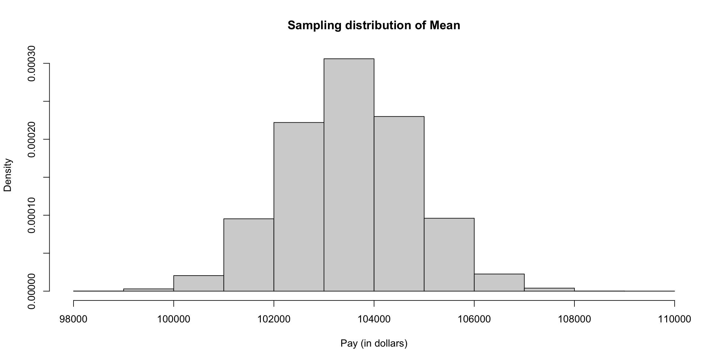
We can plot the density of pay in $10K values or $1K units instead.
 This demonstrates the effect of the scale of the data on this density histogram. Just like in our earlier discussion of density values, the width of our bins after dividing by 10,000 is a smaller number than if we divide by 1,000, so to get rectangles to have total area 1, we have to have larger values. And, if you plot histograms on the density scale, you can get values greater than 1, like densities.
Notice how density values stay on similar scales as you change the breaks.
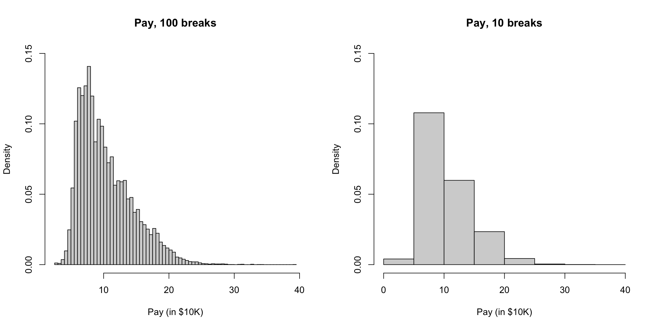
If I pick very small bins, I have the appearance of larger numbers, but when I zoom in, I can this is more due to a few bins being very large (and some have dropped to zero) but most of them are on the same scale.
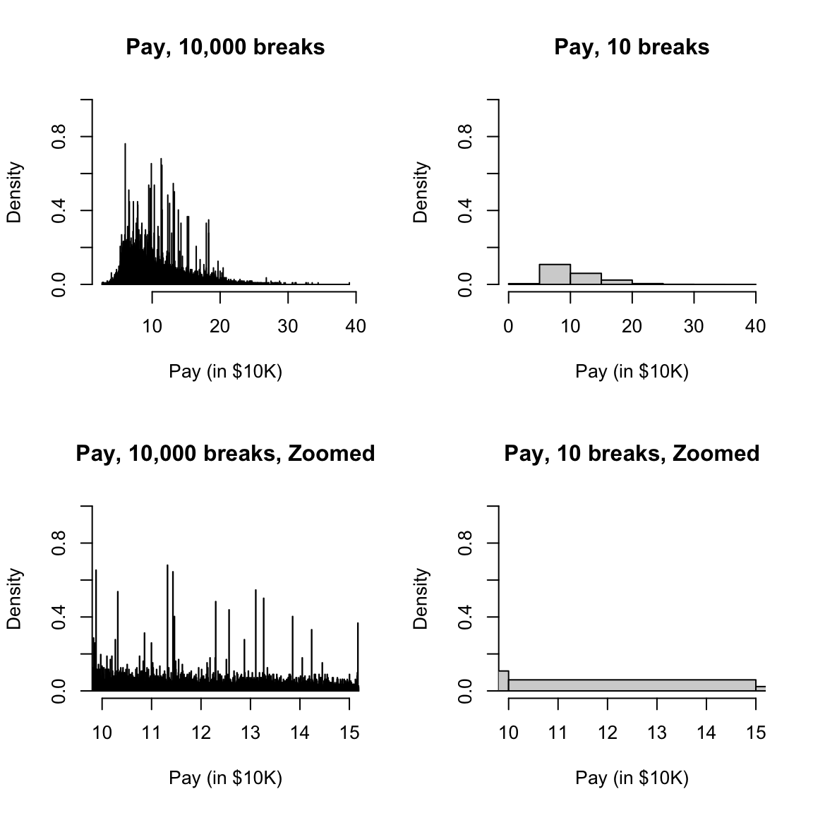
Back to the CLT
Having thought about this, we now can return to the question of comparing our sampling distribution of \(\bar{X}\) with the prediction given by the CLT. In other words, we can overlay the normal distribution, as predicted by the CLT, with the histogram of the actual sampling distribution and compare them. Notice to do this, we also have to pick the right mean and standard deviation for our normal distribution for these to align.
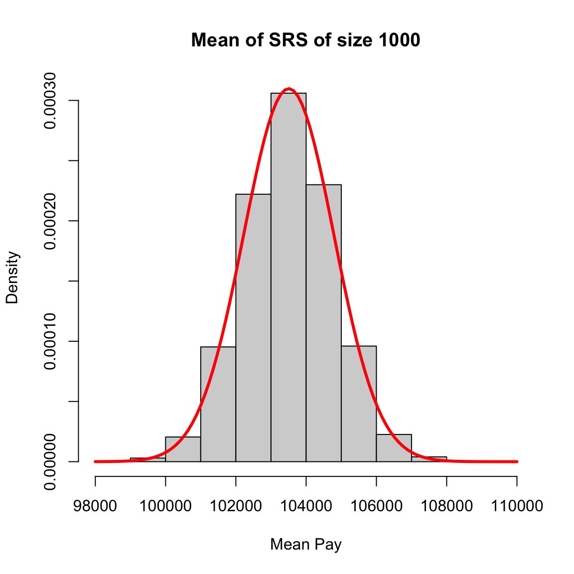 Notice how when I overlay the normal curve for discussing the central limit theorem, I had to set my
 hist function to freq=FALSE to get proper density histograms. Otherwise the histogram is on the wrong scale.
2.4.5 Improvement with larger \(n\)
We generally want to increase the sample size to be more accurate. What does this mean and why does this work? The mean \(\bar{X}\) we observe in our data will be a random, single observation. If we could collect our data over and over again, we know that \(\bar{X}\) will fluctuates around the truth for different samples. If we’re lucky, \(\tau\) is small, so that variability will be small, so any particular sample (like the one we get!) will be close to the mean. But we can’t control \(\tau\). We can (perhaps) control the sample size, however – we can gather more data. The CLT tells us that if we have more observations, \(n\), the fluctations of the mean \(\bar{X}\) from the truth will be smaller and smaller for larger \(n\) – meaning the particular mean we observe in our data will be closer and closer to the true mean. So means with large sample size should be more accurate.
However, there’s a catch, in the sense that the amount of improvement you get with larger \(n\) gets less and less for larger \(n\). If you go from \(n\) observations to \(2n\) observations, the standard deviation goes from \(\frac{\tau_{true}}{\sqrt{n}}\) to \(\frac{\tau_{true}}{\sqrt{2n}}\) – a decrease of \(1\sqrt{2}\). In other words, the standard deviation decreases as \(n\) decreases like \(1/\sqrt{n}\).
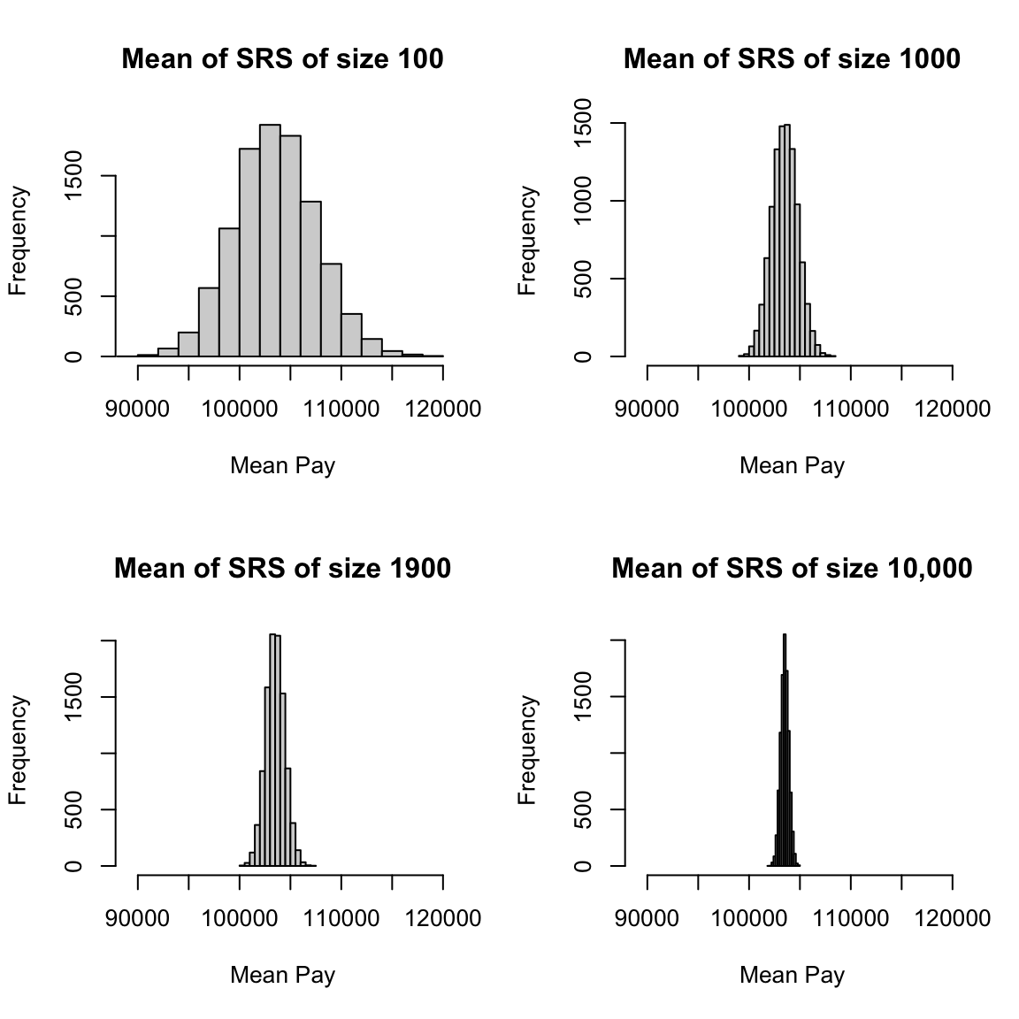
2.4.6 Visualizations as Estimates
To do exploratory analysis of our sample, we often use the same techniques we described above for the population, like histograms and boxplots. But working with a sample changes our interpretation of these plots. Consider what happens if you take a simple random sample of 100 employees from our complete set of full-time employees.
## [1] 5 3 2 1 4Let’s draw a plot giving the proportions of the total sample in each bin like I did in the previous section (remember – not a histogram!). I’m going to also draw the true population probabilities of being in each bin as well, and put it on the same histogram as the sample proportions. To make sure they are using the same bins, I’m going to define the break points manually (otherwise the specific breakpoints will depend on the range of each dataset and so be different)
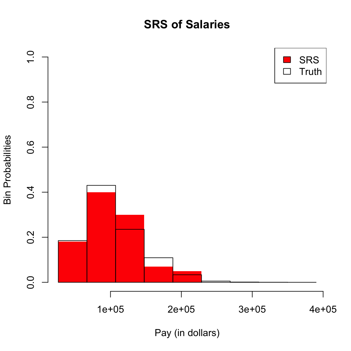
Suppose I had smaller width breakpoints (next figure), what conclusions would you make?
We can consider the above plots, but with more breaks:
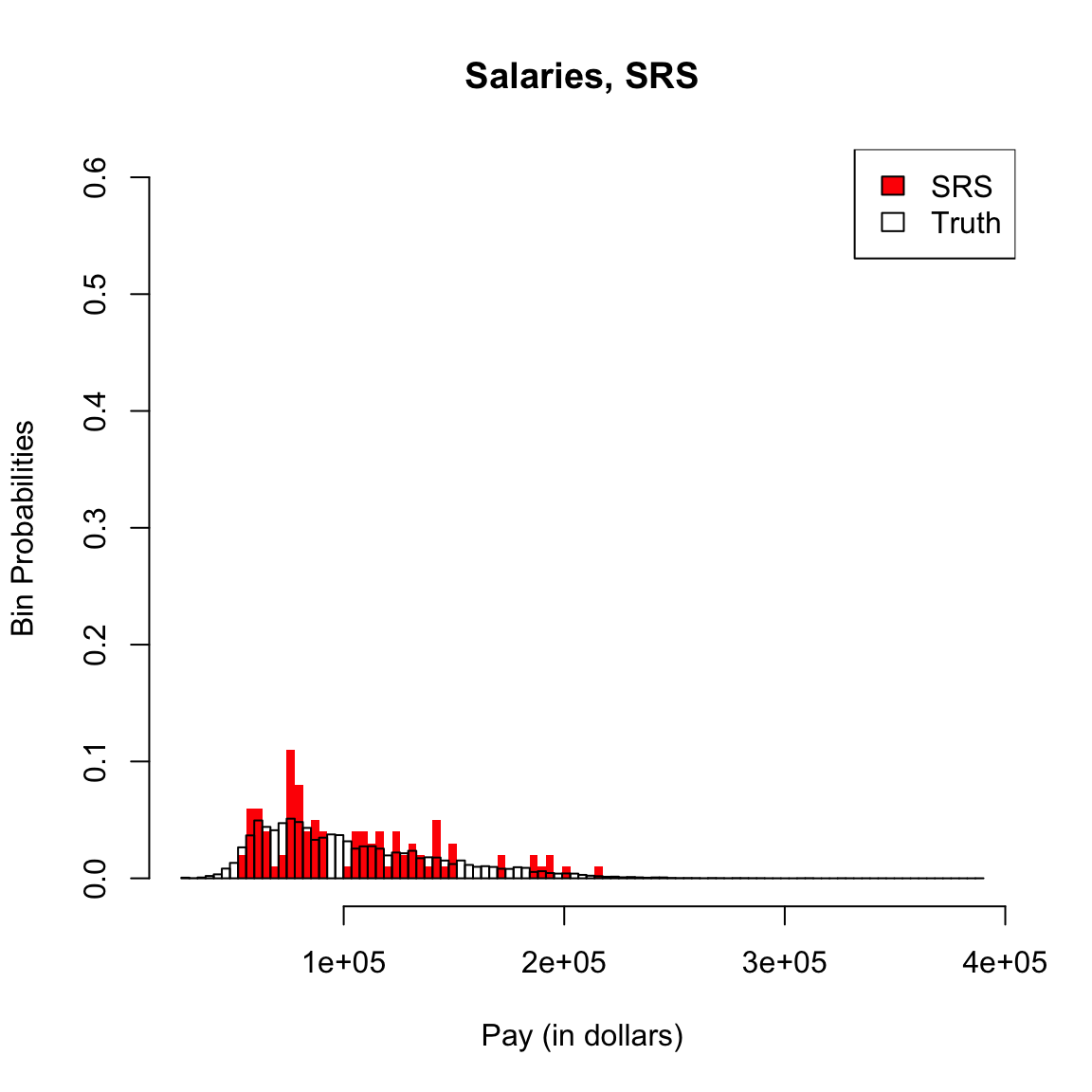
When we are working with a sample of data, we should always think of probabilities obtained from a sample as an estimate of the probabilities of the full population distribution. This means histograms, boxplots, quantiles, and any estimate of a probability calculated from a sample of the full population have variability, like any other estimate.
This means we need to be careful about the dual use of histograms as both visualization tools and estimates. As visualization tools, they are always appropriate for understanding the data you have: whether it is skewed, whether there are outlying or strange points, what are the range of values you observe, etc.
To draw broader conclusions from histograms or boxplots performed on a sample, however, is by definition to view them as estimates of the entire population. In this case you need to think carefully about how the data was collected.
2.4.6.1 Thinking about Histograms as Estimates
If we draw histograms from samples they will all describe the observed distribution of the sample we have, but they will not all be good estimates of the underlying population distribution depending on what was the probability mechanism of how the sample was created. Recall we proposed three types of samples from SF salary data.
- All salaries in San Franscisco (the data we have)
- A simple random sample drawn from a list of all employees in all localities in California.
- A separate simple random samples drawn from every locality, combined together into a single dataset
We don’t have each of these three types of samples from SF salary data, but we do have the full year of flight data in 2015/2016 academic year (previously we analyzed only the month of January). Consider the following ways of sampling from the full set of flight data and consider how they correspond to the above:
- 12 separate simple random samples drawn from every month in the 2015/2016 academic year, combined together into a single dataset
- All flights in January
- A simple random sample drawn from all flights in the 2015/2016 academic year.
We can actually make all of these samples and compare them to the truth (I’ve made these samples previously and I’m going to just read them, because the entire year is a big dataset to work with in class).
flightSFOSRS <- read.table(file.path(dataDir, "SFO_SRS.txt"),
    sep = "\t", header = TRUE, stringsAsFactors = FALSE)
flightSFOStratified <- read.table(file.path(dataDir,
    "SFO_Stratified.txt"), sep = "\t", header = TRUE,
    stringsAsFactors = FALSE)
par(mfrow = c(2, 2))
xlim <- c(-20, 400)
hist(flightSF$DepDelay, breaks = 100, xlim = xlim,
    freq = FALSE)
hist(flightSFOSRS$DepDelay, breaks = 100, xlim = xlim,
    freq = FALSE)
hist(flightSFOStratified$DepDelay, breaks = 100, xlim = xlim,
    freq = FALSE)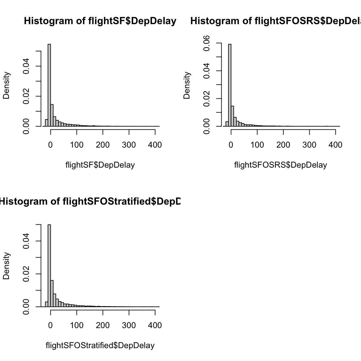
How do these histograms compare?
In particular, drawing histograms or estimating probabilities from data as we have done here only give good estimates of the population distribution if the data is a SRS. Otherwise they can vary quite dramatically from the actual population.
2.5 Density Curve Estimation
We’ve seen that histograms can approximate density curves (assuming we make the area in the histogram sum to 1). More formally, we can consider that if we observe continuous valued data from an unknown distribution, we would like an estimate of the unknown pdf \(p(x)\) for the distribution that created the data. This is a problem known as density curve estimatation. This is moving far beyond estimating a single value, like the mean, and trying to estimate the entire pdf.
The setup we consider is that we assume we have a sample of \(i.i.d\) data \(X_1,\ldots,X_n\) from an unknown distribution with density \(p(x)\). We want to create a function \(\hat{p}(x)\) (based on the data) that is an estimate of \(p(x)\). As we’ll see, a density histogram is one such simple estimate of \(p(x)\), but we will also discuss other estimates that are better than a histogram.
2.5.1 Histogram as estimate of a density
To understand why a histogram is an estimate of a density, let’s think of an easy situation. Suppose that we want to estimate \(p(x)\) between the values \(b_1,b_2\), and that in that region, we happen to know that \(p(x)\) is constant, i.e. a flat line.
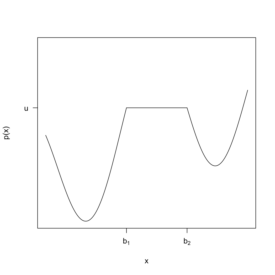
If we actually knew \(p(x)\) we could find \(P(b_1 \leq X \leq b_2)\) as the area under \(p(x)\). Since \(p(x)\) is a flat line in this region, this is just \[P(X\in [b_1,b_2])=u*(b_2-b_1)\] where \(u=p(b_1)-p(b_2)\). To estimate \(p(x)\) in this region is to estimate \(u\). So in this very simple case, we have a obvious way to estimate \(p(x)\) if \(x\in[b_1,b_2]\): first estimate \(P(b_1 \leq X \leq b_2)\) and then let \[\hat{u}=\hat{p}(x)=\frac{\hat{P}(b_1 \leq X \leq b_2)}{b_2-b_1}\]
We have already discussed above one way to estimate \(P(b_1 \leq X \leq b_2)\) if we have i.i.d data: count up the data in that interval, and divide by total number of data points \(n\), \[\hat{P}(b_1 \leq X \leq b_2)=\frac{\#\text{ Points in }[b_1,b_2]}{n}\] Using this, a good estimate of \(p(x)\) (if it is a flat function in that area) is going to be: \[ \hat{p}(x)=\hat{P}(b_1 \leq X \leq b_2)/(b_2-b_1)=\frac{\#\text{ Points in }[b_1,b_2]}{(b_2-b_1)\times n}\]
Relationship to Density Histograms
In fact, this is a pretty familiar calculation, because it’s also exactly what we calculate for a density histogram.
However, we don’t expect the true \(p(x)\) to be a flat line, so why do we use this density histograms when we know this isn’t true? If the pdf \(p(x)\) is a pretty smooth function of \(x\), then in a small enough window around a point \(x\), \(p(x)\) is going to be not changing too in the scheme of things. In other words, it will be roughly the same value in a small interval–i.e. flat. So if \(x\) is in an interval \([b_1,b_2]\) with width \(w\), and the width of the interval is small, we can more generally say a reasonable estimate of \(p(x)\) would be the same as above.
With this idea, we can view our (density) histogram as a estimate of the pdf. For example, suppose we consider a frequency histogram of our SRS of salaries,
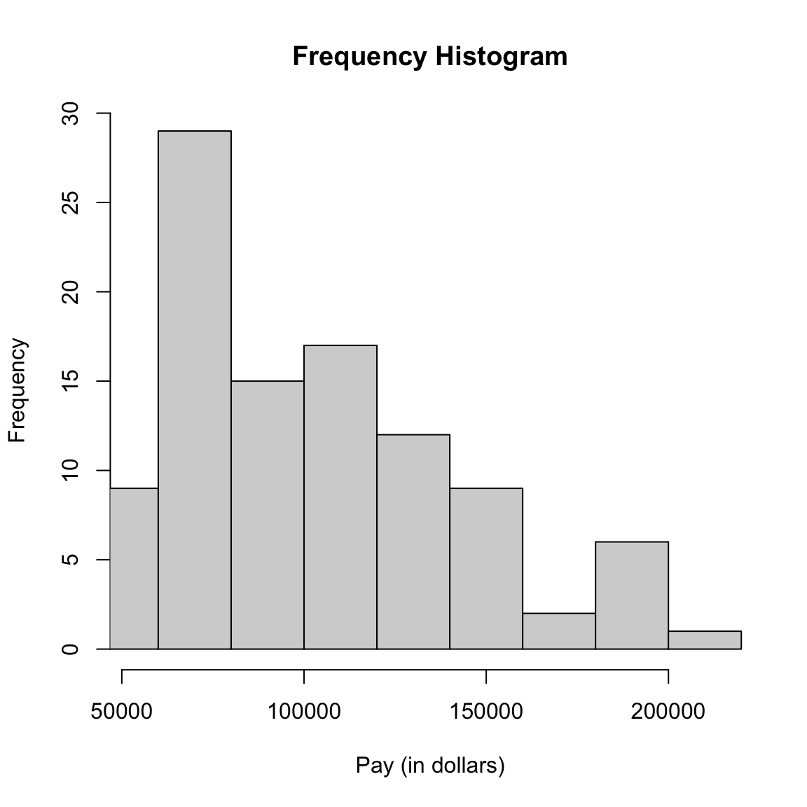
We showed this histogram as is commonly done using frequencies. But a density histogram will divide by the width of the interval of the bins (this is what is meant by the density values in a histogram), i.e. each bin defines an interval \((b_1,b_2)\), and the density histogram value is
\[\frac{\#\text{ Points in }[b_1,b_2]}{(b_2-b_1)\times n}\]
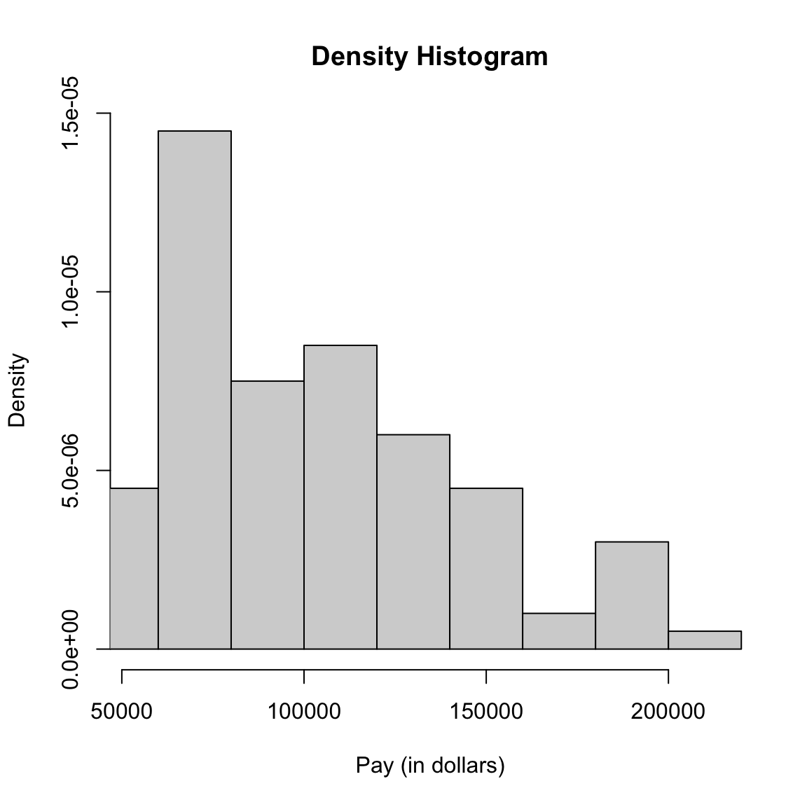
Suppose we want to calculate \(\hat{p}_{hist}(60K)\), and we’ve set up our breaks of our histogram so that \(x=60K\) is in the bin with interval \([50K,70K)\). How do you calculate \(\hat{p}_{hist}(60K)\) from a sample of size 100?
This is exactly the same as our estimate of \(p(x)\) above in the special case when \(p(x)\) is a flat line in \((b_1,b_2)\). Thus, if our true \(p(x)\) is not changing much in the interval \((b_1,b_2]\), then the density histogram value is an estimate of \(p(x)\) in \((b_1,b_2)\).
Thus, the density histogram is a function that estimates \(p(x)\). We can call it \(\hat{p}_{hist}(x)\) to denote that it is a histogram estimate of the density.
We of course need to do this for a lot of intervals to cover the range of \(x\). This gives us, for every \(x\), an estimated value of \(\hat{p}_{hist}(x)\), based on what interval \(x\) is in: \[\hat{p}_{hist}(x)=\frac{\hat{P}(\text{data in bin of $x$ })}{w}\]
\(\hat{p}_{hist}(x)\) is a function that is what is called a step function and as a function we can visualize it as:
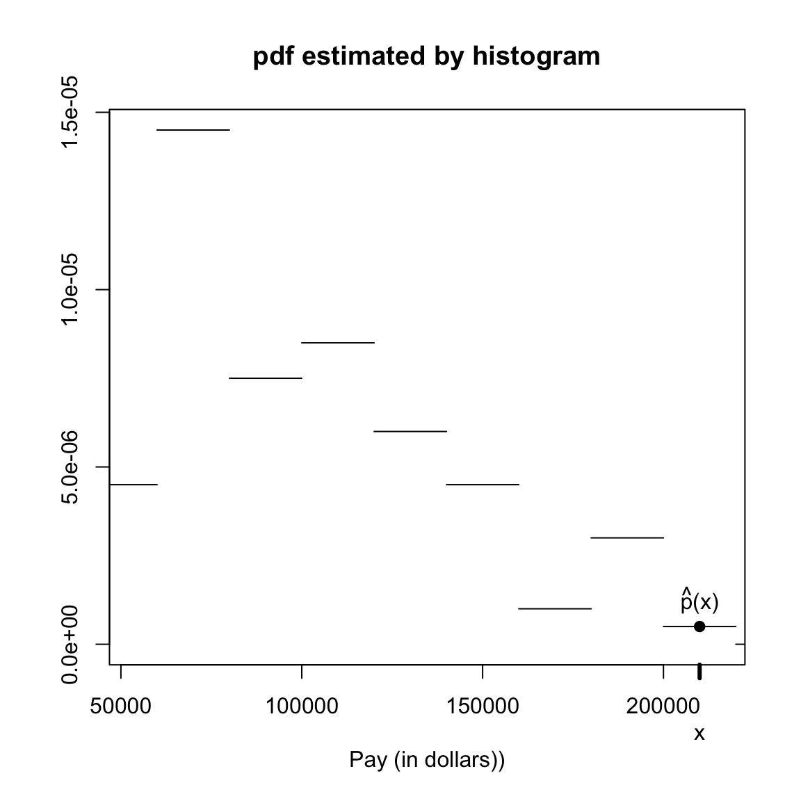
Sensitivity to breaks
How we choose the breaks in a histogram can affect their ability to be a good estimate of the density. Consider our sample of \(\bar{X}\) values from the previous section when we were discussing the central limit theorem. We know roughly many samples of \(\bar{X}\) should look like it comes from a normal distribution. Below we draw histograms based our repeated values of \(\bar{X}\) for different breaks. We also overlay the normal distribution which represents the distribution the mean should follow.
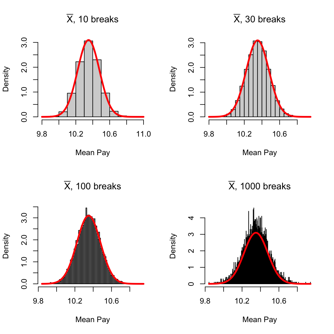 We can see that the accuracy of \(\hat{p}_{hist}(x)\) as an approximation of the values of the pdf of a normal varies a great deal with the number of breaks (or equivalently the width of the intervals).
2.5.2 Kernel density estimation
A step function as an estimate of \(p(x)\) does not seem to make sense if we think the true \(p(x)\) a continuous function. We will now consider the most commonly used method of estimating the density, kernel density smoothing, for estimate \(p(x)\). To understand how this works, we will go through several “improvements” to the histogram, each one of which improves on our estimate. The kernel density smoothing will put all of these ideas together.
2.5.2.1 Moving Windows
Let’s consider a simple improvement first: using a moving window or bin to calculate a histogram, rather than a fixed set of non-overlaping intervals.
Motivation
Previously, we said if the pdf \(p(x)\) is a pretty smooth function of \(x\), then in a small enough window around a point \(x\), \(p(x)\) is going to be not changing too much, so it makes sense to assume it’s approximately a flat line. So if you want to estimate \(p(x)\) at a specific \(x\), say \(x=64,000\), we would make an interval \((b_1,b_2)\) with \(64,000\) at the center and calculate our estimate, say \((b_1,b_2)=(54,000,74,000)\) \[\hat{p}(64,000)=\frac{\#\text{ Points in }(b_1,b_2]}{(b_2-b_1)\times n}=\frac{\#\text{ Points in }(54K,74K]}{20K\times n}.\]
However, when we make a histogram, we set a fix intervals of the bins, irrelevant of where \(64,000\) lies. In our histogram above, our bins were every \(20K\) starting with zero. So our estimate of \(p(64,000)\) is \[\hat{p}_{hist}(64,000)=\frac{\#\text{ Points in }(60K,80K]}{20K\times n}.\]
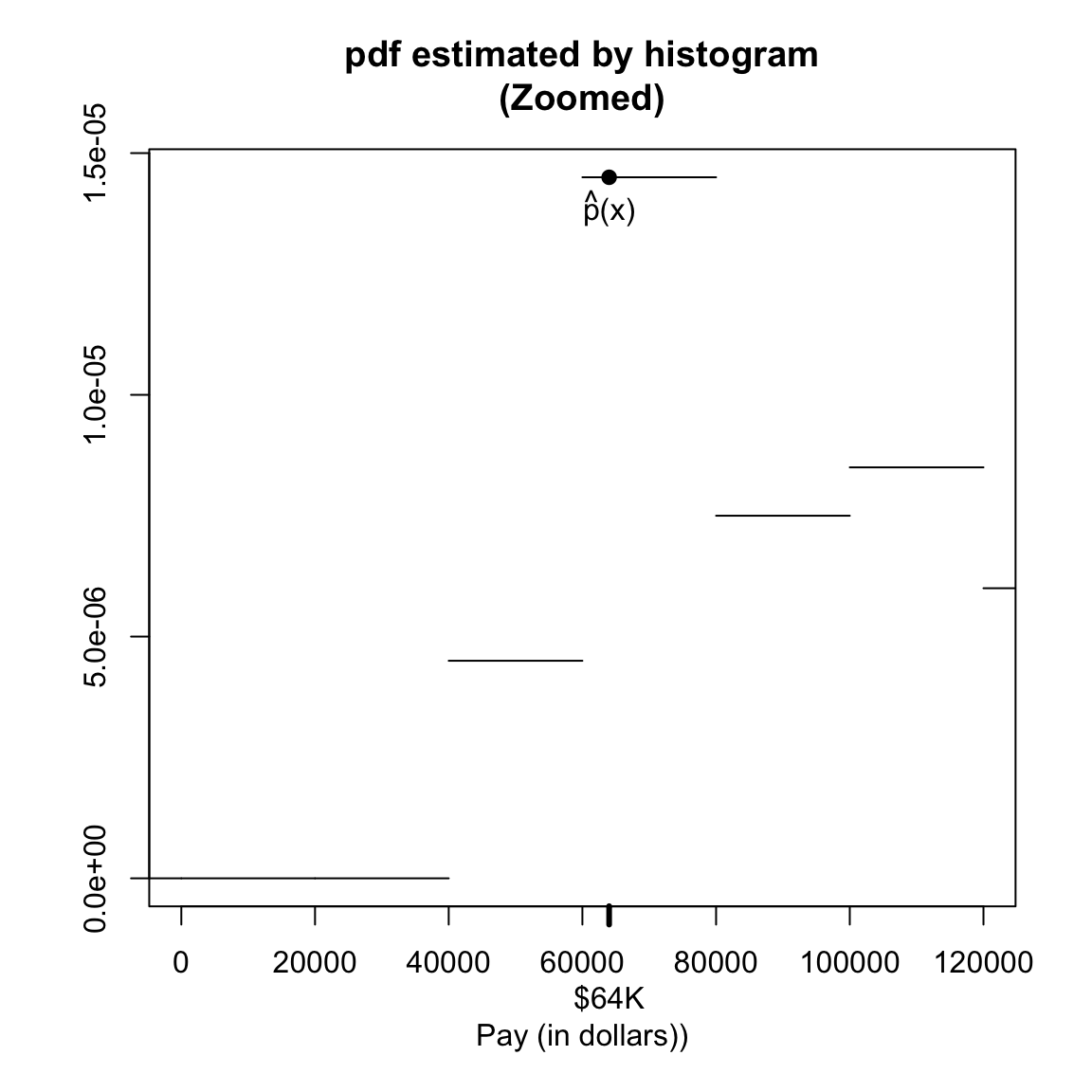
While this makes sense for our plot, this is strange if our goal is to estimate \(p(64,000)\). We would do better to use the first interval we considered above of \((54,000,74,000]\)
This is the example just a single specific value of \(x=64,000\). But in estimating the function \(p(x)\), we are really wanting to estimate \(p(x)\) for every \(x\). So by the same analogy, I should estimate a \(\hat{p}(x)\) by making a bin centered at \(x\), for every \(x\). I.e. for every value of \(x\), we make an interval of \(\pm 20,000\) and use the same formula.
For example, for \(x=80,000\), how would you estimate \(p(80,000)\)?
Doing this for every single \(x\) would give us a curve like this (as compared to the density histogram):
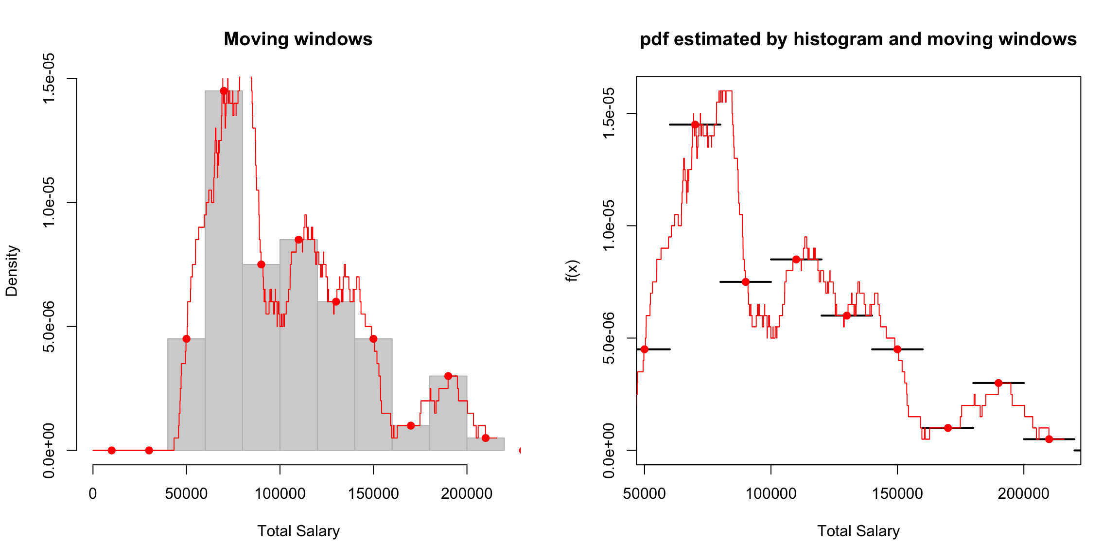
More formally, for chosen bin width \(w\) our estimate of \(p(x)\), is \[\hat{p}(x)=\frac{\# X_i \in [x-\frac{w}{2},x+\frac{w}{2} ) }{w \times n }\]
Of course, in our plots, we don’t actually calculate for every \(x\), but take a large number of \(x\) values that span the range.
Window size
We had a fixed size of \(20K\) on either size of \(x\), but we can consider using different size windows around our point \(x\):
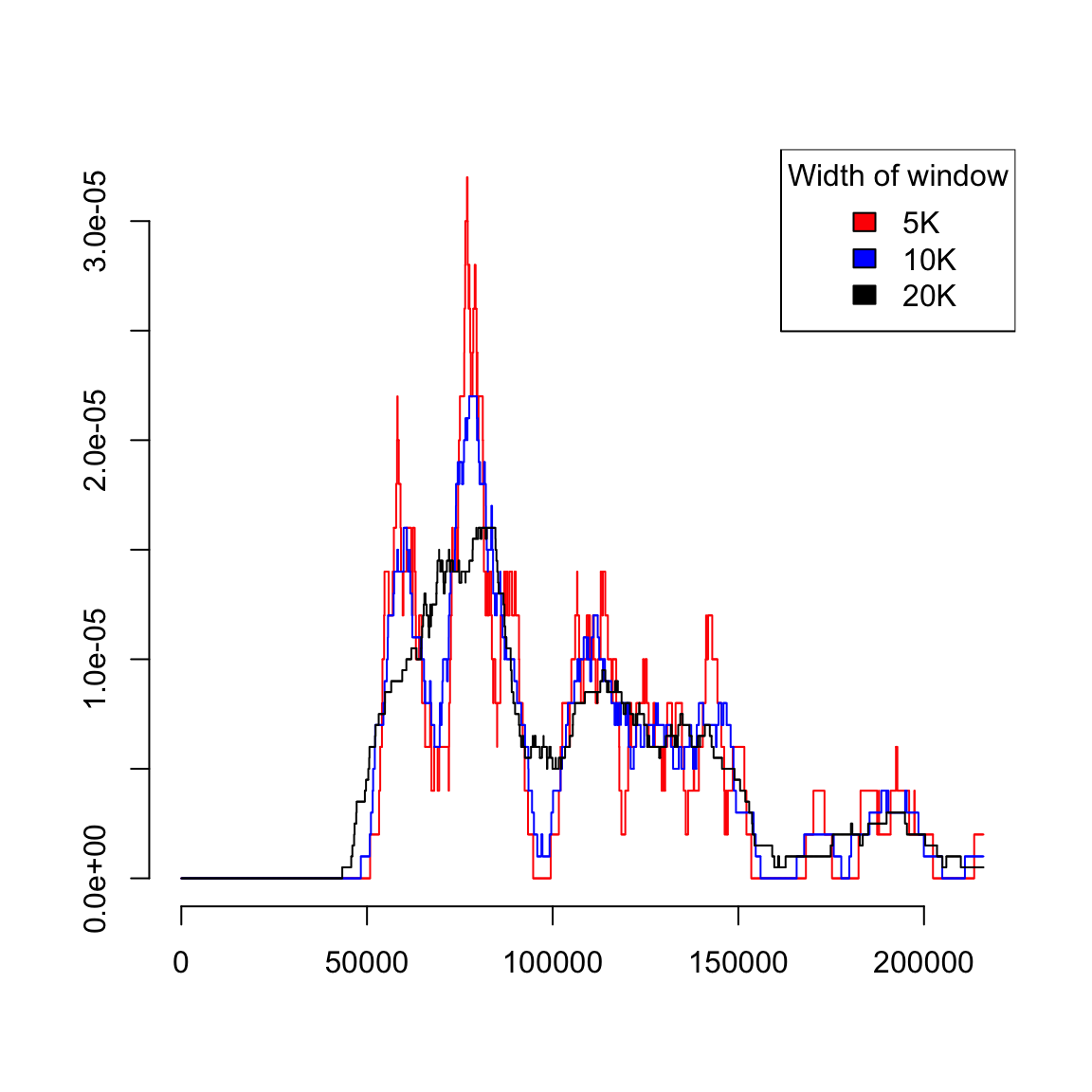
What is the effect of larger windows or bins?
2.5.2.2 Weighted Kernel Function
Now we consider further improving our estimate of \(p(x)\).
Re-writing our estimate
We said our estimate of \(p(x)\), is \[\hat{p}(x)=\frac{\# X_i \in [x-\frac{w}{2},x+\frac{w}{2} ) }{w \times n },\] where \(w\) is the width of our are interval.
To estimate the density around \(x\), this estimate counts individual data observations if and only if they within \(w/2\) to \(x\). We could write this as a sum over all of our data in our SRS, where some of the data are not counted depending on whether it is close enough to \(x\) or not.
To do that mathematically, we’re going to create a function that tells os for each observation whether it is within \(w/2\) of \(x\). Let \[I(X_i \in [x-\frac{w}{2},x+\frac{w}{2} ))=\begin{cases} 1 &X_i \in [x-\frac{w}{2},x+\frac{w}{2} ) ) \\ 0 & otherwise \end{cases}\] This is called an indicator function. Generally and indicator function \(I(\cdot)\) is a function which is \(1\) if the value inside it is true and zero otherwise. If we want to count how many times something happens, we can write it as a sum of indicator functions.
Then we can write our estimate as \[\hat{p}(x)=\frac{1}{w \times n}\sum_{i=1}^{n} I(X_i \in [x-\frac{w}{2},x+\frac{w}{2} ))\] Since we only get \(1\) for the observations that are in the interval, this sum is the same as \[\# X_i \in [x-\frac{w}{2},x+\frac{w}{2} )\]
If we rearrange this a bit, we have \[\hat{p}(x)=\frac{1}{n}\sum_{i=1}^{n} \frac{1}{w}I(X_i \in [x-\frac{w}{2},x+\frac{w}{2} )),\] and we see that in this way that we are starting to get an estimate that looks more like quantities like the sample mean or sample variance, i.e. \[\bar{x}=\frac{1}{n}\sum_{i=1}^{n}X_i, \hspace{2ex} var=\frac{1}{n}\sum_{i=1}^{n}(X_i-\bar{X})^2\] where we are taking a function of all our observations and then taking an average over these values.
Interpreting our estimate
Using this expression, we can see that every observation is contributing, in principle, to our estimate. We can thus interpret how much a point \(X_i\) counts toward estimating \(p(x)\): it either contributes \(1/w\) or \(0\) depending on how far it is from \(x\). We can visualize this:
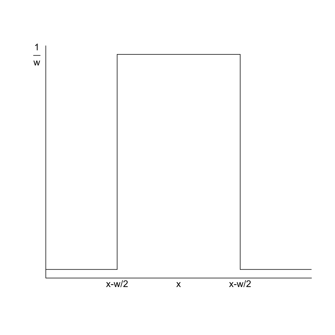
We can think of this as a function \(f\) with input variables \(x\) and \(X_i\): for every \(x\) for which we want to estimate \(p(x)\), we have a function that tells us how much each of our data points \(X_i\) should contribute. \[f(x,X_i)=\begin{cases} \frac{1}{w} & X_i \in [x-\frac{w}{2},x+\frac{w}{2} ) \\ 0 & otherwise \end{cases}\] It’s a function that is different for every \(x\), but just like our moving windows, it’s the same function and we just apply it across all of the \(x\). So we can simply write our estimate at each \(x\) as an average of the values \(f(x,X_i)\) \[\hat{p}(x)=\frac{1}{n}\sum_{i=1}^{n} f(x,X_i)\]
Is this a proper density?
Does \(\hat{p}(x)\) form a proper density, i.e. is the area under its curve equal \(1\)? We can answer this question by integrating \(\hat{p}(x)\), \[\begin{align*} \int_{-\infty}^{\infty} \hat{p}(x)dx & = \int_{-\infty}^{\infty} \frac{1}{n}\sum_{i=1}^{n} f(x,X_i) dx\\ &= \frac{1}{n}\sum_{i=1}^{n}\int_{-\infty}^{\infty} f(x,X_i) dx \end{align*}\] So if \(\int_{-\infty}^{\infty} f(x,X_i) dx=1\) for any \(X_i\), we will have, \[\int_{-\infty}^{\infty} \hat{p}(x)dx=\frac{1}{n}\sum_{i=1}^{n} 1 = 1.\]
Is this the case? Well, considering \(f(x,X_i)\) as a function of \(x\) with a fixed \(X_i\) value, it is equal to \(1/w\) when \(x\) is within \(w/2\) of \(X_i\), and zero otherwise (i.e. the same function as before, but now centered at \(X_i\)) which we can visualize below:
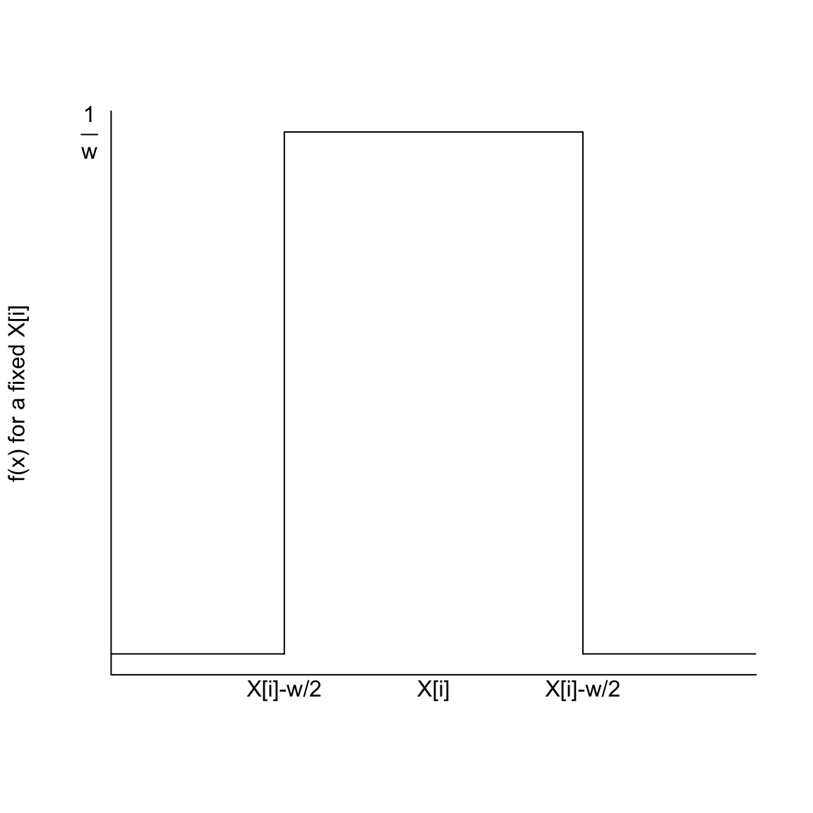 This means \(\int_{-\infty}^{\infty} f(x,X_i) dx = 1\) for any fixed \(X_i\), and so it is a valid density function.
Writing in terms of a kernel function \(K\)
For various reasons, we will often speak in terms of the distance between \(x\) and the \(X_i\) relative to our the width on one side of \(x\), given by \(h\): \[\frac{|x-X_i|}{h}\] The parameter \(h\) is called the bandwidth parameter.
You can think of this as the amount of \(h\) units \(X_i\) is from \(x\). So if we are trying to estimate \(p(64,000)\) and our bin width is \(w=5,000\), then \(h=2,500\) and \(\frac{|x-X_i|}{h}\) is the number of \(2.5K\) units a data point \(X_i\) is from \(64,000\).}
Doing this we can write \[f_x(X_i)=\frac{1}{h}K(\frac{|x-X_i|}{h})\] where \[K(d)=\begin{cases} \frac{1}{2} & d\leq 1 \\ 0 & otherwise \end{cases} \] We call a function \(K(d)\) that defines a weight for each data point at \(h\)-units distance \(d\) from \(x\) a kernel function. \[\hat{p}(x)=\frac{1}{n}\sum_{i=1}^{n} \frac{1}{h} K(\frac{|x-X_i|}{h})\] All of this mucking about with the function \(K\) versus \(f(x,X_i)\) is not really important – it gives us the same estimate! \(K\) is just slightly easier to discuss mathematically because we took away it’s dependence on \(x\), \(X_i\) and (somewhat) \(h\).
Example of Salary data
In R, the standard function to calculate the density is density. Our moving window is called the “rectangular” kernel, and so we can replicate what we did using the option kernel="rectangular" in the density function15
2.5.2.3 Other choices of kernel functions
Once we think about our estimate of \(p(x)\) as picking a weight for neighboring points, we can think about not having such a sharp distinction for the interval around \(x\). After all, what if you have a data point that is \(5,100\) away from \(x\) rather than \(5,000\)? Similarly, if you have 50 data points within \(100\) of \(x\) shouldn’t they be more informative about the density around \(x\) than 50 data points more than \(4,500\) away from \(x\)?
This generates the idea of letting data points contribute to the estimate of \(p(x)\) based on their distance from \(x\), but in a smoother way. For example, consider this more ‘gentle’ visualization of the contribution or weight of a data point \(X_i\) to the estimate of the density at \(x\):
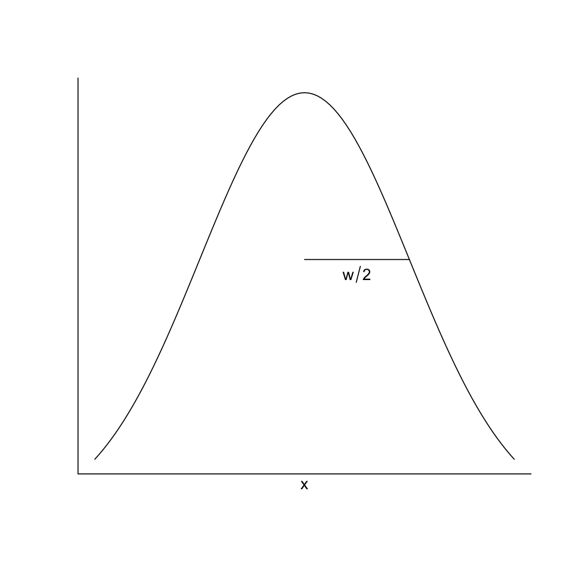
This is also the form of a kernel function, called a normal (or gaussian) kernel and is very common for density estimation. It is a normal curve centered at \(x\)16; as you move away from \(x\) you start to decrease in your contribution to the estimate of \(p(x)\) but more gradually than the rectangle kernel we started with.
If we want to formally write this in terms of a function \(K\), like above then we would say that our \(K(\cdot)\) function is the standard normal curve centered at zero with standard deviation 0. This would imply that \[\frac{1}{h}K(\frac{|x-X_i|}{h})\] will give you the normal curve with mean \(x\) and standard deviation \(h\).
We can compare these two kernel estimates.
The next plot is the estimate of the density based on the rectangular kernel and the normal kernel (now using the defaults in density), along with our estimate from the histogram:
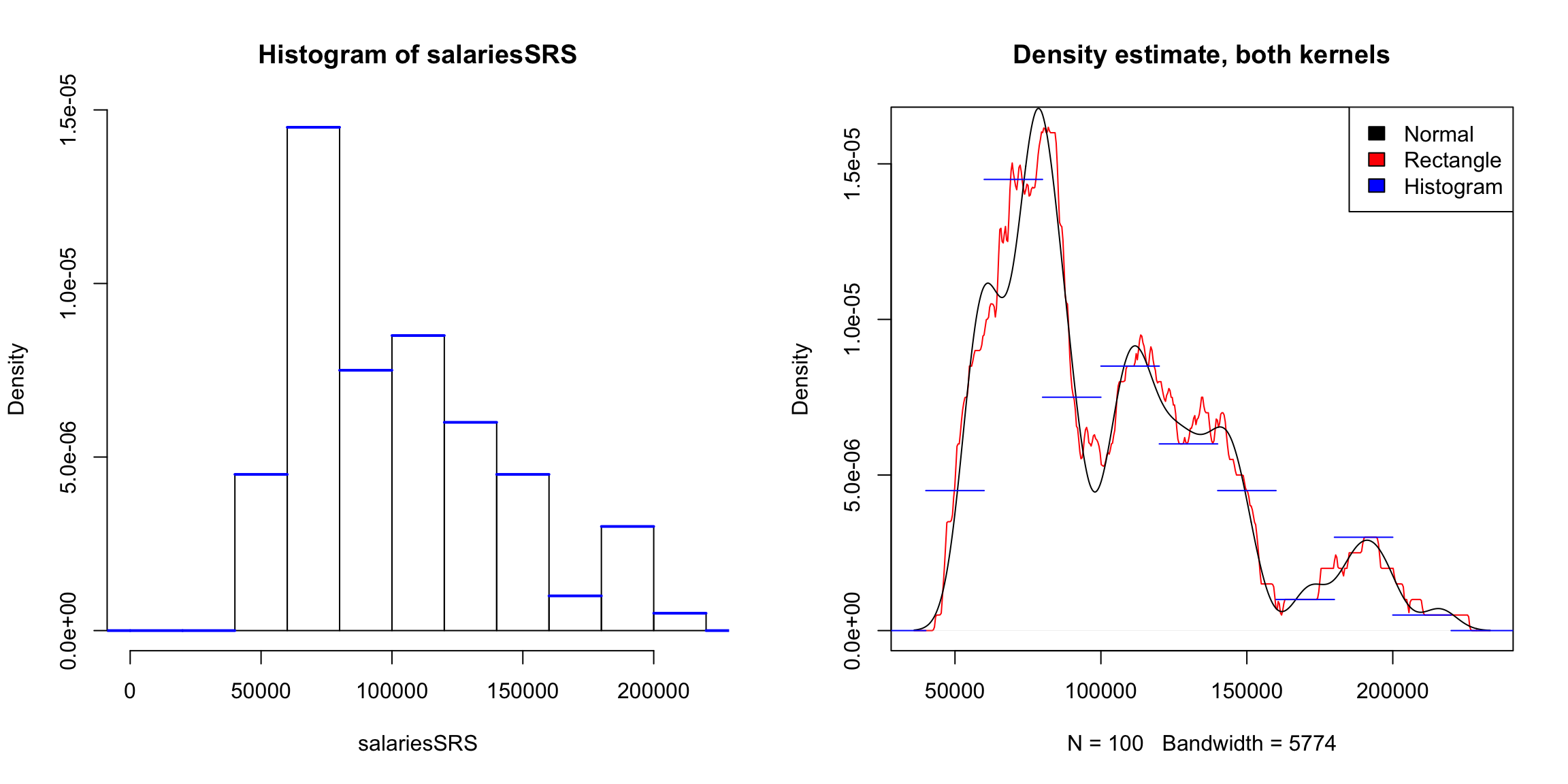
What do you notice when comparing the estimates of the density from these two kernels?
Bandwidth
Notice that I still have a problem of picking a width for the rectangular kernel, or the spread/standard deviation for the gaussian kernel. This \(w\) value is called generically a bandwidth parameter. In the above plot I forced the functions to have the same bandwidth corresponding to the moving window of $20K.
Here are plots of the estimates using different choices of the bandwidth:
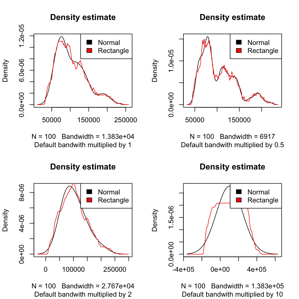
The default parameter of the density function is usually pretty reasonable, particularly if used with the gaussian kernel (also the default). Indeed, while we discussed the rectangular kernel to motivate going from the histogram to the kernel density estimator, it’s rarely used in practice. It is almost always the gaussian kernel.
2.5.3 Comparing multiple groups with density curves
In addition to being a more satisfying estimation of a pdf, density curves are much easier to compare between groups than histograms because you can easily overlay them.
Previously we considered dividing the SF salary data into different groups based on their job title and comparing them. Because of the large number of job titles, we earlier created a smaller dataset salaries2014_top with just the top 10 job titles (by frequency) which we will use again here. Here is the boxplot we created previously.

The boxplots allow us to compare some basic summary statistics of the distributions visually. We could ask if there were more subtle differences by estimating the density of each group and comparing them. I’ve defined a small function perGroupDensity to do this (not shown, see the accompanying code for the book for the function) and I will plot each density with a different color:
par(mfrow = c(1, 1))
output <- perGroupDensity(x = salaries2014_top$TotalPay,
    salaries2014_top$JobTitle, main = "Total Pay, by job title",
    sub = "Top 10 most common full-time")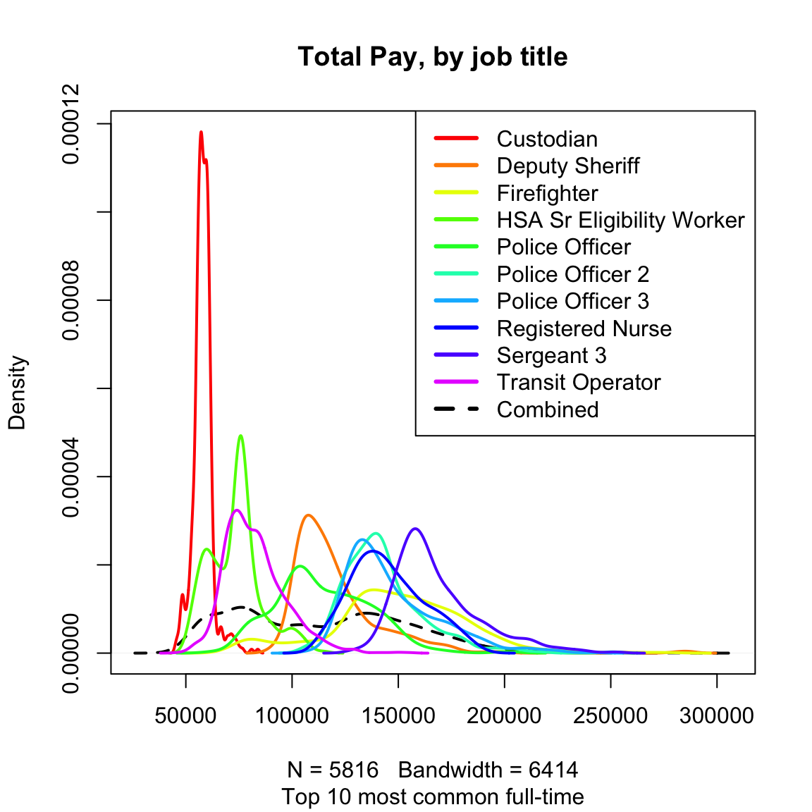
A note on colors Before we talk about what we can see, first of all notice that the default colors were not perhaps the best choice of colors. We can’t actually tell apart the various greens, for example. These kinds of details are really important in thinking about visualizations. Sometimes you want similar colors. For example, we might want all of the police categories with a similar shade. Or we might be dividing based on a continuous variable, like age, and it would make sense to have the colors for the ages follow a spectrum (though it’s still a problem if you can’t tell them apart). But generally for distinct categories we want some distinct colors that we can easily tell apart.
So now I’m going to define some colors and replot the densities for the multiple groups (I’m not going to plot the combined density to simplify the plot). I will plot the boxplot next to it so we can compare.
nGroups <- nlevels(factor(salaries2014_top$JobTitle))
library(RColorBrewer)
cols <- brewer.pal(n = nGroups, "Paired")
par(mfrow = c(1, 2))
output <- perGroupDensity(x = salaries2014_top$TotalPay,
    salaries2014_top$JobTitle, cols = cols, main = "Total Pay, by job title",
    sub = "Top 10 most common full-time", includeCombined = FALSE)
par(mar = c(10, 4.1, 4.1, 0.1))
boxplot(salaries2014_top$TotalPay ~ salaries2014_top$JobTitle,
    main = "Total Pay, by job title, 10 most frequent job titles",
    xlab = "", col = cols, ylab = "Pay (in dollars)",
    las = 3)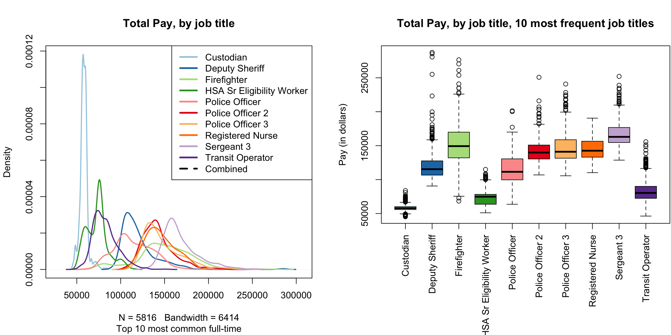
Compared to the boxplot, we can see that “HSA Sr Eligibility Worker” seems to be bimodal (two peaks in the density). This suggests there are two groups in this category with different salary rates. One of those modes/groups overlaps with the lower wages of the “Custodian” category while the other mode is higher.
We can see that with density plots we can see more subtle differences between the groups, but it is a much noisier plot. It’s easier to see the big shifts between the job titles with a boxplot. Whether boxplots or multiple density plots is better depends a lot on the data and what your question is. It also depends on how many groups you are comparing.
What are we estimating? We discussed density estimation as estimating the density \(p(x)\) of an unknown distribution. In the case of the SF salaries, as we’ve discussed, the data is an entire census of the population, so there’s nothing to estimate. This is a rare situation, since normally your data will not be a census. Furthermore, we’ve already discussed that histograms can be used as either a visualization of the existing data or an estimate of the unknown generating distribution. The same is true for kernel density estimates. So in this case it’s just a visualization tool for comparing the groups, and not an estimate of an unknown distribution.
2.5.3.1 Violin Plots
We can combine the idea of density plots and boxplots to get something called a “violin plot”.
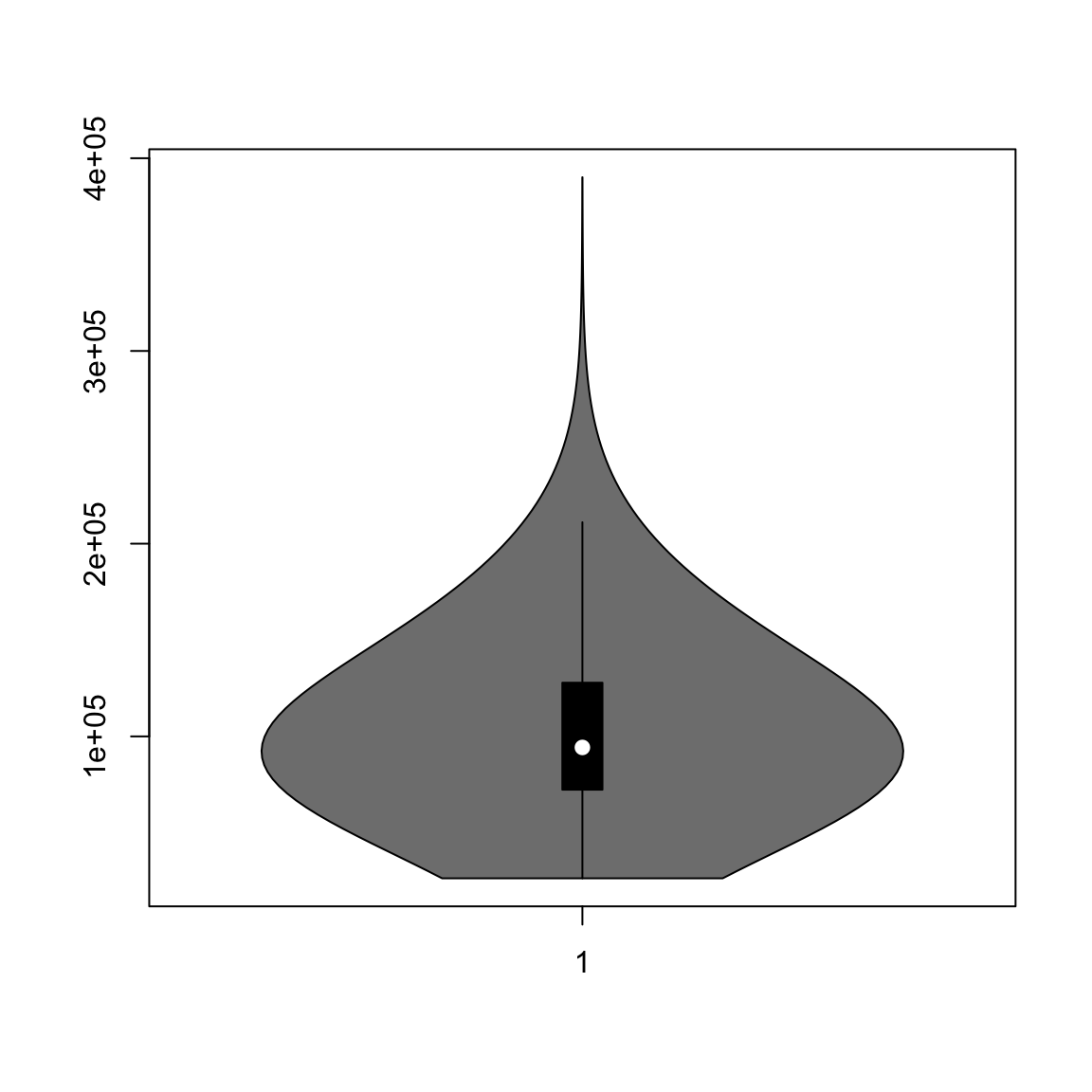
This is basically just turning the density estimate on its side and putting it next to the boxplot so that you can get finer-grain information about the distribution.
Like boxplots, this allows you to compare many groups.
source("http://www.stat.berkeley.edu/~epurdom/RcodeForClasses/myvioplot.R")
par(mar = c(10, 4.1, 4.1, 0.1))
vioplot2(salaries2014_top$TotalPay, salaries2014_top$JobTitle,
    col = cols, las = 3, ylab = "Salary (in dollars)")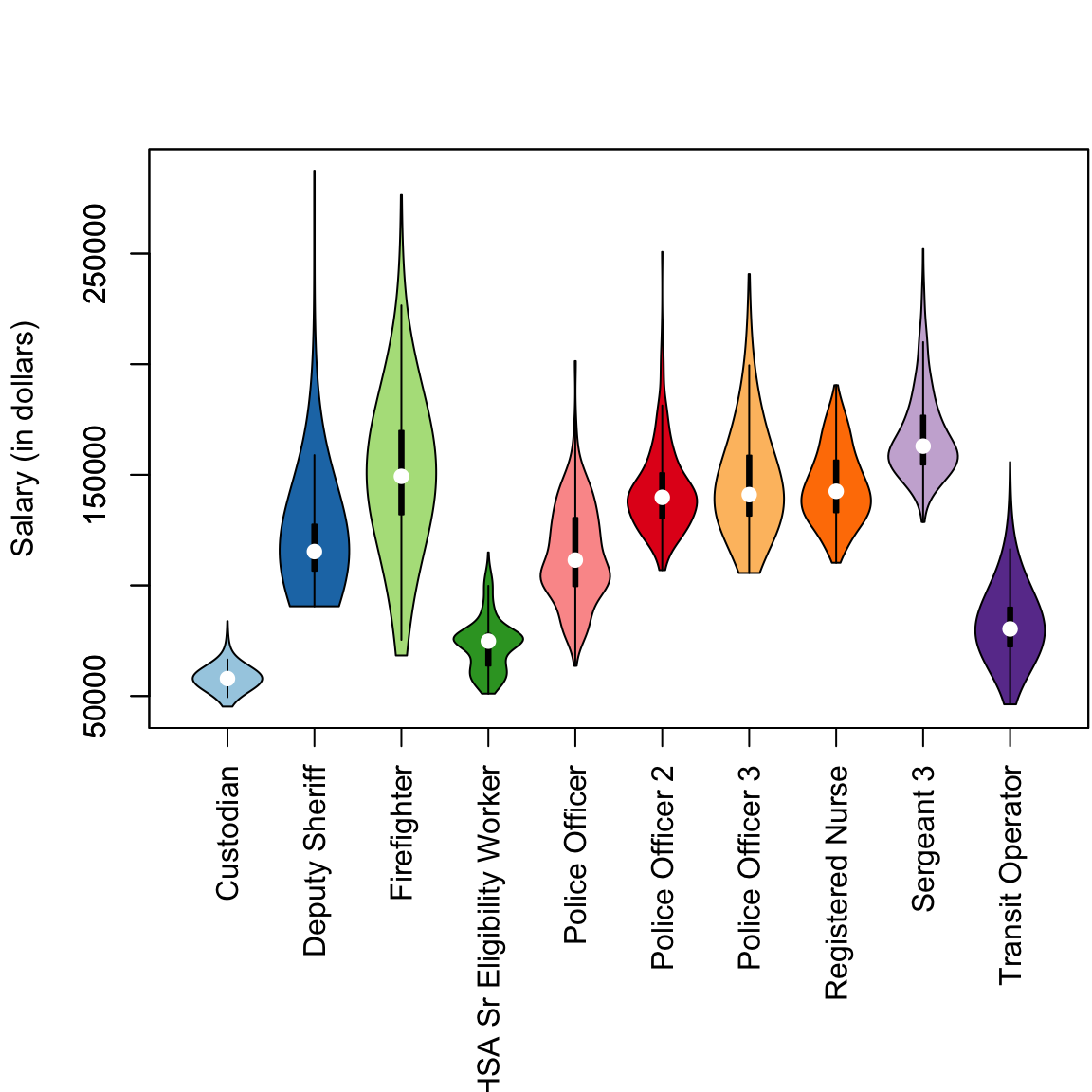
## Linking to ImageMagick 6.9.12.3
## Enabled features: cairo, fontconfig, freetype, heic, lcms, pango, raw, rsvg, webp
## Disabled features: fftw, ghostscript, x11You might have been taught that you can make a histogram with uneven break points, which is true, but in practice is rather exotic thing to do. If you do, then you have to calculate the height of the bar differently based on the width of the bin because it is the area of the bin that should be proportional to the number of entries in a bin, not the height of the bin.↩
If our data had a nice symmetric distribution around the median, like the normal distribution, the rule of thumb would be more appropriate, and this wouldn’t happen to the same degree. Specifically, for a normal distribution with standard deviation, \(IQR=1.35\sigma\), so the whiskers would be a distance of \(2.17\sigma\) from the mean/median, so the chance of a single observation from a normal being outside of the range of the whiskers would be \(0.03\).↩
Some boxplots do define the whiskers to be the min and max, showing the range of the data. This isn’t the accepted definition anymore in most areas, but it is always good to check.↩
But they are often used without providing an explicit comparison distribution; in this case, the comparison distribution is always the normal distribution, which is a standard benchmark in statistics↩
Of course the distance of ‘2’ on the log-scale does have a very specific meaning: a distance of `2’ on the (base 10) log scale is equivalent to being 100 times greater↩
http://www.hcd.ca.gov/grants-funding/income-limits/state-and-federal-income-limits/docs/inc2k14.pdf↩
The notation \(\in\) means “in”, as part of the set. So \(X\in \{1,3,5\}\) means that \(X\) is one of the values 1,3, or 5↩
Plotting these probabilities is not done automatically by R, so we have to mainpulate the histogram command in R to do this (and I don’t normally recommend that you make this plot – I’m just making it for teaching purposes here).↩
This is the definition of a distribution with a pdf. We will expand this definition for other distributions when we discuss continuous distributions.↩
Of course \(1/(n-1)\) can’t be a probability for \(n\) samples because they wouldn’t sum to 1! It would need to be \(1/n\) to be a probability. This is a small difference from the definition for a probability distribution; we won’t go into the reasons for \(1/(n-1)\) right now.↩
For more mathematically minded, a discrete distribution is one where \(\Omega\) is a countable set, which can be infinite.↩
For those with more math: convergent infinite series can of course sum to \(1\). This is the case for distributions like the geometric distribution, which is a distribution and has an infinite sample space \(\Omega\). But we are working with the continuous real line (or an interval of the real line), and there is not a bijection between the integers and the continuous line. The interval of the real line isn’t a countable set.↩
Discrete distributions have cdfs where \(F(x)\) is not differentiable, so they do not have densities. But even some continuous distributions can have cdfs that are non-differentiable↩
It’s actually hard to exactly replicate what I did above with the
densityfunction, because R is smarter. First of all, it picks a bandwidth from the data. Second, it doesn’t evaluate at every possible x like I did. It picks a number, and interpolates between them. For the rectangular density, this makes much more sense, as you can see in the above plot.↩You have to properly scale the height of the kernel function curve so that you get area under the final estimate \(\hat{p}(x)\) curve equal to 1↩